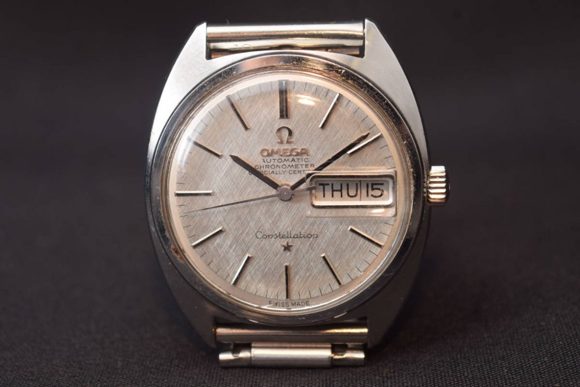
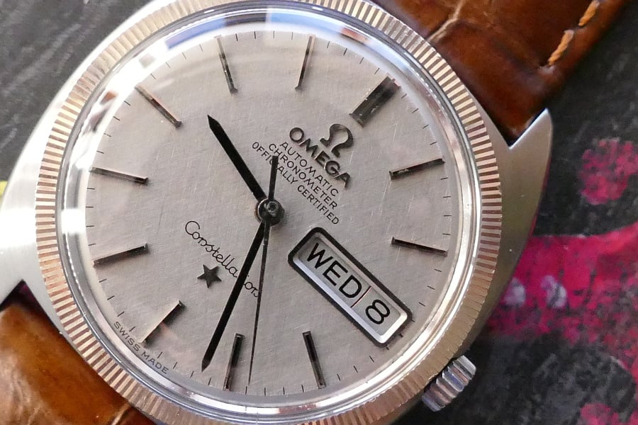
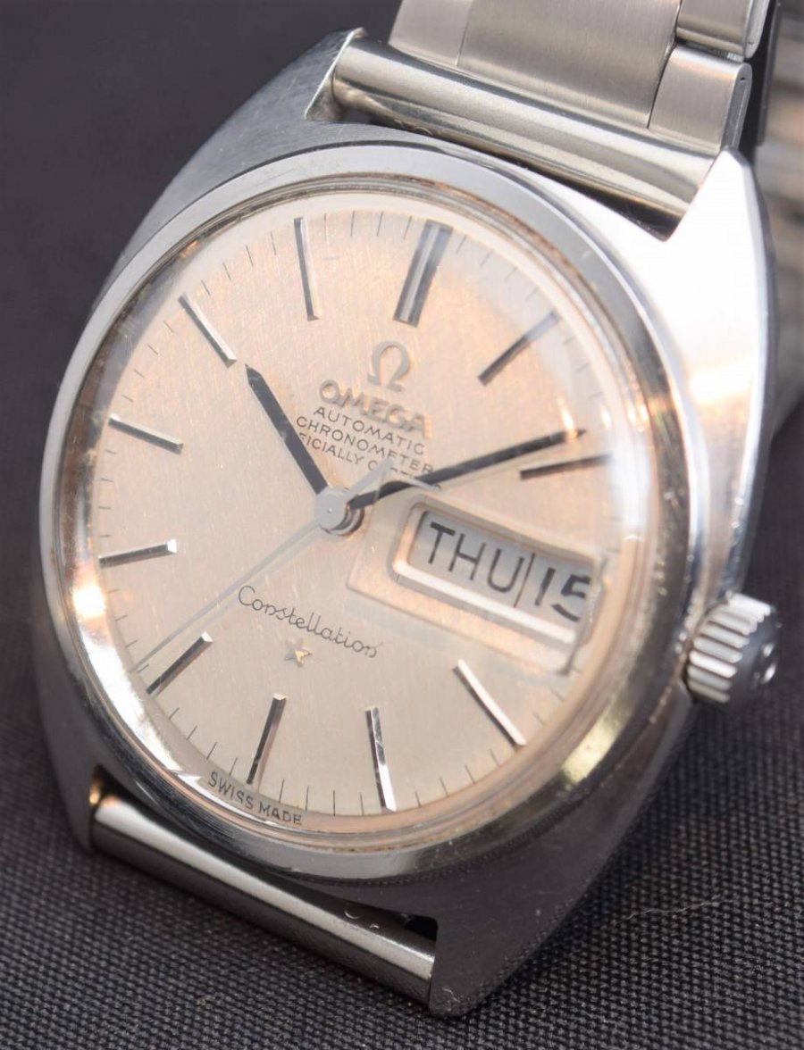
Is this a re-dial? Thin fonts
Spruce
··Sunburst dial fanI’d be more worried about the rust looking deterioration of the bezel - and what lurks beneath it
kaplan
·ConElPueblo
·Looks fine to me. I think it is a combination of the textured dial and a slightly worn crystal. One of the best C-shape dial/hands combinations.
kaplan
·Tony C.
··Ωf Jury memberThe printing looks fine to me eye, though I don't focus on the model line.
kaplan
·I think the lens used to take the photo is super weird, because the printed minute marker ticks look like 10-20% longer to me, in addition to the thinner fonts
Probably the aftermarket crystal that's causing this effect tho
Edit: there's also a blur in the second photo that could be an Omega mark, but I'm probably seeing things at this point
Probably the aftermarket crystal that's causing this effect tho
Edit: there's also a blur in the second photo that could be an Omega mark, but I'm probably seeing things at this point
Franco
·Honestly, it looks genuine to me - and is one of those occasions when the seller should have taken a picture without the crystal.


