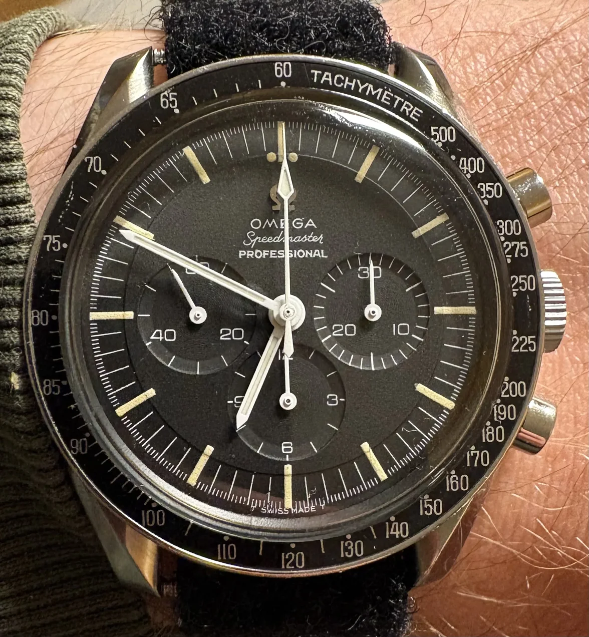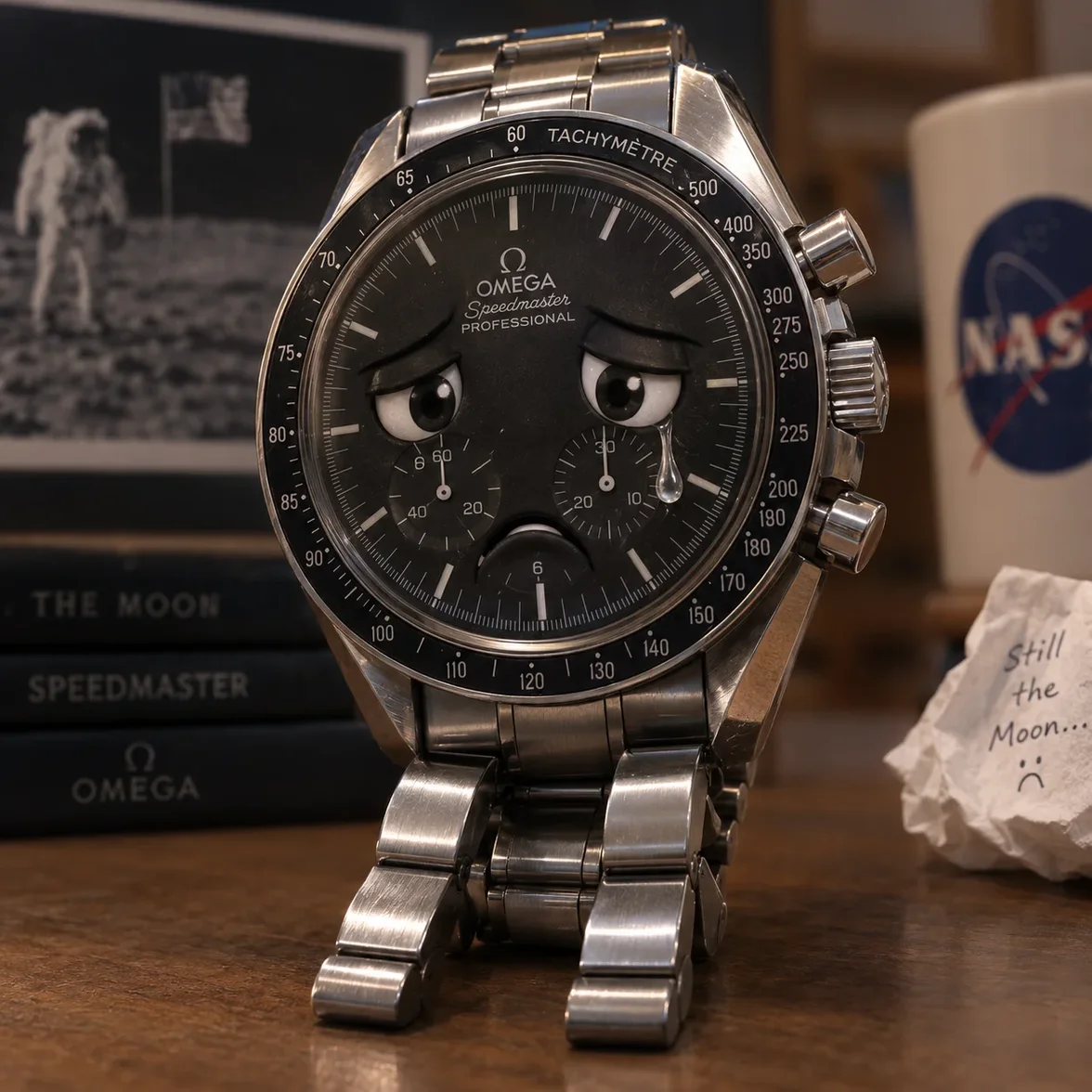
Is my DON bezel fat?

Posts
238
Likes
288
Hi all,

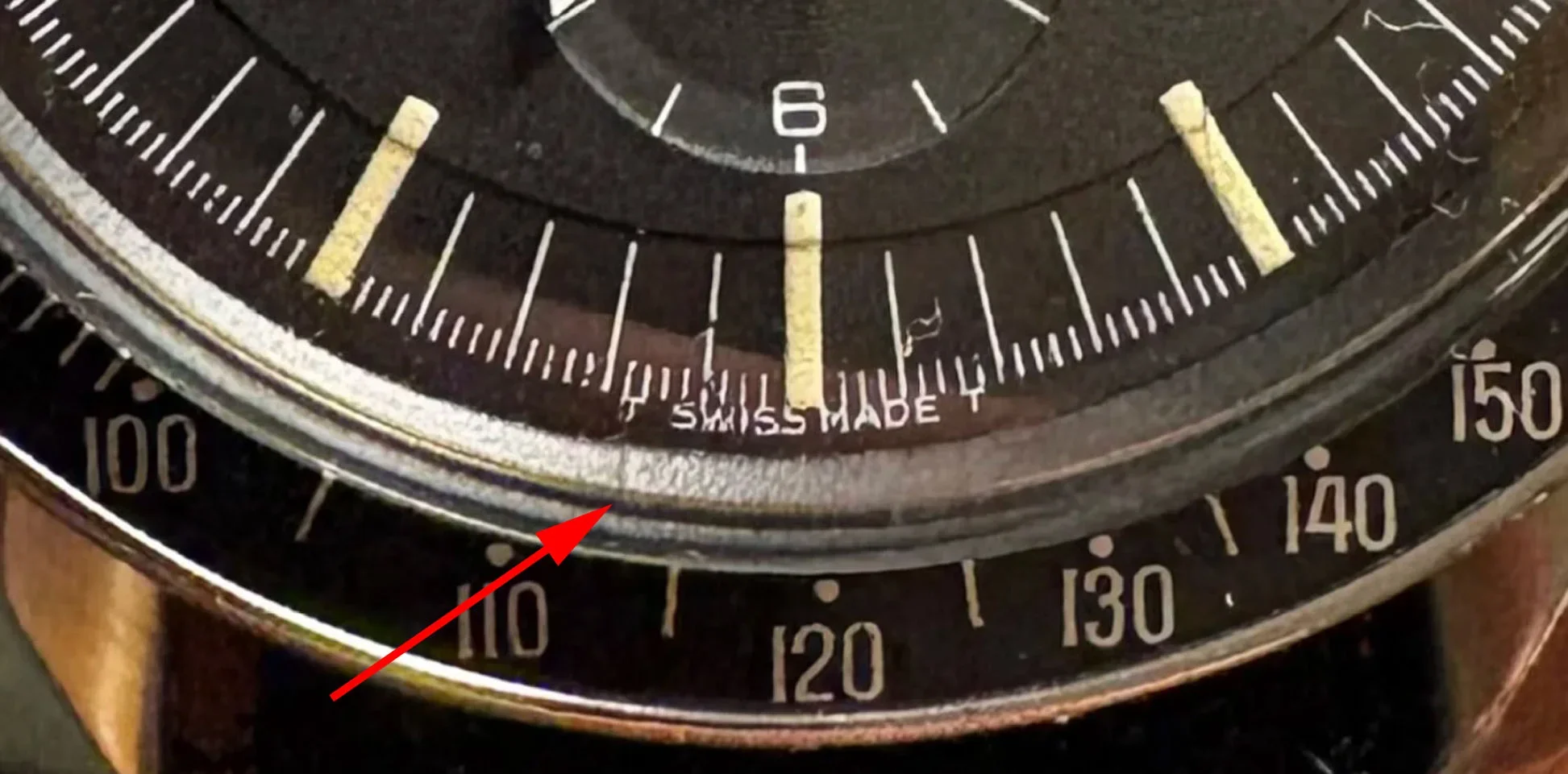
I have been researching the levels of fatness and corresponding characteristics of DON bezels. Essentially to try and determine where mine ranges on the fatness scale. I think mine is semi-fat as it has some, but not all the characteristics that I have noticed.

General fat characteristics:

  • Loss of definition on the numbers.
  • Smaller gaps between numbers/dots.
  • Slight smudged appearance on the dots.
  • No serifs visible.
  • The print of the numbers appears not as smooth/distorts light.


Characteristics of mine:


- A particularly fat 9 in 90.
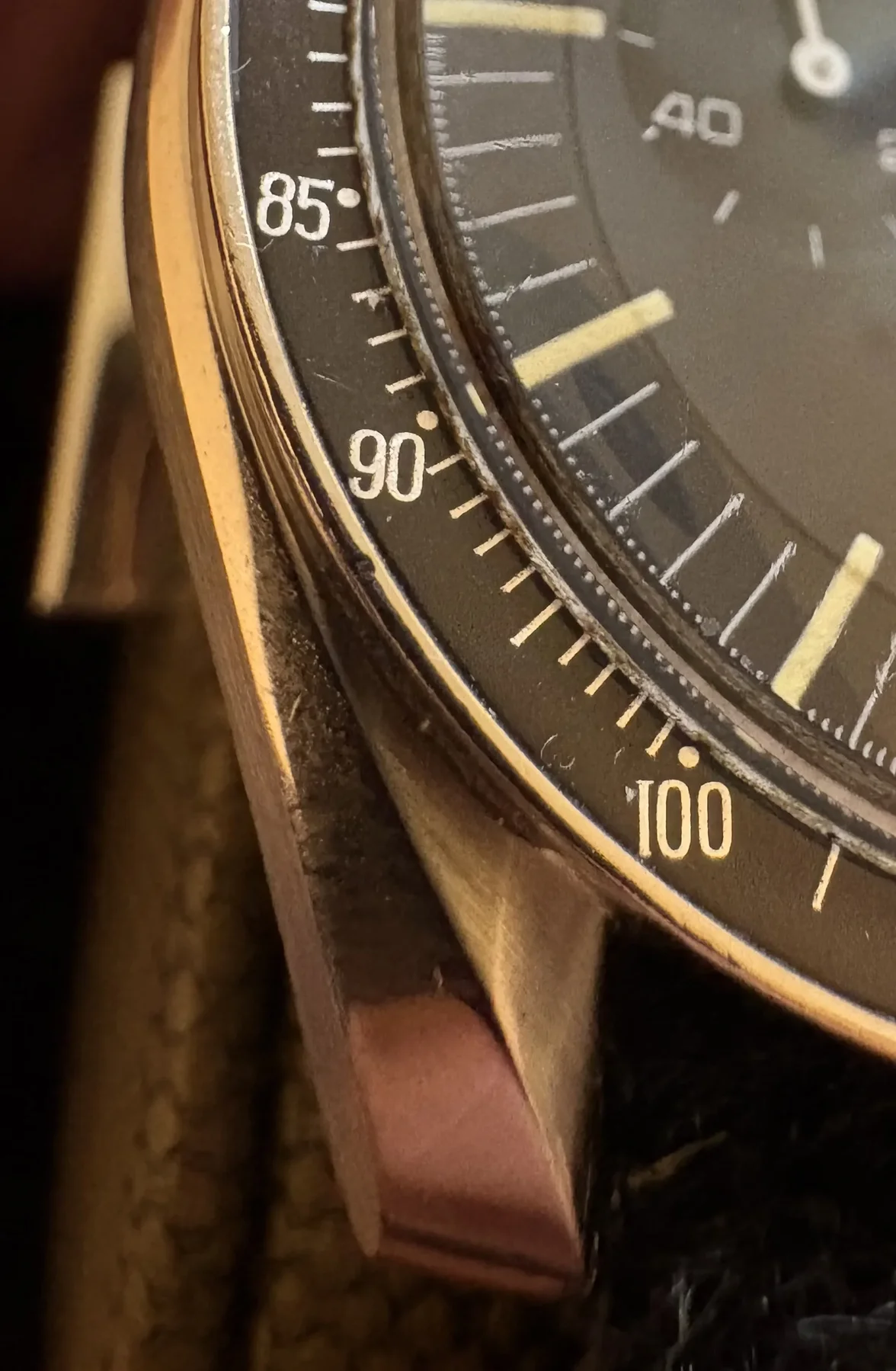


- Slight loss of definition on numbers, but serifs still visible.
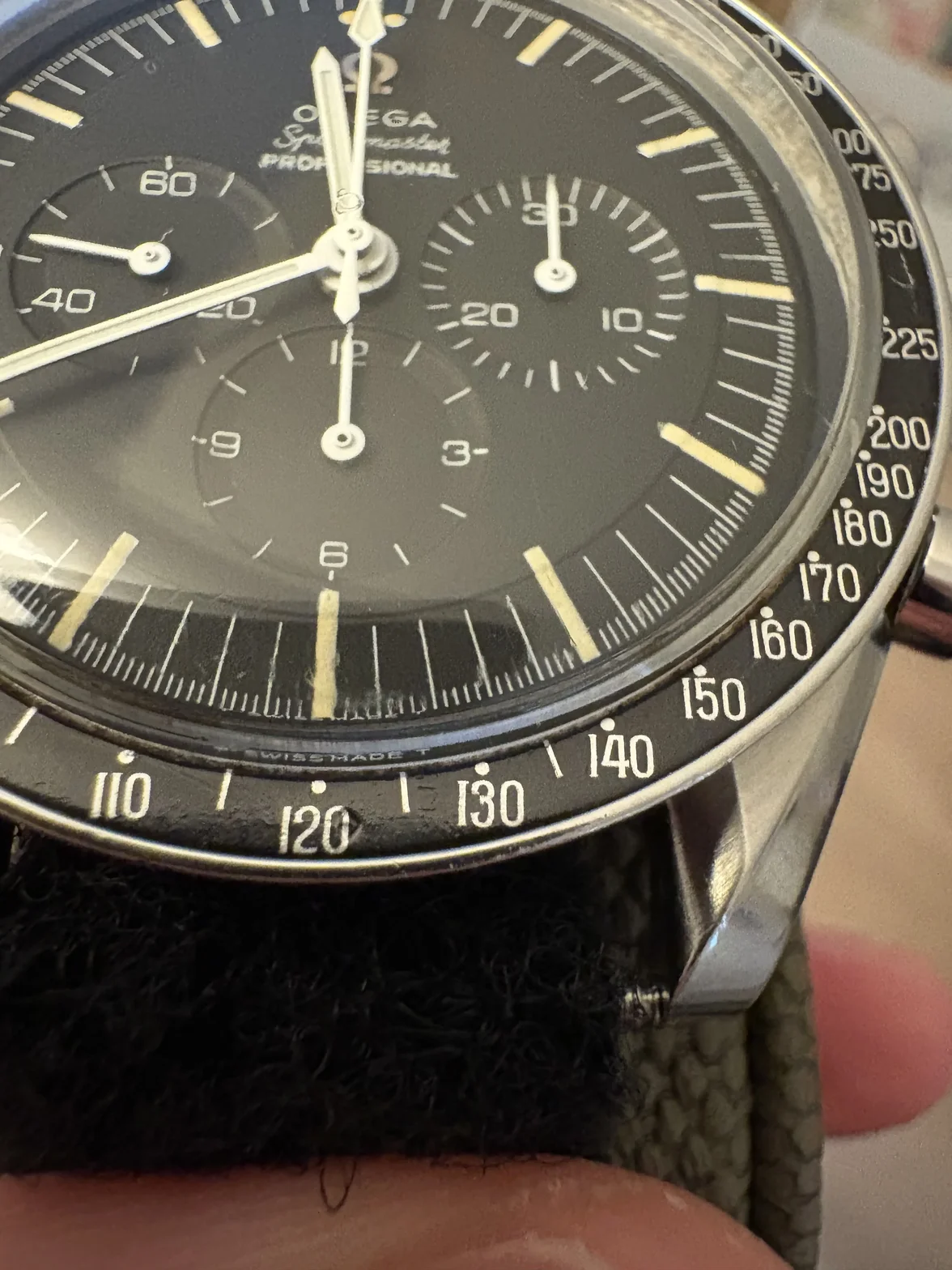


- Numbers and letters have a slightly uneven shine or uneven texture when photographed under bright light.
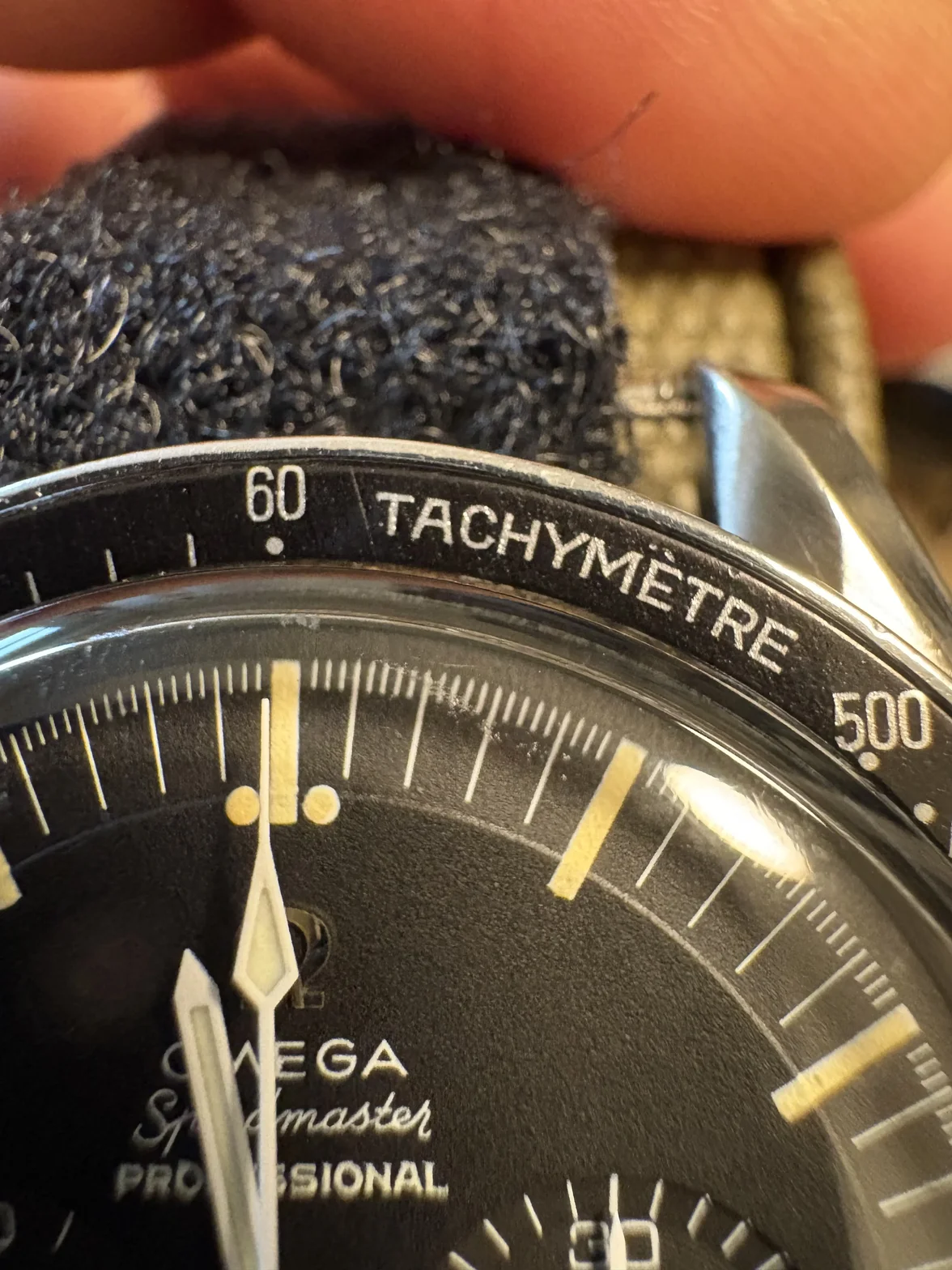


- Dots are not perfectly round in some cases
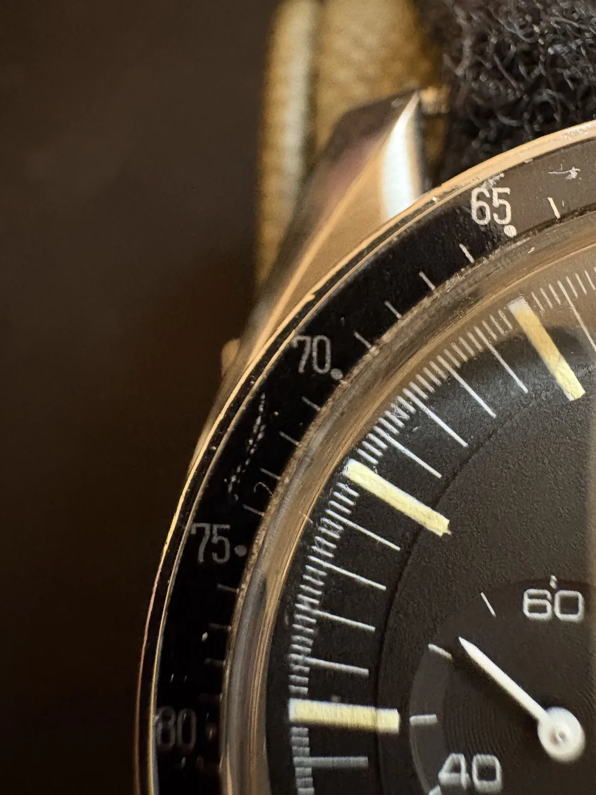


I would say the left side of my bezel has more fat characteristics than the right so maybe there was inconsistent pressure when it was pad printed?

Overall I would give mine a 7/10 for fatness. What do you all think? And are there any characteristics I have missed or pictures of good examples?
 
Posts
53
Likes
45
  • The dot sits diagonally below-right of the 70. As far as I know, that’s the layout people expect on a DON insert, alongside the dot over 90, so the pattern fits.
  • 65, 70 and 75 are sharp, with clean edges, open 0s and 5s, and round dots.
  • There’s wear between 70 and 75: whitish scuffs and a tick that’s partly worn away. That’s real damage to the aluminium, not a print fault, and the poster shouldn’t count it as “fat.”
  • This photo proves the camera point. The 80 at the bottom is soft and smeared purely because it’s out of focus. That’s exactly what made the left side look “fatter” in the wrist shot.
So across four close-ups, I’d still put it at about 2–3 out of 10, with some wear near 70–75. Whether the insert is original to the watch still can’t be settled from photos.

If you want one more line for the reply:

Your 65–75 shot is a good example: in the sharp part the print is clean and thin, and the 80 at the edge only looks heavy because it’s out of focus. The marks between 70 and 75 are scuffs in the aluminium, not print spread.
Here’s one combined reply that answers each of their points. It’s ready to paste:

Thanks for posting the close-ups. They’re much more useful than the wrist shot. Going through your list:

Fat 9 in 90: In your 85–100 macro, the 9 in 90 looks the same weight as the 8 in 85. On the wrist shot that part of the bezel sits on the curve, out of focus and catching glare, which thickens anything printed there.

Loss of definition: I don’t see it. The edges are crisp, the holes in the 0s, 6s, 8s and 9s are open, and the gaps between digits are clean. With fat print those holes fill in and the digits start to touch.

Serifs: Present all the way round. Every 1 from 100 to 190 has its flag at the top and foot at the bottom. That alone argues against fat.

Uneven shine or texture: Under bright light, the raised pad-print ink on a curved anodised insert will always catch light unevenly. It’s normal and doesn’t tell you anything about the print weight.

Dots not round: In the straight-on shots they look round and even from 110 to 200. Seen at an angle, a round dot photographs as an oval.

Left side heavier: That’s the camera, not uneven pad pressure. Your 65–75 shot shows it: the sharp part is clean and thin, while the 80 at the edge is soft only because it’s out of focus. The marks between 70 and 75 are scuffs in the aluminium, not print spread.

Also worth noting: the dot sits over the 90 and diagonally below-right of the 70, and TACHYMÈTRE is sharp with the accent cleanly separated.

On your scale I’d call it thin to normal, around 2–3/10, not 7. To grade inserts fairly, shoot each section straight on with the macro focused on the print itself and diffused light rather than a point source. Nice insert. This data comes our watchbreaker Dastabase
 
Posts
238
Likes
288
Interested to hear any thoughts. Or otherwise this is your chance to cyber bully my bezel and call it fat!
 
Posts
792
Likes
845
  • The dot sits diagonally below-right of the 70. As far as I know, that’s the layout people expect on a DON insert, alongside the dot over 90, so the pattern fits.
  • 65, 70 and 75 are sharp, with clean edges, open 0s and 5s, and round dots.
  • There’s wear between 70 and 75: whitish scuffs and a tick that’s partly worn away. That’s real damage to the aluminium, not a print fault, and the poster shouldn’t count it as “fat.”
  • This photo proves the camera point. The 80 at the bottom is soft and smeared purely because it’s out of focus. That’s exactly what made the left side look “fatter” in the wrist shot.
So across four close-ups, I’d still put it at about 2–3 out of 10, with some wear near 70–75. Whether the insert is original to the watch still can’t be settled from photos.

If you want one more line for the reply:


Here’s one combined reply that answers each of their points. It’s ready to paste:
Thank you AI and for your negative contribution to this forum.
 
Posts
2,465
Likes
11,888
My question is why is the omega symbol sideways on the crystal?
 
Posts
238
Likes
288
My question is why is the omega symbol sideways on the crystal?

That just depends on how much attention the watchmaker is paying when he installs the crystal.
 
Posts
2,465
Likes
11,888
That just depends on how much attention the watchmaker is paying when he installs the crystal.
That would drive me nuts, even though I can't even see it on my own watches.
 
Posts
238
Likes
288
That would drive me nuts, even though I can't even see it on my own watches.

Normally something like this would bother me, but I cannot really see it and I know it is easily fixed so I can let it slide.
 
Posts
30,259
Likes
78,106
My question is why is the omega symbol sideways on the crystal?
Omega does not specify an orientation for the symbol. They do however specify that the split in the tension ring is oriented towards the bottom of the watch, near 6 o'clock. So on this watch it's right where it should be...

 
Posts
147
Likes
156
This topic of differences in DON bezel fonts has been raised a couple of times.


Yes there are differences. Yes fonts can be thin or thicker. Compare your bezel to the ones in these threads and you can judge for yourself where yours lies. You can also look through the many photos users have posted of their watches over the years and get a very good sense of the range of what exists. That’s how I educated myself when I first got interested.

I always thought this watch had one of the nicest fonts I’ve seen on the thicker side:

 
Posts
238
Likes
288
This topic of differences in DON bezel fonts has been raised a couple of times.


Yes there are differences. Yes fonts can be thin or thicker. Compare your bezel to the ones in these threads and you can judge for yourself where yours lies. You can also look through the many photos users have posted of their watches over the years and get a very good sense of the range of what exists. That’s how I educated myself when I first got interested.

I always thought this watch had one of the nicest fonts I’ve seen on the thicker side:


Thank you for the links. I had somehow missed those. When I searched for fat bezel it mostly came up with threads of fake DONs or ones with extremely fat font. I hadn’t managed to find any with a semi fat font for comparison.

Looking at the fonts I think mine is almost identical to the Ed White, although my bezel isn’t in as good condition. I can also see the fuzziness in the print which is nice as that is the main thing I wasn’t sure about.

Personally I like the fatter font, although I have never seen a thin font bezel in person. I am sure there is a clear difference when a fat and thin bezel are side by side but to the naked eye the numbers seem crisp anyway.
 
Posts
7,363
Likes
23,831
General fat characteristics:

  • Loss of definition on the numbers.
  • Smaller gaps between numbers/dots.
  • Slight smudged appearance on the dots.
  • No serifs visible.
  • The print of the numbers appears not as smooth/distorts light.
Here’s what I’ve found:

General fat characteristics:

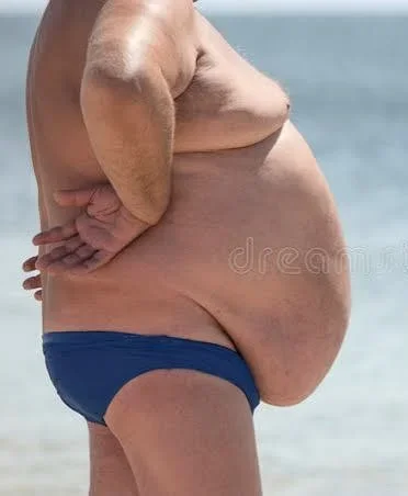
1) Loss of definition in the abdominal region
2) Small gaps between shirt bottom and belt
3) Slight smudged appearance of chocolate around mouth
4) No genitalia visible
5) Belly is smooth but side view distorts light

 
Posts
238
Likes
288
Here’s what I’ve found:

General fat characteristics:

1) Loss of definition in the abdominal region
2) Small gaps between shirt bottom and belt
3) Slight smudged appearance of chocolate around mouth
4) No genitalia visible
5) Belly is smooth but side view distorts light

My Speedmaster right now