Hello everyone, 
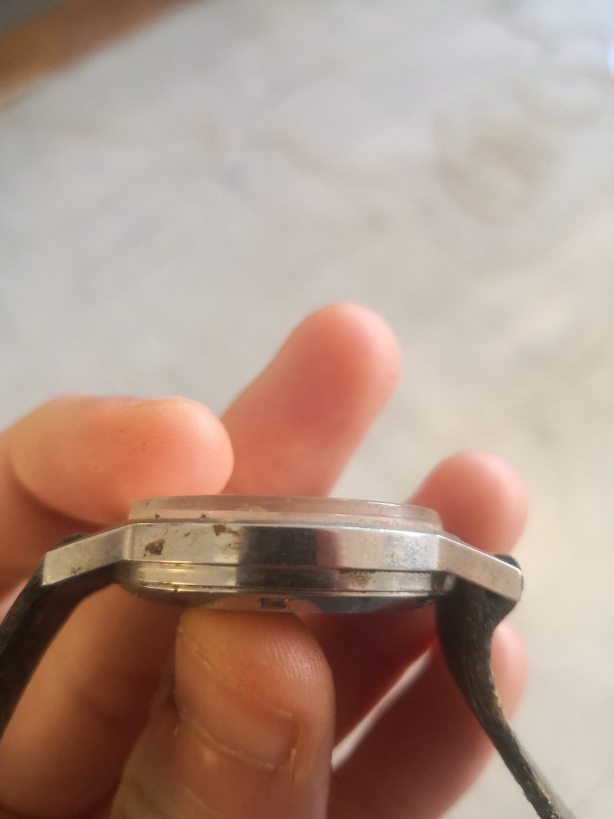
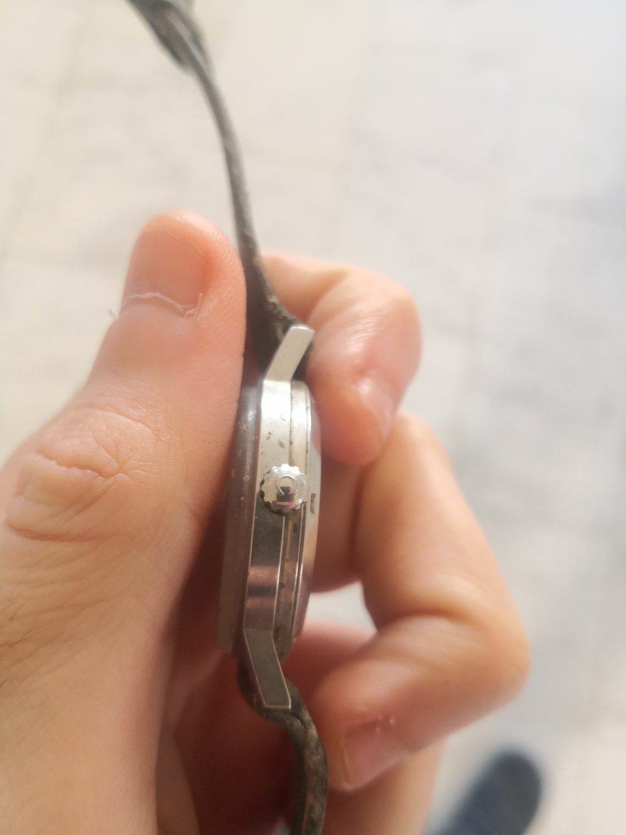
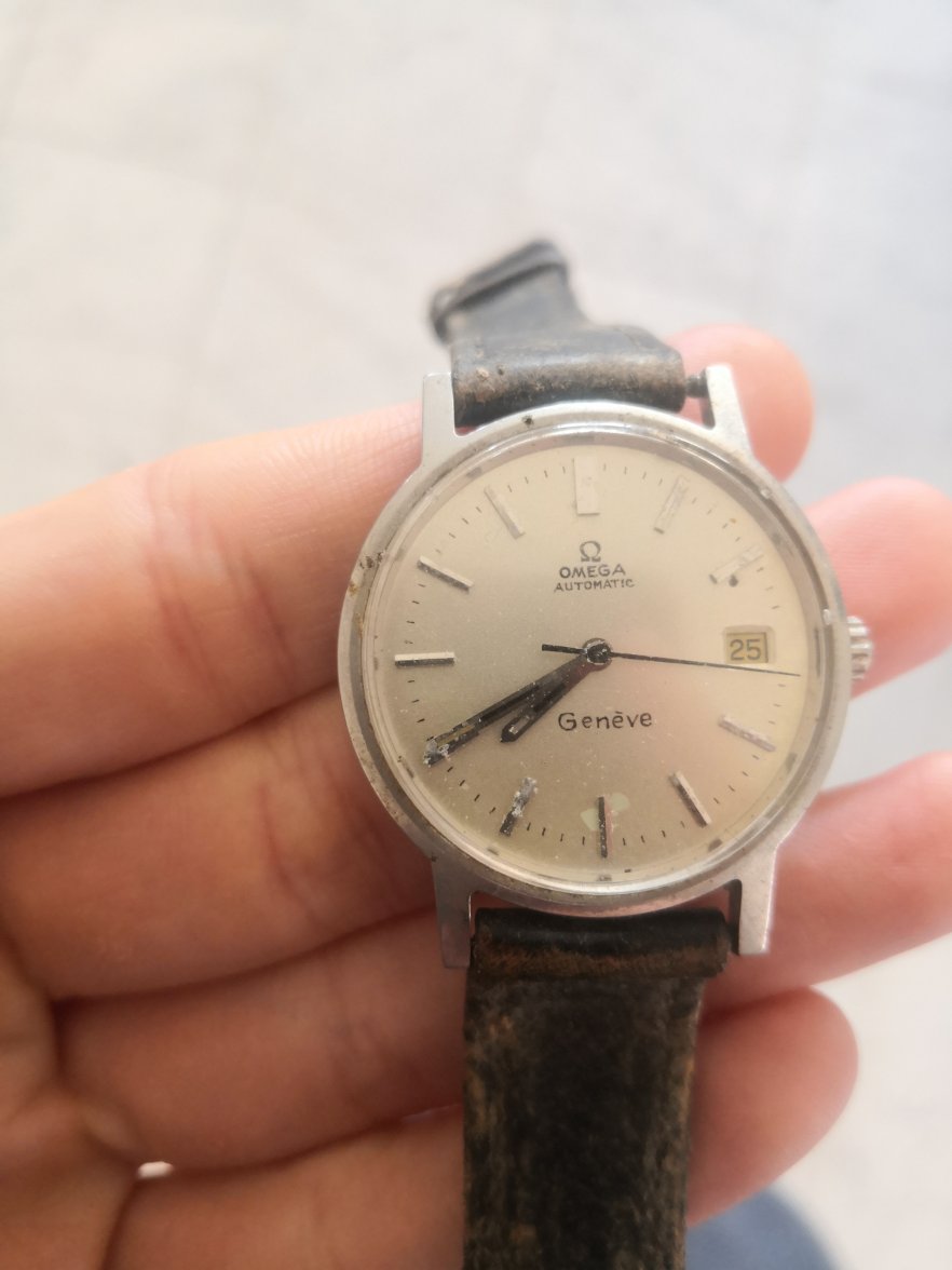
A family friend came with that vintage Geneve and I would highly appreciate a few info. The watch winding functionality does not seem to work, however if you move it, it seems that the watch starts working again for a bit. 
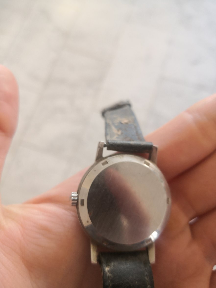
I attach here some pics but without opening the watch. I will try to add some pics of the movement hopefully later on today in order to see if it makes sense to put money for fixing.
The case is stainless and should clean up but the big worry is the dial, and the deterioration of the hands and lower indices which suggests to me internal mechanical problems. You need to get it opened up and checked out before doing any winding or wearing.
The main tell is the fonts on all the text. They are all wrong. If you look at enough original dials, these will just pop out at you. @Spruce has seen more than most and is a Genève fan, but even to me this is an obvious redial. Redialling would have been part and parcel of a service back in the day and is not usually viewed well by collectors. There are good and bad examples and they can serve to make a deteriorated dial look more presentable, but with the obvious downside that originality, so prized by most collectors, is lost. The important consideration here is what the owner wants to do with the watch. Is it an heirloom and they wish to wear it? If so, the redial is part of the watch's history and is worth conserving. The cost of mechanical repair/service may be justified by sentimental value. If your friend is looking to sell, it’s really not worth much at all. If you are being offered the watch for sale, politely walk away. This is not worth pursuing on any level if there is no sentimental value.
@kristal To give you a few more details as to why it's so obviously a redial: Just look at the three "e" in Genève, zoom in on them and compare them to the original printing. They are all different and in varying angles: Also, look how, in the top writing, the Omega logo is at an angle and the bottom right hand side reaches further down than the bottom left hand side. Note how close the G is to the E, and how far away it is from the A. AUTOMATIC is also at an angle and check where the second A and the M are positioned, the M reaches quite a bit further down. Comparing fonts and the thickness of the print can be challenging in the beginning. But do know that - with exceptions, especially in earlier examples - this was a quality product. Trust them to print their words in a consistent and even manner. This looks like it was written by hand.
Picture an imaginary straight line under Geneve. The text is so crooked If it started under the G it would run half way through the V and E. Genuine Omega dials have high quality printing that is fine, clear and straight.
Thanks a lot everyone for the valuable feedback and the help! As you suggested, the verdict is that there is no point in putting money on that for fixing since there is no sentimental value attached to it for me..