Has anyone else noticed the visibility sucks at certain angles? I thought it might be just the silver hands blending into the background, but compared to the 300, they’re nearly invisible:
Spot on, except that it’s not as though some of the modern “fashion” speedy’s don’t sometimes suffer the same “fashion” issues as the FOIS:
I think the sapphire crystal is equally responsible as the hands for poor visibility. Passed up on more than one Apollo Soyuz meteorite dial because the visibility with the reflections was terrible.
Funnily enough I have the same Seamaster 300 and struggle in certain light too. Must be an age thing!
Some people have the issue of "silver" color hands disappearing against the background. Turn your damned wrist a bit. But I get it.
I also chose the FOIS for the handset. Agree the polished hands are more difficult to see in low light, but I was drawn to the vintage look...
Interesting discussion. It’s usually the skeleton hands on the Seamaster Professional Diver 300m that people either love or hate.
Really not a big deal for me. Yeah, you make the hands disappear for a moment but it isn't like you then have to send out a search party to find them again. A minute shift of the wrist and they're back. Also worth pointing out that at other angles the metal catches the light and they hands explode into focus. I do think that GS and IWC pull this trick off better -- GS by faceting the hands so they catch more light and IWC by shaping and luring the hands so that they're never less than highly visible. But in my case it's really only the running seconds that occasionally go MIA, and it isn't a major deterrent, like the difficulty of winding the Pro was for me. But I get that it's joined the skeleton hands on the Great Big List of Omega Design Grievances.
Yes that can happen but it doesn't bother me that much. Perhaps that is the reason why the hands have changed for the "Professional" models. Personally, I love the FOIS and the hands are one of the things why it is appealing to me. It is one of the most elegant Speedmasters mainly because of the alpha hands and the size imho.
They do tend to a bit, the 116520 Daytona has some really bad legibility too with silver hands against silver subdial rings
But were they really all curved (convex shape)? As far as i see there were different variations, for example here is a 2998-3 found here (right now for sale from a member) with, what to me looks like, flat hands.
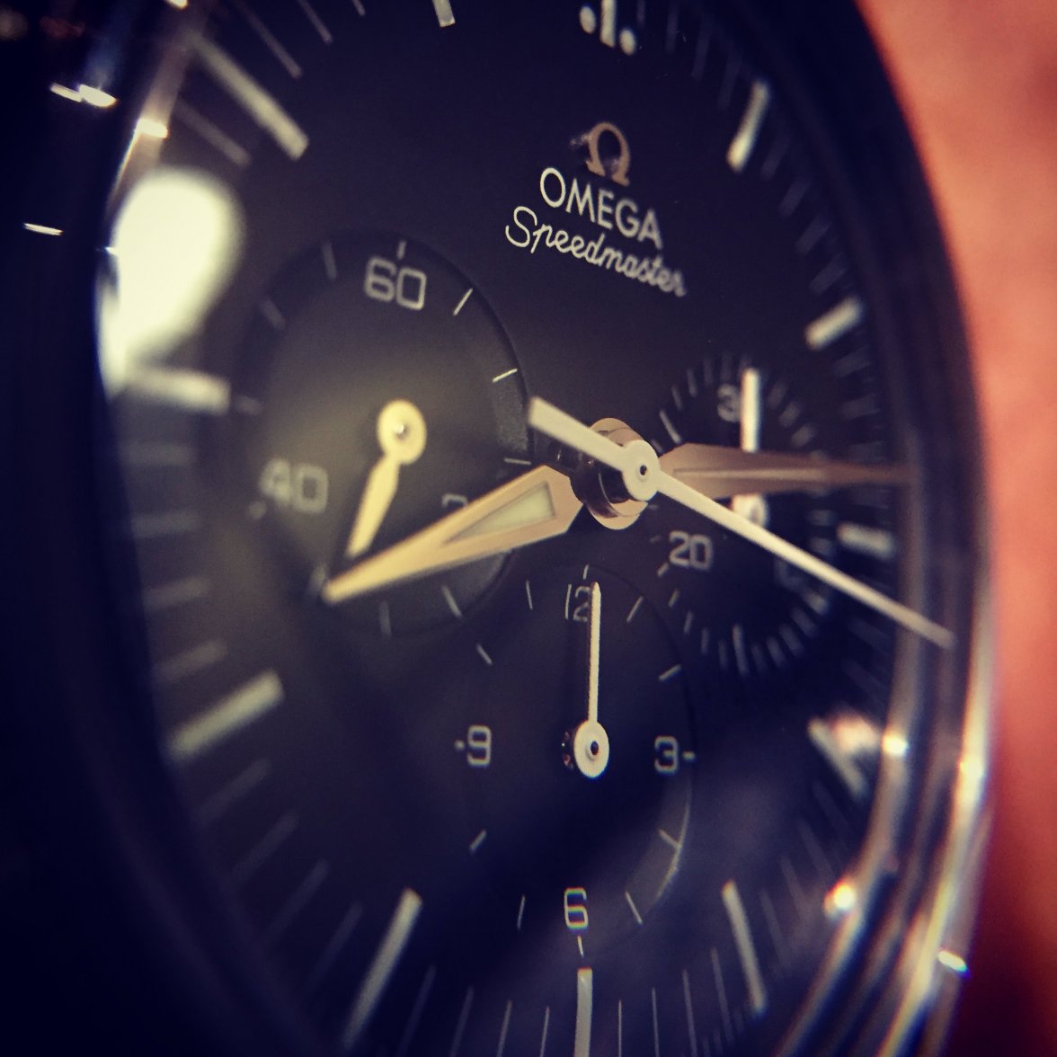
I really came close to buying a FOIS two years ago but ultimately didn't, because of the bright sapphire, the flat polished hands, the squished applied logo and the lack of depth on the dial. It looks quite OK by itself but as soon as I looked at an original speedy from the 60s, it felt sanitized, shiny and fake in comparison. It may feel better with white batons hands, but forking out this price and having to customize afterwards, meh. Quite luckily, I soon after stumbled on my EW and ratty as it is, I much prefer it. I could have sold the EW, bought a FOIS and pocketed 5 to 6k spare change. But I didn't, and never looked back.
Are the hands really that much of a problem? I reckon its one of those things if it plays on your mind, even subconsciously, then you go looking for it. I know what you mean that they can disappear but I've only noticed this when I make it so by tilting my wrist - never ever had an issue reading the time. Each experience is individual, though. Its a beautiful watch and enjoy it! @M'Bob cracking pair () you have there by the way - snap!