- Posts
- 4
- Likes
- 2
DomJames
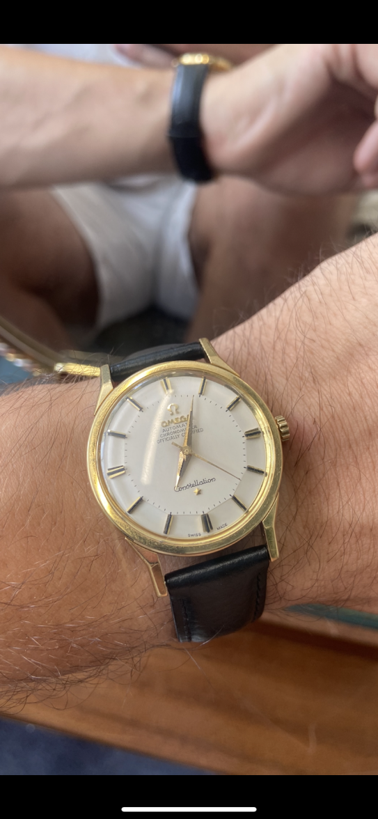
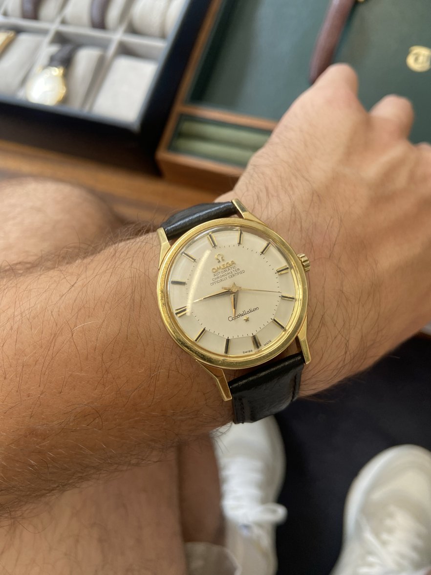
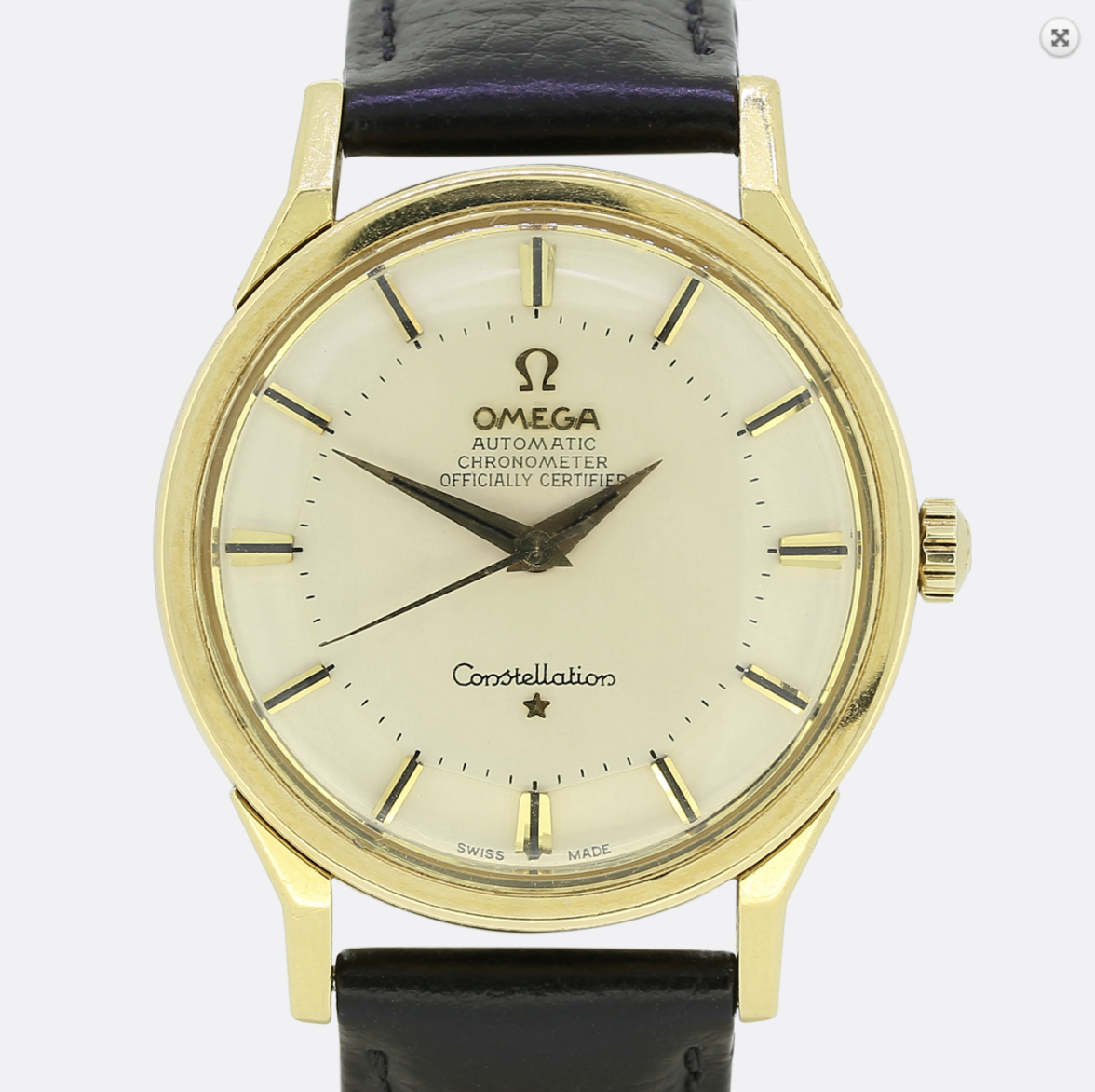
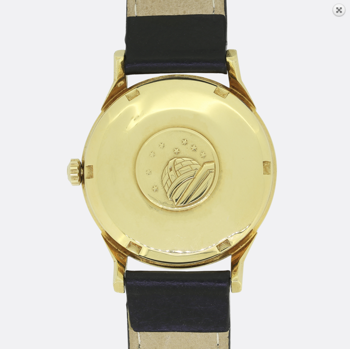
·I'm looking at purchasing a 1960's constellation (first vintage watch).
I've found one I love, however the not sure if the watch has had a redial due to the hands showing patina whereas the dial looks pretty perfect. Also not sure if the type on 'OFFICIALLY CERTIFIED' looks genuine?
Short video of the watch here: https://we.tl/t-AEAoTpvRz6
Any help on this would be massively appreciated.
Also the watch is priced at £3450 if that helps.
Thanks in advance!