I'm probably going to be in the minority here, but since this is not a limited edition, I think the red text detracts from what could otherwise be a very classy design. Red text IMMEDIATELY catches the eye; there's absolutely zero reason to draw attention to the Speedmaster text here, the design is TIMELESS. we all know it's a Speedmaster by the design alone.
Contrast this to the Apollo 11 that has the red July 20 text on the dial, and the whole point
is to draw the eye to the July 20, 1969 text. Why? Because that date has significance. Totally fine to force the eye to text that has significant meaning- the observer is being
told to look at the text and to understand it is important
above and beyond the design. There is zero reason to tell the observer they're looking at a Speedy, and in fact by doing so it
detracts from the timelessness of a design that should 100% be speaking for itself.
One other thing:

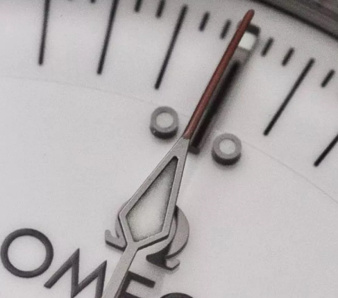
If the Speedmaster text was black and the chrono hand was left the color it is, the watch might have been reminescent of a white tux with a dark red flower, like we see Craig wear in Spectre. Or, like we see Connery wear on multiple occasions. All white, black highlights,
with a single spot of red. That I would have understood. Red carnations as a boutonnière are the single spot of red here. It compliments. A red marker on the chrono hand alone may have functioned this way,
without forcing the eye to dwell on the detail.
It's a good design overall, and this is probably just going to be my take... but the red Speedmaster text makes it much too modern and edges it into sporty where Omega had a chance to make it timeless, classic, and even dressy.
I like it, the white of the dial is nearly perfect. It's absolutely beautiful. but I can't love it for this one detail. There are better white speedies. But perhaps that was the point?