WestCoastTime
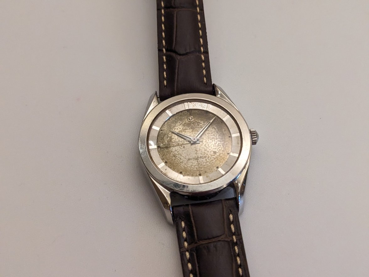
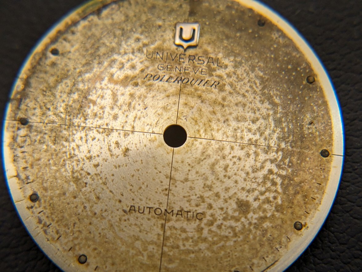
·Picked up a gen-1 Polerouter cal 138SS bumper-wind with some pretty extensive degradation to the dial finish. Intact & all original, including the signed crystal, but showing its age & then some.
Also, good an’ hot under the Geiger Counter.
Maybe Radium burn from the hands contributed to the dial condition?
So the question for me then becomes, how much value is there in an original but heavily degraded dial? And, would I wear it more if it were refinished (& not quite so hot in Alpha & Gamma emissions…)?
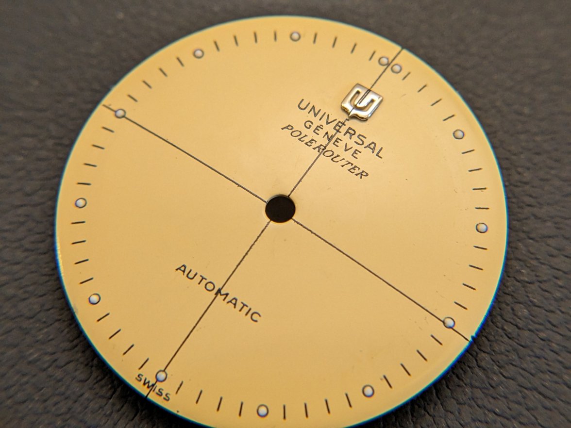
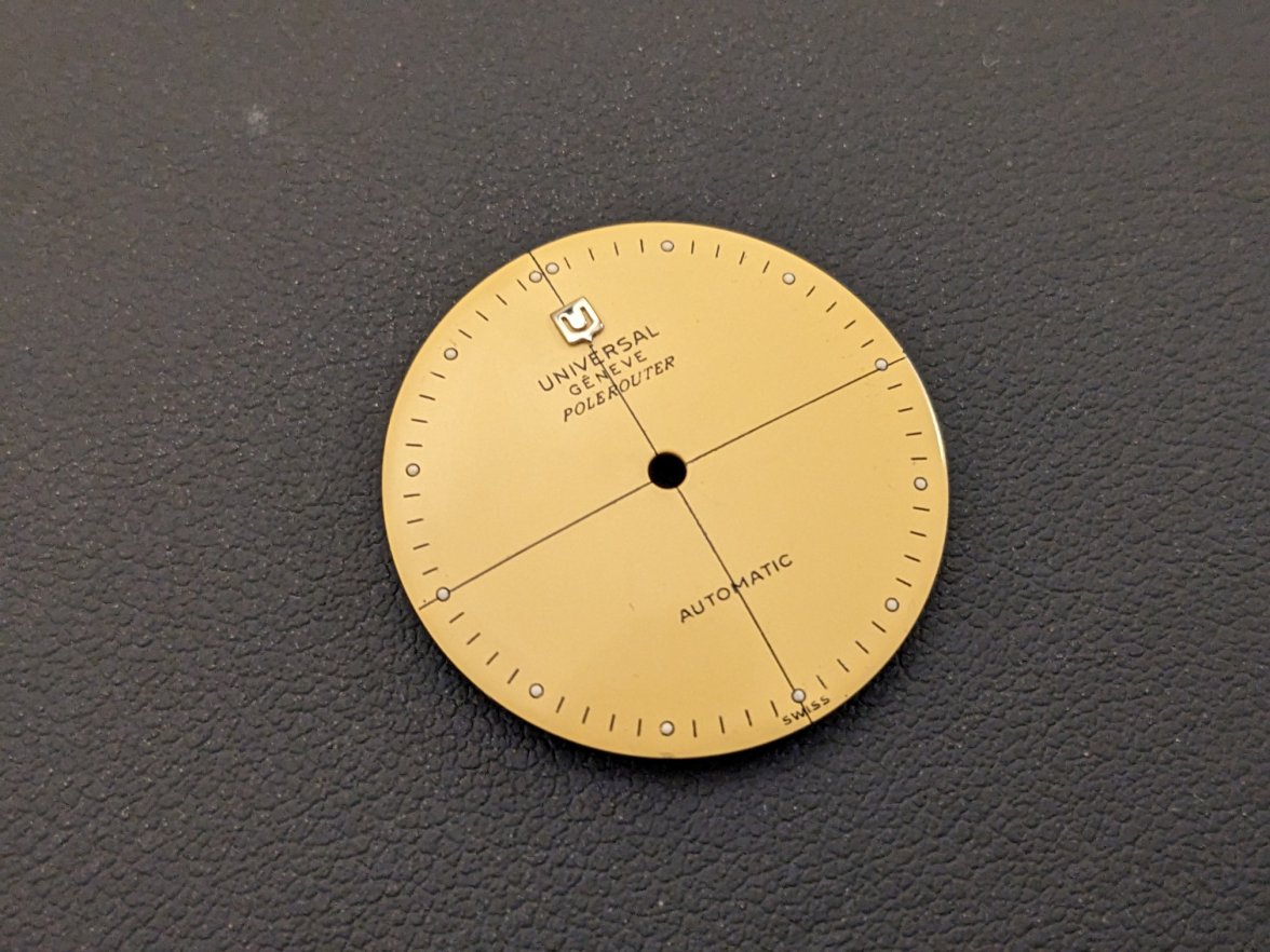
Let’s find out. Off to Kirk Rich Dial, 4 weeks & $250 later this is what we get back.
Maybe not 100% perfect, but overall pretty pleased for the $ spent. 3 lines of text on the top half, 1 line on the bottom half, 'SWISS' at 6 o'clock, single lume plots at the hour markers, double lume plots at 12. All looks like a pretty good match for the original.
For some reason the vertical cross-hair line got printed overtop the UG logo dial furniture. That doesn’t look great, but comes of very easily via some light rubbing with peg-wood.
Under the loupe, the printing is not quite as sharp as the original factory finish, but overall quite good.
From 18” away it looks just fine.
So let's hear the community's verdict. Have I committed a sin by erasing an original piece of UG history? Or have I taken a worn out old watch & made it nice?
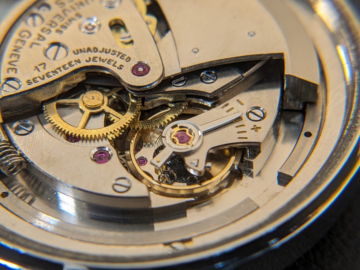
One more for anyone who likes movement pics
