- Posts
- 1,698
- Likes
- 7,384
bazamu
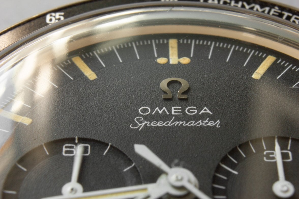
·This is not revolutionary or new information, but always interesting to compare the different finishes on 105.003-64 Ed Whites versus 105.003-65. I go back and forth between what I like more, as the smooth finish of the -64 seems to appear darker (a "truer" shade of black) on the wrist and the sandpaper-like finish to the -65 is lighter. That said, the -65 can produce interesting effects depending on your wrist angle. What do you all prefer?
1964 105.003

1965 105.003

1964 105.003
1965 105.003