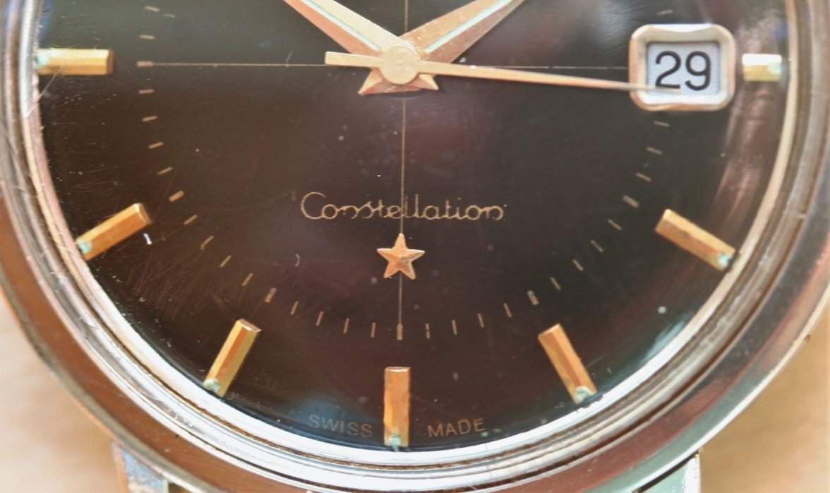
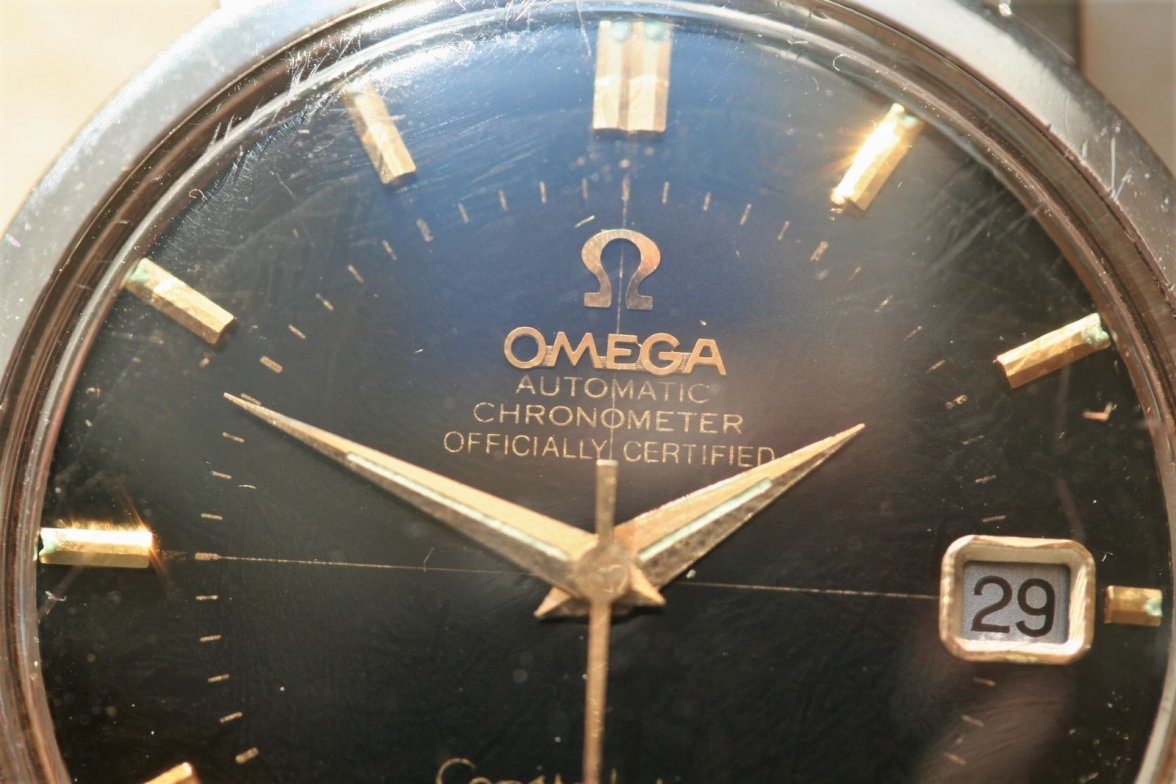
Does this dial look original to you? Thanks
Vanallard
·Dial might be original but it has been refinished.
kaisiang098
·The font is quite inconsistent, definitely a refurbished piece.
bbl1998
·The font is quite inconsistent, definitely a refurbished piece.
stahlmotte
·The Lume looks restored
connieseamaster
·The "A" should be flat topped, not pointy. Definitely a repainted dial, and not a good one
auxpomme
·It’s amazing that can be done. The skill to do that is actually pretty impressive. With that said, you can tell immediately that it is janky af.
doog
·If you’d bother going to all the effort of reprinting the text, why not do it in the correct typeface? Facepalm.
Foo2rama
··Nowhere near as grumpy as he used to be...I’m going to go out on a limb. I see no issues.
ClarendonVintage
·Very professional...but font looks too Arial, or Times New Roman, whatever you call it, you get my point.
doog
·The correct Omega gothic serif font with the splay-footed M is a peculiar beast, and given Switzerland’s long tradition in font manufacture, very probably custom designed. Awkward to match, but not beyond a skilled typographer by any means. I suppose we should be grateful that re-dialers don’t get it right, as it would make picking them out rather harder.

