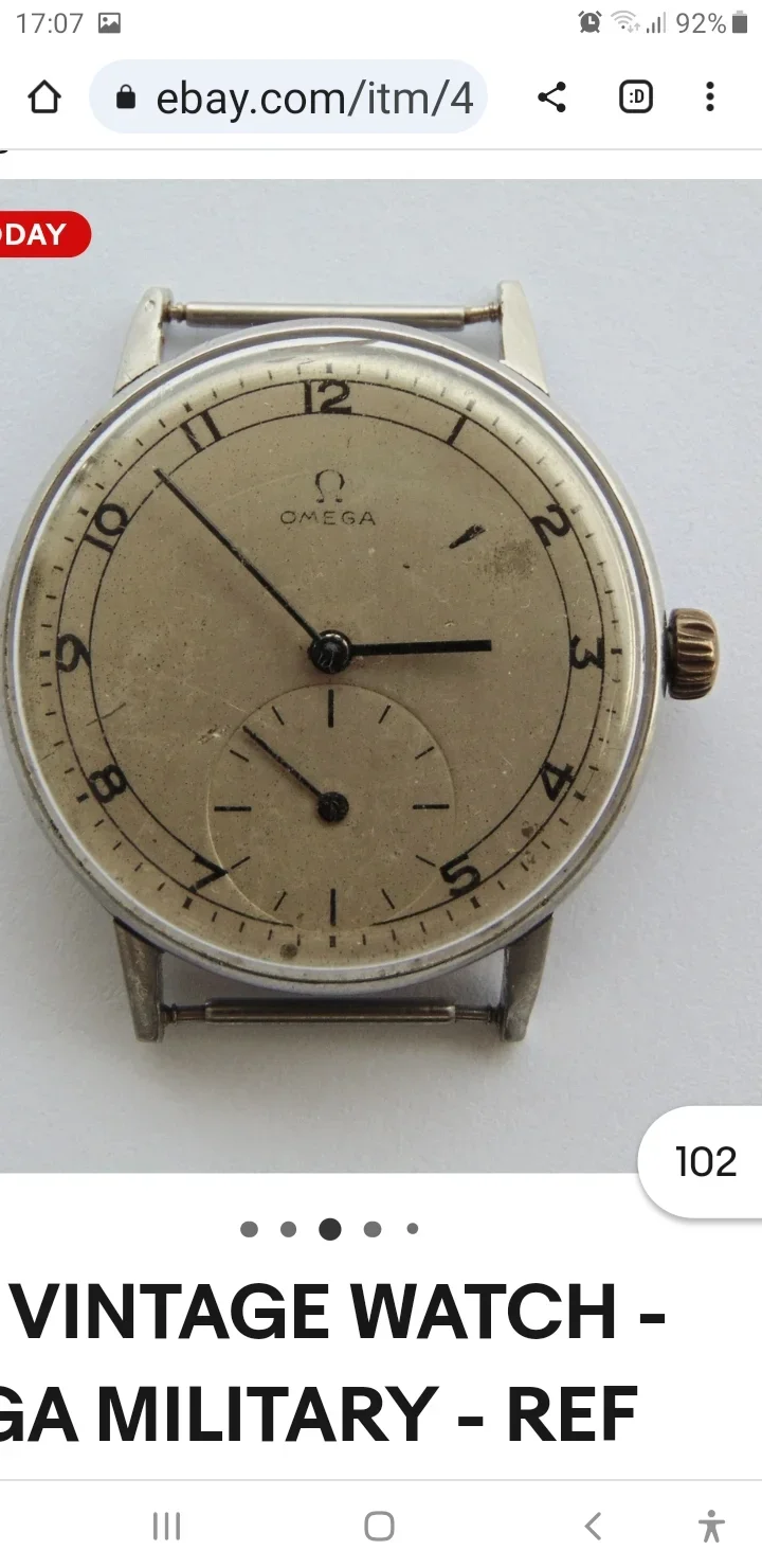
Hi everyone , can you verify the authenticity of the dial and hands of this 1940s omega , the numeral 9 in a horizontal seems suspicious?, what are your thoughts? Thanks.
I do not particularly think this looks suspicious. There are often times kind of quirky font styles used on Omegas from that era. The minute marks as well as the omega logo appears to be crisp and sharp to me. But there are experts around here who might know it better.
I do not particularly think this looks suspicious. There are often times kind of quirky font styles used on Omegas from that era. The minute marks as well as the omega logo appears to be crisp and sharp to me. But there are experts around here who might know it better.
I don't think the hour/minute hands are original. The orientation of the 9 is OK, it fits the style of the remainder or the numbers in the top arc of the dial.
Without a better photo I can't offer anything more.
PS: No way it's "military", so just seller bullshit.