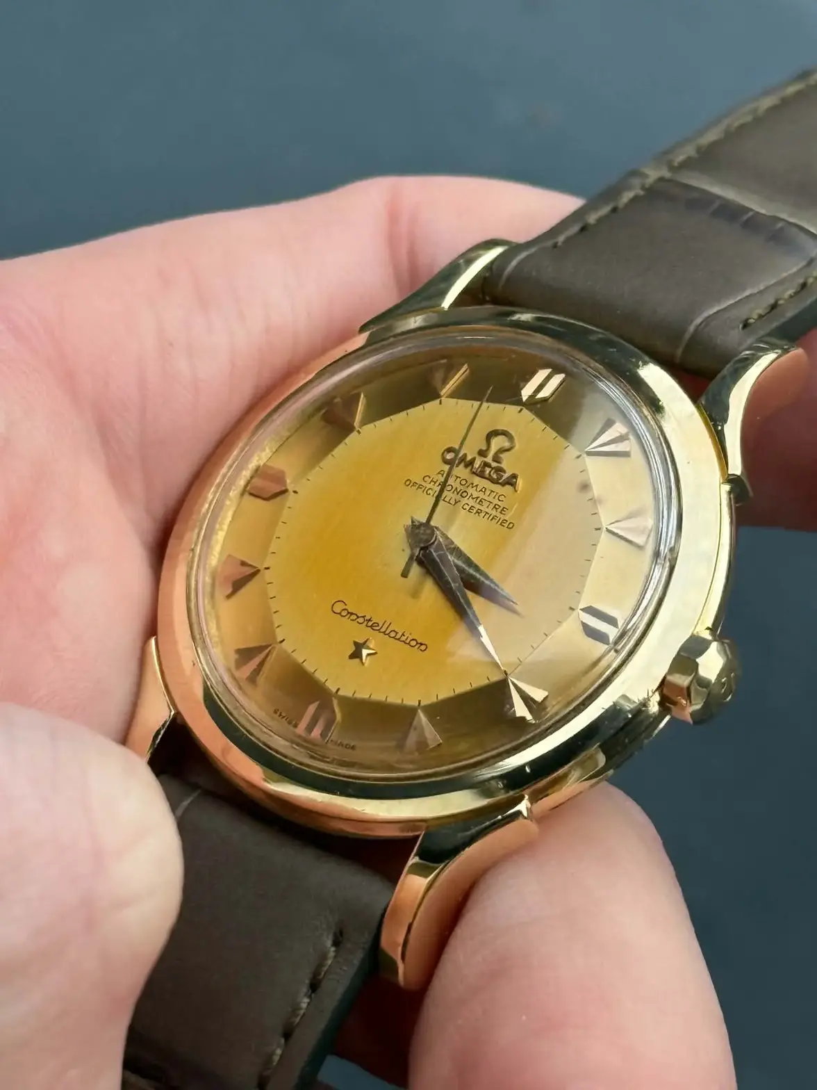
Constellation Deluxe 2852/2853

Posts
503
Likes
735
Hi all,
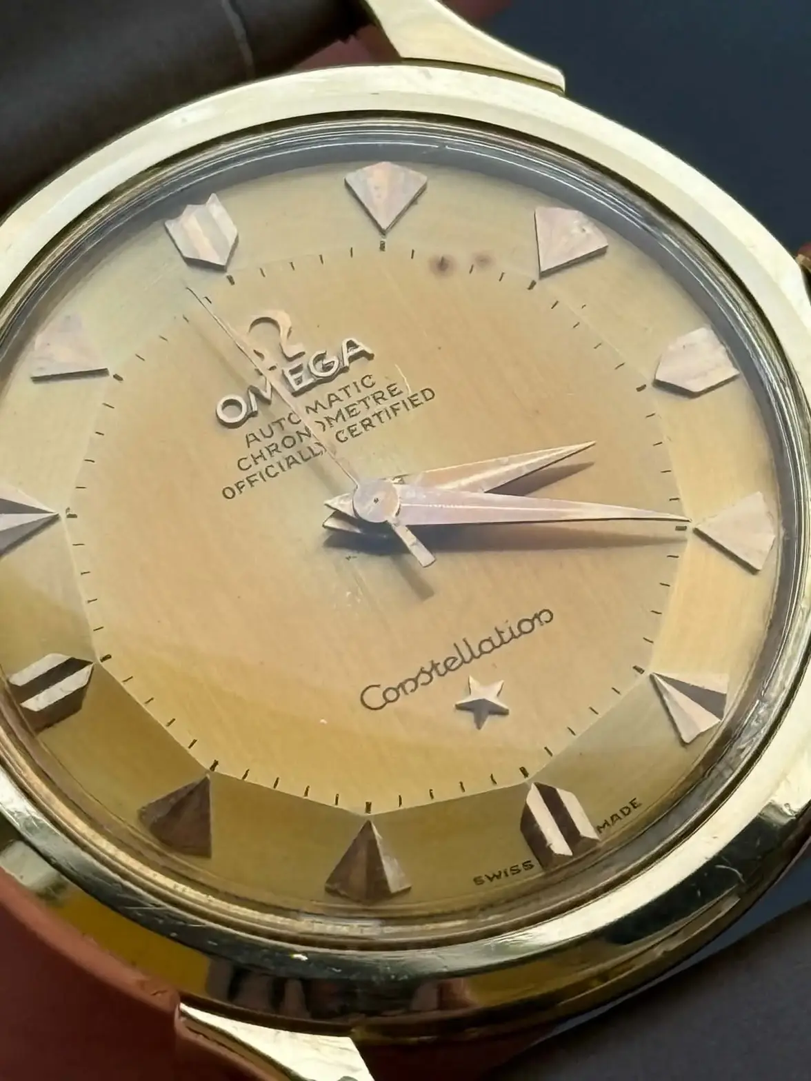
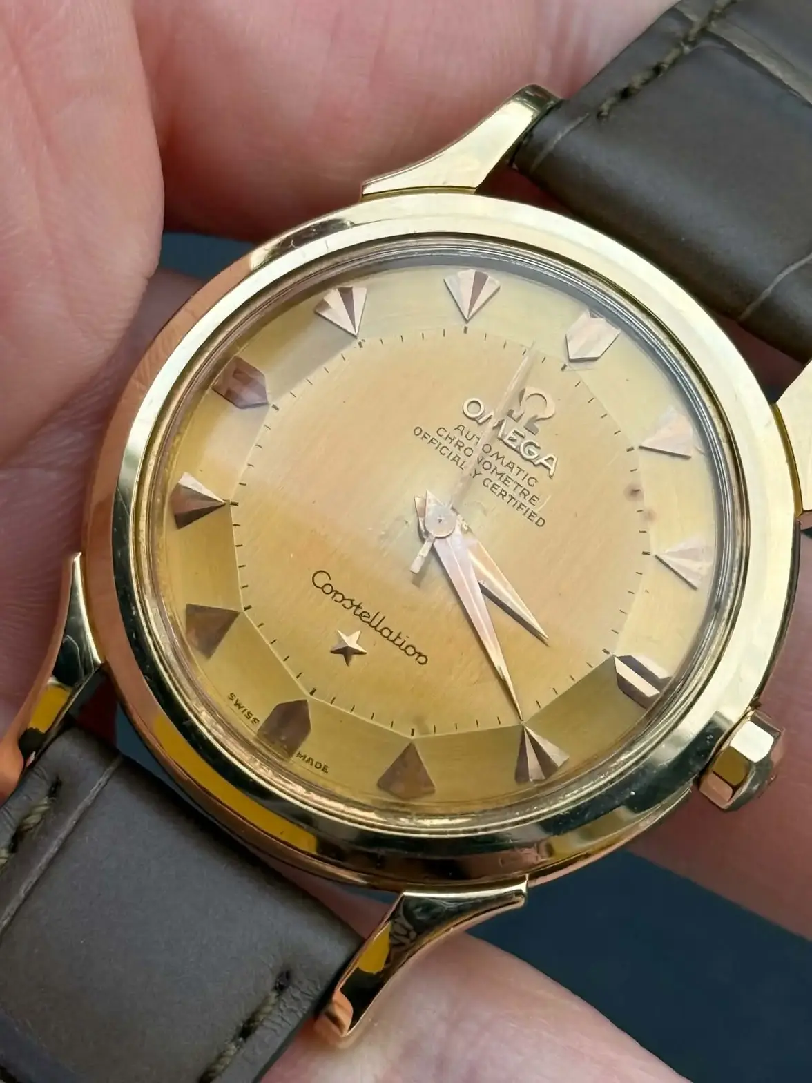
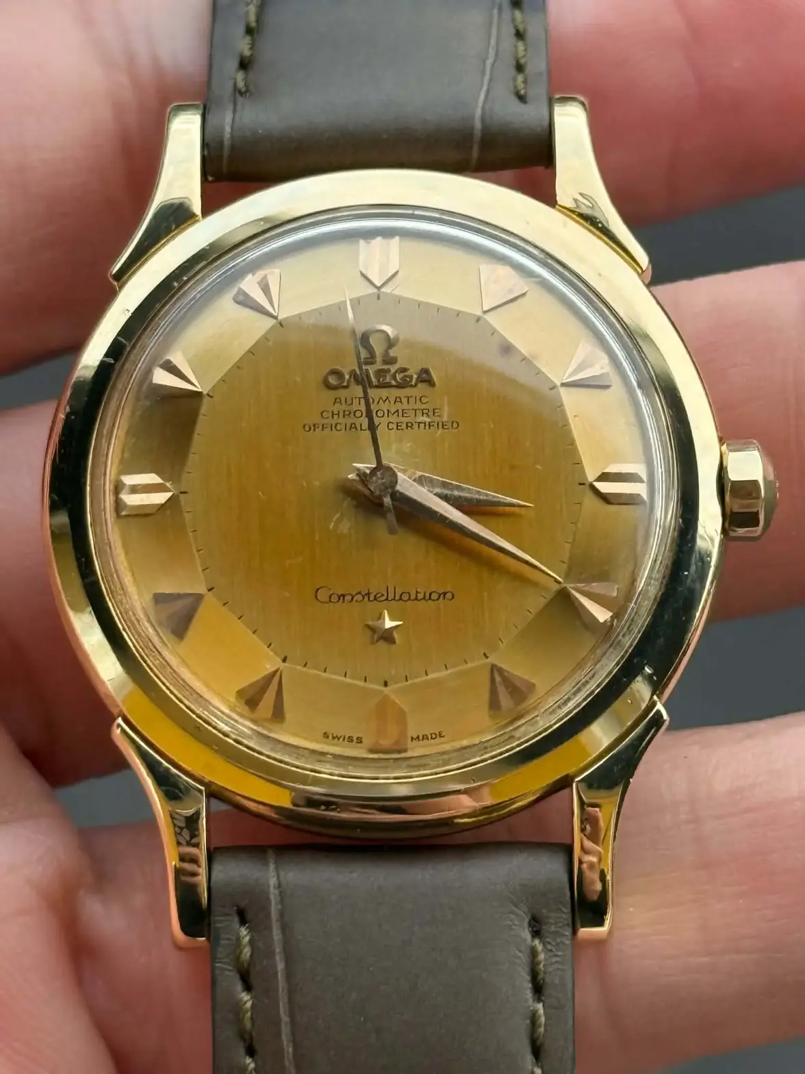
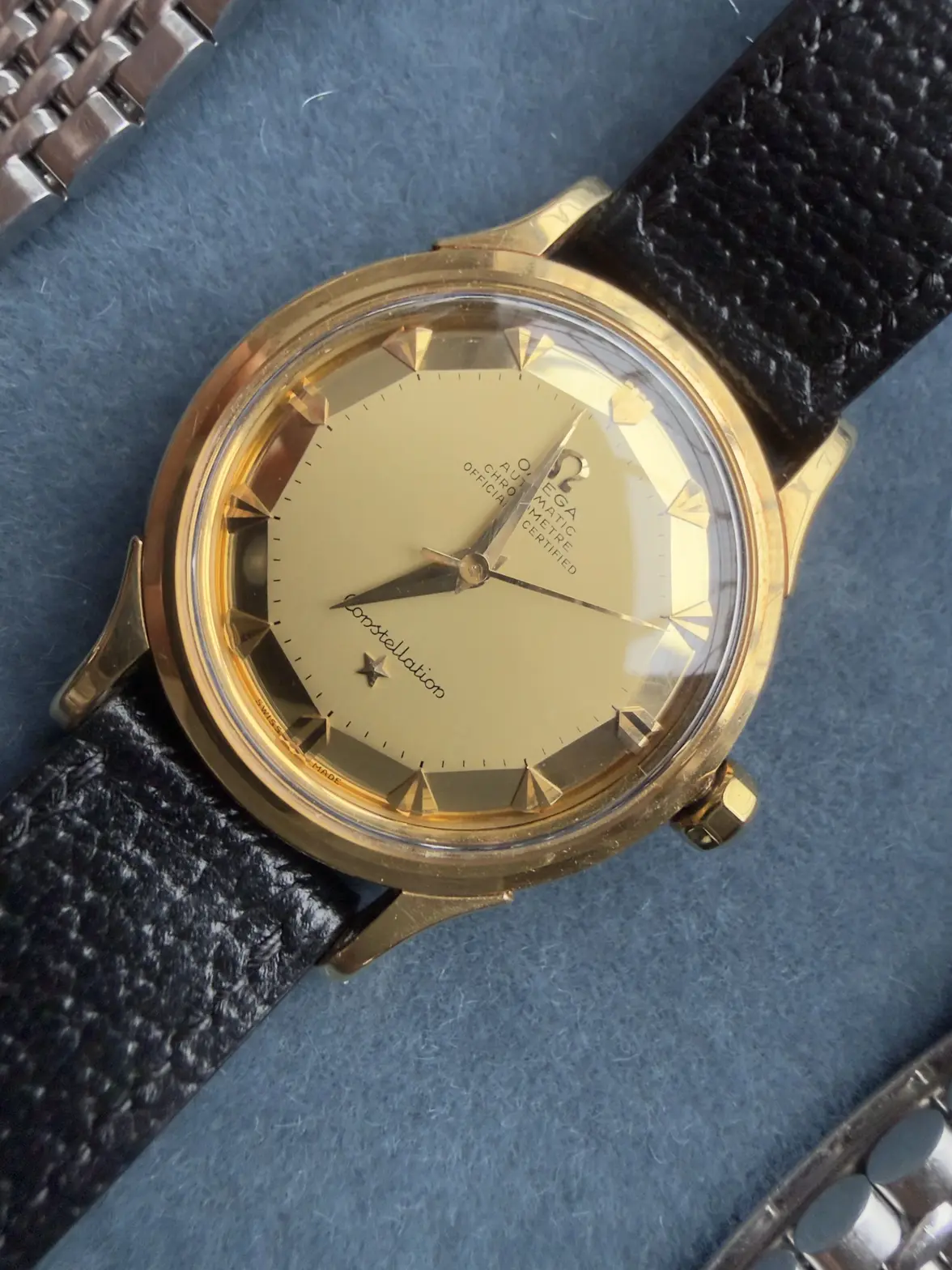
A friend of mine is about to pull the trigger on a nice Constellation Deluxe réf 2852/2853.
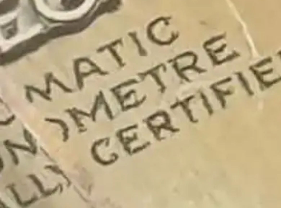
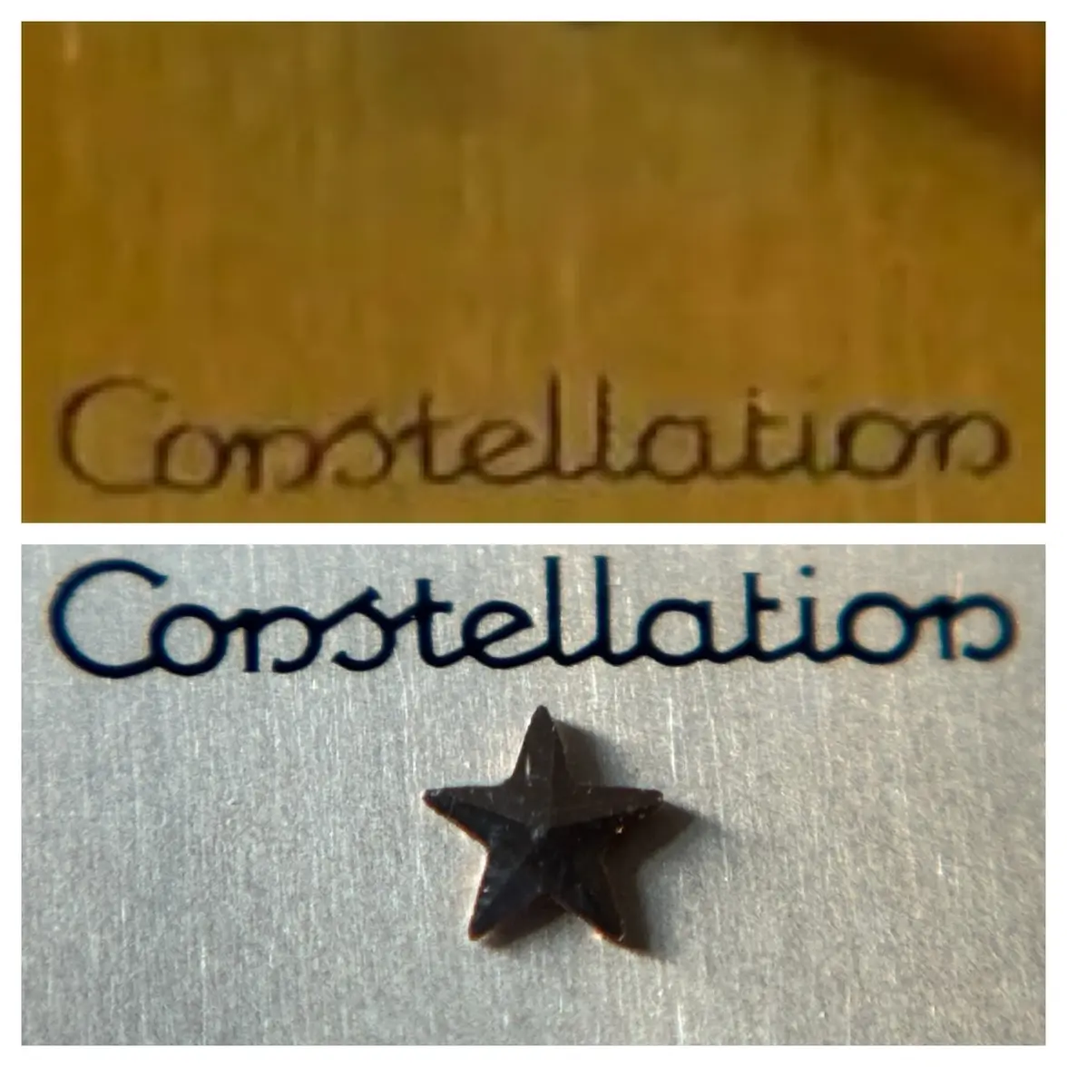
At first, i was sûre it was a redial, but after some research, it seems that this particular référence from the 50’s does not have the same font than later constellation from the 60’s.

What is your point of view ? Is it a redial ?

Thanks you
 
Posts
30
Likes
20
Not too familiar with the deluxe dials but the printing looks consistent with other 50s constellations I’ve seen and looks original to me, though the photos are a bit blurry. Also, there are some spots around the 1 o’clock position.
 
Posts
48
Likes
68
Looks original to me. However it’s not in that good condition. I’d always hold off for the best example you can get but appreciate these are getting harder to find.
 
Posts
778
Likes
1,104
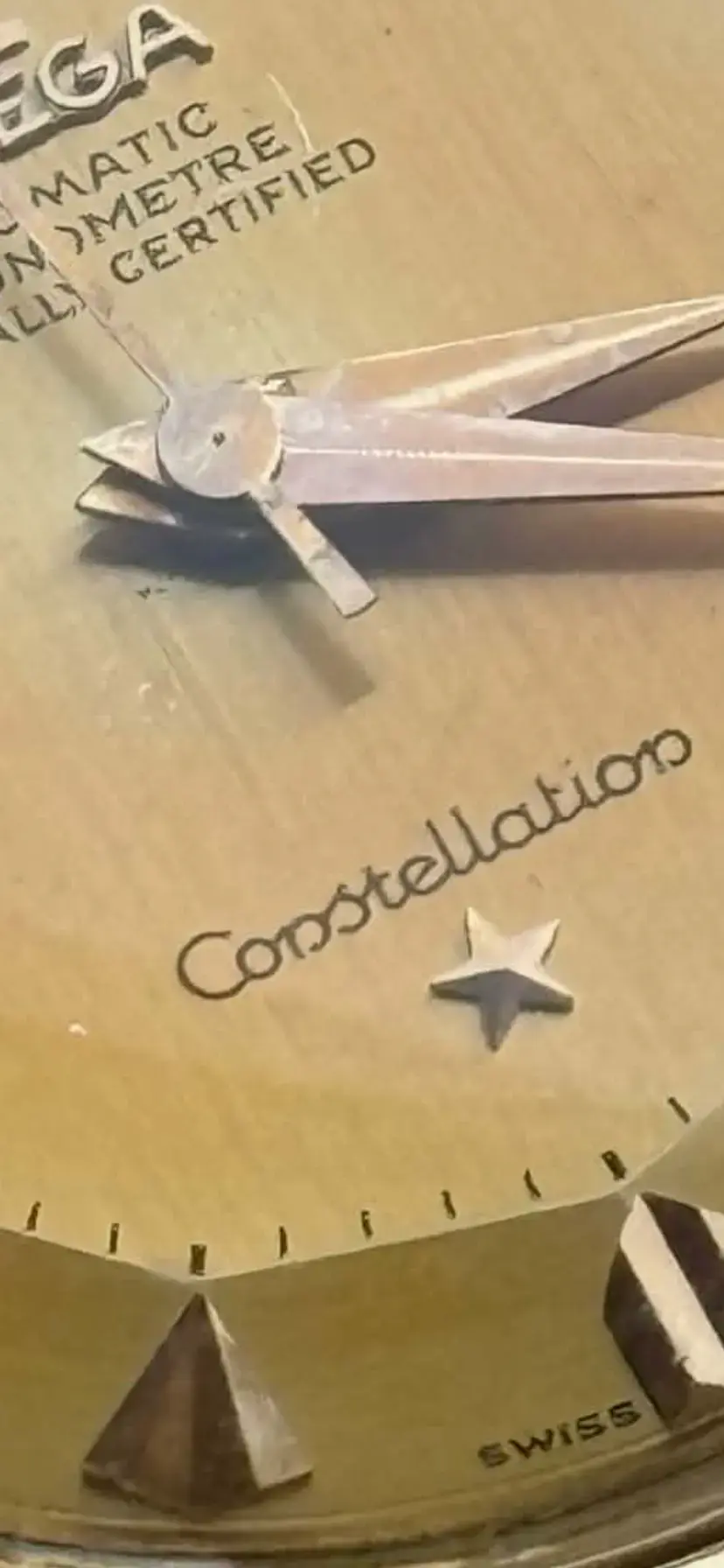
What’s happening there? It looks kind of dodgy. Is it the crystal that’s deforming the script to a hand-written style?

 
Posts
503
Likes
735
What’s happening there? It looks kind of dodgy. Is it the crystal that’s deforming the script to a hand-written style?

That is the point
 
Posts
30
Likes
20
What’s happening there? It looks kind of dodgy. Is it the crystal that’s deforming the script to a hand-written style?

Probably a combination of crystal distortion, low resolution and AI automatically sharpening the image on most phones’ photos nowadays
 
Posts
778
Likes
1,104
Probably a combination of crystal distortion, low resolution and AI automatically sharpening the image on most phones’ photos nowadays
Yes, I imagine that should be it (I hope!) as the letters do look a bit different on each image.
 
Posts
503
Likes
735
Well, I seems to be original according to all of you.
I must say I’m surprised by the gap of quality between 50’s and 60s.
Constellations from the 60s have consistent dont, with clean serifs.
In 50’s, it seems writen by hand
 
Posts
30
Likes
20
Well, I seems to be original according to all of you.
I must say I’m surprised by the gap of quality between 50’s and 60s.
Constellations from the 60s have consistent dont, with clean serifs.
In 50’s, it seems writen by hand
Could you post some clearer photos, or have you seen it in person? It shouldn’t look like it’s written by hand (if original)
 
Posts
503
Likes
735
Not written by hand. But far from being as clean as a 168.005
 
Posts
23,807
Likes
52,909
I think that we are seeing severe compression artifacts. Who took the photos? If they are from the seller, maybe they can send high resolution files.
 
Posts
23,807
Likes
52,909
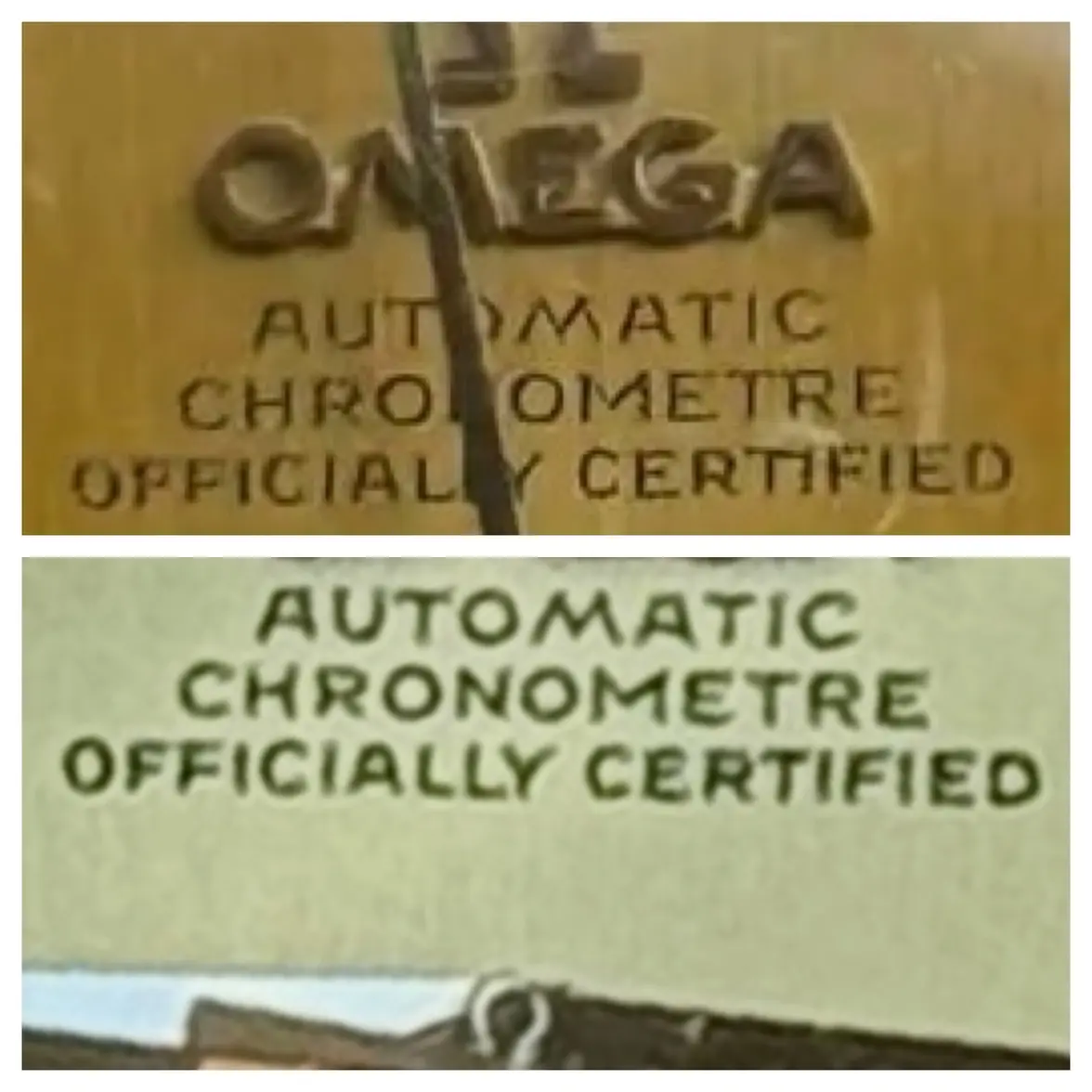
What I find most interesting is the totally different styles of the M's in AUTOMATIC (angled legs) and CHRONOMETER (straight legs). That's a very unfortunate choice by Omega IMO, but apparently it is a known style.
 
Posts
48
Likes
68
Well, I seems to be original according to all of you.
I must say I’m surprised by the gap of quality between 50’s and 60s.
Constellations from the 60s have consistent dont, with clean serifs.
In 50’s, it seems writen by hand

This is my early 50s 2699 and the text is crisp and clear like all genuine examples should be. There’s a thread on the forum that does show that these early 2699 models have two different types of fonts despite being the same model. It was concluded that these were likely first off the line 1952 model year dials then they changed to the later font (as shown on mine) before changing again to the applied “omega” logo on the later refs much like your watch. Regardless of these small tweaks all the dials should have clear font that look like this:

 
Posts
3,367
Likes
13,130
Thank you @Peemacgee but I‘m not sure I can be a significant help with those pics. What @Dan S said - something rather weird is going on with those pics. Ask the seller to take the movement / dial out and take pics, or have a watchmaker do it. It’s an easy job and not too much to ask for at this price range. The way some of the letters seem to be completely bent in different ways in different pics makes me thing that a scratched plexi might be the cause of this, combined with a softening after-effect on the pic itself.

The two main texts on the dial seem like they might be ok, relatively thin but then my example, used for comparison here, has a rather thick print and there were slight variations:


@Dan S While the different Ms might not be to everybody’s taste, they’re indeed correct.

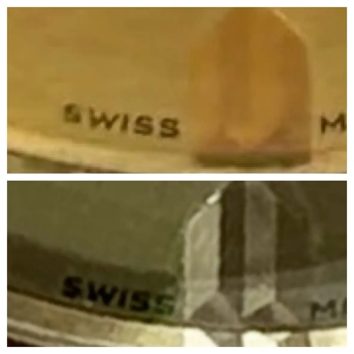
What does give me a little bit of pause - and it might just be the bad quality of the pics / distortion from the plexi - is the positioning of the Swiss Made, which is very high. Compare:

 
Posts
13,206
Likes
18,166
It is clear to me that the photos provided were not of great quality and that there could also be fine scratches on the crystal that are causing to printing to look distorted at high magnification.

What I do see is some yellowing and decay of the original lacquer. Probably just on the surface and doesn’t affect the 18K gold underneath. But it is a condition issue that should affect the price somewhat.

A watch of this price magnitude should be examined in person or have some sort of an approval period.
gatorcpa
 
Posts
503
Likes
735
Thanks a lot to all of you for détails.
Indeed i ask for better quality pictures.

For me who is not familiar with this model, I was surprised by the “bad” quality of the script.
But then looking at your pictures and comment, it seems well to be original.
I must say that I deeply prefer later version 😀