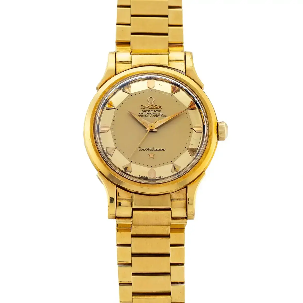
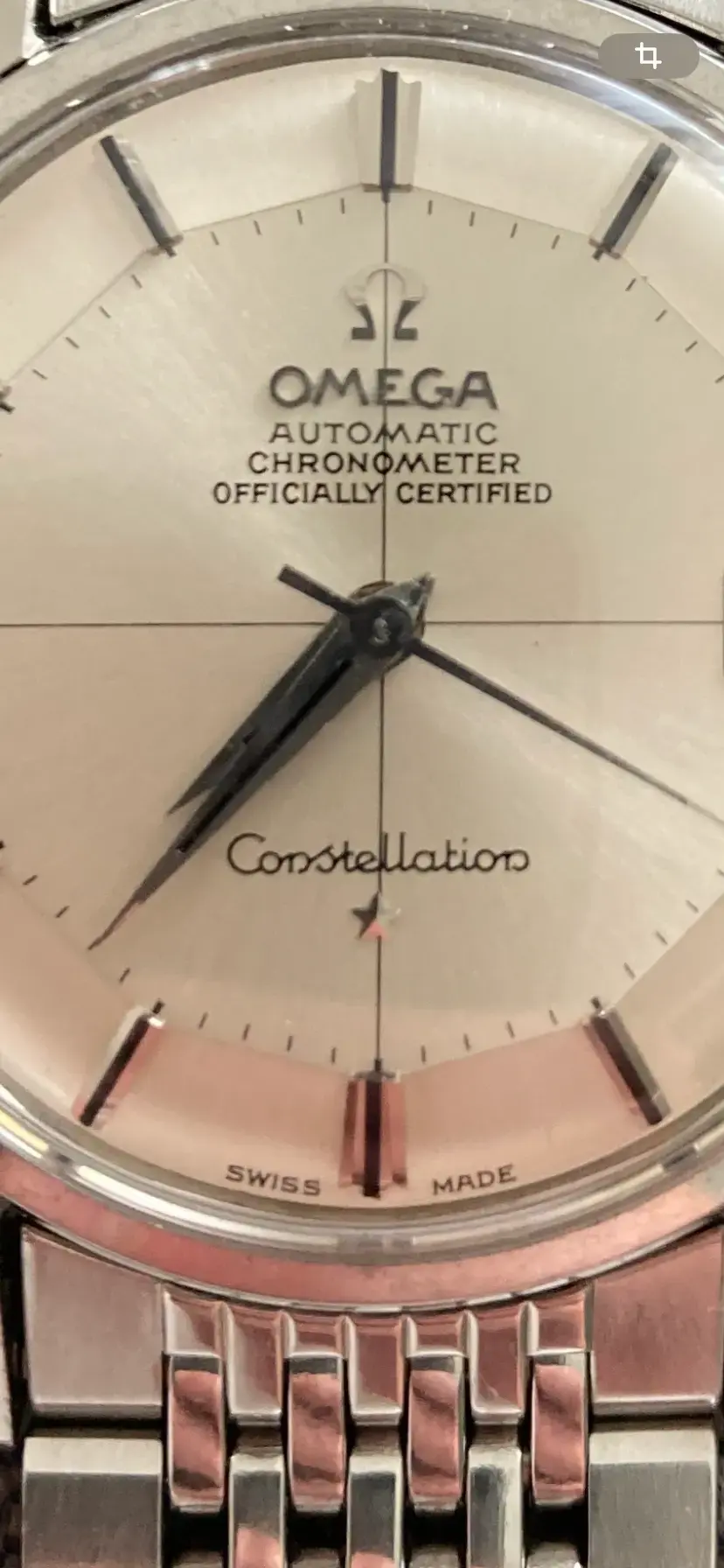
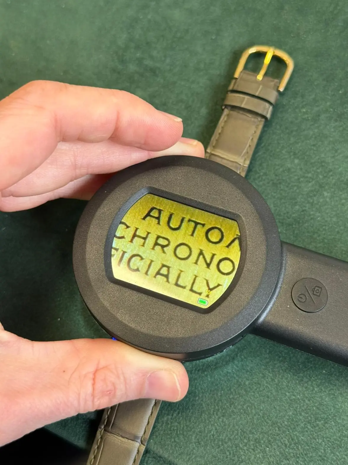
Constellation Deluxe 2852/2853

Posts
3,367
Likes
13,130
Thanks a lot to all of you for détails.
Indeed i ask for better quality pictures.

For me who is not familiar with this model, I was surprised by the “bad” quality of the script.
But then looking at your pictures and comment, it seems well to be original.
I must say that I deeply prefer later version 😀
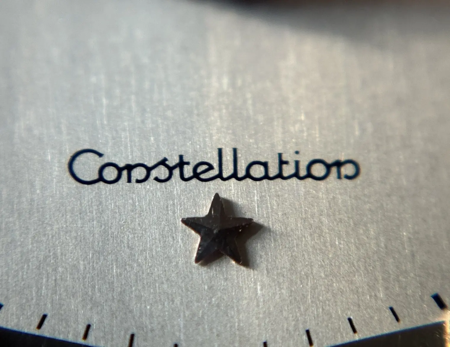
Just to be clear again: The script on a 2852 is by no means of low quality or even hand-made. Here’s a close-up again:
 
Posts
503
Likes
735
Just to be clear again: The script on a 2852 is by no means of low quality or even hand-made. Here’s a close-up again:
This one is the same than à 168.005.
But on the 2853 it is not the same
 
Posts
3,367
Likes
13,130
This one is the same than à 168.005.
But on the 2853 it is not the same
As stated above, we can’t say without good pics. You’re guessing that the quality of the writing is bad when in fact it might very well just be the quality of the picture itself.
 
Posts
7,851
Likes
35,634
I'm with you guys, I find the pictures too poor to say much, but if I had to say something my gut feeling is that it is original.
 
Posts
23,807
Likes
52,910
Thanks a lot to all of you for détails.
Indeed i ask for better quality pictures.

For me who is not familiar with this model, I was surprised by the “bad” quality of the script.
But then looking at your pictures and comment, it seems well to be original.
I must say that I deeply prefer later version 😀
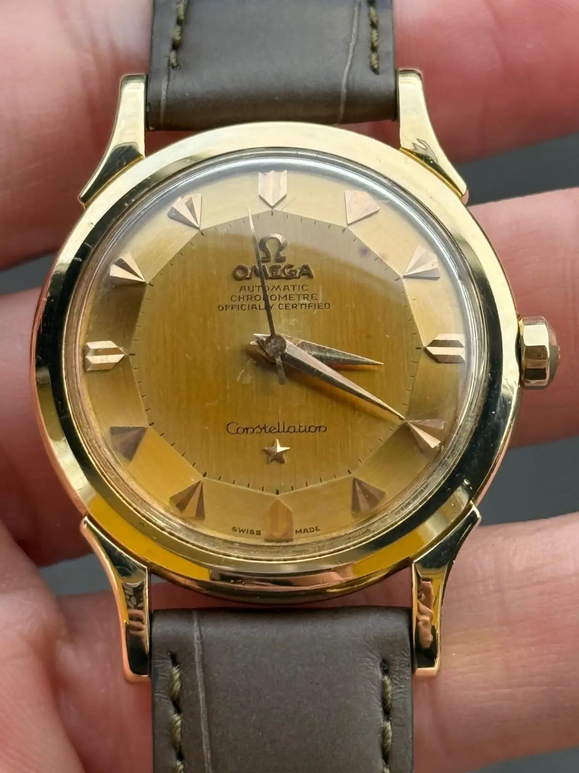
What do you prefer about the later version? I am not Constellation expert, but I have seen plenty of good photos of 1950s Constellations (including my own) where the printing is excellent.
 
Posts
163
Likes
167
Thank you for your confidence.
I think it looks fine.
(@Dan S is right about the picture quality)

However, it’s @cristos71 and @MtV that you want for 50s Constellations.
Don't be modest. All three of these fellas helped me in buying this last year:

 
Posts
503
Likes
735
What do you prefer about the later version? I am not Constellation expert, but I have seen plenty of good photos of 1950s Constellations (including my own) where the printing is excellent.
The serif text, seems cleaner to me.
But it is just about taste !
 
Posts
503
Likes
735
Hi All,
Well, with a better pictures, nothing to compare !
This is the font I was loonking for !
Thanks a lot for your help
 
Posts
147
Likes
125
Hi All,
Well, with a better pictures, nothing to compare !
This is the font I was loonking for !
Thanks a lot for your help

That’s good news! Nice and crisp