- Posts
- 1,567
- Likes
- 12,408
Zapatta
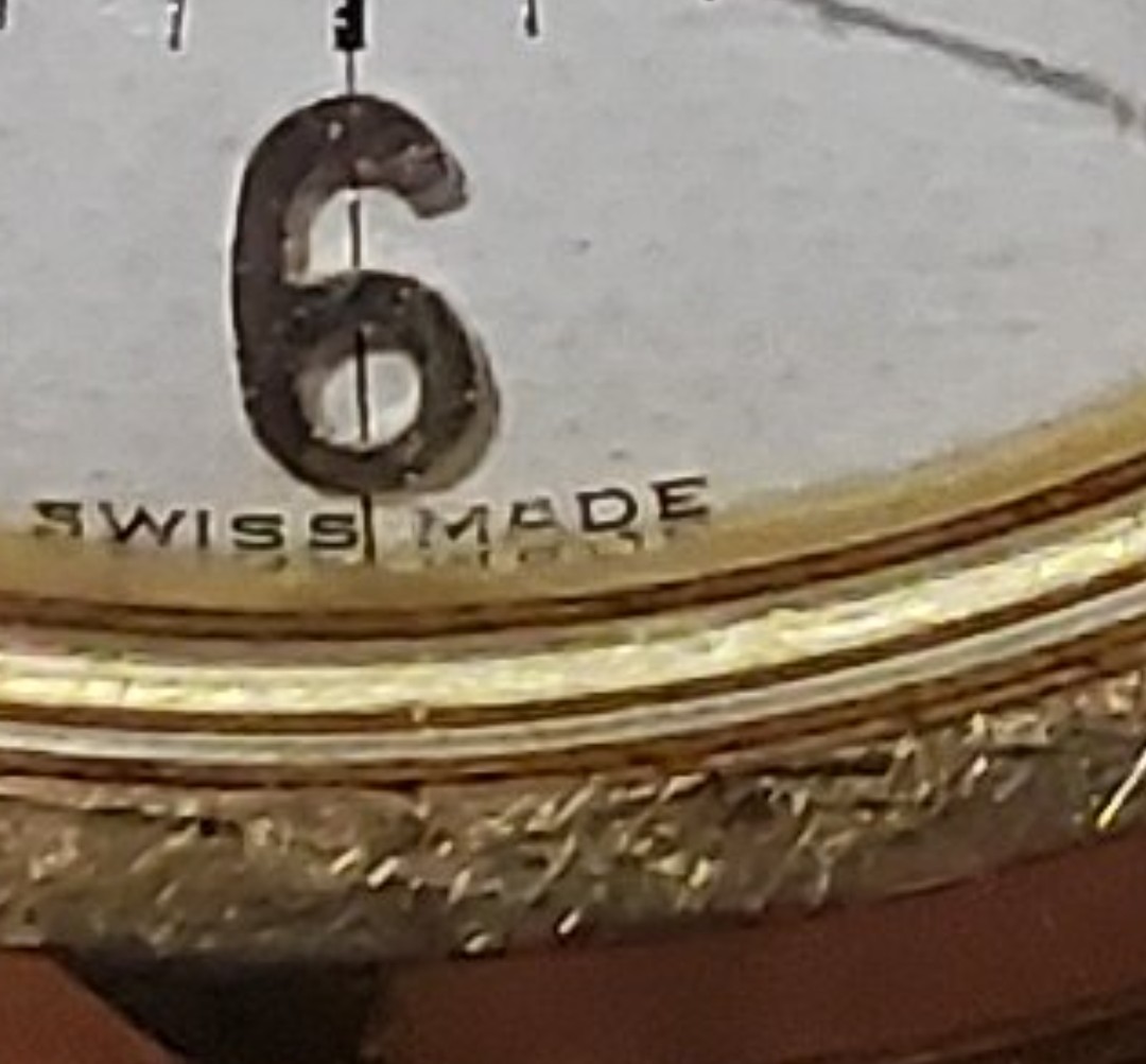
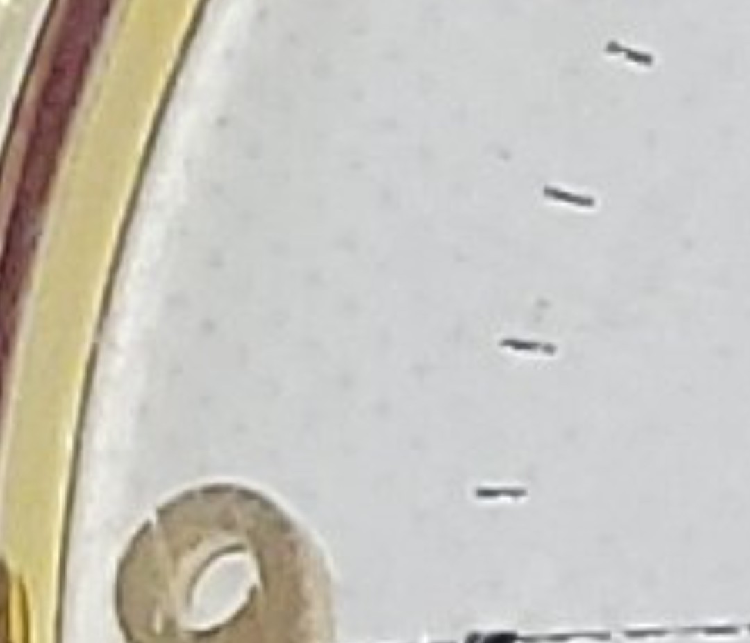
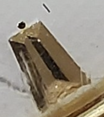
·The back is great, the observatory and the stars and the writing at the top and bottom are crisp, but the dial looks redone to me. The crosshairs don't seem to align with the star or the omega logo and they cut across the numbers which isn't right, I think they are supposed to stop before the numbers. It also looks too white. If the pic wasn't so blurry you could probably make out printing issues as well
With all due respect, I disagree with everything you said here 😀