Probo
·Dear All
I have a question to propose to the forum.
While searching for my vintage Speedmaster, I had the opportunity to observe several examples.
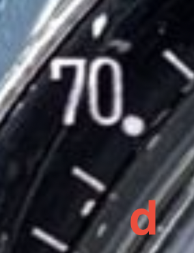
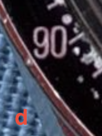
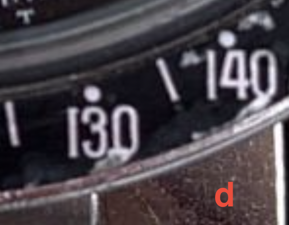
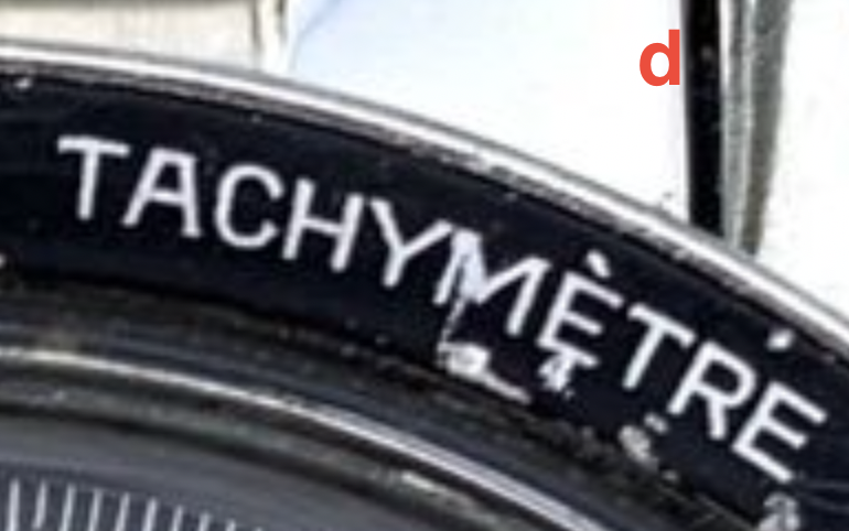
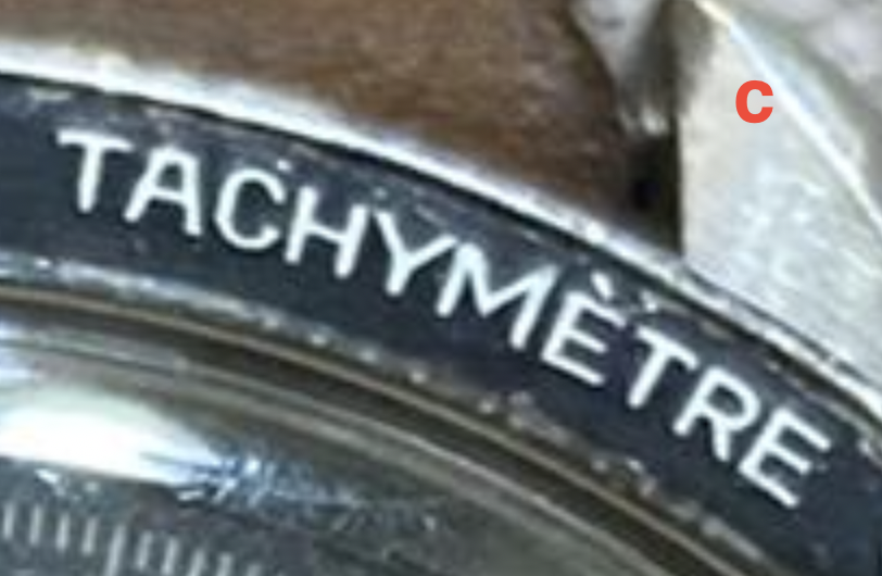
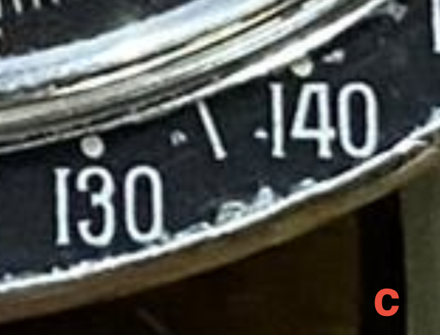
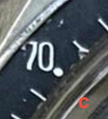
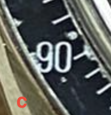
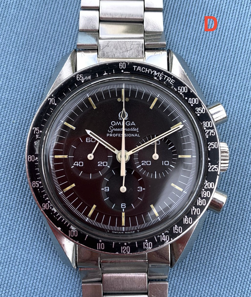
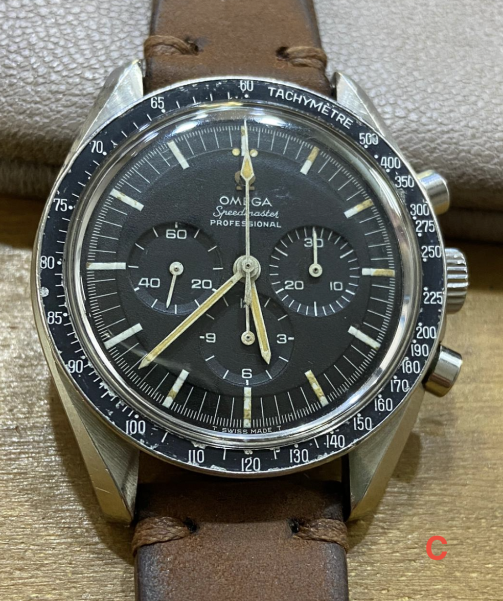
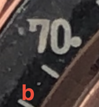
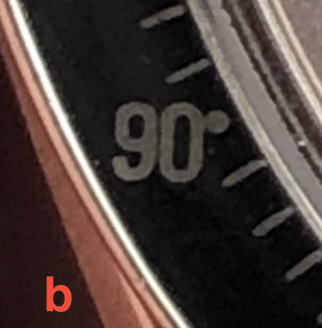
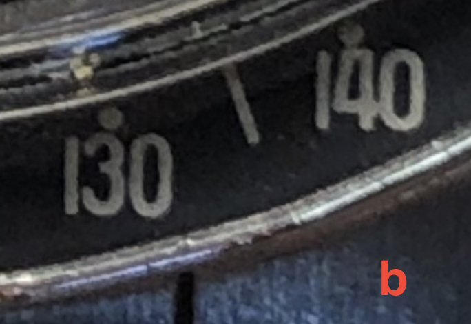
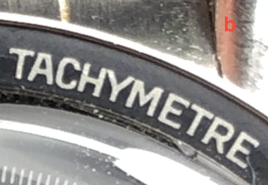
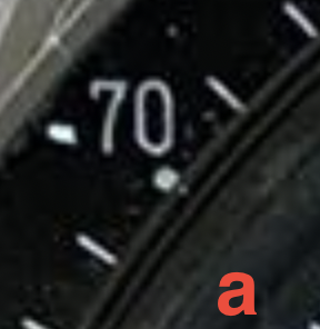
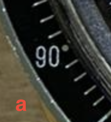
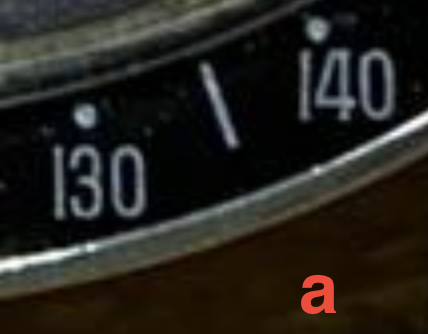
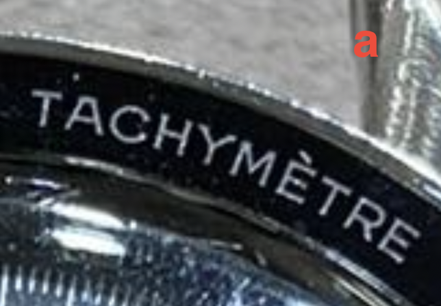
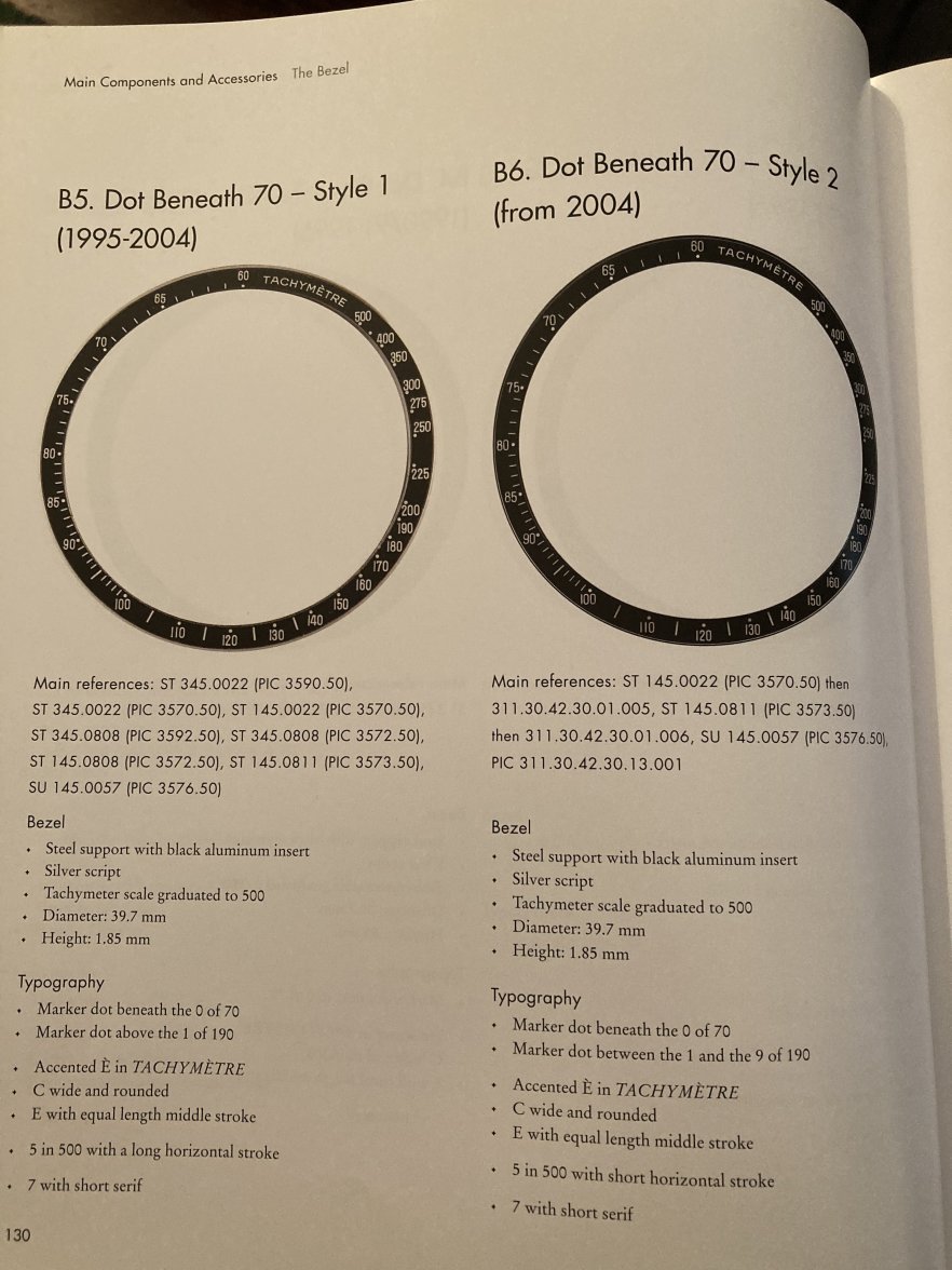
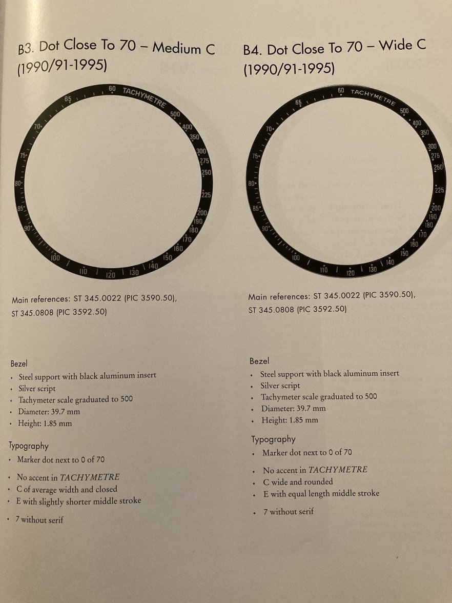
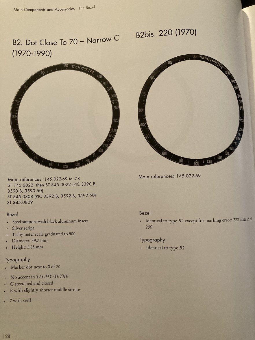
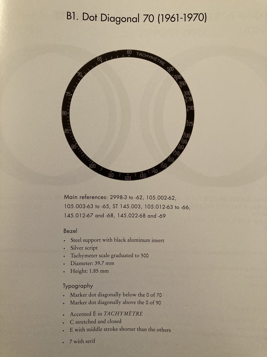
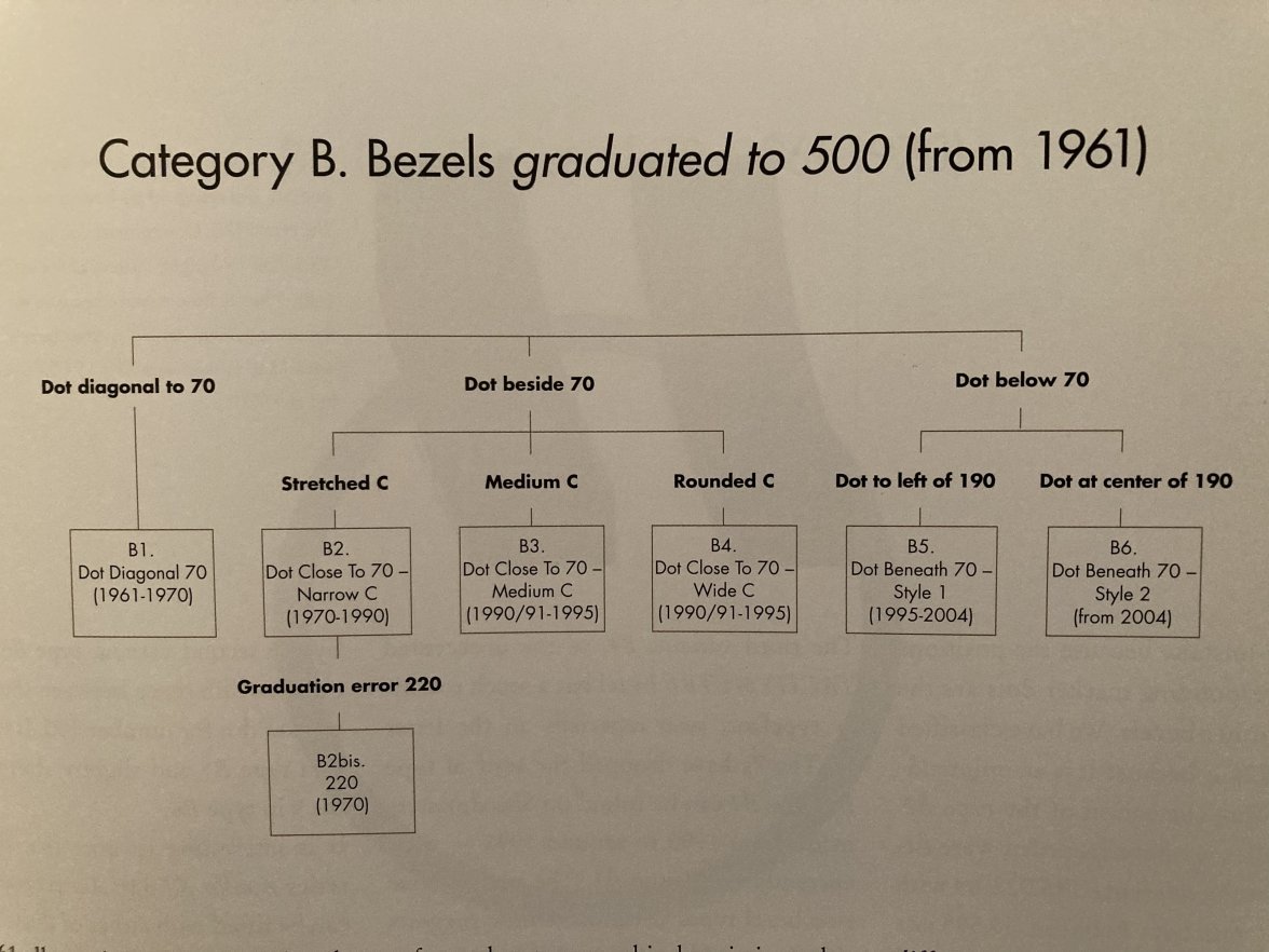
I noticed that the font of the bezel changes, in some cases quite a bit. Even the accent on E comes and goes.
Does it depend on the different manufacturers or could it be that in some cases they are fake?
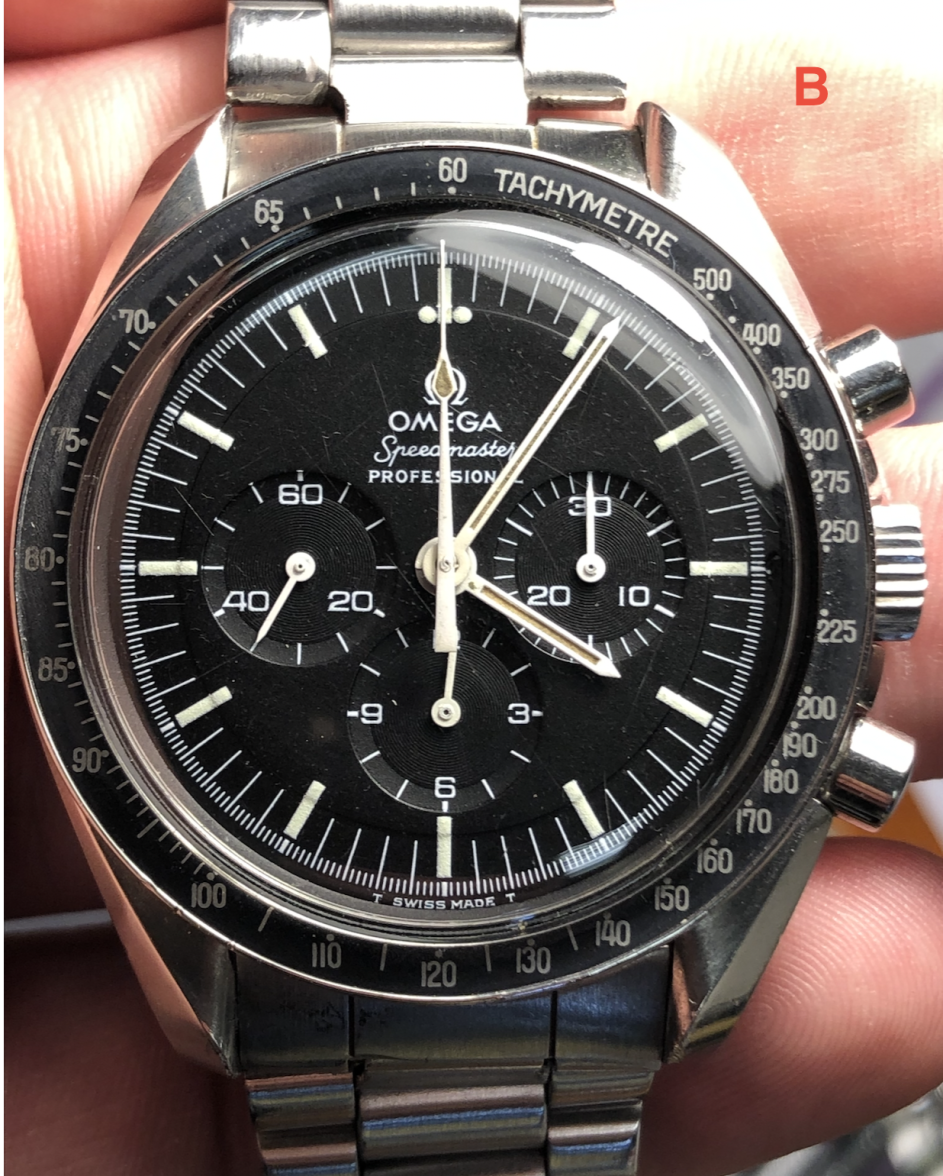
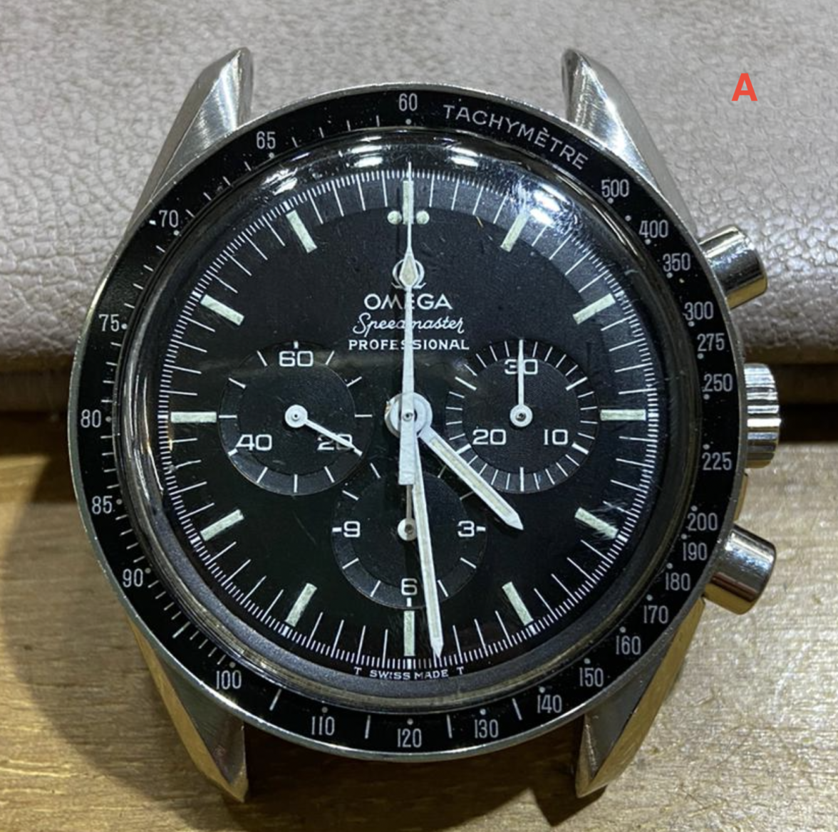
Here are some examples. Note that they are all vintage models between 1966 and 1969 except B (I don't remember if 76 or 78).
I'm sure you know more than I do.
Thanks for your attention
A 145022 '69 / '70 smooth case - DNN
B 145022 mid '70 medallion case - delivered from Mexico
C 105012-66
D 145022-69 smooth case - DO90
