I think they're nice too! Here's a shot with the other two ss models. Also never had an issue with the case back of any watch imprinting on me. But I also don't wear watches at a vascular cutoff pressure.
So... with the 2020 Games now cancelled - this is a special edition indeed... Will be interesting whether Omega will put out another one for 21... or just send you a sticker to put over the engraving
Maybe when you send it in for a servicing they will polish away any evidence that 2020 ever happened.
Seriously I never considered that etching on the case back to end up marking my wrist. The complete opposite of a Seamaster 120!!!
Beautiful watch and great review. It will be interesting to see how these 2020 Olympic watches go down in history... I tend to really like the panda/ reverse panda look in my watches, so this one is appealing.
Excellent review, T4S I can relate to the hands issue - I experience at times with my SpeedyTuesday (ST1) as well. Re. the lume - well it's enough I'd say for those of us not visiting the dark side of the moon I also agree with the sapphire vs. hesalite but no one will complain about the durability of sapphire. That panda dial is really beautiful and is for sure the star of this reference's show Thanks again for the excellent review
What is the answer to swapping casebacks with a see-through? (I did a half-a** search on swaps. Apologies if I did a poor search). If a swap is possible would it impact anti-magnetism? Would it negate the warranty? My interest is not because it may be uncomfortable (which could be a good reason in itself) but more for appearance.
Unclear - these are case references that don't match other cases with sapphire case backs, so the only way to know for sure would be to try it. Yes, you would be removing the inner anti-magnetic cover. But it's not like other Speedmasters don't already do this, so the impact is not likely a huge one. You can demagnetize the watch easily enough it wouldn't be a concern for me personally. Absolutely.
I think they look fantastic, too, and have a ton of unique personality. Personally, I've been lusting after the blue one since it was announced. Half of me wants to just pull the trigger and buy it and then put it in the safe. I only buy watches I wear, but I'd make an exception for that one because I really believe these are going to be massively collectable in the future. Not just to Omega guys or watch collectors, either. If you think about it, there probably isn't going to be a 2020 olympics. Thats historic. Which makes those watches a lot more special than any other commemorative Olympics watch ever released in the past.
I've been following this thread awhile trying to determine how i feel about these, as well as consider all the reactions. I was pleasantly surprised to find that I had an ah-ha moment, as it's more normal for me to keep alternating between pros and cons. Forget that these are limited editions that reference previous designs, that they are for the 2020 Olympics that will take place in 2021, when I considered the watch on it's own merits, I was repeatedly attracted to the black and white panda. 
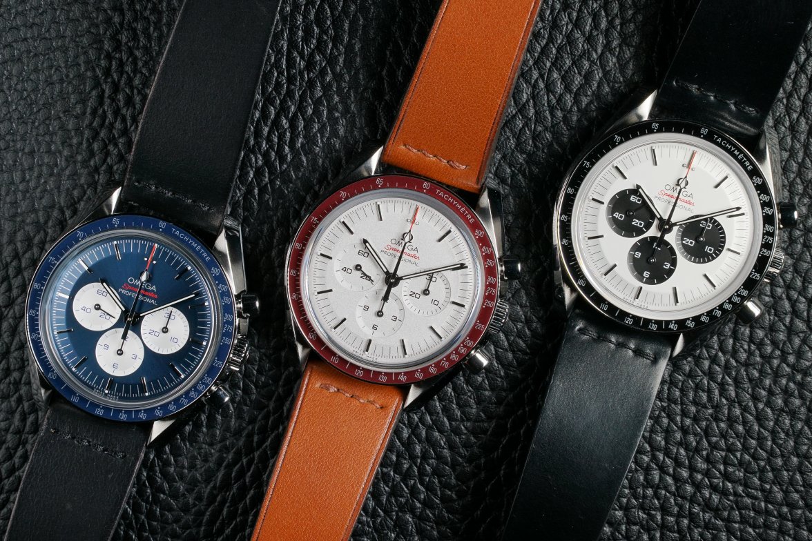
After reading the reactions to the blue dial from the Gemini, I took another look at the blue dial. Then there was a thread on blue dials and the Vacheron Constantin new relaese with blue dial was shared. Gorgeous and made me consider the blue. Last thing, I rewatched the Apollo 8 mission, which highlighted the Earthrise photo of the blue marble. Long-winded background to say that my next watch will be the blue dialed Tokyo. It's fantastic. How many blue dials can be had with a moonwatch movement? I love the touch of red and the stepped style markers. Plus it has the panda style color distinction, which is an attractive style on any color combination. It is a watch to be worn. My only regret is sharing this before buying one. Please don't drive up the cost. I let my emotion override my rational side.
@pdxleaf probably the most favourite along with OPs in this thread and the red bezel. Funny how no one ever talks about the green one
Budget, budget, budget. Really, they are all striking. The silver dial on the green one is striking. Green itself is a wonderful earthy and warm color. Racing green on a car is fabulous. I personally don't care for the gold on the sub-dials and pushers/crown on this green edition. The gold works on the black dial. Gold and silver combined is tricky to pull off. My preference for the blue was a surprise to me because I really like the panda. Before this LE I was enamored with the 35th apollo, FOIS and mitsukoshi. I had a mitsukoshi dial and hands and almost put together a replica just because I wanted the wear it and didn't want to spend crazy money for the original. And I haven't been overly drawn to blue dials as others maybe. Something clicked with this blue Tokyo. But all are nice. I get people's frustrations. I think I would love this on the wrist though.
Great review, thanks! I really like the look of the face of this one, not sure I'd be happy with that caseback though. Could this be a niche seller one because the games have been cancelled this year? A bit like stamps with short runs of misprints on them?