- Posts
- 470
- Likes
- 526
Madjam1966
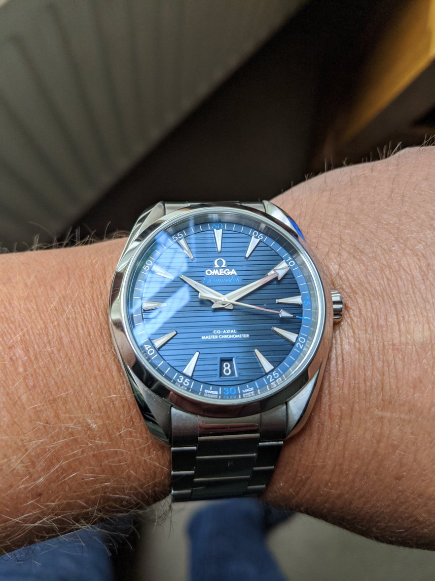
·Always hankered after an Aqua Terra (preferably a Master Chronometer variant) but torn between the dial designs. I, generally, prefer the previous dial (vertical 'teak' stripes) vice the new one (horizontal) although the symmetry of the 8900 version with the date at 6 is an improvement.
Is the dial on the new one a bit more 'glossy' in appearance compared to what appears to be more of a matt finish on the previous?
What do other AT owners/ponderers think please?
Thanks 😀
Is the dial on the new one a bit more 'glossy' in appearance compared to what appears to be more of a matt finish on the previous?
What do other AT owners/ponderers think please?
Thanks 😀


.jpg")

