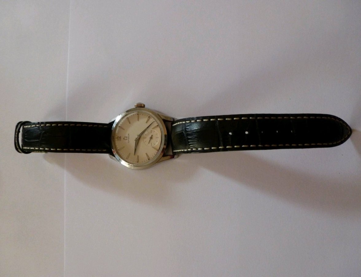
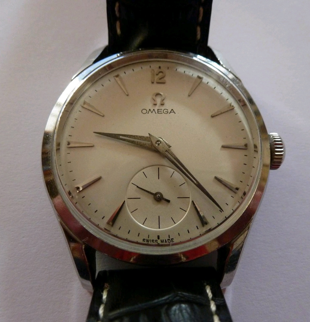
Two things look OK to me: the Omega script and the subdial circles. I agree the crest looks off, but could partly be because of the pic, and it is partly things that can be found on dials of that period.
The lines of the subdial are too long compared to what I have seen in such dials. So maybe a redial after all. A partial one?