- Posts
- 1,418
- Likes
- 6,614
mydeafcat
·Like the AT, the PO was never on my radar. I have an AT now and love it. And now that I’ve tried on the new PO, colour me smitten. I like it a lot.
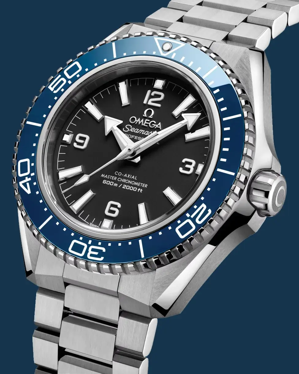
I wanted to check them out in person as I really wasn’t sold on the new design. Fortunately, my local OB had them available. (Other brands may be ‘masters of marketing’ through scarcity tactics and circus tricks, yet Omega apparently prefers getting watches on wrists. For me, that’s smart branding. But I digress.)
I’ve never worn a PO before but always liked the early versions. I found this new one very comfortable, and the orange was quite understated in person. It didn't seem overtly blingy. Omega does orange best, in my view. The case bevels definitely harken back to the SHOM from yesteryear. I also think the blue and black version, while not for me, is a better realization of this colorway than the recent Tudor release, say. The bezel is a bit big for my liking but it works with this set up. It’s a 42 that, to me anyway, wears smaller. I also like the bracelet (the clasp, well, sure, I get the complaints but it isn’t a big deal to me). The polished links also are fine by me since my AT has them as well and I never expect my watches to remain pristine. I am careful, sure, but I buy them to wear.
I have a 2254 and rather dig the HEV (it’s a Seamaster thing!!) but I honestly don’t miss it on this new iteration. The hippocampus, while minimal and clean, was a bit of a downer.
Other than these few minor issues, (and the fact I don’t have $12,000 CDN) I really, really like the new PO. I want one.
Edited: