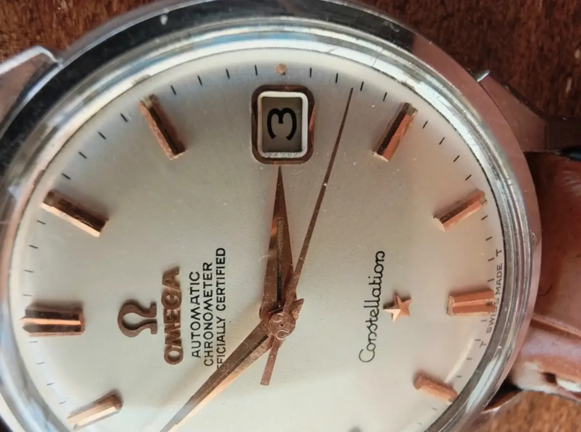
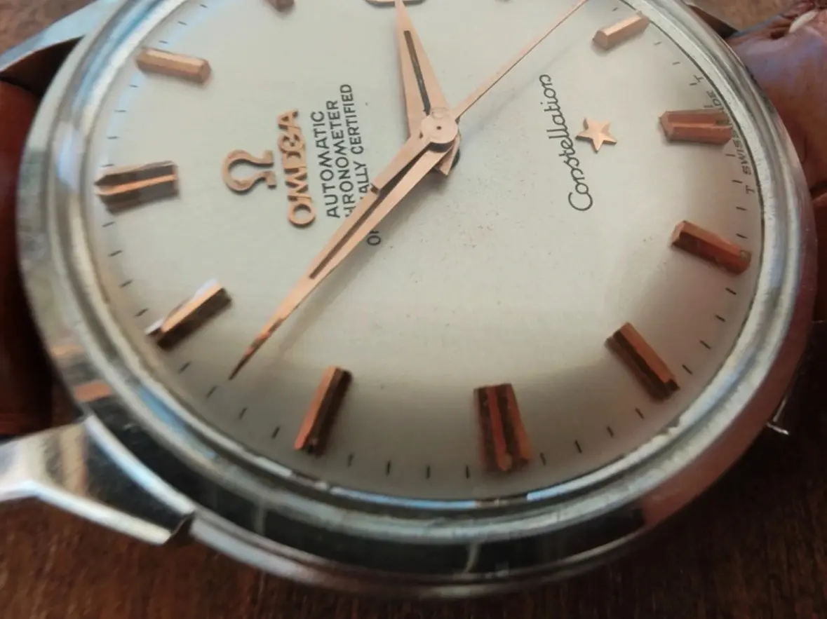
It would, generally, be a red flag.
But there are instances of ‘heavy’ text being as being ok.
The point being - look for standards that you can be certain of.
Thank you! Anything else in the dial that looks off to you? So I can start learning what the standards are.
Thanks for sharing this, very helpful material! The seller confirmed the photo was taken before servicing so doubts on the movement may be addressed if I get this watch checked. He also sent another couple macros of the dial, I'd love to get your opinion again on the dial overall and about the text and font because I really like the rose gold furniture so I may still go for it for a lower price...
My personal opinion is that the dial is correct.
I would want to see a post-service picture of the movt.
We still haven’t seen a single in-focus picture of the lugs - so can’t comment on their condition (which is very important for a dogleg)
The text seems far too heavy but other than that it looks correct. I’d want better pictures before I considered it, as I assume it’s the photo quality that’s making the text seem thick.