DylanMcA101
·Hello All,
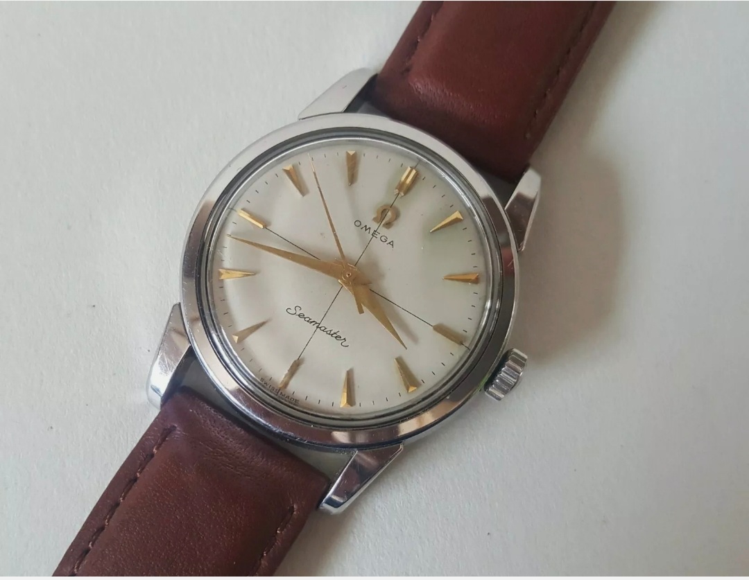
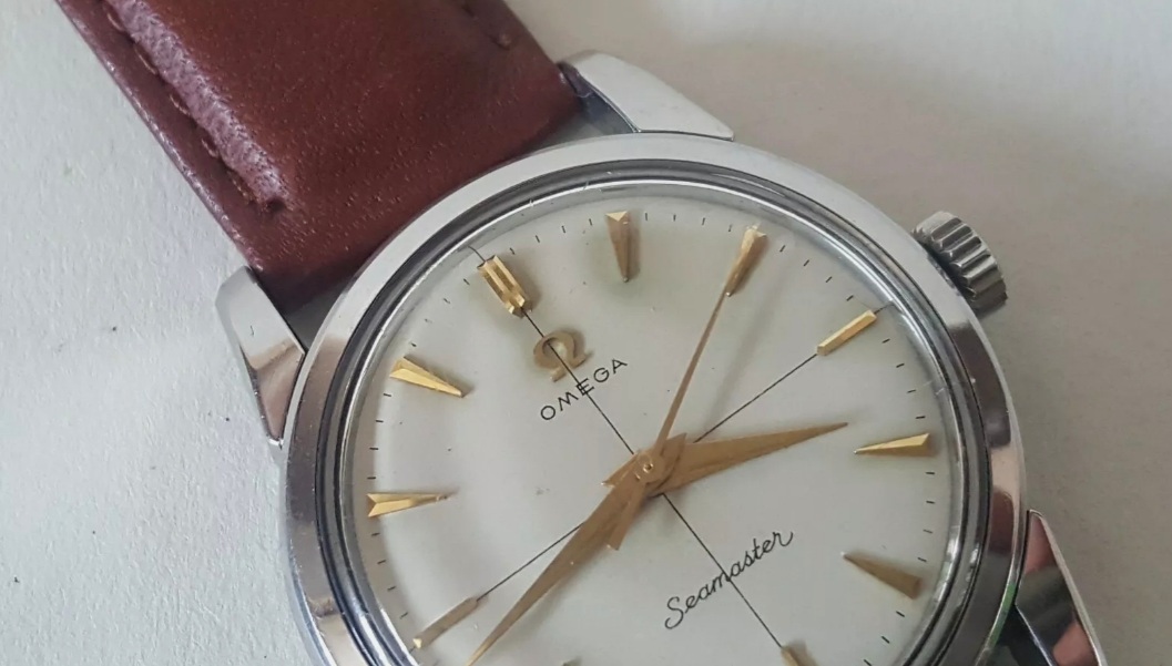
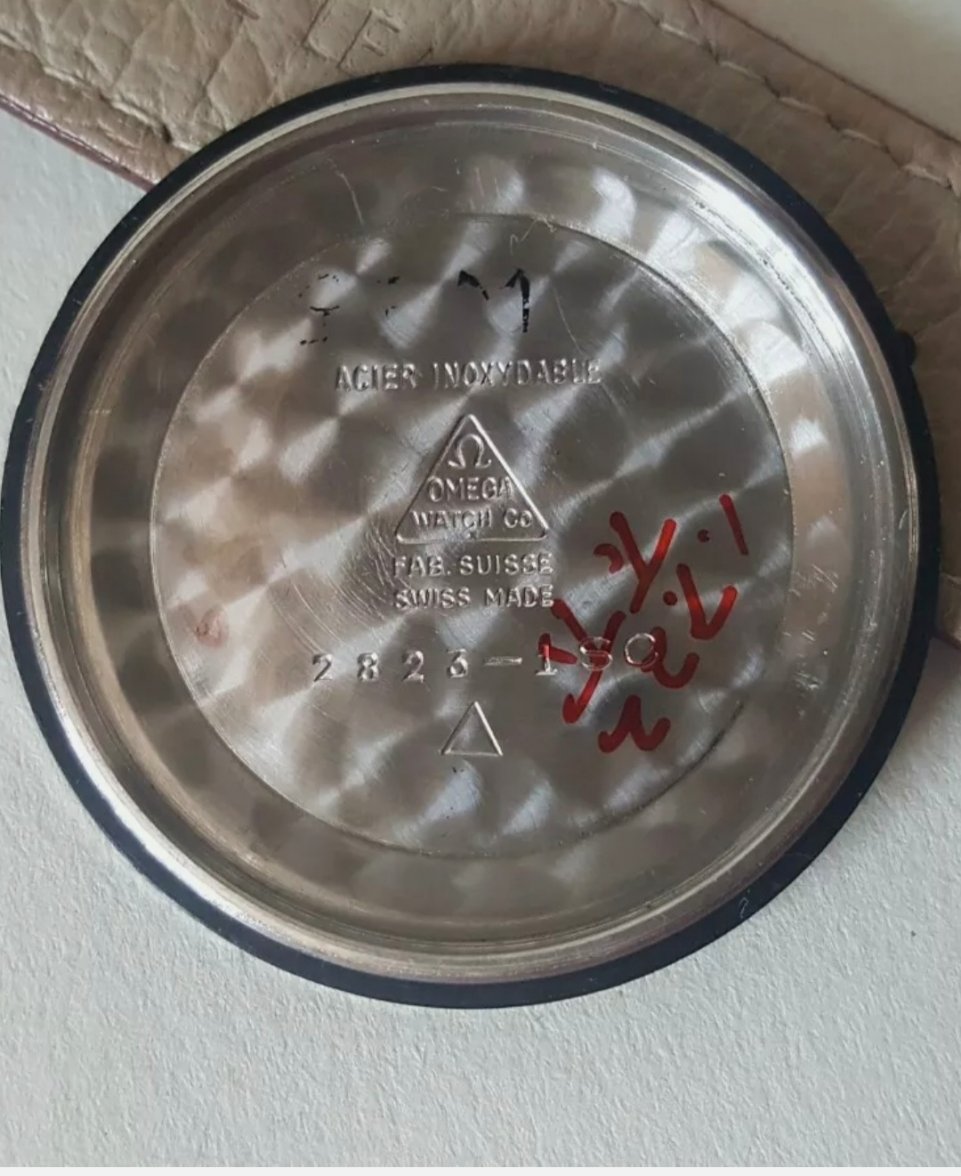
I'm in need of some advice with this one as it has me slightly torn. Usually I can spot a re-dial a mile off however there is a tricky period in vintage omega wristwatches where numerous changes to the font style took place and I believe this watch may be one of those watches. The watch is a 1956 omega seamaster, case reference 2823-1SC and from what I've found on the Web, there aren't many pictures for reference however those which I have found do appear to resemble this one, albiet without the crosshair design.
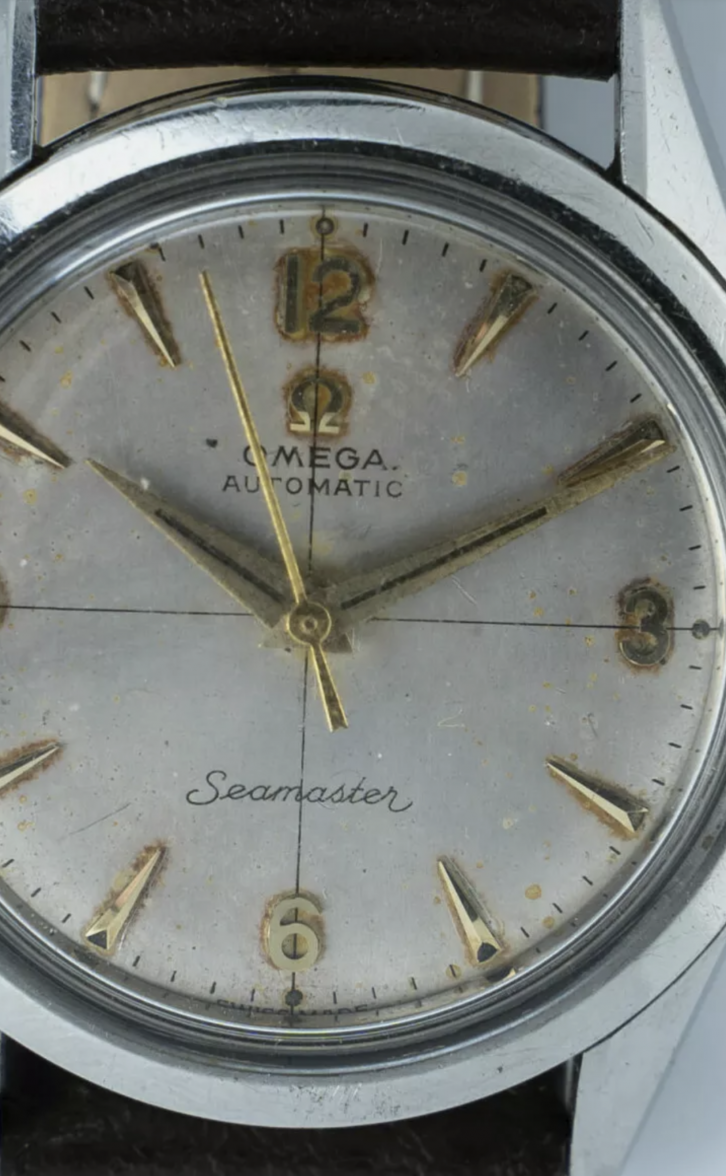
The dial has some discolouration and the surface appears to show the signs of age that I would expect with a watch of this age. The only point which has me concerned is the S and the R of the 'Seamaster' logo - is this correct? I'm aware that earlier seamasters usually have the coat-hanger S however I've also seen this style (photographed) on late 50s / early 60s era watches too.
Any input from our experienced members would be greatly appreciated!
Thanks,
Dylan
Edited:


