Clarion
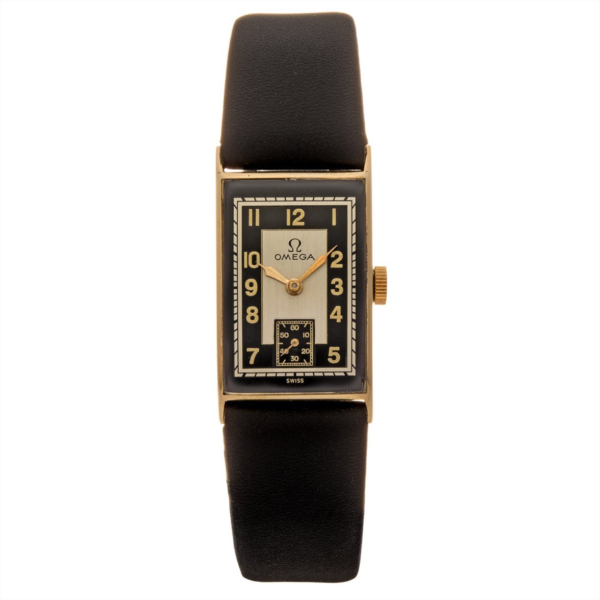
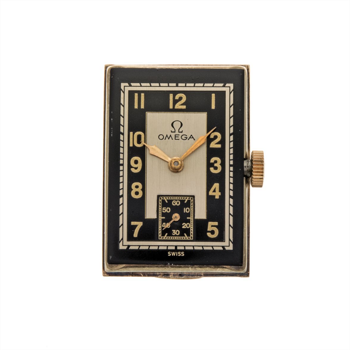
·Hello! Newbie to collecting and I'm starting to learn more about/research redials to spot them. I think I found an obvious one today and I'm kind of sad about it because it is part of a watch with an escapement I really want in my collection. Here's what I'm seeing as the issues:
1) From my research, these "tanks" produced by Omega came in Black, White/Cream, some blends. However, I was unable to find any old advertisements or examples of this particular dial color scheme.
2) The black paint seems "bubbled" in a few places.
3) The Omega symbol has wings off the ends that are a bit thin and high in comparison to the logos of that period (1930's-1940's).
4) The font is off. The seconds dial has a relatively Art Deco style, including a split in the curl of the "6" in "60". Whereas the hours are noticeably...contemporary. Interesting too is the "5" which has a slant on the back of the 5 (slightly off from a straight 90 degree back), which is something it seems Omega consistently does not do...they tend to go for a very straight 90 degree back on the 5's in most fonts. The numbers also just seem like thick new-ish paint.
Anywho, would love to get thoughts from the forum. AND if it isn't too much people's personal feelings on whether they'd want it in a collection. Admittedly I love escapements...and want this in part for that purpose. However, I'm trying to start a solid collection and want to start it off right. Thank you for your help!


