- Posts
- 1,131
- Likes
- 2,218
No Mercy
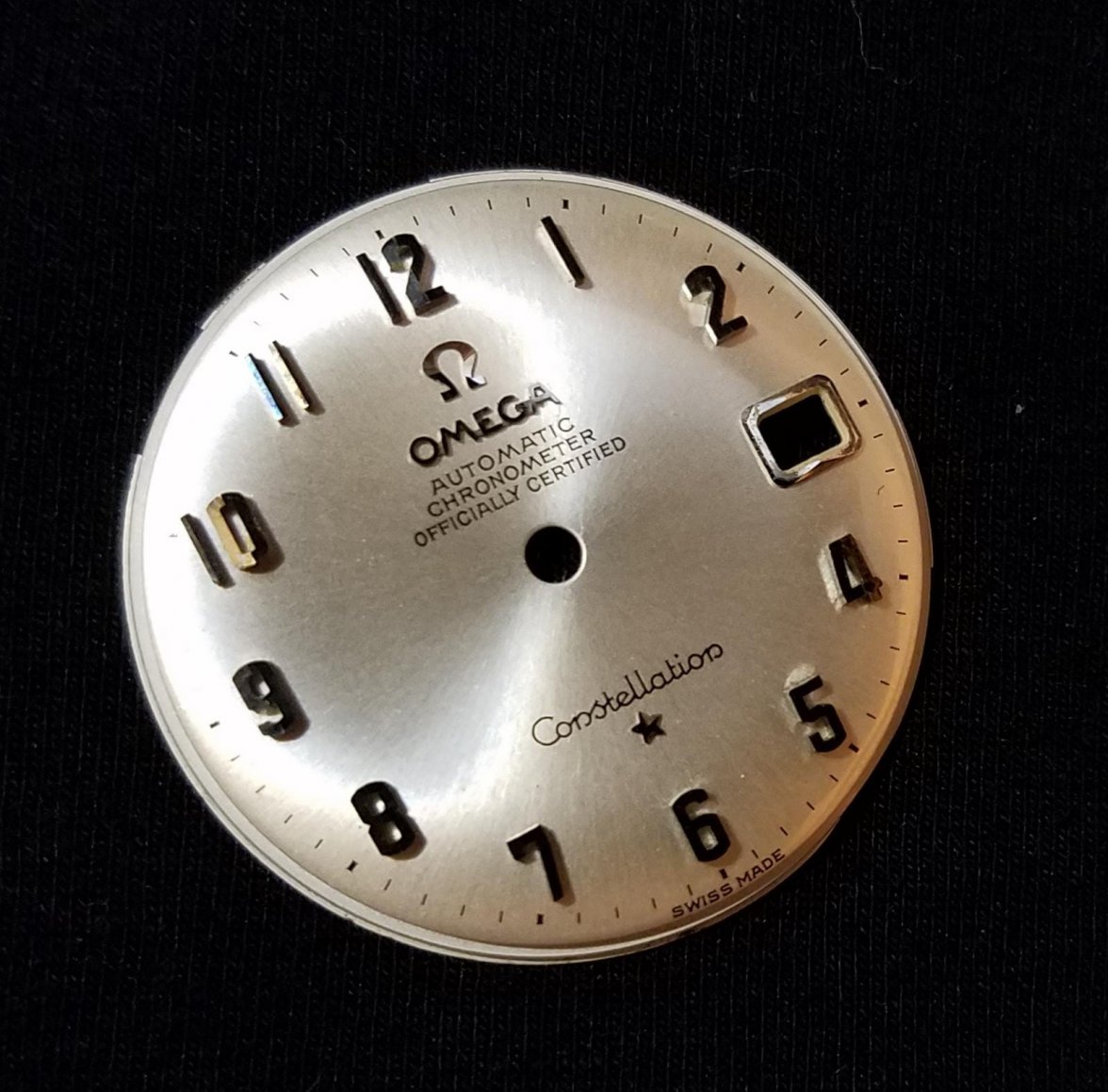
·Did any fellows see any other example? This dial is 100% original untouched.


Please consider donating to help offset our high running costs.

This dial raises some questions. The Omega logo and the star looks blued. Why?
The font seems to be correct but - I get the feeling that the font size is to small? (tiny difference, and I checked other pieces).
Look at my comparison with my 168.005. Please note that the OPs picture has much lower resolution. (I have enhanced OP,s pic).
Note that i don´t say it´s uncorrect, other than the obvious remarks pointed out by gatorpca
But Are you sure the star on your watch is correct?


Markers, logo, star, date window are made from solid white gold. That "blueish" color is because of natural oxidation, I can clean them to bright white gold but decided to keep their color of time.
Do you know why the star and logo are ”blued”?
Markers, logo, star, date window are made from solid white gold. That "blueish" color is because of natural oxidation, I can clean them to bright white gold but decided to keep their color of time.
IIRC the 'silver' markers on most Connies are rhodium plated rather than white gold (other than some special arrowhead markers perhaps)
The dial certainly didn't leave Omega with the star upside down - unless it was a quality control reject and kept by someone.
Great photos by the way
The blueing (particularly on the AML) could be an effect from heat when brazing. This is either a factory cockup or an excellent quality redial where the dial furniture was removed then reapplied, but wth the star there was a d'oh moment. Note on the rear the feet of the applied logo, text and star are ground brighter than the indices suggesting recent work possibly. Either way it raises questions and I wouldn't be rushing to buy it. A brave and competent watchmaker may be able to remove and reattach the star correctly.

Looks to me like some of the dial elements were removed, possibly for a stripping of the original lacquer and replacement with a modern synthetic version.