- Posts
- 411
- Likes
- 626
river9
·-edit to add pics-
Hello
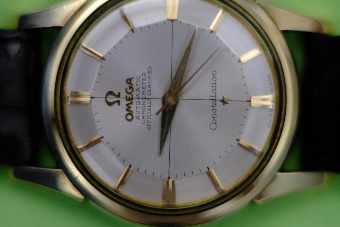
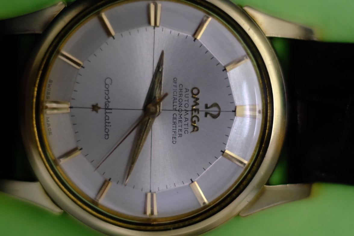
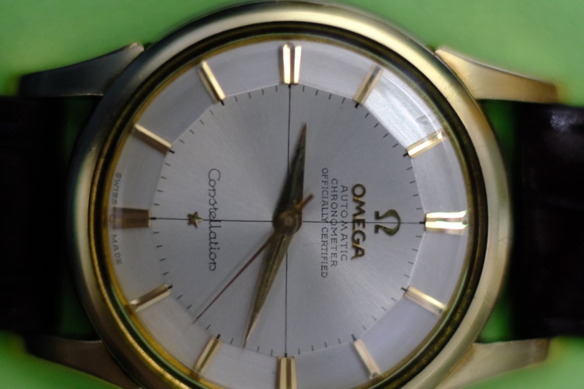
I own this 14381 for a while. Bought it mainly as a 'birthyear watch'.
I would want to know your opinion on this dial that I already post here in OF.
Some would said it is legit but some are inconclusive. Some OF experts suggest here to see underneath of dial but it is not done yet although I will do it on next date of watch service.
I will not part with this watch due to sentimental value. But for the shake of genuineness are there reasons for concerns? I see the following red flags...
- 4 lines on this ref are correct? Other examples are 3 lines, NO 'officially certified' wording
- font thickness: not strong enough
- font height uneven...
Please share your thoughts.
Thank you.
Hello
I own this 14381 for a while. Bought it mainly as a 'birthyear watch'.
I would want to know your opinion on this dial that I already post here in OF.
Some would said it is legit but some are inconclusive. Some OF experts suggest here to see underneath of dial but it is not done yet although I will do it on next date of watch service.
I will not part with this watch due to sentimental value. But for the shake of genuineness are there reasons for concerns? I see the following red flags...
- 4 lines on this ref are correct? Other examples are 3 lines, NO 'officially certified' wording
- font thickness: not strong enough
- font height uneven...
Please share your thoughts.
Thank you.
Edited: