What's Wrong Here?
C Master
·Alright this is a great test for my newly acquired knowledge thanks to this incredible sub...
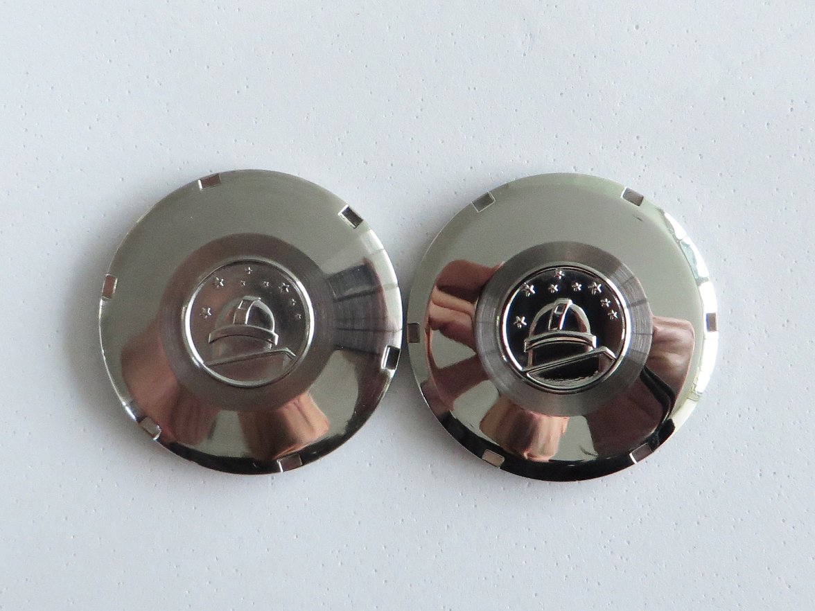
First pic:
- Observatory logo on the right is simply wrong and looks poorly done.
- Stars on the right one look totally off and cheap.
- I've never seen the polished ring around the logo, so I'm not sure if that's correct on either, but could be.
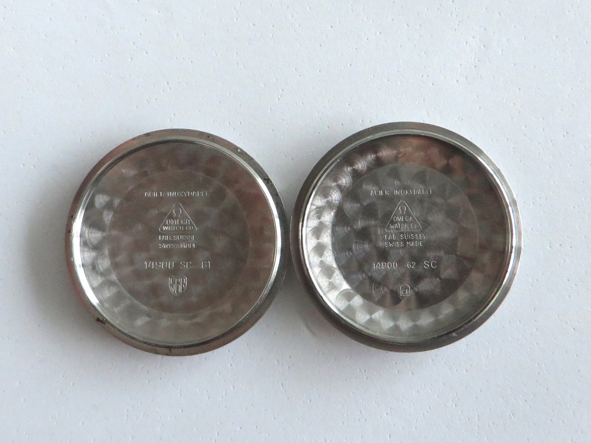
Second pic:
- The one on the right doesn't look like the exact font.
- The one on the right looks like the logo and triangle are slightly too tall.
How did I do?
Dr. Arnaud
·Should we question the perlage on the case back on the right?
- Posts
- 1
- Likes
- 0
TJHT
·Its the location of the divots right (no idea what the correct term is)? The top divot should be just to the right of the central star, but on the right hand caseback the star is almost centered between them?
Tayne
·The one on the right has what I think is a "CE" mark which has only been a thing since the early 90s.
140dave
·Okay, been here for a minute but not a Connie guy at all so I’ll play. First, I’ll admit it, I don’t know the answer and I am just guessing to keep this going and learn something new.
The stars look off on the one in the R. Size and layout both.
The stars look off on the one in the R. Size and layout both.
Aroxx
·Yea I’m thinking it’s something to do with the stamps below the reference number but I’m just completely guessing. Something about the polished observatory on the right seems off but maybe it’s just the contrast between the two.
GuiltyGear
·I'm giving it a shot. The stars and observatory are kind of a dead giveaway. The big difference to me on the inside of the caseback is that the fake one seems lasered instead of stamped.
dougwhiz
·Perlage on the right photo seems too uniformly placed in the outer ring. And then the swirls sometimes overlap, and then not. Like someone was in a hurry.
Canuck
·It looks to me as though the Observatory on the right case back is a separate stamping applied to the back (as in glued, or soldered). The one on the back was either milled, or die struck into the case back as I would expect to see on the genuine article. Otherwise, the one on the right looks like a FAKE to me.
TimeODanaos
·Let's think about letters and numbers.
X350 XJR
··Vintage Omega AficionadoCaliber561
·That's a bit scary, to be honest.
Pastorbottle
·The alpha numeric number on the left case back has a consistent sized font where as the one on the right has different sized font used on the suffixes also the layout of the number is different
The l/h one reads with the alpha suffix before the numeric suffix where as the r/h one reads with the numeric suffix before the alpha suffix.
I’ll take a stab it the r/h one being the wrong’un
The l/h one reads with the alpha suffix before the numeric suffix where as the r/h one reads with the numeric suffix before the alpha suffix.
I’ll take a stab it the r/h one being the wrong’un
timjohn
·The year and the SC are in the wrong positions on the left hand pic at the top?
Makesbelieve
·What's wrong? None of these watches have been serviced in the last 62 odd years, (i.e. no watchmaker markings)
What's right? Everyone that serviced these watches over the last 62 years was respectful enough to not scratch a date into their case backs. 😉
What's right? Everyone that serviced these watches over the last 62 years was respectful enough to not scratch a date into their case backs. 😉
Edited:
Olhenry56
·The year and the SC are in the wrong positions on the left hand pic at the top?
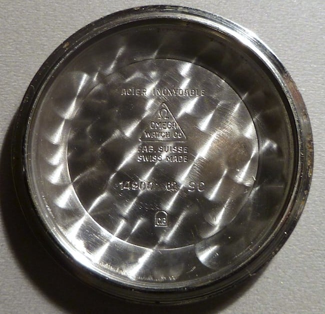
I think the first CB case back is counterfeit but the second in the later comment is real. In addition to the differences others have pointed to, I think the "A"s in the first one should not be pointed, but flat as they are in the second one. Also, the triangle around "Omega Watch Co" is nearly equilateral, but I think the base should be slightly longer than the other two sides, as they are in the other two case backs.
Edited:
Appleseed6
·tagging to learn something.
Dal Cais
·Tagged as well to learn, picked up most issues noted so far but the additional photo has me reviewing again.


