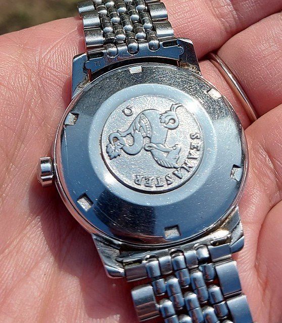
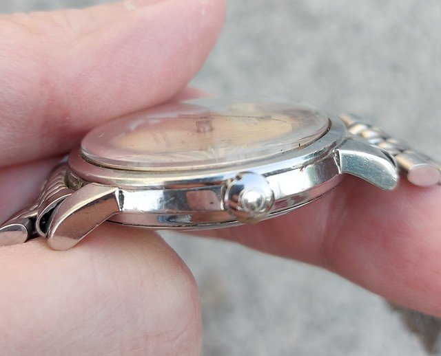
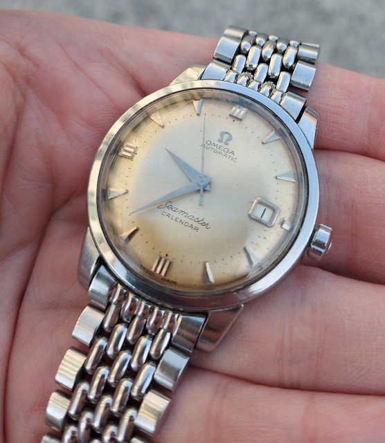
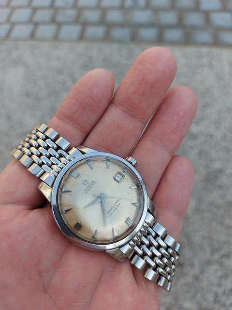
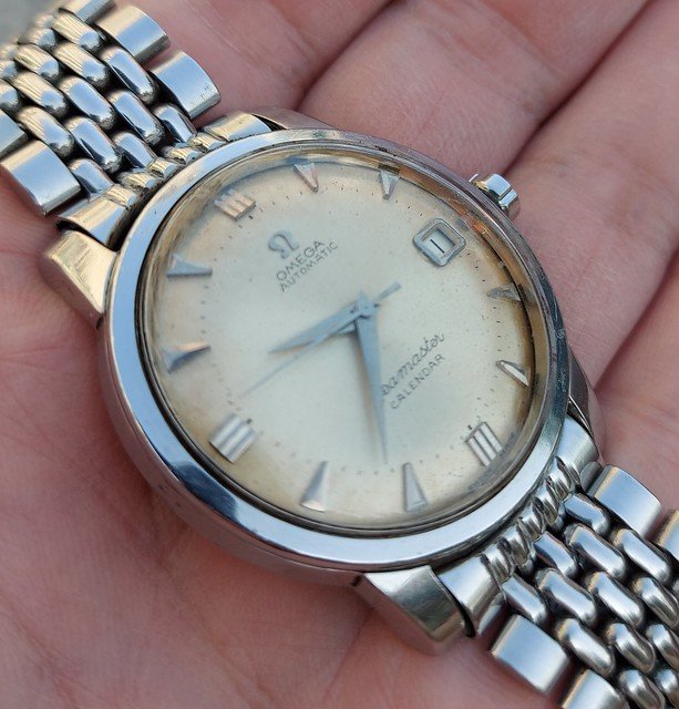
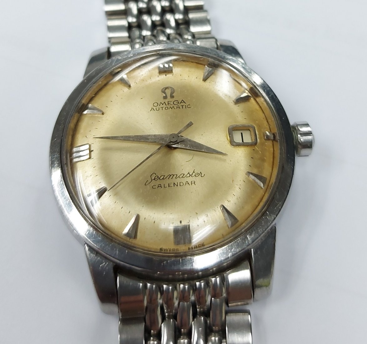
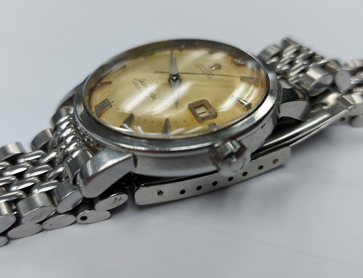
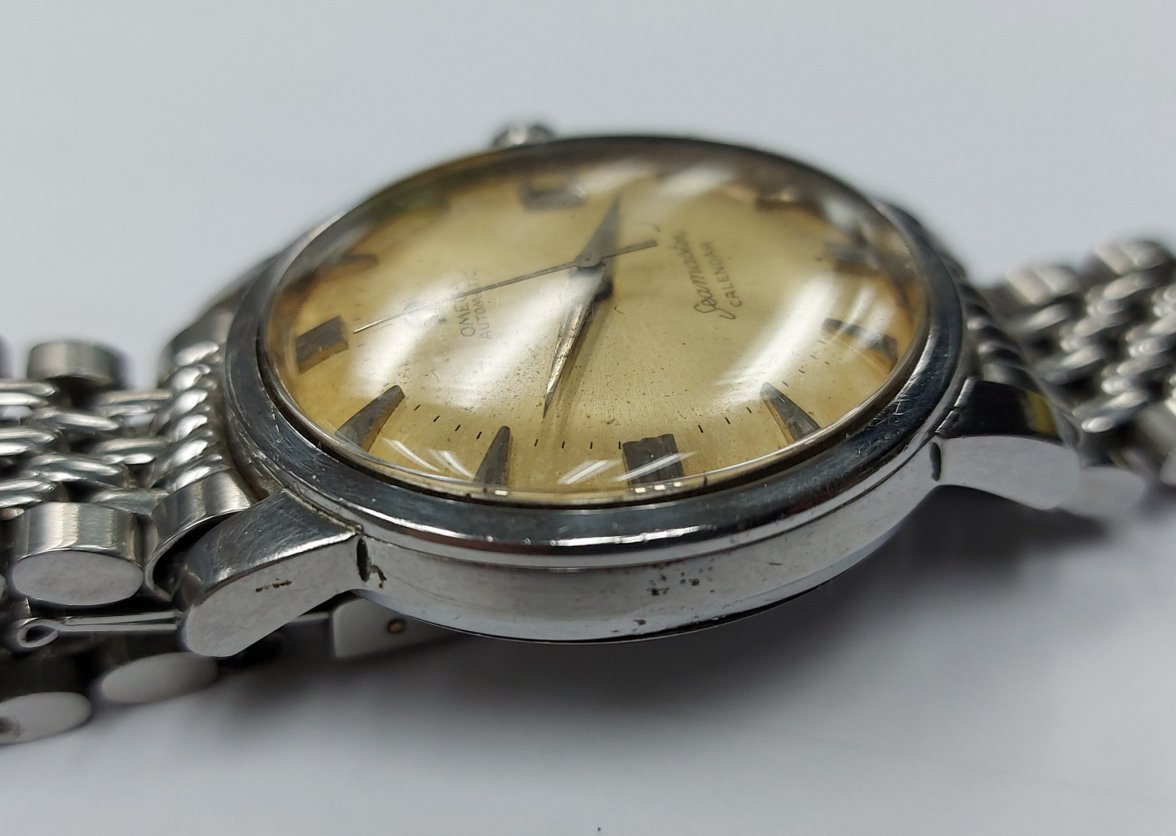
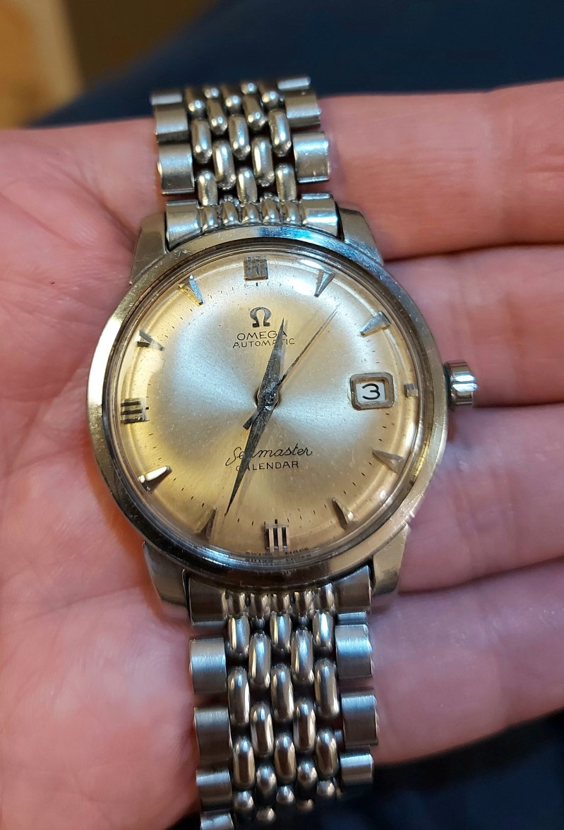
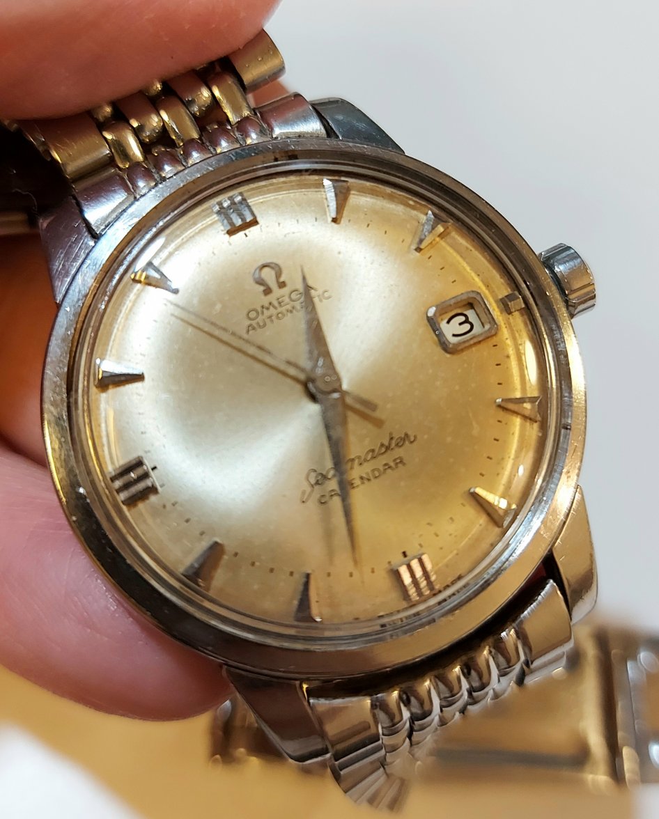
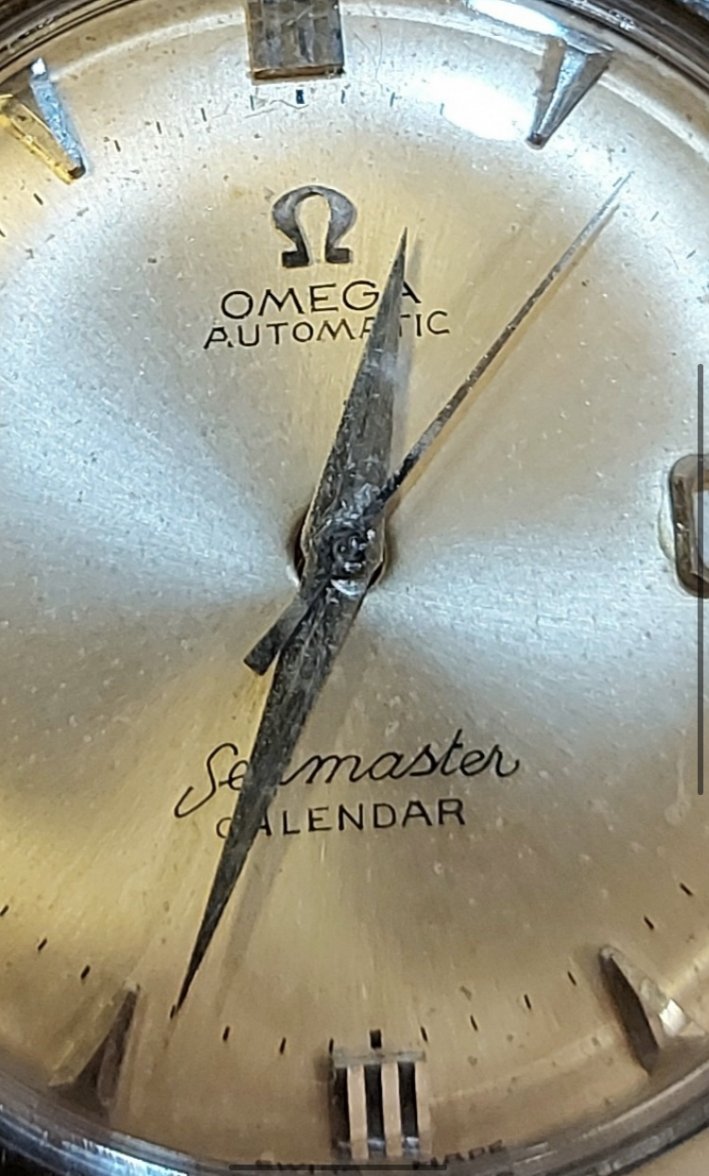
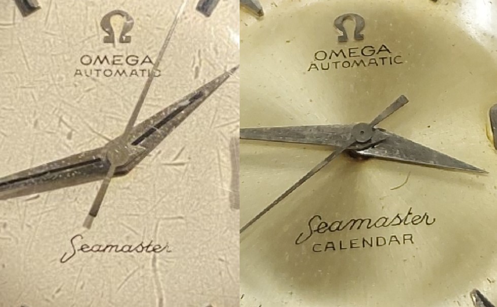
See what you mean at 6 but I have a feeling might just be the angle in which the photo was taken.
I personally don't think it has been redone and from what i can see the fonts are correct, maybe fixed at some point
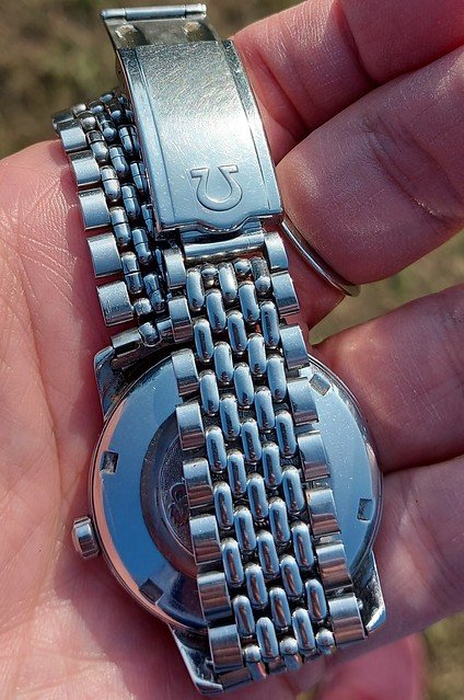
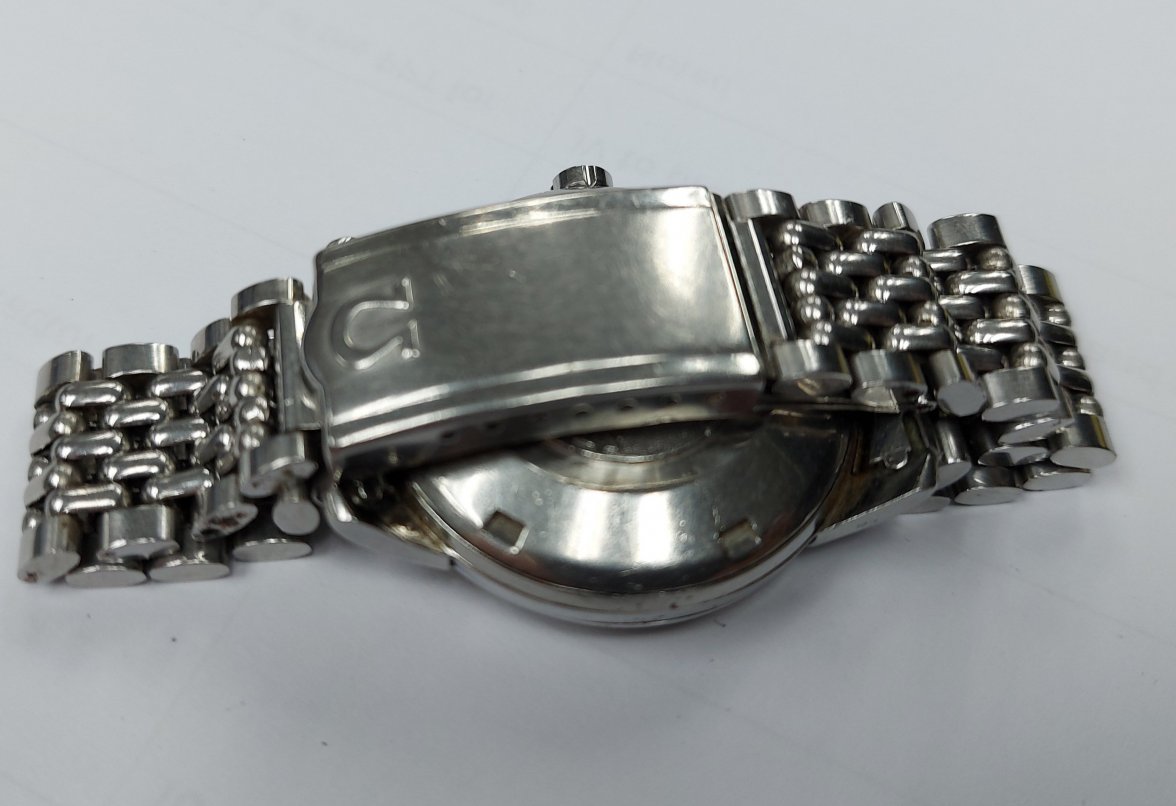
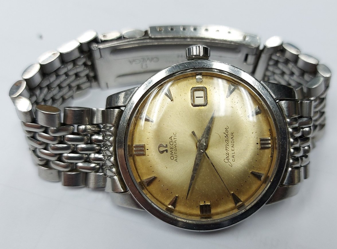
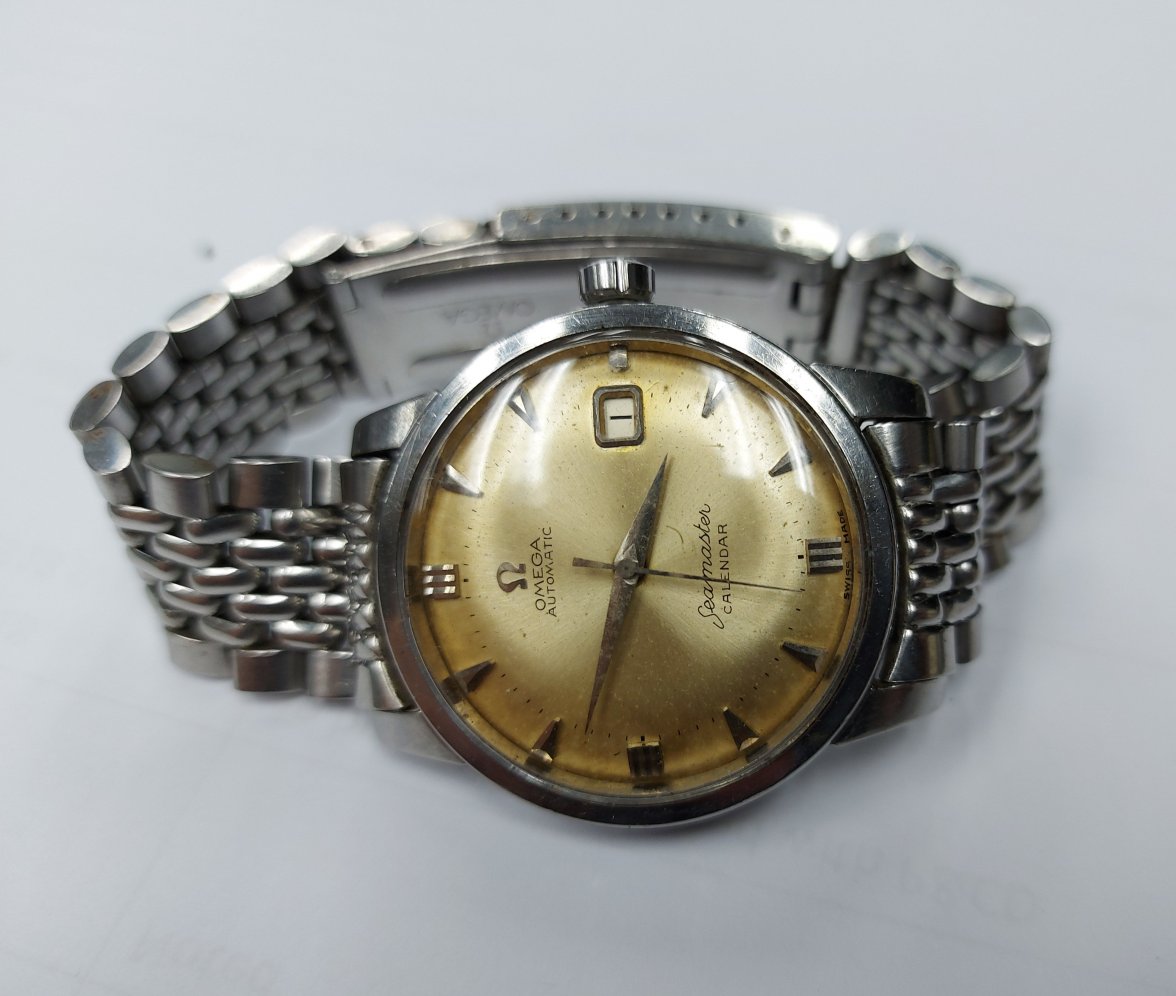
ill send better pictures when it arrives.
.
Yoni