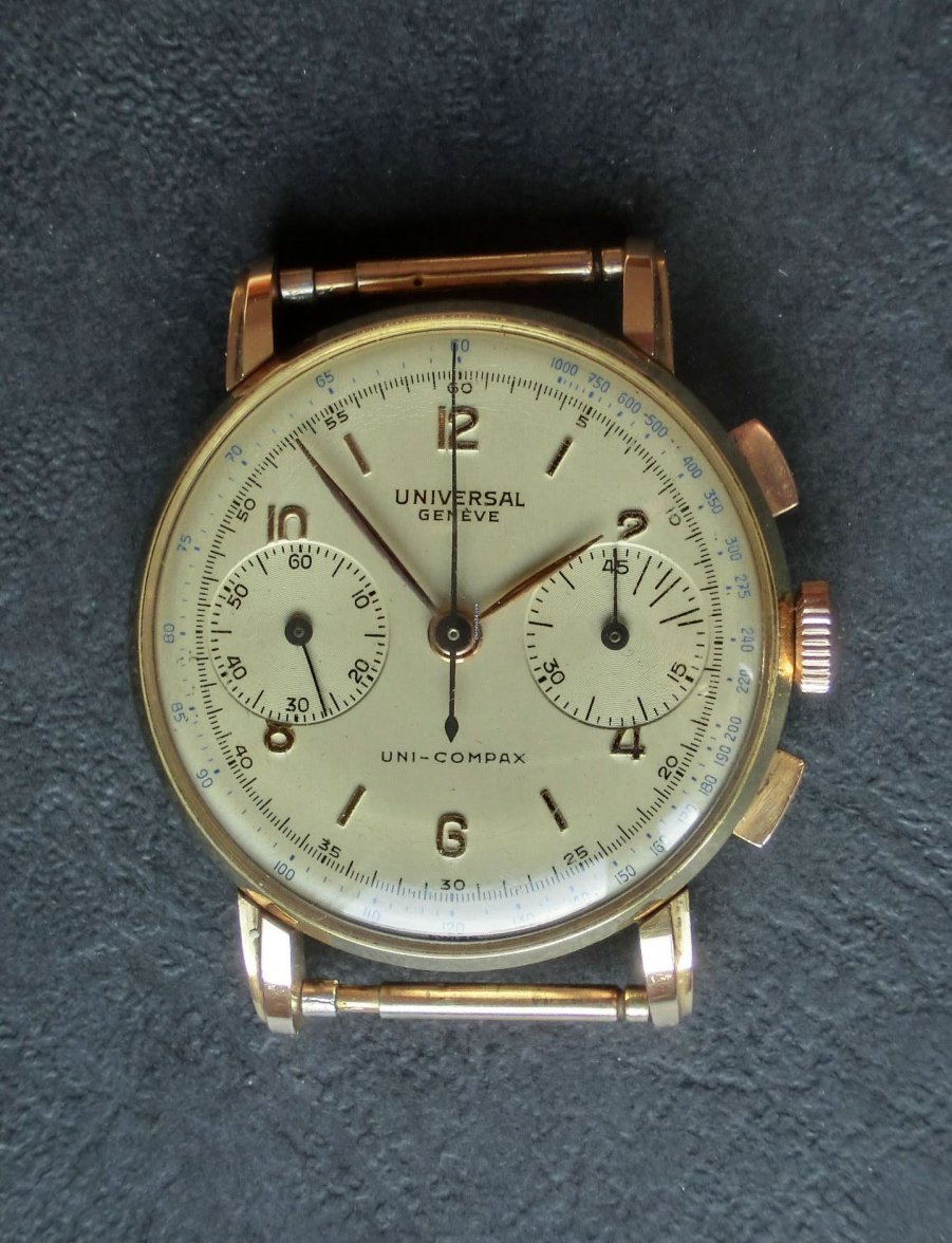
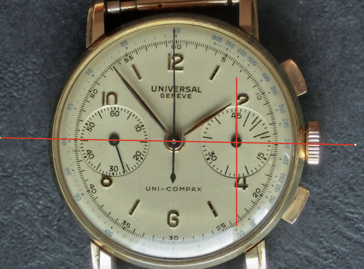
Granted I haven't taken a serious look at this, but offhand I'm not seeing an issue on right subdial alignment. With 45 at the top, quartered, you would expect to the see the 15 on the minute track hitting 11.25 on the minute subdial, which this appears to be doing.
This just popped up on C24 this morning, a similarish and higher res photo comparison. It's hard to evaluate the OP dial on the this thread from the one (not great) pic, in terms of fonts, serifs, etc....