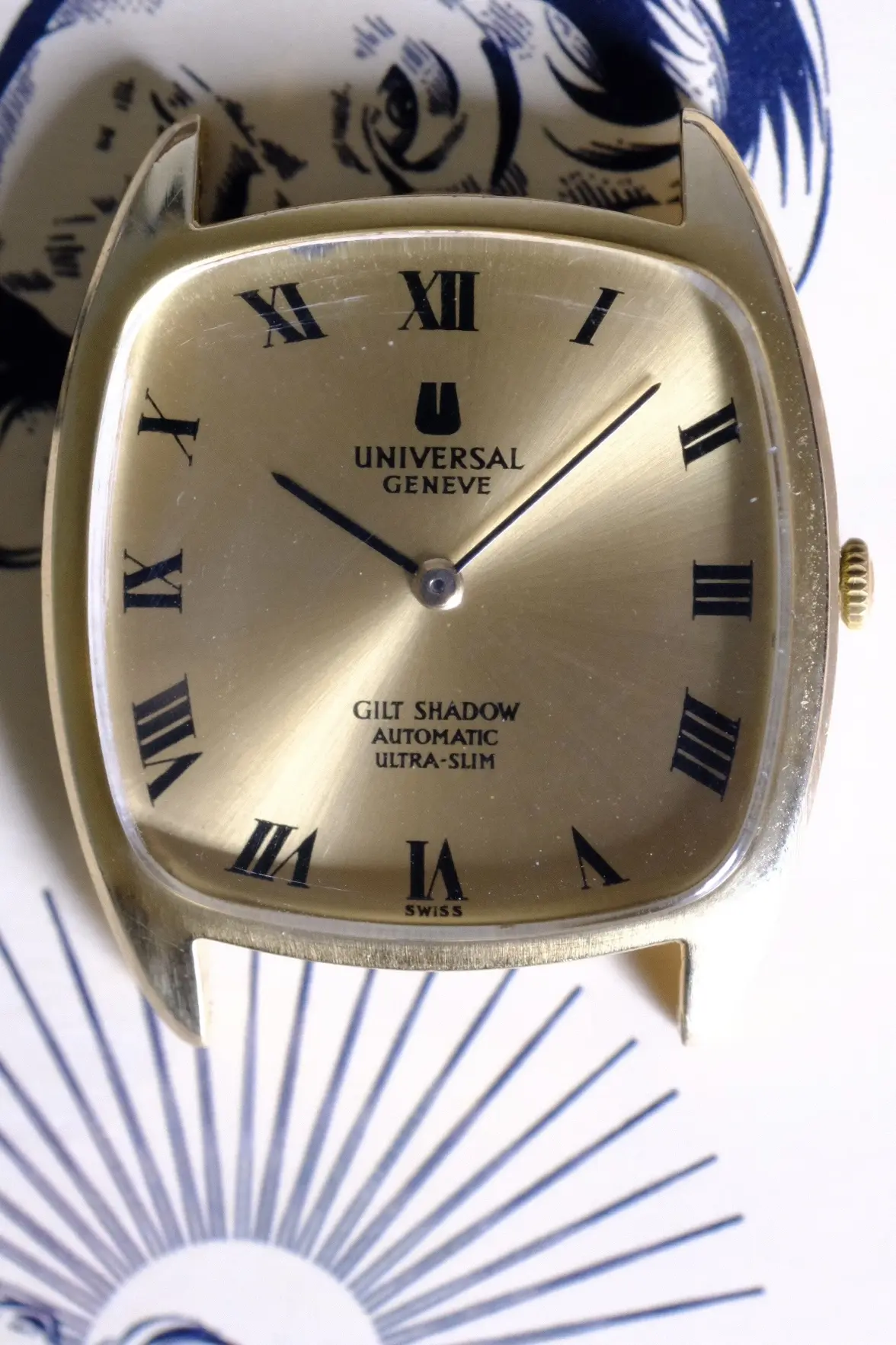
UG Gilt Shadow Ref. 566105 - Dial Info?

Posts
5
Likes
1
Good day sirs.

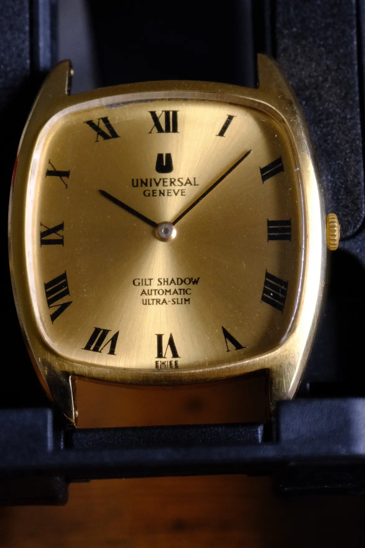
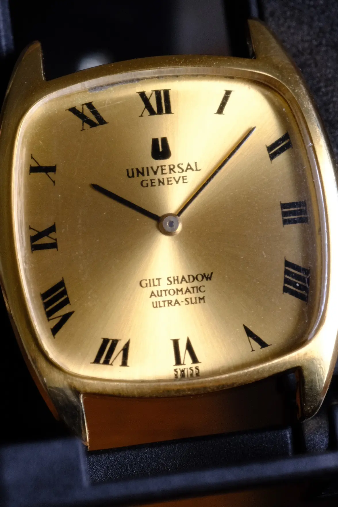
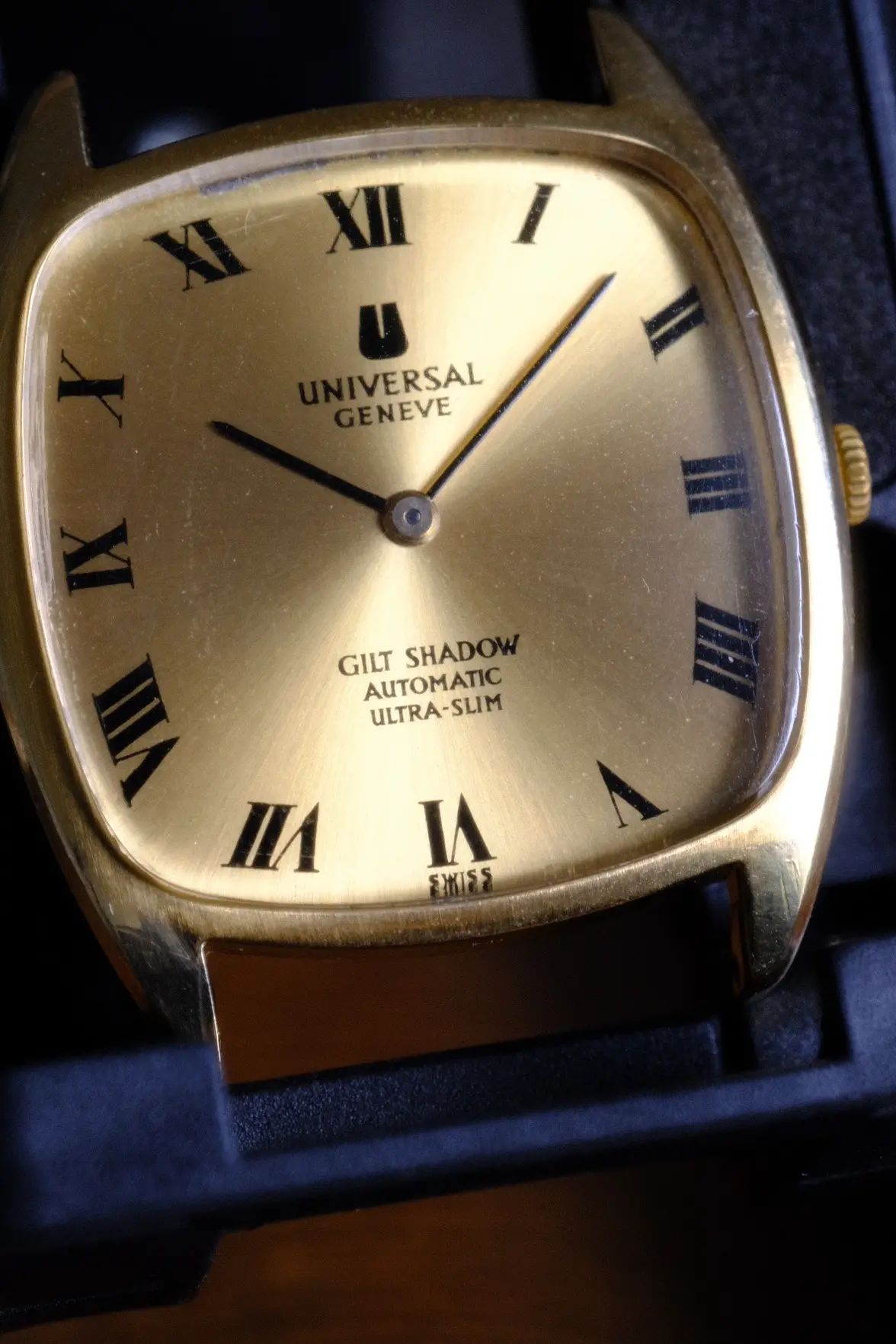
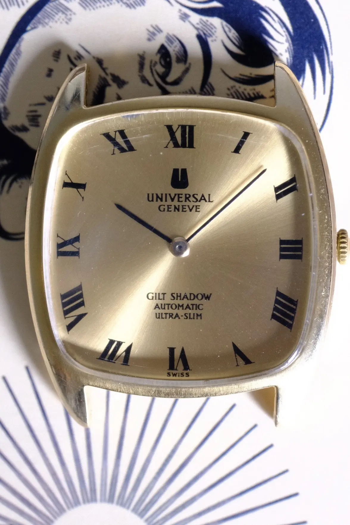
Can I get your opinions on this UG dial? I’m a little conflicted about its originality. There are some characteristics I’ve identified which seem to show correct / original behaviour:

  • The font / typeface used, which also includes;
  • The serifs
  • Consistency of the letters
  • Kernings, spacing and their positions against each other (vertically and “coordinate” wise)
  • The roman numerals are also pretty neat with the combination of their thin & thick lines

However, I have some doubts due to:

  • The inks are slightly bolder than known examples on the internet, which particularly can be seen in
  • The “fat U” logo. Notice that the inner hollow part is slightly made too thin
  • The texts are slightly thicker too

I don’t know whether it’s an honest manufacturing error (perhaps they used too much ink for this batch?), a light retouch, or a complete refinishing done by professional studio.

Let me know what you think of!
 
Posts
43
Likes
63
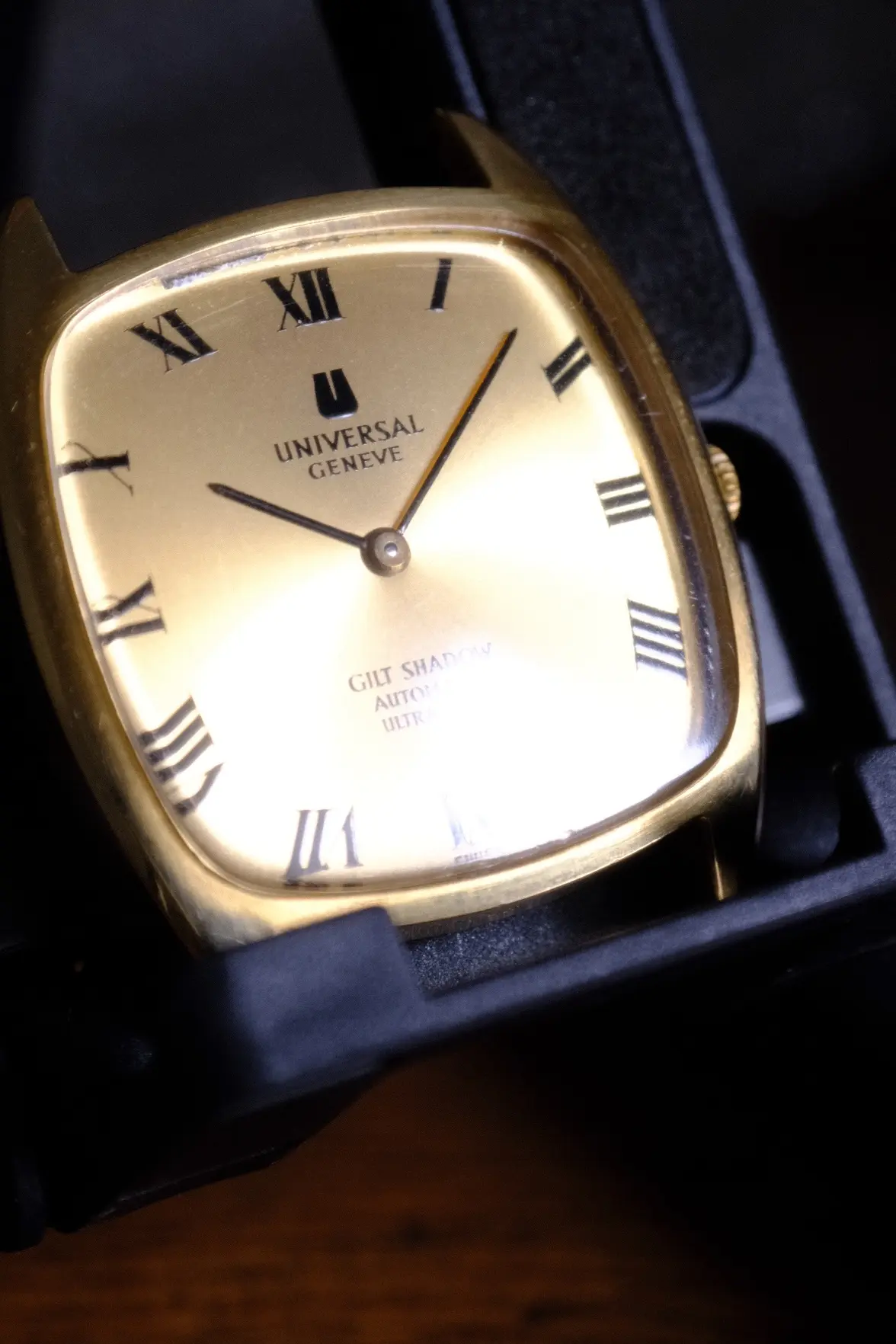
Leaning towards it's original. The shape of the fat U is varying enormously based on different models and texture of the dial. I do agree that the the print is on the thicker side, and it would have been more aesthetic with a thinner print. In the first photo the text looks just fine, but in the last photo with unfavorable lighting it looks much more coarse. Perhaps this is one that just barely made it through quality control. I think the fact that the watch dial shows some deterioration in the upper edge also supports that it is original. If it was a recent redial, it would have looked more spotless.
All that being said, these flat dials are easier than not to reprint, so you can never rule it our completely. Just my two cents.
Edited:
 
Posts
5
Likes
1
Leaning towards it's original. The shape of the fat U is varying enormously based on different models and texture of the dial. I do agree that the the print is on the thicker side, and it would have been more aesthetic with a thinner print. In the first photo the text looks just fine, but in the last photo with unfavorable lighting it looks much more coarse. Perhaps this is one that just barely made it through quality control. I think the fact that the watch dial shows some deterioration in the upper edge also supports that it is original. If it was a recent redial, it would have looked more spotless.
All that being said, these flat dials are easier than not to reprint, so you can never rule it our completely. Just my two cents.
Appreciate the feedback mate. Upon further research on how the pad printing worked back then, I too leaned towards it being original. Do you collect the Shadow lines as well?
 
Posts
21
Likes
31
Gilt shadow is plated? Gold shadow is solid gold, and white shadow is stainless? Is that correct?
 
Posts
43
Likes
63
Gilt shadow is plated? Gold shadow is solid gold, and white shadow is stainless? Is that correct?
That's correct. There are even some WG golden shadows, but they are rare.