- Posts
- 1,851
- Likes
- 3,759
TimeODanaos
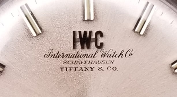
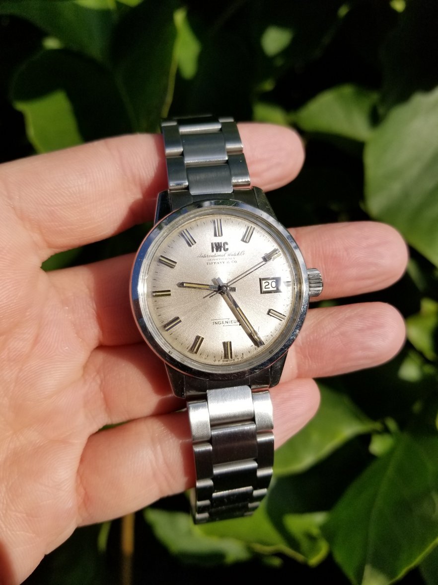
·This was bought from Tiffany at the very end of the 1950s. No-name manual wind dress watch (Cal 520) rather than Seamaster, but point is IMO the fonts have a beautiful hint of (what was then) modern America, without a hint of serif about them. Note also that the "Co." abbreviation uses a period rather than a raised underscore. Agree with what has just been said about the quality of the fonts, but I think the signatures could still be co-applied and matching, since the last thing Tiffany would have wanted was an aesthetic clash.
(Sorry about pic quality - I don't have macro equipment, so it's a blow-up squared...)

(Sorry about pic quality - I don't have macro equipment, so it's a blow-up squared...)
Edited: