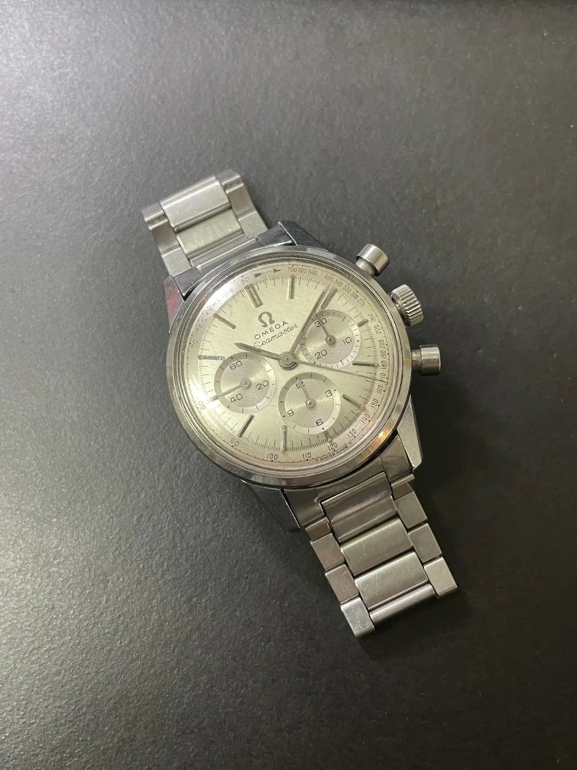
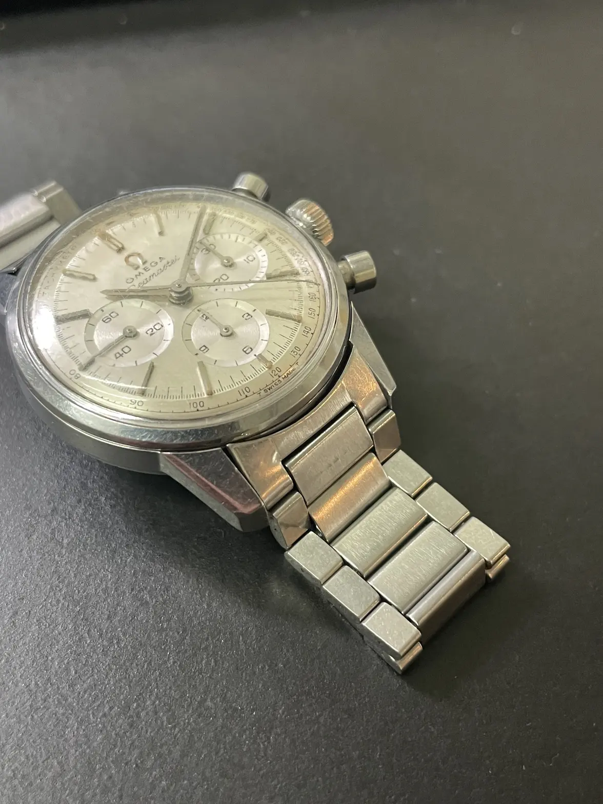
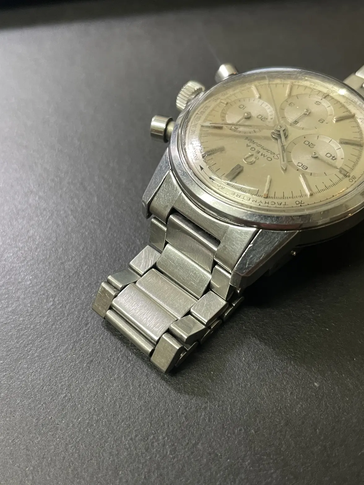
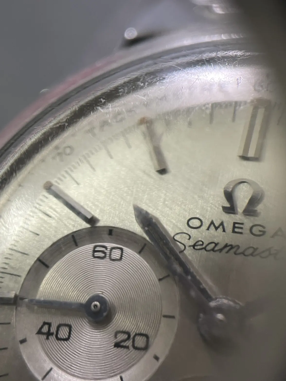
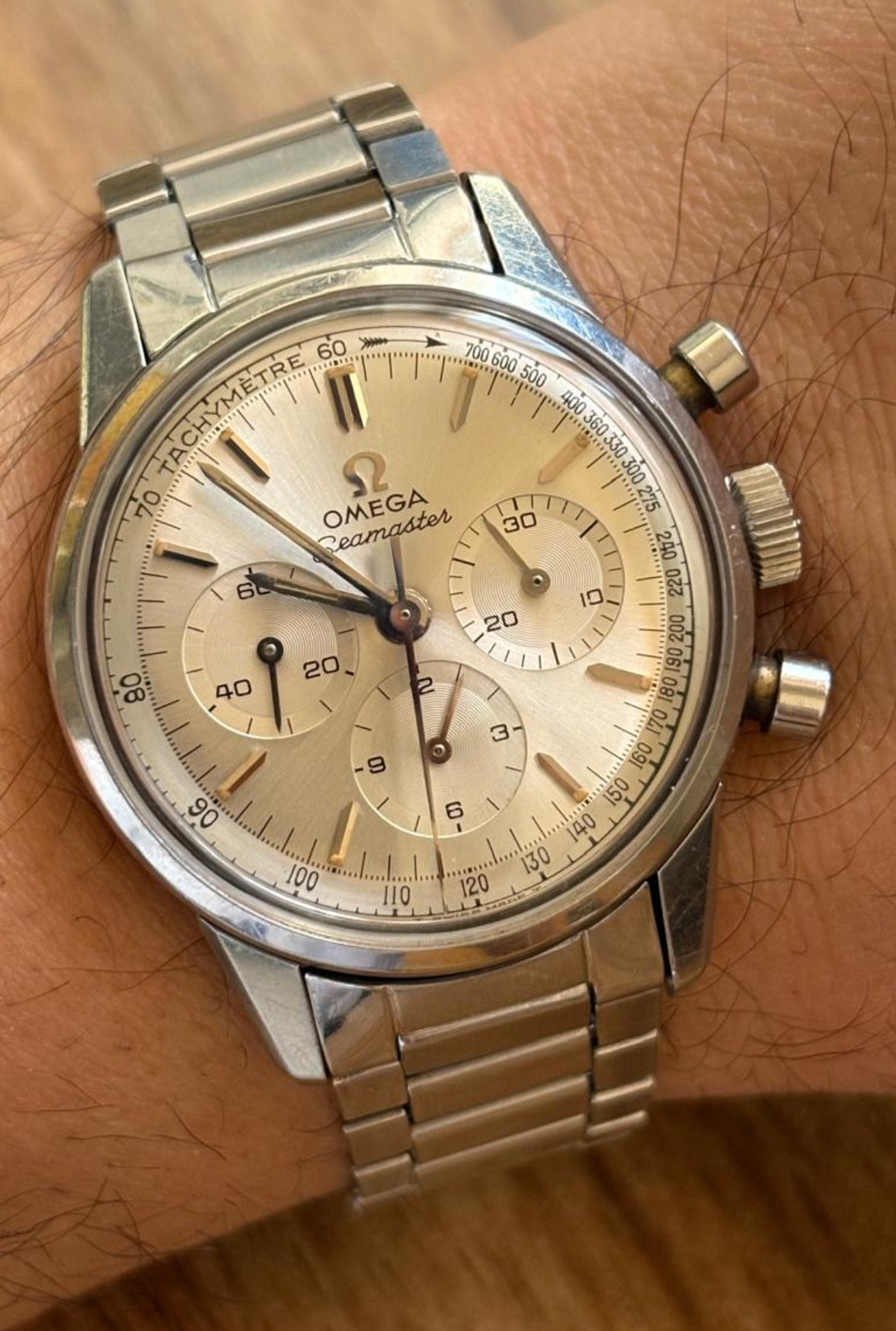
Thoughts on a 105.004-64
Davidt
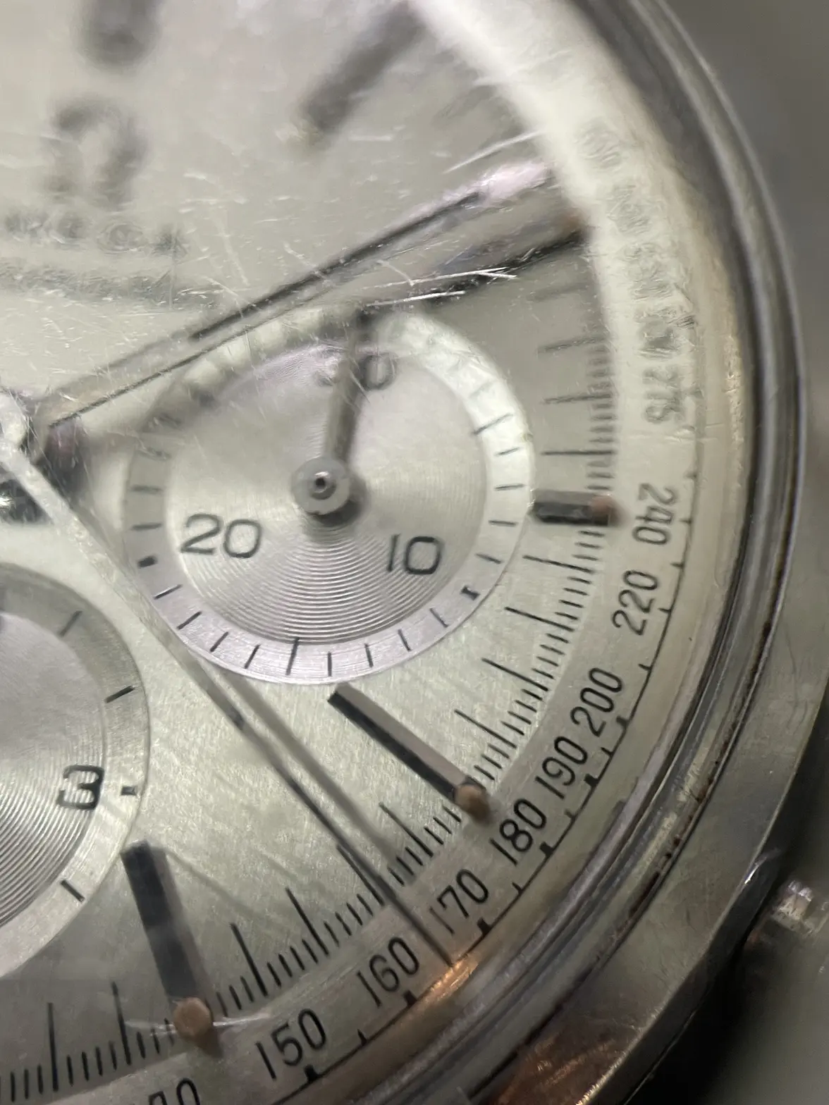
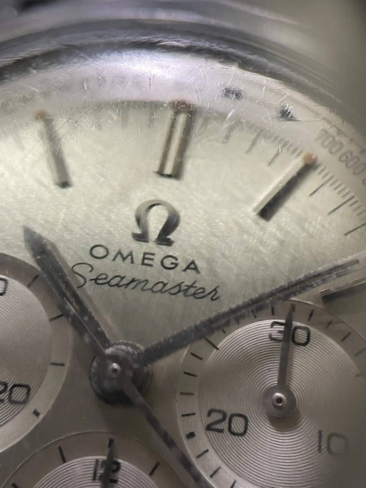
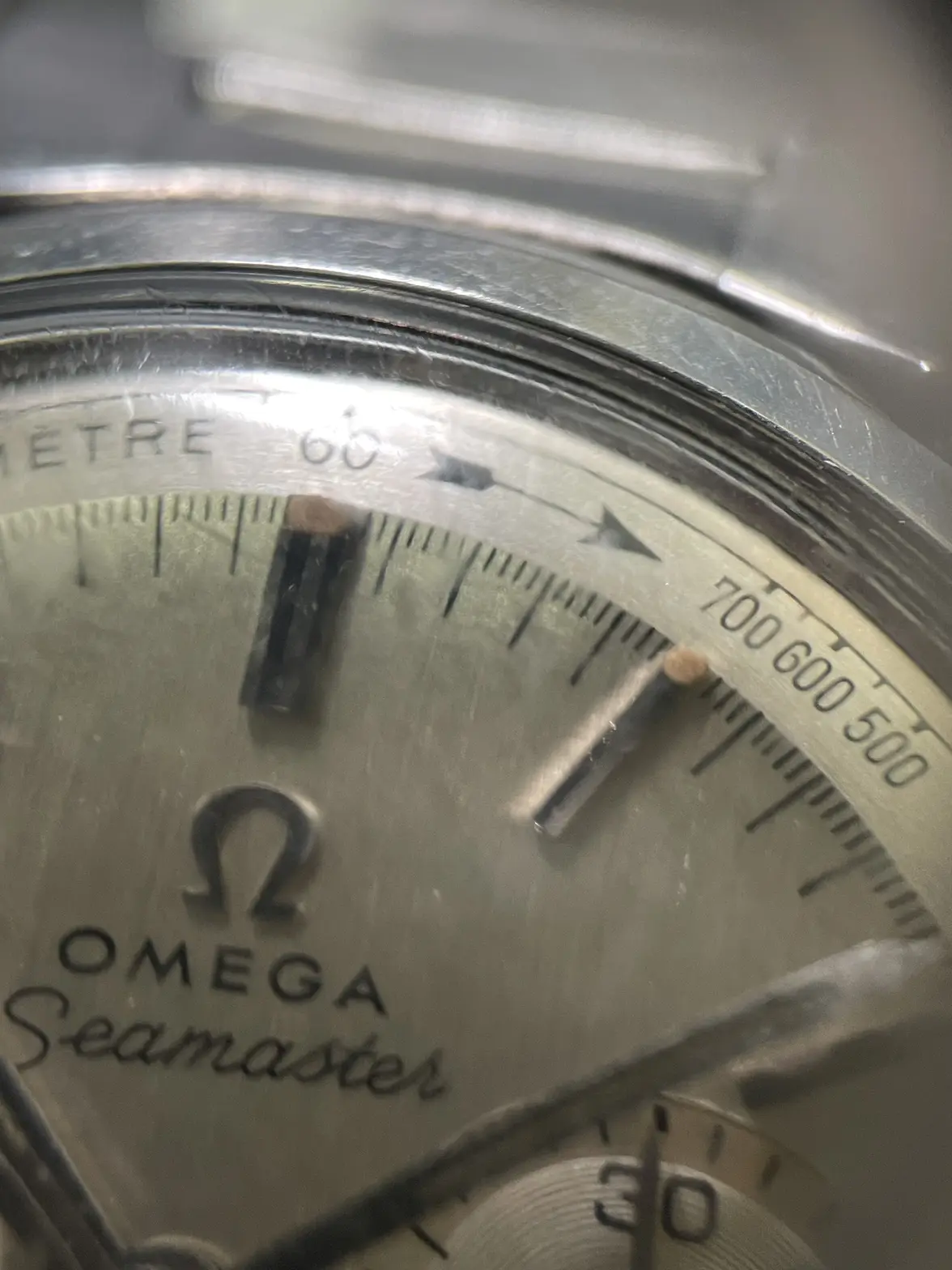
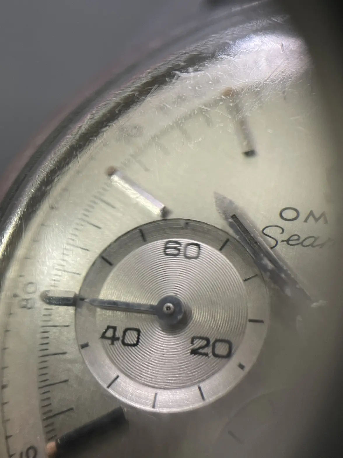
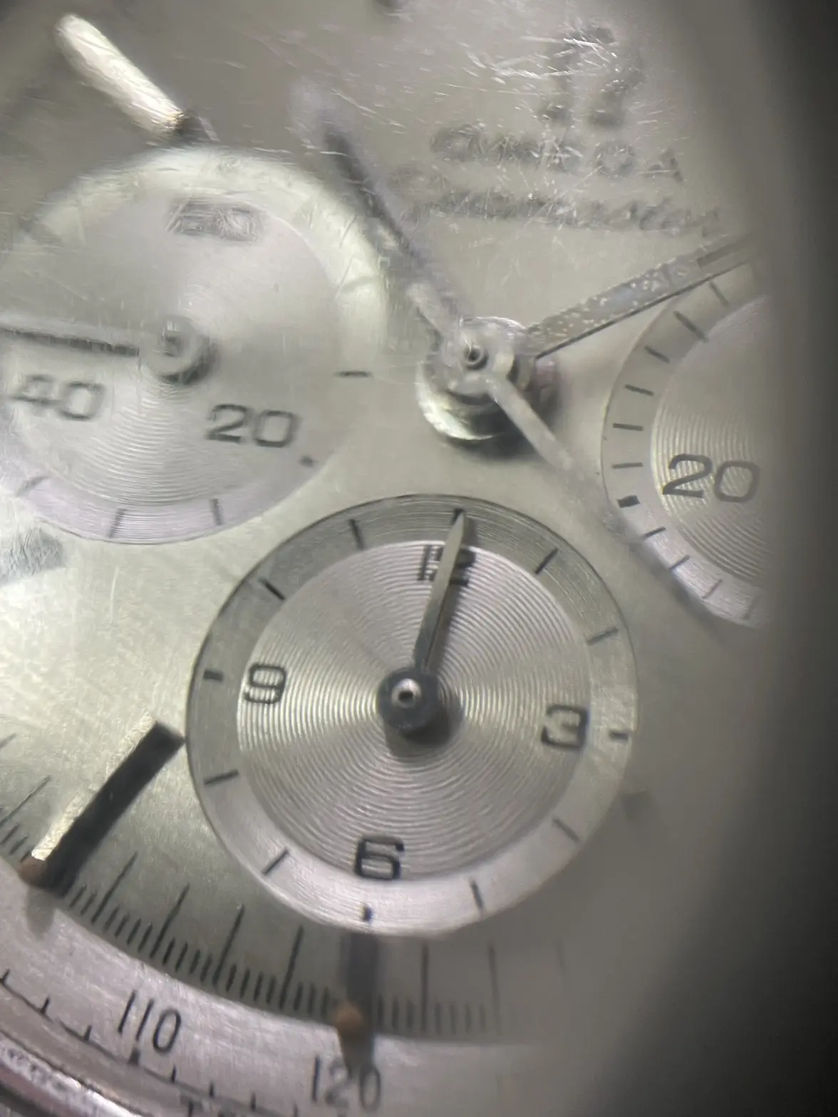
·At first glance, looks nice and original.
M'Bob
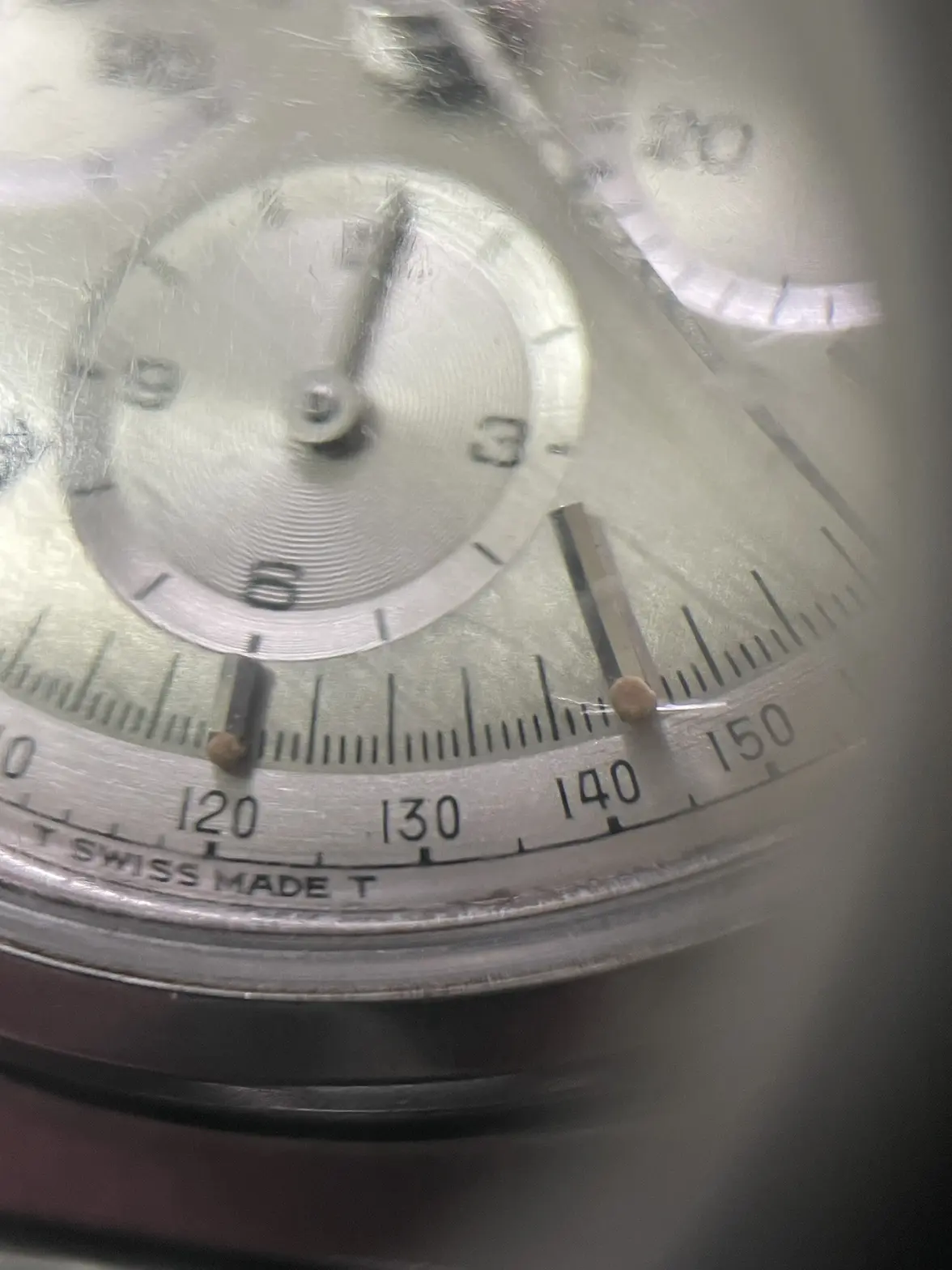
·Hmmm…my re-dial sensors are on alert for some reason. And the luminous looks touched up in places.
Davidt
·It’s not the best pictures for assessing the dial but I’m seeing nothing that makes me think it’s not an original dial
Dsplash
·M'Bob
·I’m going to agree with David: I think the dial is original. But the luminous has very likely been touched up in places.
smorrisonmd
·Looks good to me. And the bracelet is a major bonus.
flqt-9000
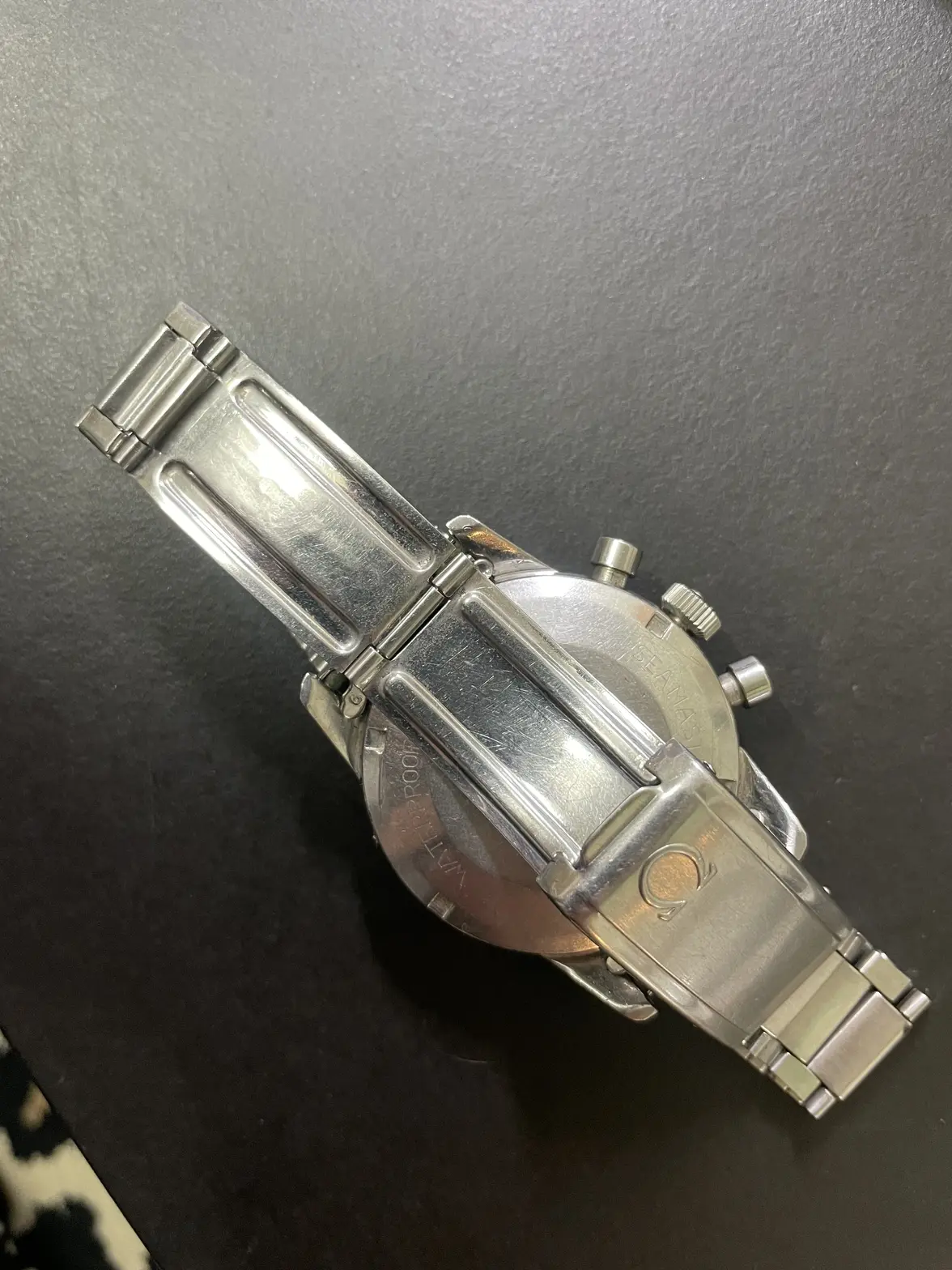
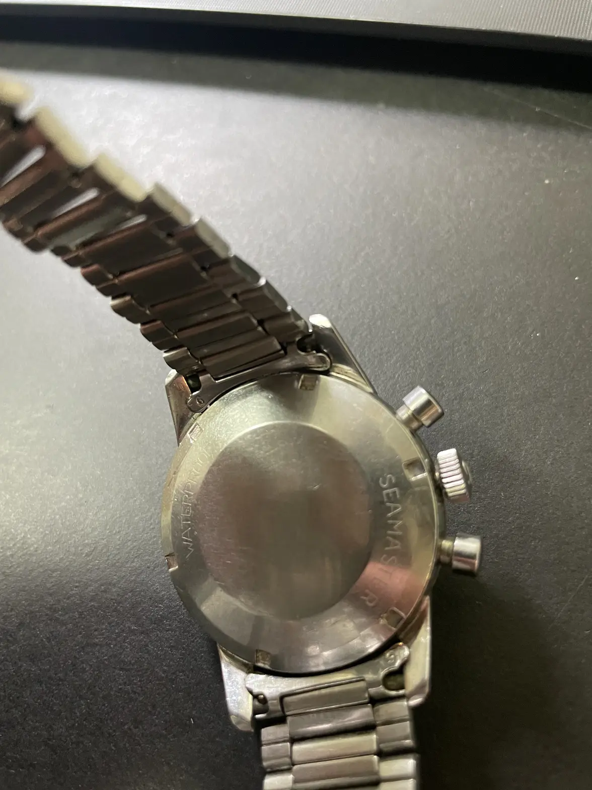
·I would say that even the spring bars are original in this one!
Dsplash
·This one has a 1035 with #6 endlinks so I guess they were shaved down to 18mm…
More in a few days, I bought it 😁
More in a few days, I bought it 😁
Servius
·That dial looks really nice, good news we’ll see how it cleans up 🙂
- Posts
- 56
- Likes
- 29
njlam
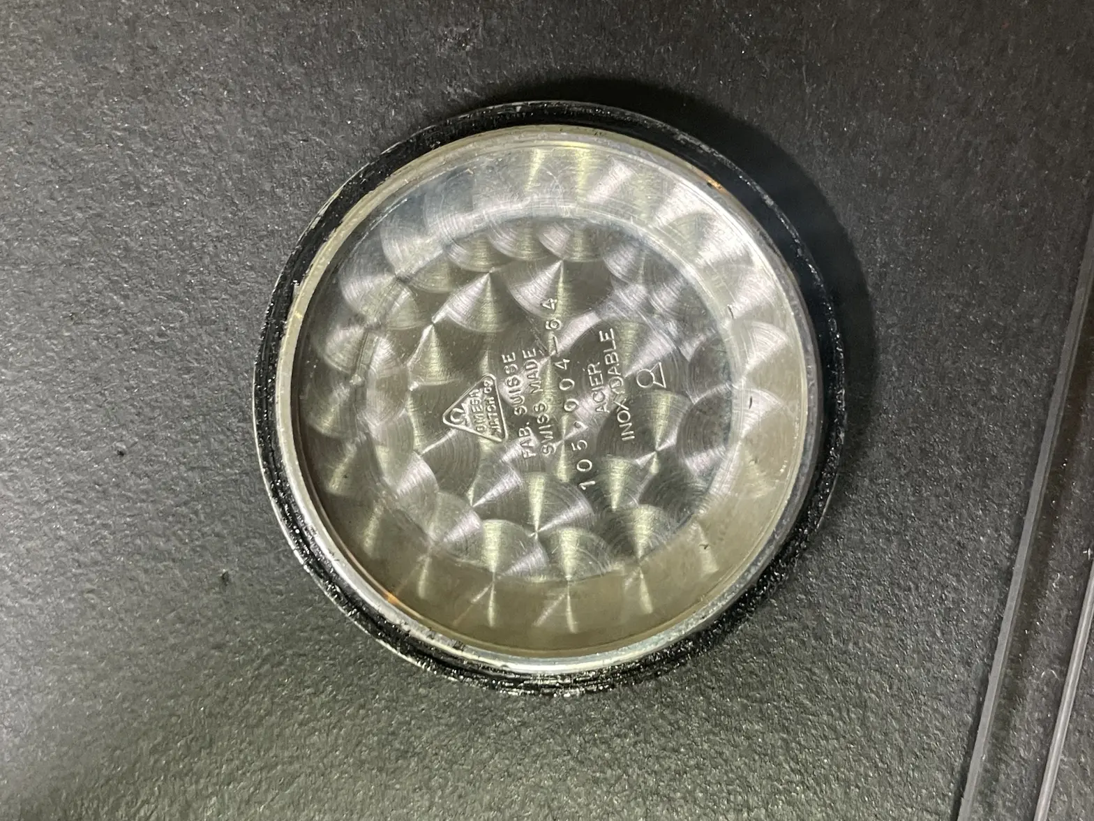
·any idea of the date of manufacture?
flqt-9000
·If the serial is 22m then 1965
- Posts
- 56
- Likes
- 29
njlam
·I am looking for a birth year 1960…what range should the s/n be?
Dsplash
·I would say high 17m serial based on the charts available
Sharp
·I'm pretty sure 18mm is correct for No.9 end links so you are good 👍
Risto
·Quite interesting that applied metal logo is a bit different than some of these ref have. With some of them the Omega sign feet are angled, some straight. Also, most of these do not have oval "O" in Omega text. But, probably these had both styles used... maybe. Not sure about that crown. Also, the arrow is sometimes more "filled" and another times "feathers" are more separated. What is correct...
