Forums Latest Members

Speedy production dates: an alternative to Hartmann's table?

  1. eugeneandresson 'I used a hammer, a chisel, and my fingers' Apr 25, 2017

    Posts
    5,005
    Likes
    14,661
    That's what I've read on the forum (big bin, random pick kinda thing). Might also make sense for the way things were done in the good 'ol days. But not sense for the way it's done for these days (any of you guys watch the Omega 'Metas' video?) ... 'you know nothing Jon Snow' ...
     
    SouthernScot likes this.
  2. WurstEver Apr 25, 2017

    Posts
    440
    Likes
    1,638
    Yep, that's about the size of it. I guess what motivated me to start looking at this was to try and determine exactly how random/predictable the process was. While there have been some really encouraging results so far that indicate the process might be reasonably predictable within certain constraints, it's very early days.

    One possibly interesting outcome is that we might see some change points in the data that suggest modifications of Omega's production or record-keeping processes (there's already a hint of this). So extract dates could be quite predictable for some periods and quite random for others. Or we might need separate curves or more complex curves as @eugeneandresson mentioned above. All good, geeky fun :)
     
  3. WurstEver Apr 26, 2017

    Posts
    440
    Likes
    1,638
    Holy smokes, that's a lot of extra data points! Thanks so much! Looking forward to adding these to the update. Indeed, thanks to everyone who has jumped in and provided data. If it turns out that we can predict production dates reasonably well using this kind of method (and I do think that's still an "if"), a web-based tool would be a great idea. Thanks for suggesting it, @kov! Let's keep in touch about that as things develop. Only time and more data will tell :)
     
    kov and SouthernScot like this.
  4. JMH76 Apr 26, 2017

    Posts
    88
    Likes
    152
    This is great work. I hope maybe this could be extended through the '90's so that all the 861's would be covered. Perhaps a separate regression would be needed for 45xxxxxx - 484xxxxx; a lot of changes were happening in the '92-'97 timeframe which could be better pinpointed.

    I also wonder if we could somehow associate production numbers with dates. Right now I know of only one point: a 2007 press release that said 330,000 moonwatches had been produced (by 2007). That's an average of 6,600/year. Given a s/n range of 14,000,000 to 48,340,000 from 1957 to 1997 that means only 0.8% of the serial numbers went to moonwatches. I've used that figure to determine how many watches might have been made in a given range of s/n's but I'm not sure how accurate that is since the production rate may have not been constant over 50 years. Is there anywhere public to get (or figure out) production data?
     
    WurstEver and eugeneandresson like this.
  5. JMH76 Apr 26, 2017

    Posts
    88
    Likes
    152
    WurstEver likes this.
  6. WurstEver Apr 26, 2017

    Posts
    440
    Likes
    1,638
    This is a great find! The updated data set should be ready soon (we now have n=60). Unfortunately, the data are still relatively thin on the right-hand side of the plot. But something is definitely looking fishy over there, so it's good to see there might be some clear explanations of what we should expect to see and what's driving the changes. Awesome stuff :thumbsup:
     
    m84 likes this.
  7. eugeneandresson 'I used a hammer, a chisel, and my fingers' May 3, 2017

    Posts
    5,005
    Likes
    14,661
    I have played around with the equation (i.e. direct copy/paste into a google sheet), and, AWESOME :) This definitely seems to be a very useful tool indeed, and I am sure with enough data points could surpass the tables.

    So, dear OF members...

    If any of you have a Speedy with an extract from the archives, could you kindly either post the info here, or if you really want to remain anonymous (which is 100% understandable), could you kindly send it along to the OP via PM?
     
    Edited May 3, 2017
    WurstEver and mr_yossarian like this.
  8. WurstEver May 4, 2017

    Posts
    440
    Likes
    1,638
    Yep, the more the merrier! Thanks to everyone who has contributed already. I have an updated data set (n=74) and model just about ready to go. Should be posted within the next 24-48hrs. We will be needing new cases to test the predictions.
    Now I just have to get this pesky day job out of the way for the week... :)
     
    Foo2rama likes this.
  9. SpeedyPhill Founder Of Aussie Cricket Blog Mark Waugh Universe May 5, 2017

    Posts
    5,883
    Likes
    11,013
    I like those OP numbers:
    Hartmann's table correctly predicted 16 of the 35 production years (46%). The linear model outperformed the table, correctly predicting 24 of the 35 production years (69%).
     
    eugeneandresson and WurstEver like this.
  10. WurstEver May 5, 2017

    Posts
    440
    Likes
    1,638
    Hi all! Thanks so much to everyone who has commented and contributed data. This is why OF is such a fantastic forum! Today I'm posting an updated data set that contains 76 serial number-production date pairs for Speedmaster Professionals in the 321-861-1861 family (up from 40 in the original data set). For most of these watches, I have a photo of the extract, so we can be fairly confident in the data. I have also developed an updated model on the basis of the expanded data and things are looking reasonably good :thumbsup: Bottom line up front: while this curve-fitting approach is nowhere near perfect, and it is still very much a work in progress, it does still seem to be a promising method.

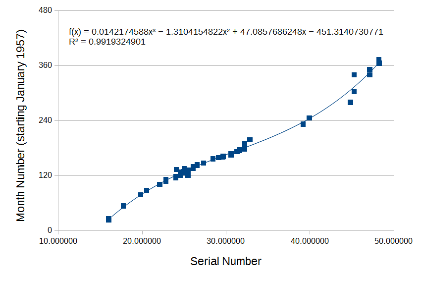
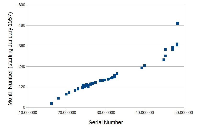
    The entire data set (n= 76) is shown in the scatterplot below...

    RawDataMay2017_76Cases.png

    As with the original numbers, there is a roughly linear relationship between serial numbers and production dates throughout the 60s and 70s. The slope is different on the far left (low serial numbers, early years) and far right (high serial numbers, late years) and there appears to be more spread (ie., the relationship is less predictable) in the later years. The two extreme cases from the original data set (watches with production dates in the late 1990s) can still be seen in the top right corner.

    With the exception of those two watches from the mid-late 1990s, it appeared that the entire data set might be reasonably well fit by a slightly more complex curve than I had used in the original post; as was suggested by @eugeneandresson. So, I removed those two cases - effectively reducing the sample size to n=74 and restricting subsequent model development to watches made before 1990 - and then fit the remaining data with a curve. A third-order polynomial yielded the fit shown below...

    ThirdOrderFitMay2017_74Cases.png

    This model could be considered an improvement on the original linear model in the sense that it fits the updated data set quite well (R^2=0.99) and it accounts for a wider range of production dates than the original model. It's possible though that by expanding the scope of the model, we might be sacrificing some precision. So of course the key question is, how does it perform relative to Hartmann's table?

    As with the first model, I used the new model to calculate a predicted month number (starting from January 1957) for each watch and then translated that into a predicted calendar year and calendar month using slightly modified equations from the ones I originally posted (which were generally fine, but turned out to misbehave a bit around December). I then compared the model's ability to predict production year with estimates derived from Hartmann's table. Across the whole data set, the new model outperformed the table. Overall, the model predicted just a touch under 70% of production years correctly (0.68), while Hartmann's table predicted around a half of the years correctly (0.51).

    Breaking things down by time, the model outperformed the table for watches produced between 1957-1969 (accuracy = 0.74 versus 0.6) and for watches produced between 1970-79 (accuracy = 0.65 versus 0.41). Both methods were pretty rubbish at predicting production years from serial numbers between 1980-89, but the model still outperformed Hartmann's table (accuracy = 0.29 versus 0.14; just two correct versus one correct respectively). As the thread that was found by @JMH76 suggests, something seems to have changed in the mid-80s and there's probably more work to do to get acceptable accuracy during that period.

    The model and Hartmann's table agreed on production year about half the time (0.49). When the two methods agreed, that estimate was correct 75% of the time. When the two methods disagreed, the model was correct 60.5% of the time, Hartmann's table was correct 26.3% of the time, and both were wrong 13.2% of the time.

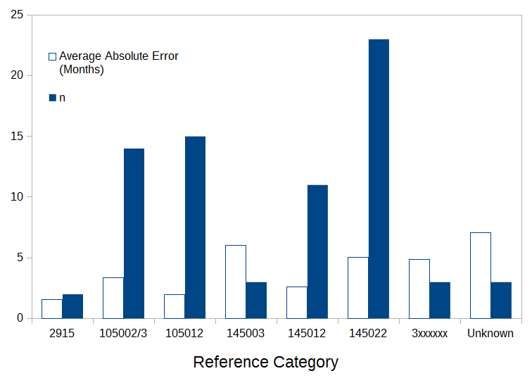
    Regardless of the specific equation that is used, a benefit of the curve-fitting approach over the table is that it enables finer-grained prediction (eg., down to the month). So how did the new model fare in predicting production month? Across the whole data set, the average absolute error was just 3.71 months. However, the maximum error was a far-less flattering 26.74 months (!!!) for a watch with a 4481xxxx serial number that was produced in April, 1980. The updated model predicted July, 1982 for this watch; Hartmann's table did even worse, estimating that the watch was produced some time in 1983. The next worst error from the model was just under half of this. Broken down in terms of time, the average absolute errors were 2.61 months, 7.28 months, and 4.59 months for 1957-69, 1970-79, and 1980-89 respectively. Broken down in terms of references, we get the following ...

    AveAbsErrorByReferenceMay2017_74Cases.png

    Average absolute errors from the model were generally less than 6-7 months, which is an OK outcome.

    What can we conclude from all of this? Well, we shouldn't read too much into attempts to validate a model using the same data set that was used to derive it. We need new cases. Ultimately, the process might just not be quite simple enough to be characterised by a curve of this kind across all relevant time periods/references and we may have to augment the model with other information. However, on the positive side, there's nothing in the updated data that invalidates the general approach. There's probably still fruitful ground here.

    In the interests of error checking and to enable folks to try this out for themselves, here are the updated calculations (where x is the serial number in the form xx.xxxxxx and z is the predicted month number):

    Predicted month number (z) = (0.0142174588*(x^3))-(1.3104154822*(x^2))+(47.0857686248*x)-451.3140730771
    Predicted calendar year = 1957+ROUNDDOWN((ROUND(z-1))/12,0)
    Predicted calendar month = MOD(ROUND(z-1),12)+1

    BREAKING NEWS: Yesterday as I was preparing this post, I was sent a list of 18 new dates and partial serial numbers, mostly from watches in the early 70s with serials in the low 30 millions. I tested the new model against these numbers and both the table and the model performed poorly. Indeed, sadly, for the first time, the table slightly outperformed the model :confused: I'm corresponding with the member who sent me the data to see if we can figure out what might be driving this poor performance.
     
    D.D., BartH, abrod520 and 5 others like this.
  11. Foo2rama Keeps his worms in a ball instead of a can. May 5, 2017

    Posts
    17,303
    Likes
    25,629
    I'm curious how this works out I have a high serial -76 with the early dial from the -74. My understanding was this was the period 68-74ish where the table breaks down.

    As 76 is my birthyear I've been a little hesitant to get the extract working under the assumption that serials where not consecutive in this period with the assumption that the early dial variant denoted 1976 production.
     
    Banner Roar and WurstEver like this.
  12. eugeneandresson 'I used a hammer, a chisel, and my fingers' May 6, 2017

    Posts
    5,005
    Likes
    14,661
    Hey @WurstEver, WOW. Many thanks for your time and effort in this research, as well as the professional presentation of your results. I wonder how many members realize that many of the science-tech products in the world today have important parts that are created/presented/applied in a similar way to what you are doing here :thumbsup:...

    I have absolutely nothing to add that could be of assistance to you, you are doing a great job. All that's required now are more data points (just PM'd you one more).
    Only other suggestions I have (but you have most likely thought about this) is if/when enough points arise for the higher numbers (the mid-80's+ where things change from linear to polynomial), depending on how much chaos it is (due to Omega doing some funky stuff), separating the data and making it a multiple equation solution (that has serial number regions) might give 'more fruit'/'better overall accuracy'. At this point, perhaps @kov 's hosting offer might be appropriate for easy use by other members :) I am sure the OF Mods could also be of assistance...I am fine using a sheet...

    Of course, there will always be an error with this approach (n = infinity for the curve to go through every single sample) due to the human chaos factor, but so far it seems very reasonable.

    More info on your 'breaking news' please! Maybe the provided data is wrong ::bleh::
     
    WurstEver likes this.
  13. WurstEver May 14, 2017

    Posts
    440
    Likes
    1,638
    Given the saying "All models are wrong, some models are useful", I don't think it's likely that the data are at fault here :)

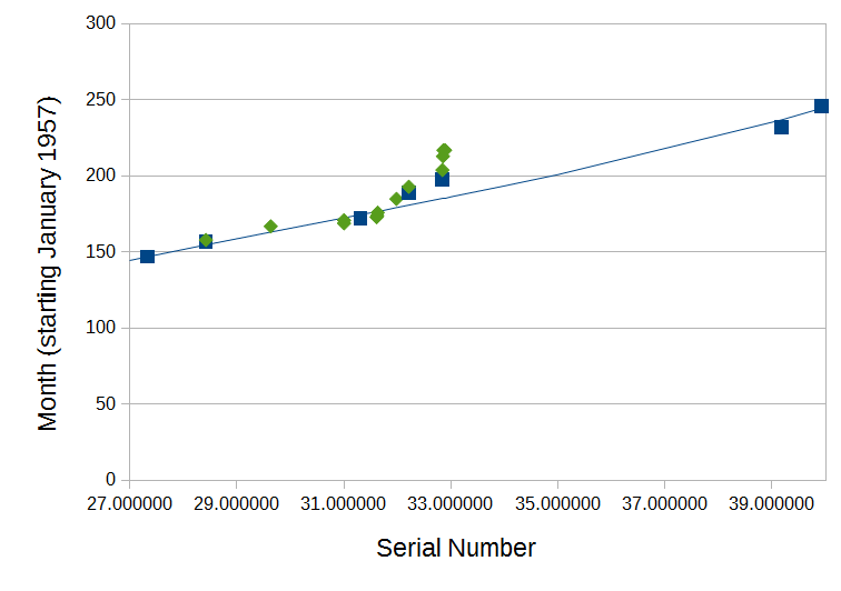
    After a busy week, I've had some time to look at the data that didn't quite fit the model. Thanks very much to @Banner Roar for his help in contributing those new numbers. The manner in which the new numbers departed from the predictions of the most recent model is potentially really instructive. The plot below shows a 'zoomed-in' view of the model (blue line) and existing data set (blue squares) with @Banner Roar's data added (green diamonds). Unless you look closely, you might mistake the model for a straight line because only a small segment of the curve is shown. It's actually the third-order polynomial curve from the post above.
    BannerRoarModelFitZoomedIn.png
    There are some interesting take-aways from this plot: First, the data sets corroborate one another quite well. Second, the model performs well for about half of the new observations. Third, the new data extends on a trend away from the predictions of the model around Month 200 (mid-1973) that was hinted at in the existing data. This is reflected by the slightly-right-leaning vertical column of points in the middle of the figure. Third, and perhaps most interestingly, when one looks at the actual numbers in the column, it appears that the process continued in a roughly sequential manner (ie., higher serials tend to be associated with later dates), only much, much more slowly. That's what gives it a lean. This does not look like simple random noise. It looks like a pronounced, but short-lived slowdown in production. And that kind of thing can be modelled :) (@Andy K, you'll recognise this kind of right-leaning column of points, right?)

    Based on the existence of the slightly-later observation with a much larger serial number that falls right on the curve, it's possible that one of two things happened after the slowdown: either production sped up again significantly (ie., the curve flattened) between about January 1975 (the topmost green diamond) and April 1976 (the next blue square over to the right), or there were some serial numbers that were skipped. This is testable, which is always good!

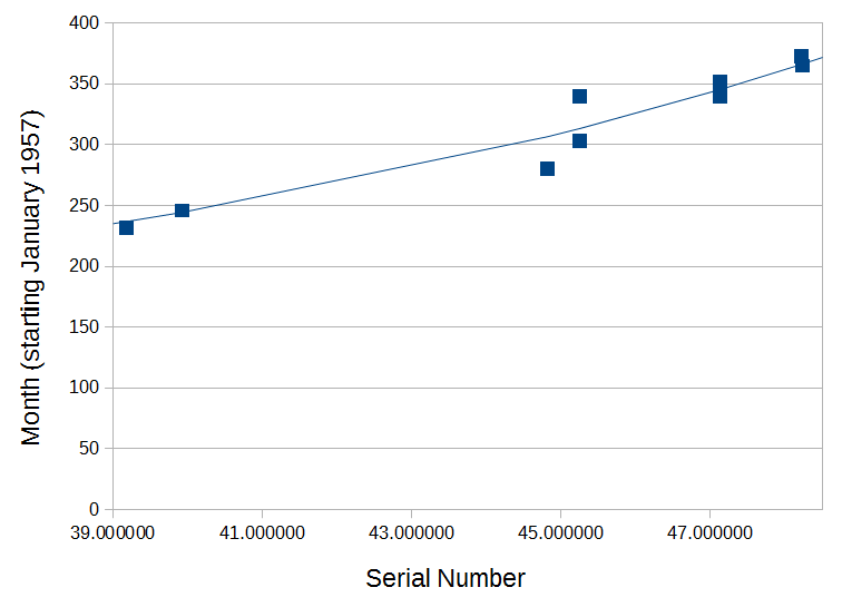
    This is not the only "Brief Lull in Production" (BLIP) :) shown in the data. The existing data hint at another similar event around month 300 (December 1981) for serials around 44-45xxxxxx (see the scatterplots in my post above). A zoomed-in version of that part of the existing data set is shown below. In this case, the predicted values (blue line) shoot right down the middle of the vertical column of points because they were in the data set that was used to derive the model.
    MidFortiesSlowdownZoomedIn.png
    Again, this column leans sequentially to the right and suggests a slowdown in production, rather than simple random noise. Based on the existence of the next point to the right after the column it's possible that production either rapidly ramped up again, or a range of serial numbers were skipped.

    So how should we account for the BLIPs in making our predictions? Well, so far it looks like they are relatively few in number and relatively short lived. Also, the data seem to suggest they might have a similar shape: an accelerating curve on the front end and a relatively flat return to baseline on the back end. And importantly, the BLIPs appear to be reflective of a slowdown in production, rather than simply being the product of an increase in randomness in the process. So it may be possible to apply the underlying model to most cases, then model the BLIPs separately, using a different set of rules within those specific serial number ranges. Of course, this could also be a case of (over)fitting ad-hoc curves to a small sample that is not representative of the population! That would be bad. Food for thought :)
     
  14. JMH76 May 14, 2017

    Posts
    88
    Likes
    152
    Another way to do this would be to just publish an excel table of the data and then have a cell where you enter the s/n and a preset lookup formula then interpolates a resulting date. No need for a formula this way.
     
    WurstEver likes this.
  15. WurstEver May 14, 2017

    Posts
    440
    Likes
    1,638
    G'day there! Unless I'm mistaken I think we're actually pointing in the same direction. In order to interpolate the date for a watch that was not in the original dataset, we will need to apply a rule based on what we know about the relationship between serial numbers and dates in general, right? I think this rule is what you refer to as a "preset lookup formula"? If so, then we are in luck: I have one of those :) Actually I have two, but the second is probably more useful than the first.

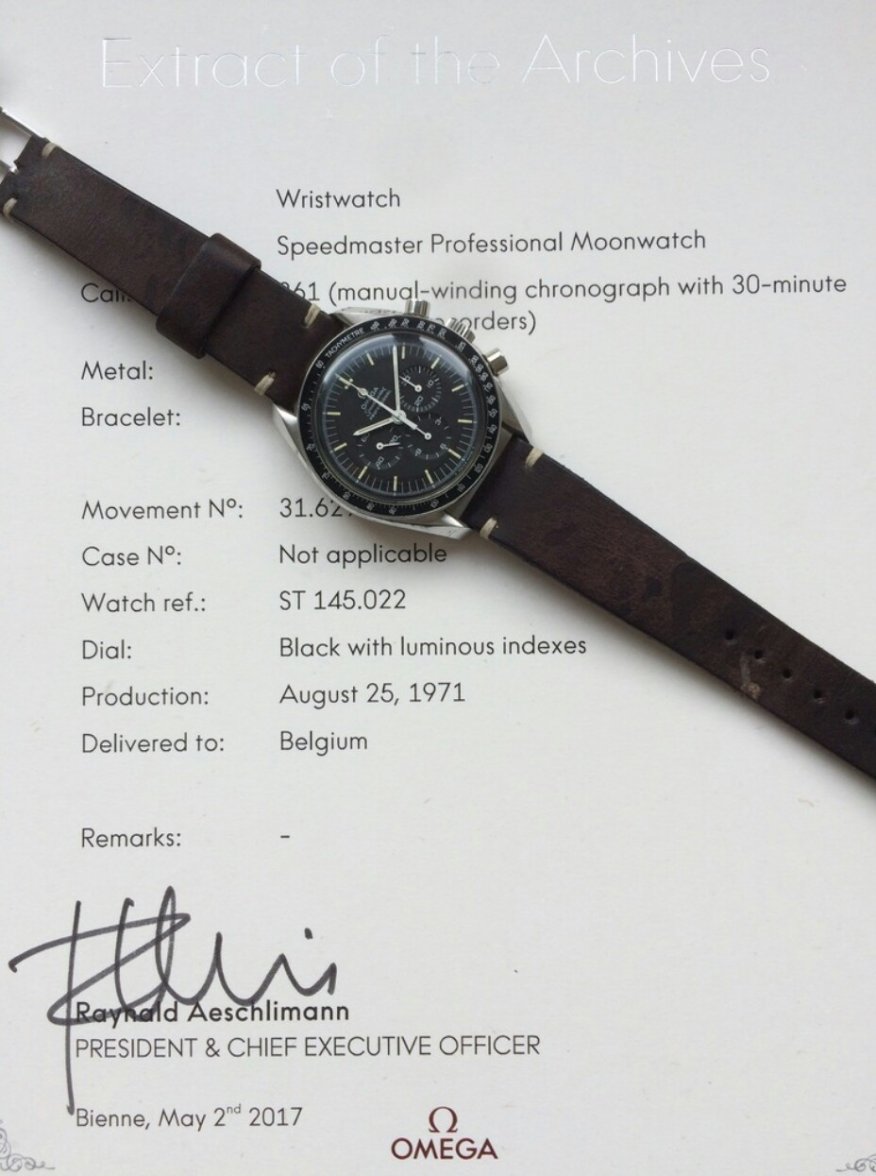
    By way of example, here's a watch that was posted for sale just a few hours ago...
    _20170515_062239.JPG
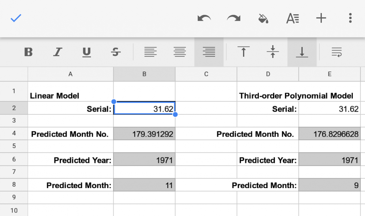
    This watch has a serial number beginning with 3162xxxx. If we didn't have the extract, we could use the models in this thread to predict the production date. I have a little spreadsheet with the equations from this thread all set up for this...
    Screenshot_20170515-061245.png
    So the earlier linear model estimates a production date for that watch of November, 1971. The updated third-order model estimates September, 1971. Because we have the extract, we know that this latter estimate is just one month off. Now, that's pretty good, but it's not perfect and there are other watches where the model misses by a large margin. So there's still work to be done.

    Does this seem similar to the approach you were thinking of? Maybe I've misunderstood? I'd be very keen to hear suggestions for other ways to go about this and I'd be more than happy to post the data set so that others can have a go at developing different methods or tweaking this one. If we can improve on the table, it's all good :thumbsup:
     
    BartH likes this.
  16. JMH76 May 14, 2017

    Posts
    88
    Likes
    152
    I was thinking a simple linear interpolation might be good enough. A VLOOKUP will find the nearest value which is the same or lower. An interpolation between that result and the next higher datapoint can easily be done. Arrange your data like this:
    Col A. Col B. Col C
    s/n1. Date 1. S/n2.
    S/n2. Date 2. S/n3.
    S/n3. Date 3. S/n4.

    With this arrangement you can find the s/n's and dates on either side of the point you want to know. A simple linear interpolation can then be done.

    If the data points are reasonably close a curve isn't needed. Your first linear formula worked well so linear interpolation would work reasonsbly well over most of the range. The accuracy will depend on the spacing of the points. Where your curve is relatively flat fewer is ok but in that area where it curves a lot closer datapints are needed. It looks like you do have close points in that 45 million area that curves heavily.

    It's the equivalent of just drawing straight lines between each point.
     
    eugeneandresson and WurstEver like this.
  17. JMH76 May 14, 2017

    Posts
    88
    Likes
    152
    The closer the known points, the more the straight lines will approximate a curve without actually having to do a curve fit.
     
    eugeneandresson and WurstEver like this.
  18. eugeneandresson 'I used a hammer, a chisel, and my fingers' May 15, 2017

    Posts
    5,005
    Likes
    14,661
    As they say gents, there are a million ways to skin a cat (with the end result being the same, a skinned cat) :) Don't get me wrong, I totally dig cats (my avatar is proof). Nice to see this going forward. It would appear that @WurstEver wants to reach a month granularity with his lookup :thumbsup::thumbsup::thumbsup:

    That would be awesome...but IMHO so far so good.

    My 2c : either approach (linear interpol between 2 nearest points or using curves) will all yield similar minor inaccuracies at some point in time : in some place the curve might approximate the random distribution of points at a particular period better than the straight line, and vice versa. Especially when new 'non fitting' points appear as a few weeks ago...those might be better done with a curve.

    2 more things worth considering : There could be 3 separate approaches implemented. 1) And then, like Mission-critical decision-making software, a 'vote of 3' could be done for the final answer. Or 2) averaging applied using the results of all 3.
     
    WurstEver likes this.
  19. WurstEver May 15, 2017

    Posts
    440
    Likes
    1,638
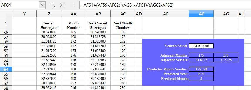
    Hey thanks! I don't recall ever having played around with VLOOKUP, but if I am understanding correctly, this could be a very nice way to go about it. Assuming I've implemented the approach properly, it certainly seems to give a good result for the new watch I posted above!! ...

    VLOOKUP.png

    Very nice indeed :thumbsup: (at least the outcome is nice ... the implementation probably leaves a lot to be desired!)
     
    wsfarrell and eugeneandresson like this.
  20. WurstEver May 15, 2017

    Posts
    440
    Likes
    1,638
    Great suggestion! It would be interesting to know which approach to combining the results tends to yield more accurate results. So far, it seems that at least when the table and the polynomial model disagree, the model is more often correct. It will be interesting to have a good look at this linear interpolation approach in the same terms. As you say, it's bound to have its pros and cons.

    Awesome stuff! Still lots of details to lock in, but one way or another it's starting to look like the table is TOAST! :D
     
    eugeneandresson likes this.