- Posts
- 2
- Likes
- 0
paulm
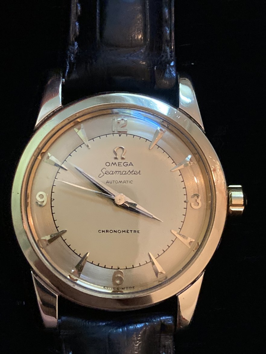
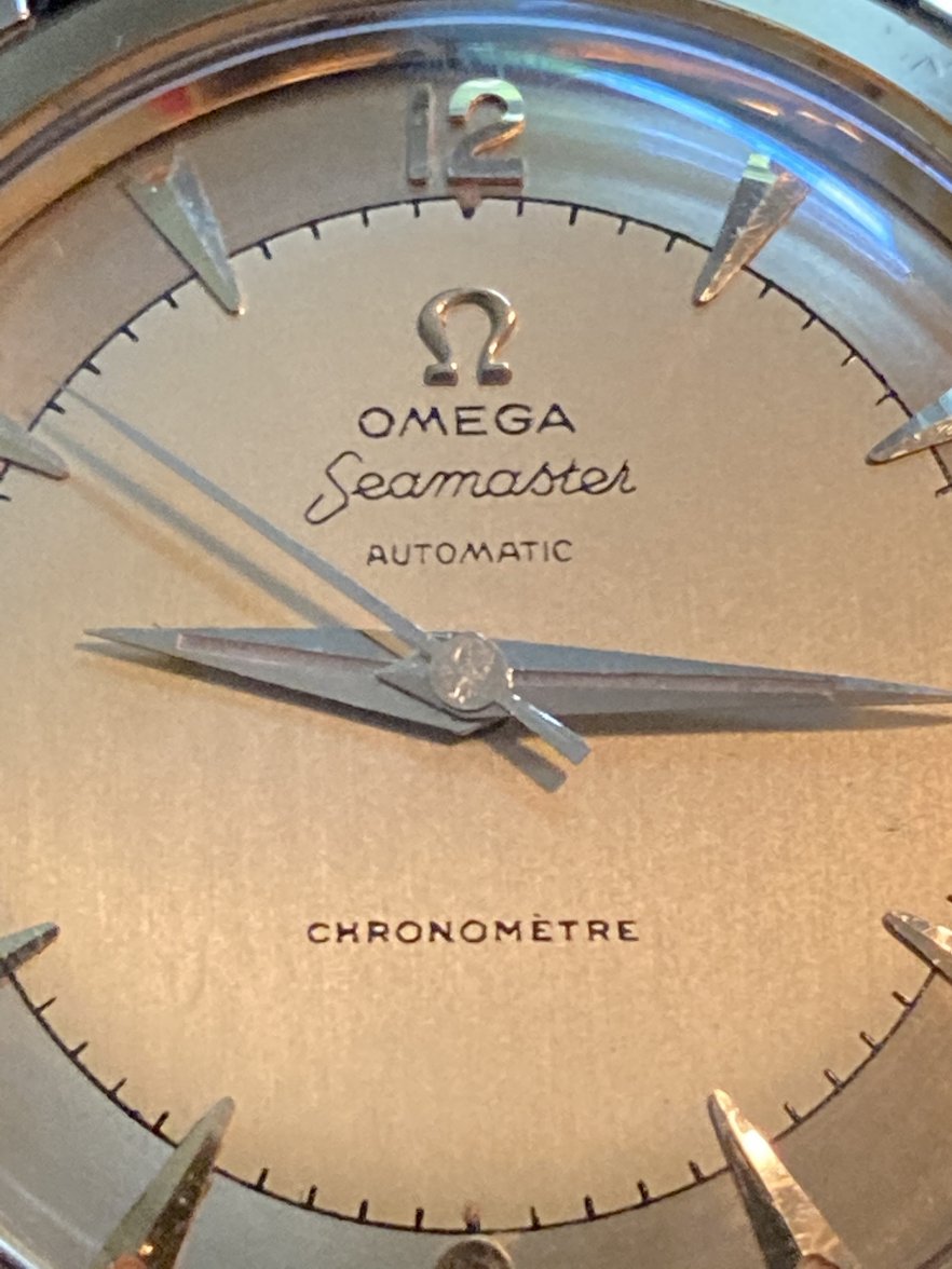
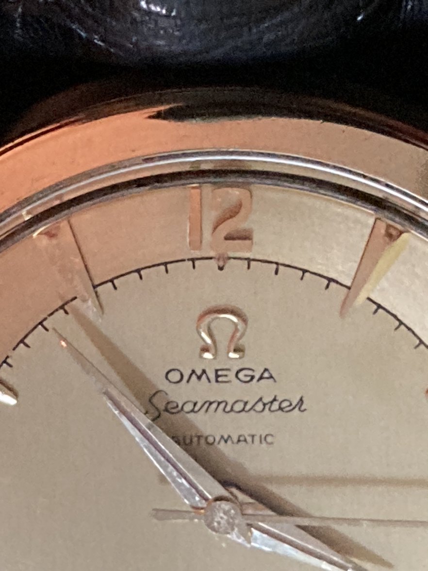
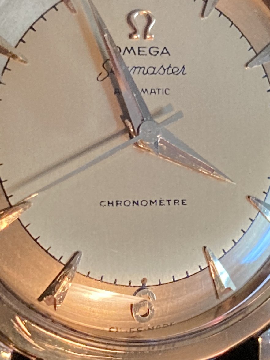
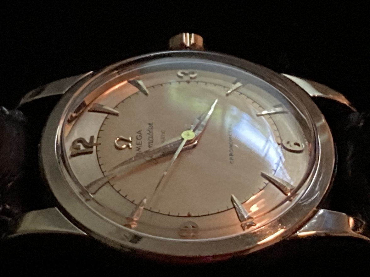
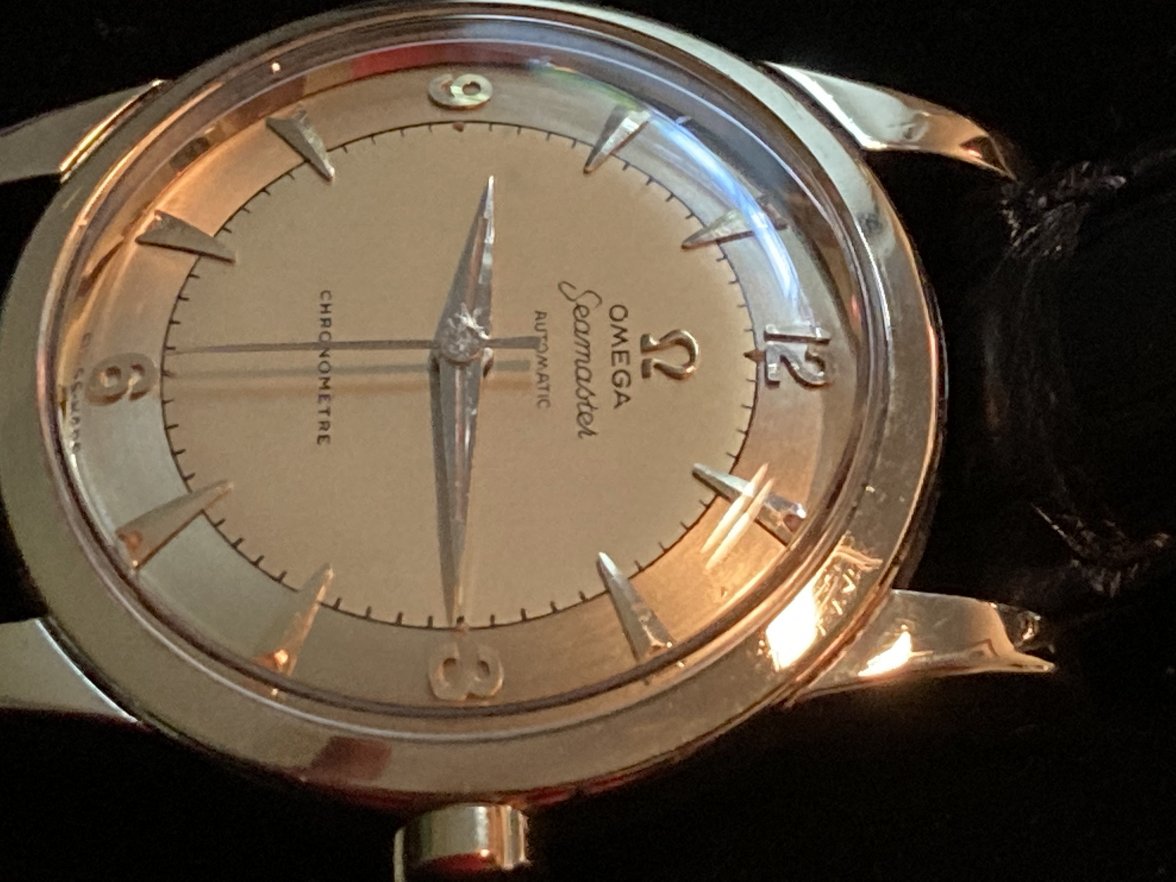
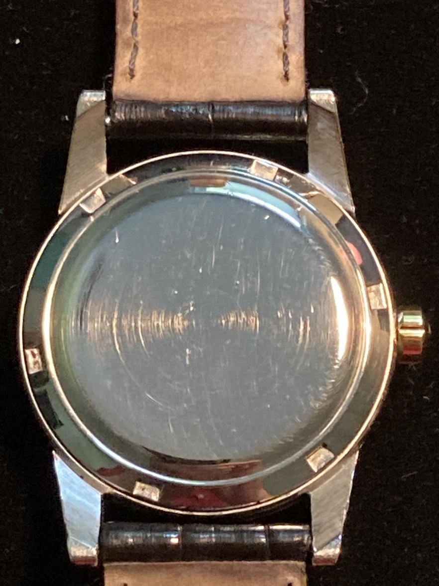
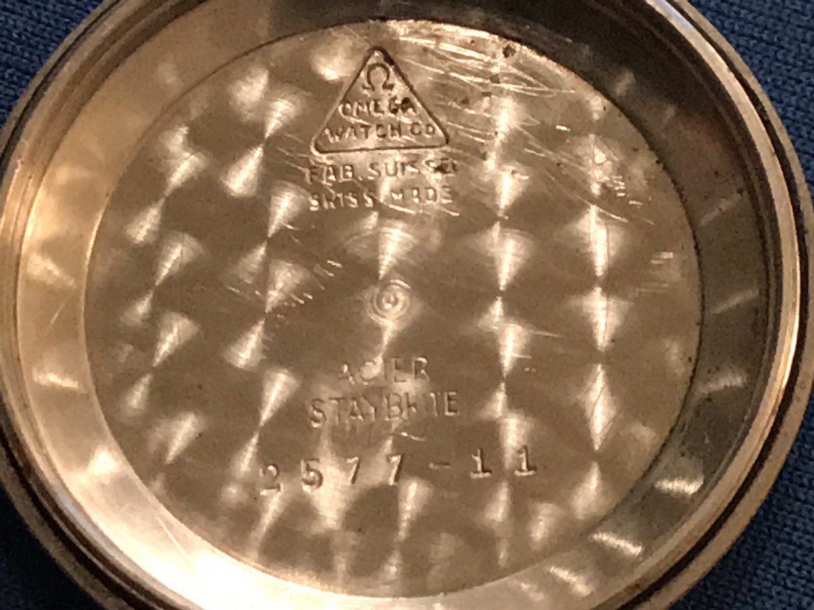
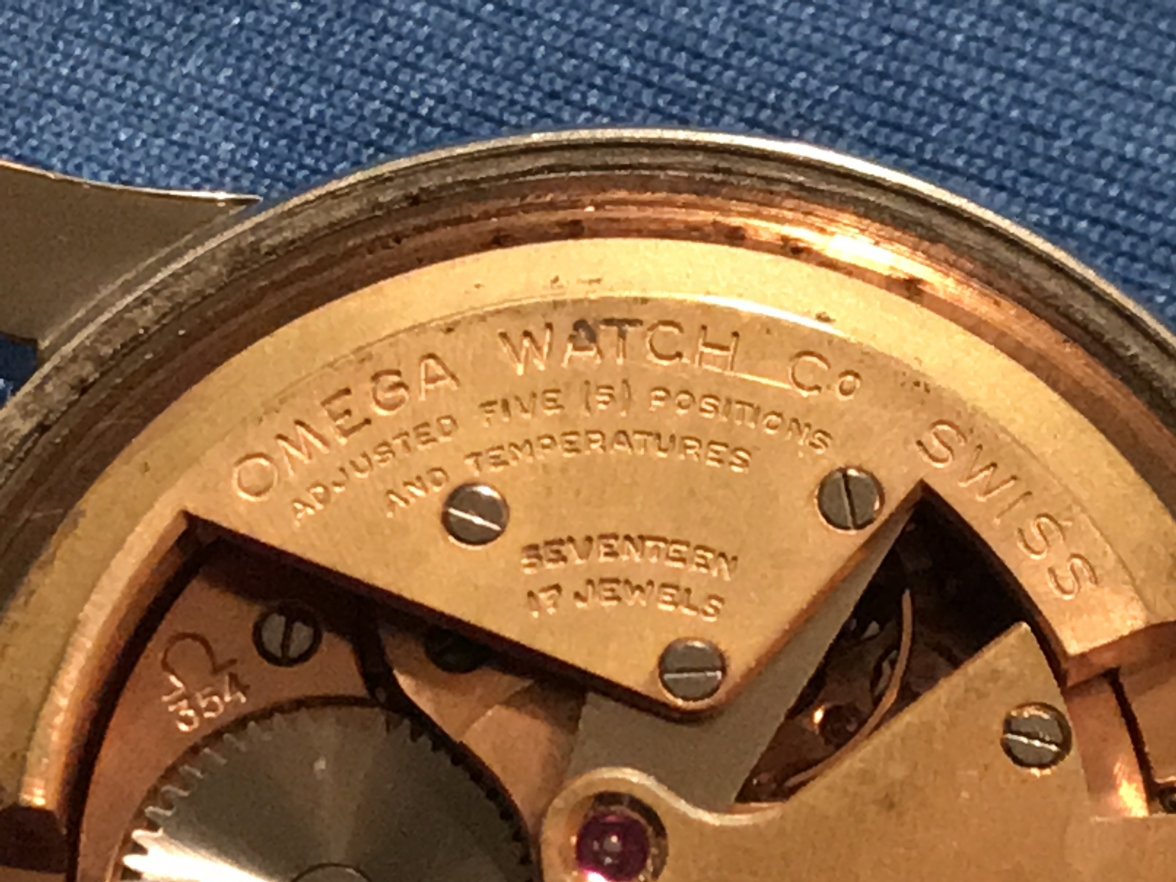
·Hi, everyone. I'm new to OF and looking forward to what any of you can share with me about this watch's dial. I bought the watch a little over 20 years ago; my second vintage watch purchase, found on a Seattle jeweler's website. (Not the savviest watch buyer at the time, but there you go.) About a year later, the crown and stem needed to be replaced. As the photos show, the movement is a cal. 354 chronometer in a yellow gold-capped 2577-11 case. It has a low 14,0xx,xxx serial number dating it to 1954. Some of you will recall that in that long-past era, Omega was generous with requests for information from their archives about vintage watches. A simple email to Customer Service netted me the information, gratis, that the watch was originally sold in Colombia, South America. So that was cool. Although it can't be seen in any of the photos, the Ω symbol is etched into the crystal above the second hand pivot. Now, about the dial. Under a loupe, and I hope in the photos, it looks to me like old lume in the open ends of the shark tooth markers and the pips at 12, 3, 6, and 9, and to me the application looks too good and uniform for a refinished dial. There is also old lume in the H and M hands. I worry, however, that because "Officially Certified" is not on the dial, "Seamaster" is above the hands, and "Chronomètre" is below the hands the dial is definitely not original. But then I also wonder whether there aren't original dials with this variation. Thus, I come to OF. Thanks.