Please consider donating to help offset our high running costs.
Not original - the Seamaster font is incorrect. Definitely high quality print, though.
Agree, very high quality.
To me it is the "SWISS MADE" that is the immediate red flag.
As redials go, that's a damn good one.
Did you mean incorrect fonts or there should not be "SWISS MADE" wordings?
Freaking good redial indeed
Imagine what it must have been like to have been able to get one of these brand new, back in the day😲. As a collectable piece it's not good, re dial, polished etc. but a as a restoration, it would be a lovely watch to wear, I think.
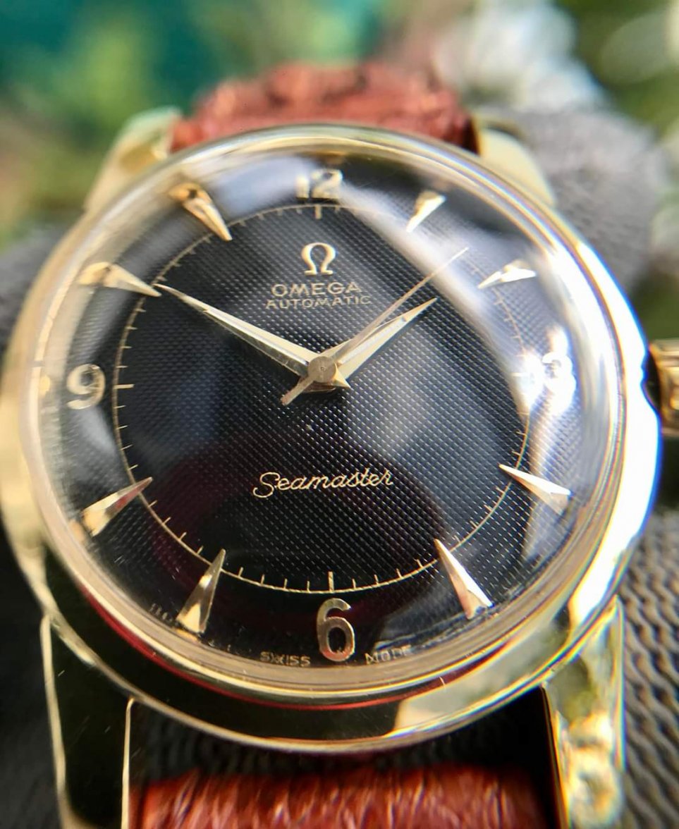
I believe "S" letter in Seamaster should be a coat hanger to be period correct (on 40-50s era Omega watch). If the redialer is capable of such a remarkable job why did not he (or she?) reproduce this coat hanger?
I agreed with @BAJJ about this is a nice looking watch for wear although not suitable for collectors.
On a sidenote, based on high quality print I wonder if by any chance this dial has been "factory restored" by Omega... or even this is simply a service dial?
I alread asked here on OF about a dial of a 50s era Seamaster. There is the same "mistake" related to coat hanger on "Seamaster" font. Below is the photo of the other Seamaster I bought locally here in Vietnam (cal 355 in stainless steel case)
Sorry for my bad English 😀
Not so. There are plenty of 40s and 50s Omega with rounded S Seamaster script. They were used alongside the coat hanger style. The S shape does vary though and the one in the OP watch looks more like that used today maybe.