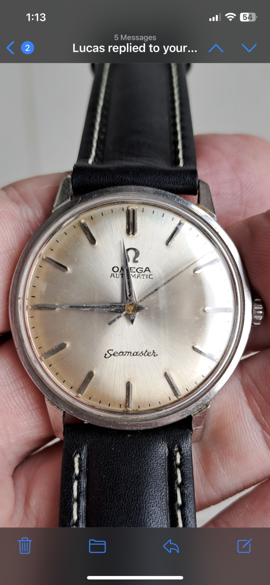
Hi, new here and to vintage seamasters so excuse my ignorance. I worried this isn’t original? My concern is the font. The S and the E are joined and I can’t find any images of any seasmasters from this period where the font looks like this?
Every time I see a pristine silver sunburst dial on a vintage Omega I'm immediately suspicious.
This isn't the worst re-dial we've seen, but it's not very attractive with Seamaster in that font.
Hi, new here and to vintage seamasters so excuse my ignorance. I worried this isn’t original? My concern is the font. The S and the E are joined and I can’t find any images of any seasmasters from this period where the font looks like this?
The "A" for OMEGA looks like it's screaming for help haha.
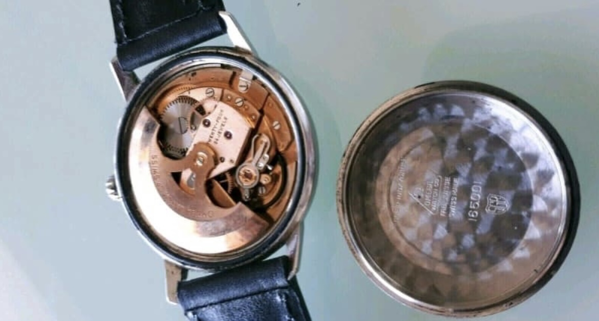
No reason to accept a redial on a common model. Certainly a pass but finding a decent one at a reasonable price should be fairly straightforward with a bit of patience.
Just to pile on and maybe help with future prospects lots wrong with this:
Omega and automatic uneven and wrong
Seamaster the s is wrong and r is big
There is lume on top of swiss at bottom
The minute markers are different lengths and thicknesses
Seamaster curves
Omega slopes down to right