Seamaster 300M Legibility

Posts
2
Likes
0
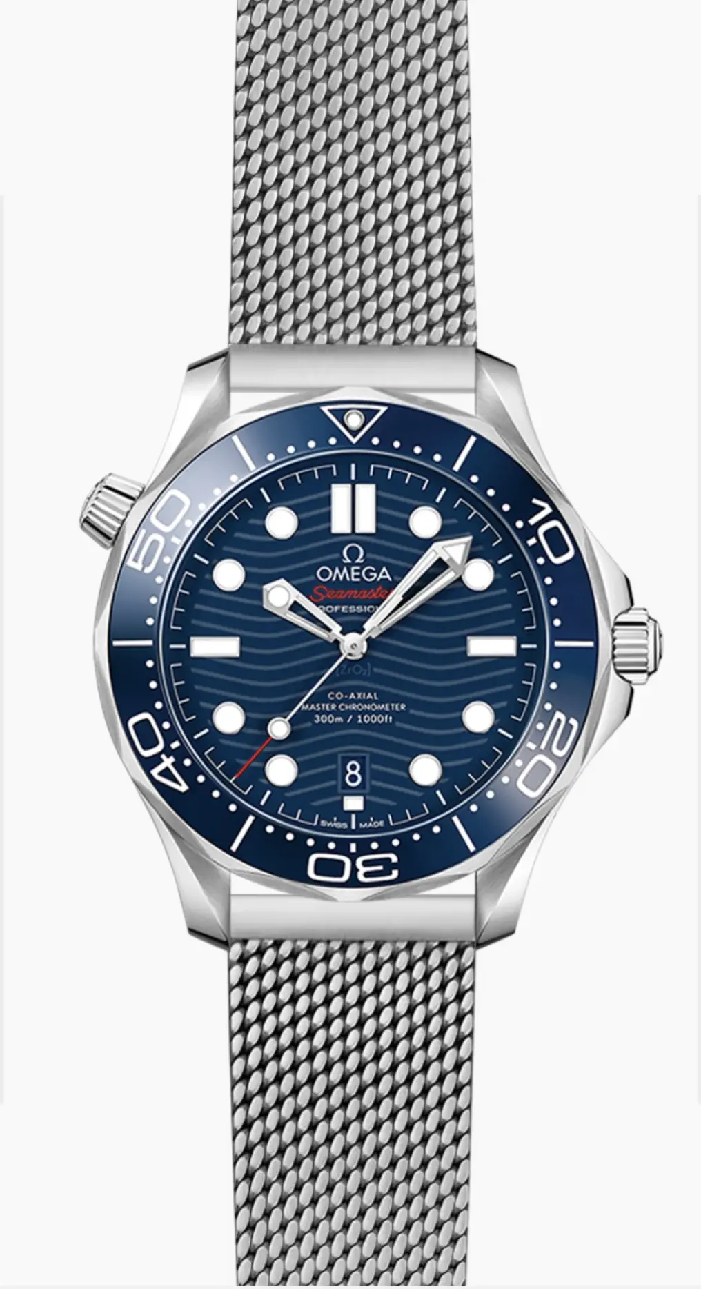
Hello everyone, I am trying to decide the color for my first Seamaster, was instantly drawn to the blue and chrome dial versions, for those who have experienced both, which would you say has better legibility? Because it is an important factor for me. I would have gone for the blue without a second thought if it wasn’t for the splashes of red on the dial.

 
Posts
2
Likes
0
The Blue dial IMO is far more legible in person, black dial and green dial are also very good. The silver-grey dial, brushed grey and NTTD all look very good too but not as legible.

The one that is the best of all though, is the 60th anniversary Bond with the vintage style wave dial which I wrote about here: https://stories.omegaforums.net/jam...ry-omega-seamaster-300m-diver-with-wave-dial/
Thank you for the reply and clarification.

I love the 60th Bond watch, it is my favorite blue and overall design Omega has done, but because there is the number ‘60’ at the 12 position instead of the usual triangle and pip, to me it looks like a prop more than a professional dive watch and I can’t get past that.

I’ll probably have to wait for a new seamaster 300 just like the 60th bond but without the branding.
 
Posts
1,070
Likes
1,150
I have the white dial/black bezel 300m that is REALLY legible. White is a bit polarizing though.
 
Posts
215
Likes
272
There are varying degrees of legibility but the only 300M that I've found to have the absolute worst legibility is the black on black model with the ceramic case and all greyed out dial, hands and indices.
 
Posts
33,130
Likes
37,868
I have the white dial/black bezel 300m that is REALLY legible. White is a bit polarizing though.
Yea that's a really good suggestion too, that one is probably one of the least seen variants but it's a really nice option too. I think the biggest factor is the white dial hides the wave pattern a bit by reducing its contrast and that helps for sure. The lines between the waves create a bit of visual distraction on some of the dials and the more verbose they look the harder it can be to see.

The America's Cup White dial is probably even slightly better than the regular white dial with its different coloured hands: https://www.omegawatches.com/en-au/watches/seamaster/diver-300-m/america-s-cup-edition/product
 
Posts
77
Likes
54
I've got both the watches you reference in your OP. I've also got the NTTD and Bond 60th and have owned black, white and green dialled variants of the Diver 300 in the past. Of the two you have picked out it is definitely the blue dial for legibility. I would say overall however for me the white dial is most legible although my least favourite of them all.
 
Posts
867
Likes
889
For a first Seamaster I really would go with the blue model. It's the iconic color and has been for 30+ years. Kind of like the Rolex Submariner's iconic color is black, the Seamaster's iconic color is blue.

And it's more legible too. Win-win.


(writing this with a blue Seamaster on my wrist--the Brosnan Bond Seamaster, 2531.80)
 
Posts
670
Likes
3,184
I’d go with the blue or black for the classic look. Can also look back at the 2254.50 model and the one after that with the black/blue gloss dials. All of these are legible and great first seamasters
Edited:
 
Posts
132
Likes
104
Both the standard blue and grey dial SMP 300M diver look great. The splash of red on the blue SMP 300M is a homage back to the the SMP 300 2220.80 worned by Daniel Greg in his 1st outing as Bond. The grey dial and blue bezel has a nice contrast, which I did consider buying before Omega released the Summer Blue SMP 300M diver(yes, before anybody says anything, I have to give a shout out to the Summer Blue SMP 300M diver😂🤣) . That said you can't go wrong with either of these SMP 300M divers. My advice go into an Omega Boutique and try them both on, whichever one you think looks good on you. Go for that one. As the pictures of the Omega watches don't do them justice, they look far better in the person than they do in pics or videos