Seamaster 2938, buy or bye bye?

Posts
733
Likes
1,457
Hello

I am considering purchasing this Omega Seamaster ref. 2938


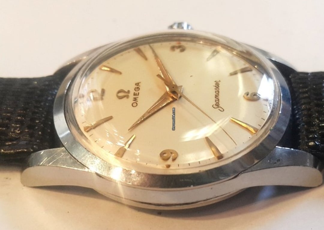
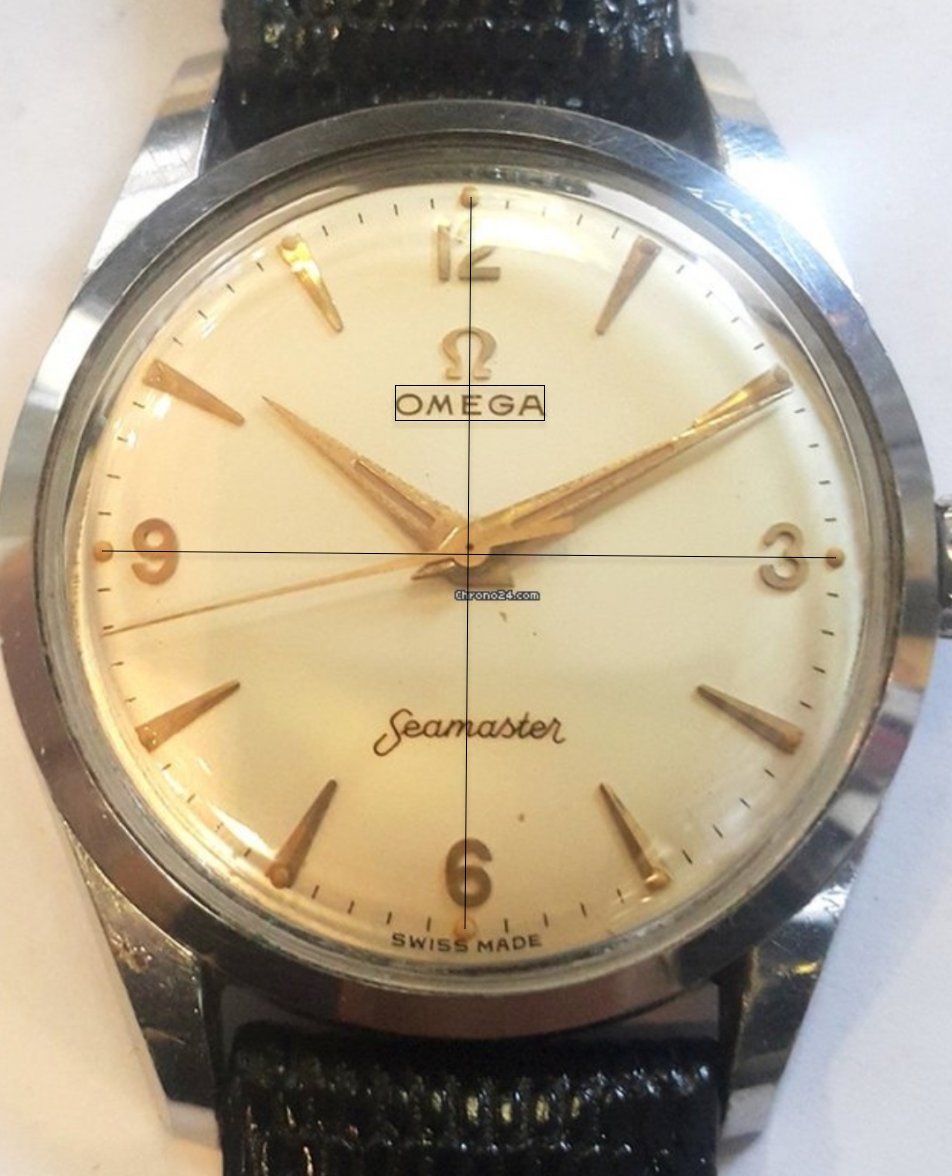
Dial seems to have patinated nice cream color. A few spots. Dial printing seems good quality and the lume plots seem to be intact. Font and typeface looks to be ok to my untrained eye. 👎

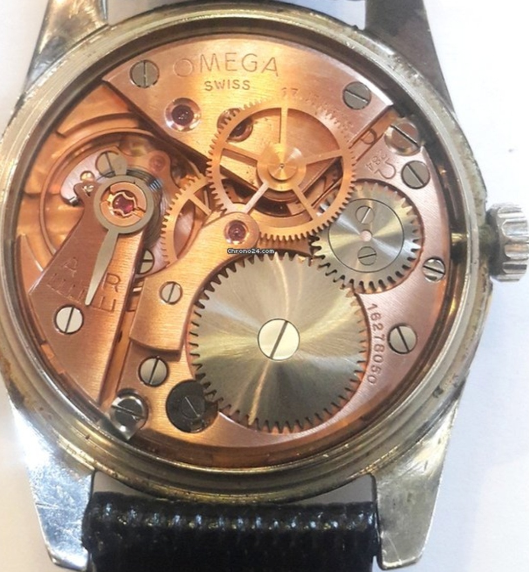
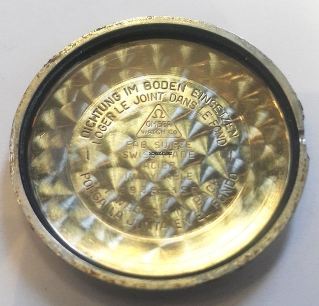
Case is sharp and not polished and the movement is the correct 284 and the movement is in my opinion in good condition.

I would kindly ask the more experienced members of the OF family if I am missing something? And does this look ok? Experiences with this reference?

I am hoping this could be one of my trusty daily wearers.

So in your opinion; buy or bye bye? Asking price 650€ + shipping
Edited:
 
Posts
163
Likes
221
While we wait for the more experienced members to chime in, my rookie assessment which may be absolutely wrong, is that the printing on the dial doesn’t seem to be 100% right, the writing seems too fresh but maybe I’m wrong.. also the M in Omega looks like it’s not symmetrical.

I see no issues on the movement, as per pricing if my assessment on the dial is correct I just wouldn’t touch it

Best
Dootcho
 
Posts
1,485
Likes
5,718
That dial looks gorgeous, and I do not think it is refinished. Case is unpolished, I would go for it.
 
Posts
399
Likes
711
OMEGA does not look centered under the logo, at least to my eye......
 
Posts
1,485
Likes
5,718
OMEGA does not look centered under the logo, at least to my eye......

Please have a look at my heavily patinated and guaranteed original ref. 2638 dial. Note the Ω logo relative to OMEGA and compare.

 
Posts
2,326
Likes
1,884
Well, I'll be dipped. My original dial Seamaster currently on the list, that E is "offset" too.

Tom
 
Posts
399
Likes
711
Please have a look at my heavily patinated and guaranteed original ref. 2638 dial. Note the Ω logo relative to OMEGA and compare.

Script on yours looks different than OP also. Should it be the same?
 
Posts
1,485
Likes
5,718
Script on yours looks different than OP also. Should it be the same?
To my eyes, the fonts are identical, but the script on my watch is faded.
 
Posts
733
Likes
1,457
To my eyes, the fonts are identical, but the script on my watch is faded.

I agree.I my opinion the script looks very very similar if not identical. Additionally the placement seems to be the very much the same with that everso slightly offset E.
 
Posts
5,399
Likes
8,439
I'm not sure about the originality of the lume
 
Posts
399
Likes
711
The "mouth" of the G on Felsby's is much wider than that of the OP's. Not suggesting that makes it a redial, just an observation.
 
Posts
7,641
Likes
26,491
I am not expressing an opinion on the subject watch, but would like to remind everyone that dial manufacturing was outsourced, and not always to the same companies. One should never expect high production models to necessarily have identical dials.

Again, I have no opinion on the OP's watch, but subtle differences between dials are not always indications of a lack of originality in one or the other.
 
Posts
2,326
Likes
1,884
Again, I have no opinion on the OP's watch, but subtle differences between dials are not always indications of a lack of originality in one or the other.

I agere. I have a KX 6275, a "Seamaster Calendar" and where Calendar appears below Seamaster varies greatly.

Tom
 
Posts
733
Likes
1,457
Thanks to all for the input and opinions. Greatly appreciated 👍

Watch ordered 😁
 
Posts
9,591
Likes
27,598
I am not expressing an opinion on the subject watch, but would like to remind everyone that dial manufacturing was outsourced, and not always to the same companies. One should never expect high production models to necessarily have identical dials.

Again, I have no opinion on the OP's watch, but subtle differences between dials are not always indications of a lack of originality in one or the other.

I'll happily express the opinion that the dial is original 😁
€650 is expensive, IMO, but that doesn't seem to have deterred the OP. Congrats, @WatchCor.
 
Posts
163
Likes
221
Well,

I guess I’ll wait another 10-20 years before giving another rookie assessment ::facepalm1::
 
Posts
16,180
Likes
34,131
OMEGA does not look centered under the logo, at least to my eye......

The "OMEGA" should not be centred with the "E". Due to kerning, the word should appear with the vertical bar of the "E" slightly to the right of the left leg of the Ω symbol.

Although not a foolproof method, using boxes and lines can give an indication of originality if photographic distortion is taken into account (as evident in the photo below).