- Posts
- 206
- Likes
- 162
Dug
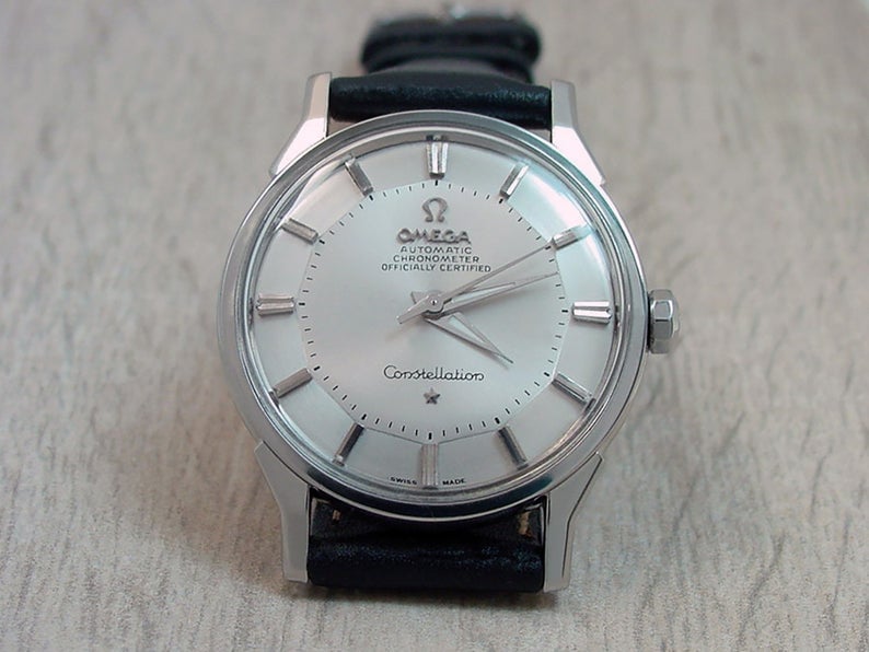
·A newbie here, searching for a Constellation with a pie pan dial.
Just wondering if any of you kind folks could advise me on what would indicate that this one has its dial restored?
It's listed on an auction site at what appears to be a reasonable price and the seller, who has provided lots of detail and appears to be very up-front, lists it as having had a 'premium restoration'.
The problem I have is that, apart from how clean it is, if the seller hadn't declared then I wouldn't have known. I applied the knowledge I've gained so far, mainly on here and from Desmond's blog, but still flummoxed.
On the learning curve.....any pointers would be greatly appreciated.