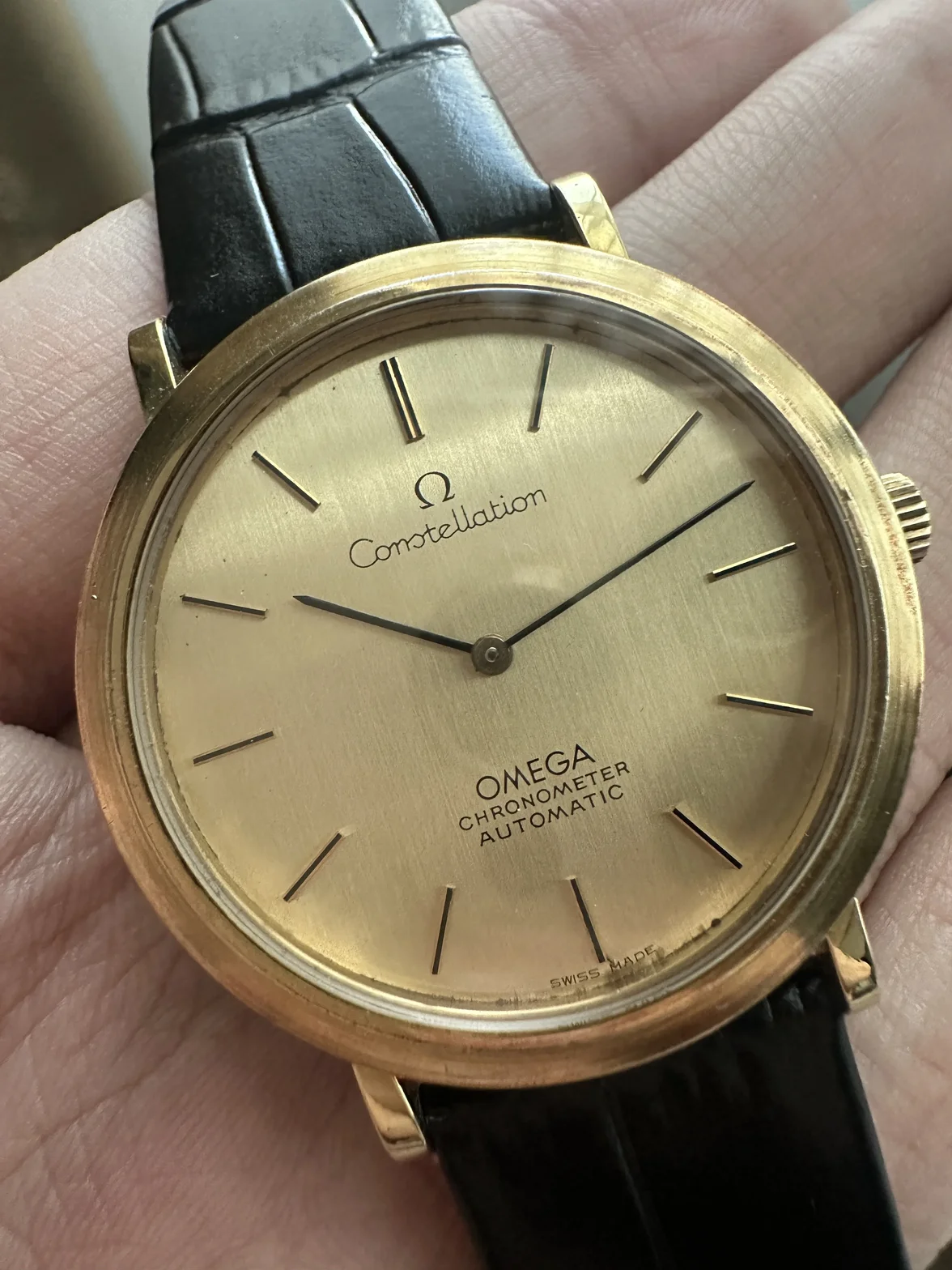
A tiny ink spot by one letter isn’t proof of a redial on its own. Factory pad printing in the 1970s wasn’t perfect, and small blobs or a slightly heavy letter do turn up on original dials. What gives a refinish away is usually several signs together:
printing that looks thick, fuzzy or slightly off-centre, or a font that doesn’t match ther examples of the same reference;
SWISS MADE” missing, crooked or in the wrong spot (yours is there at 6);
a fresh-looking dial surface with wear or marks around the index feet and the dial edge;
once the movement is out, refinisher marks or numbers scratched on the back of the dial.
From this photo the print looks crisp and the applied markers sit cleanly. Nothing jumps out as a redial, but one angled photo can’t settle it.
For reference, Omega’s vintage database lists 157.0001 (1972) as a Constellation chronometer with cal. 712 and a press-in back. If you can post a sharp straight-on macro of the “Constellation” and “OMEGA CHRONOMETER” print, side by side with another 157.0001, it’s much easier to call.