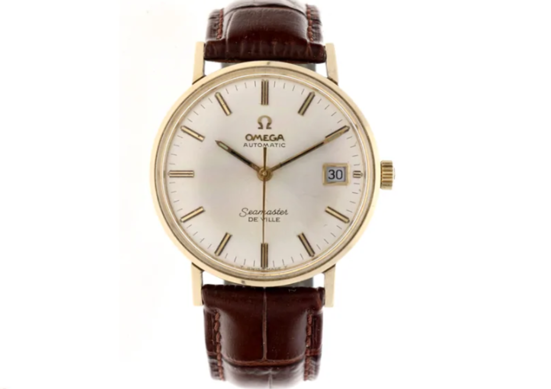
I think it's not because of the font, but I'm not very good at spotting redials, by tips and tricks via this platform I'm trying to get better. What do you think?
I would say not, based on hour markers and tritium all looking good, T Swiss made T looking balanced and the minute markers all appearing to be appropriately spaced