hungdangnguyen23
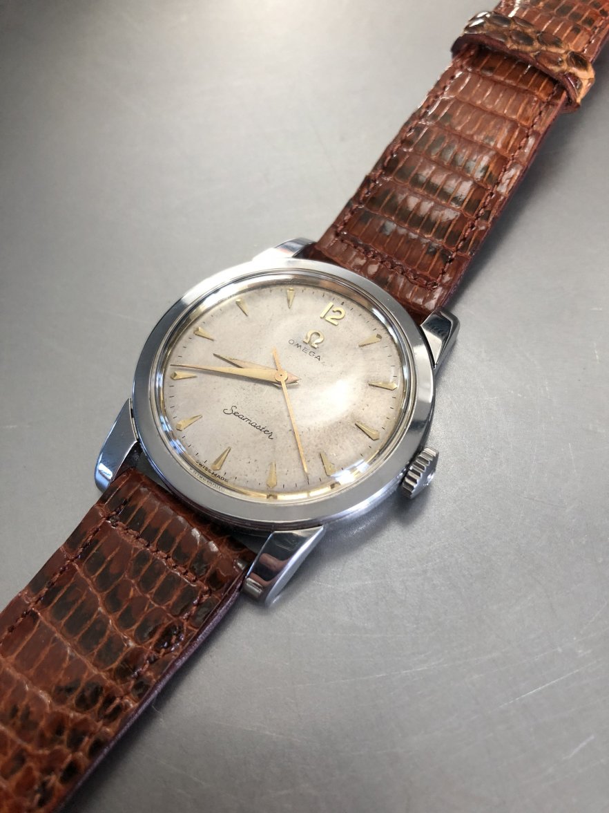
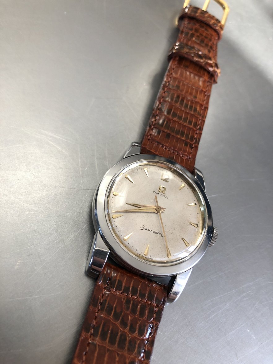
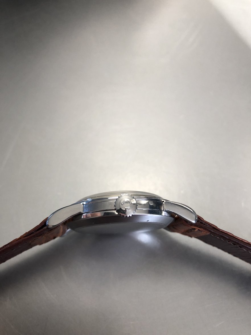
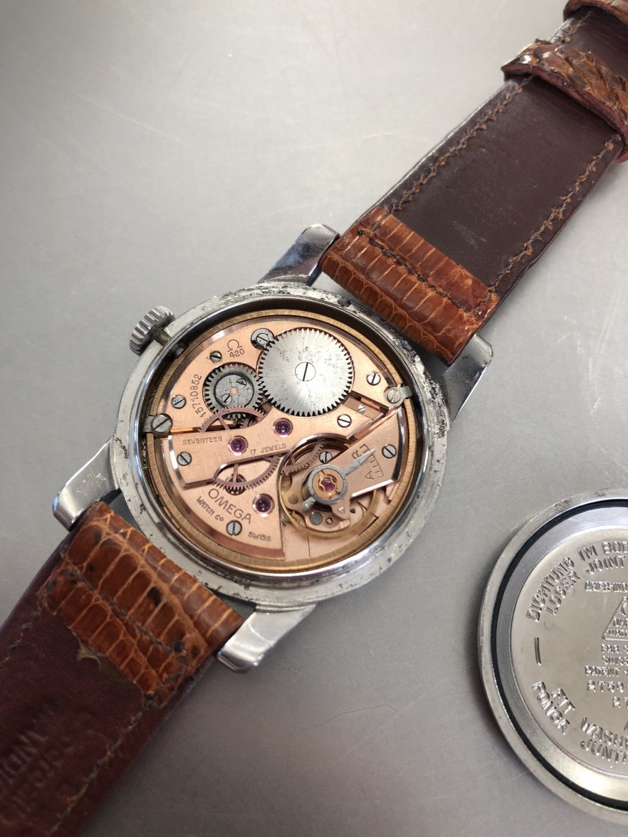
·Hello expert members of OF - please help me evaluate this Ref. 2769 Cal. 420. Right off the bat, please note that the crown is not original to the watch and the movement has been recently serviced:
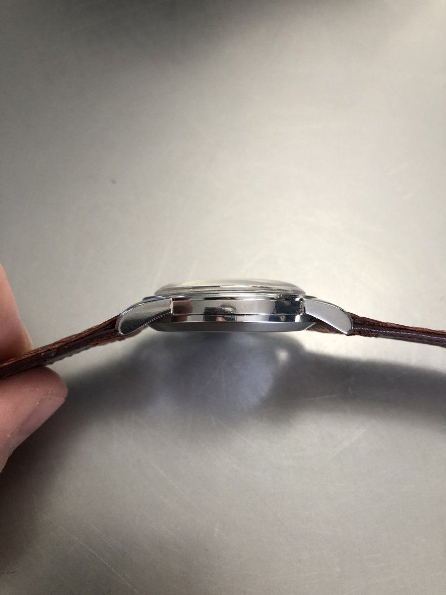
The case doesn't look overly polished to me and I think I can still make out the chamfers on the lugs (although a bit rounded at the bottom of the lugs, but this is the design of the watch?).
I'm more concerned about the the lettering in the "Omega" - the letter "E" in particular looks a bit goofy but the watch is old and other examples I've seen don't have the most pristine and sharp font to begin with. Another point of contention is the shade of the font in "Omega" vs. "Seamaster" where the later is noticeably darker and more defined than the former. One would expect both fonts to degrade at the same consistency, but I'm a newb in all of this and would love some feedback from the pros.
As usual, everyone's comments are very much appreciated!
