Can you point why it's a bad fake? I took my time to compare it to images of watches presumed to be genuine:
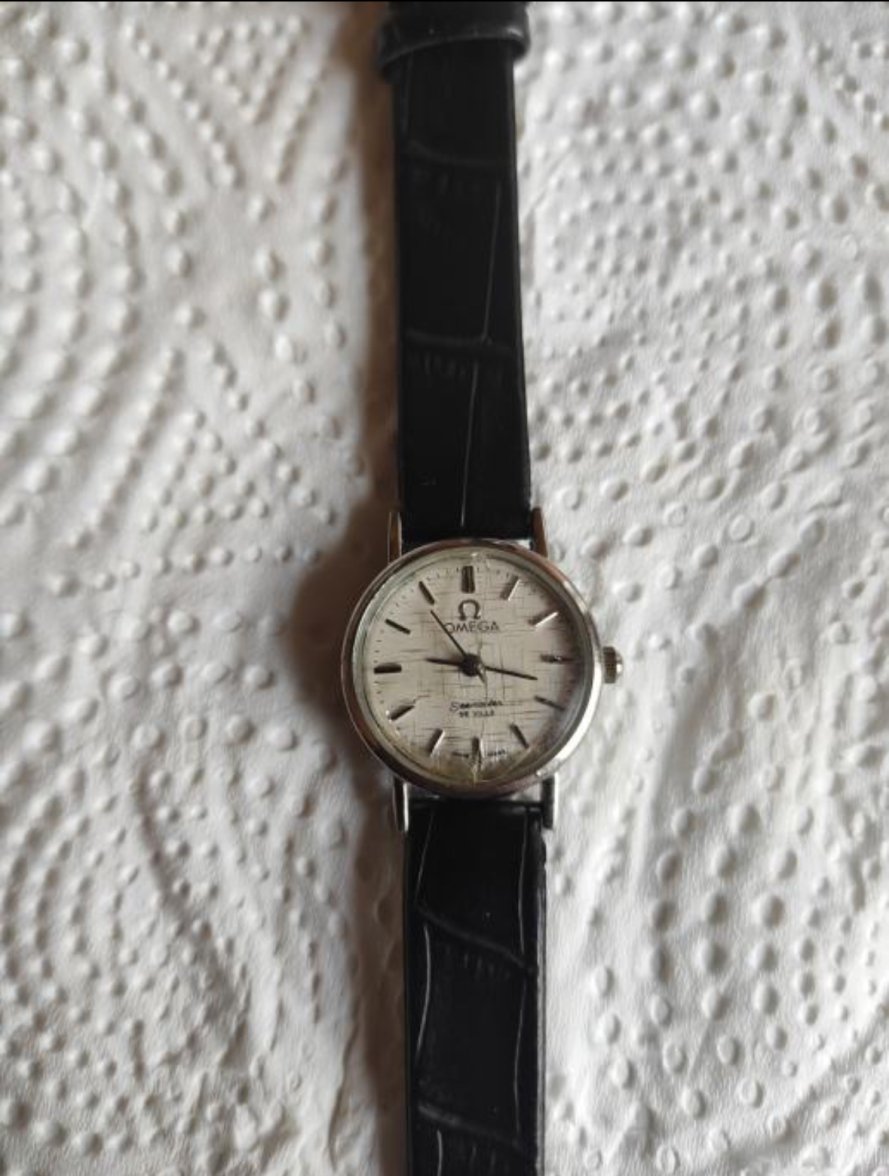
Front:
S on Seamaster looks fake
Omega symbol looks too stretched.
I can't say however that the font looks too bold. It's just so low res. And weirdly I was able to find lots of solid gold ones with bold font making me wonder if it's a good indicator at all.
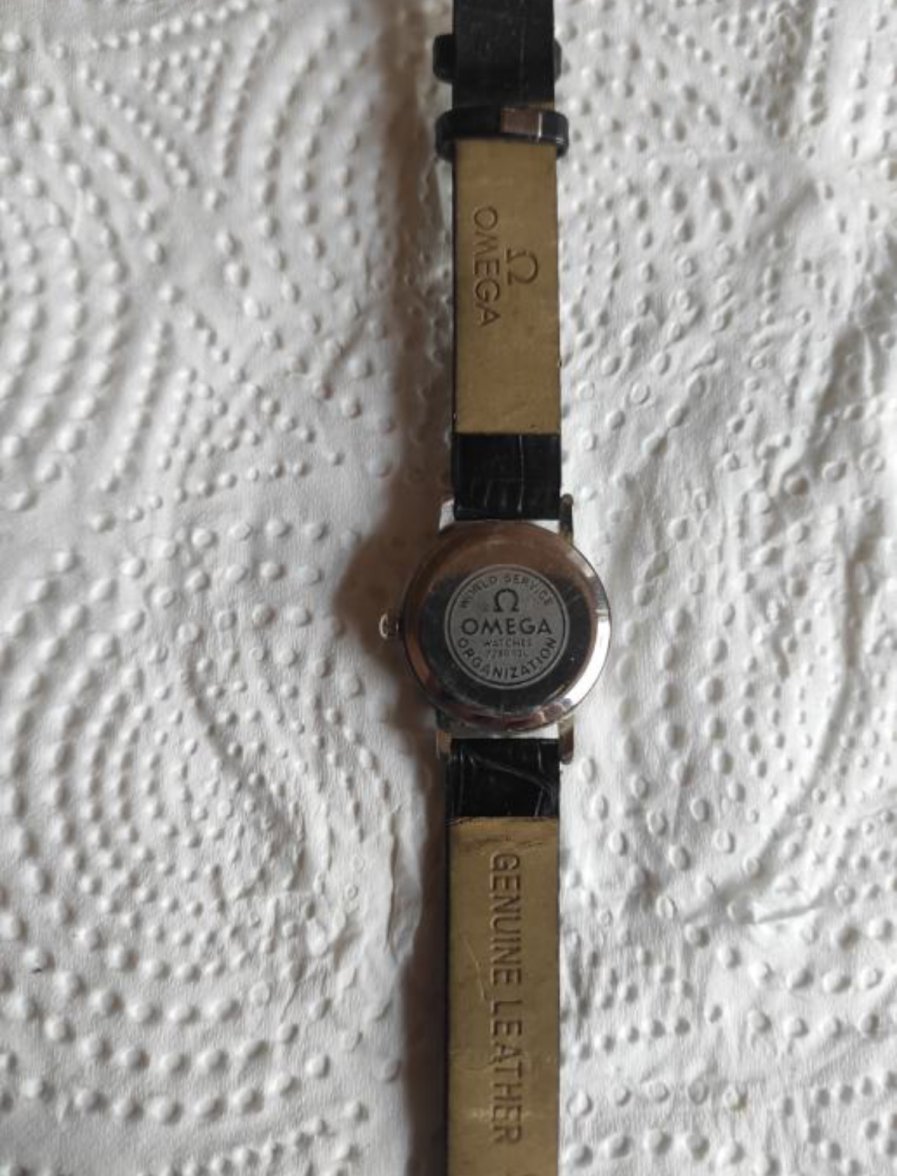
Back:
I've never seen one like that.