- Posts
- 4
- Likes
- 0
Blackxlu
·Hi everyone,
I’m looking to tap into the collective wisdom of the forum to get some insight and help identifying a highly unique vintage Hewlett-Packard (HP) Omega Constellation C-Shape (Ref. 168.017).
While the case geometry, hand length, and inner case back stamps (Schmitz Frères / S.F.) check out perfectly as standard late-1960s production, the dial features a very rare HP corporate presentation logo variant that I haven't been able to find documented anywhere else online.
Directly above the applied 5-pointed star at the 6 o'clock position, there is a vertically split oval emblem (dark left side, light right side). Inside this oval is a prominent, uppercase block letter "H" conjoined directly with a lowercase "p", where the right vertical leg of the capital H serves as the main spine for the wrap-around loop of the p.
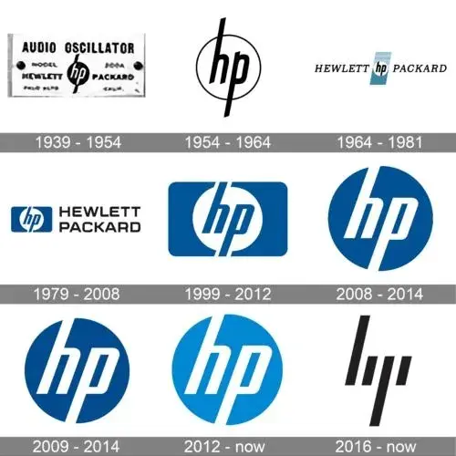
I know that tech giants like Hewlett-Packard ordered tiny custom batches of executive presentation and retirement reward watches during this era, but their public branding typically utilized two lowercase letters (hp). This unique, blocky uppercase "H" structure looks like a highly specific internal variant or a custom design asset.
A few questions for the vintage experts here:
Thanks in advance!
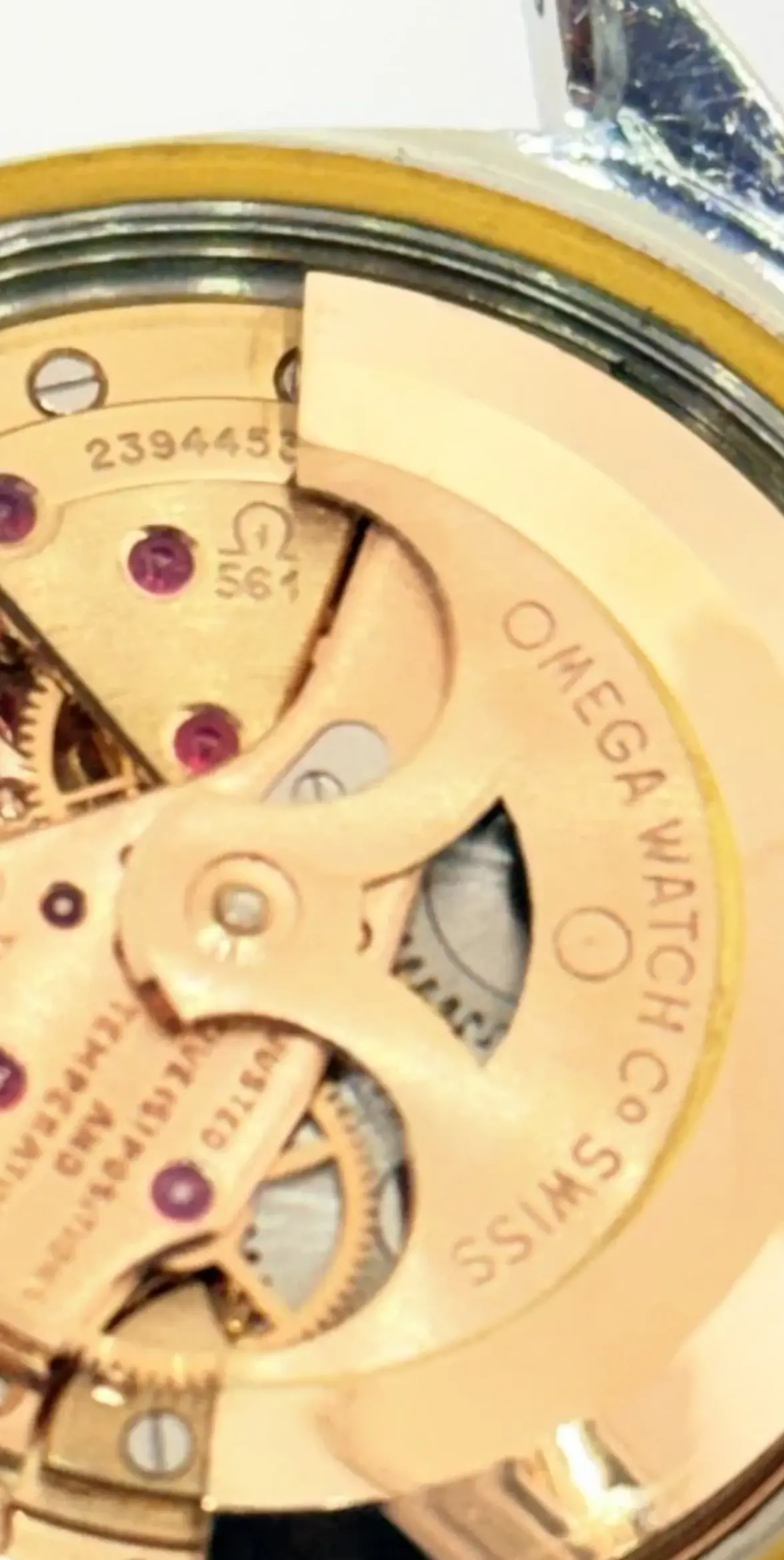
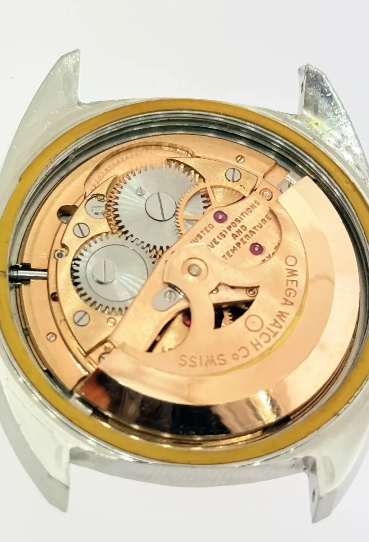
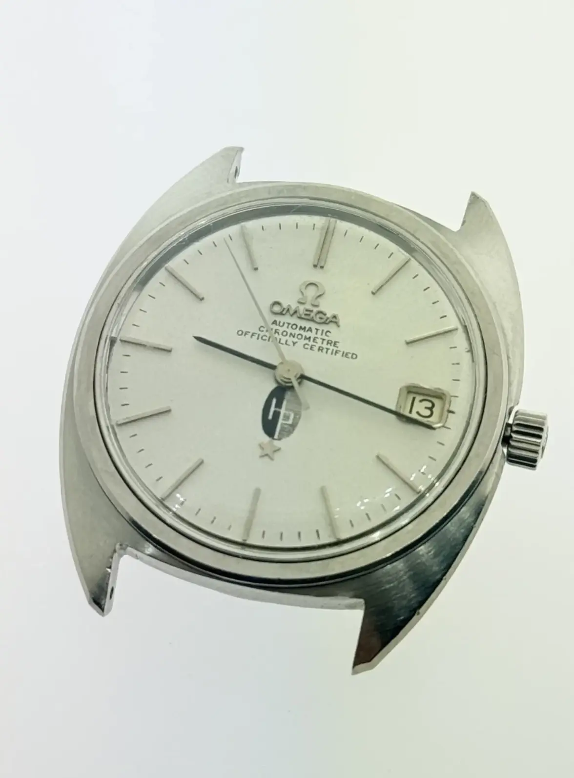
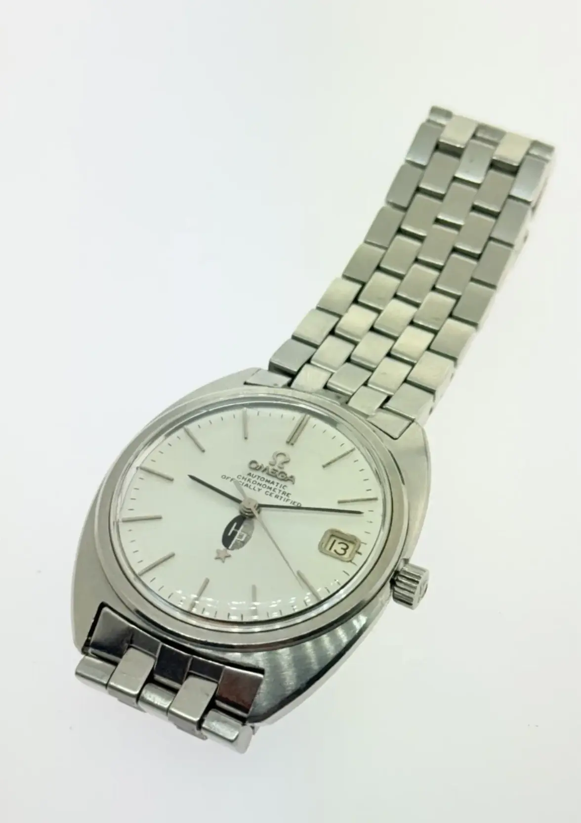
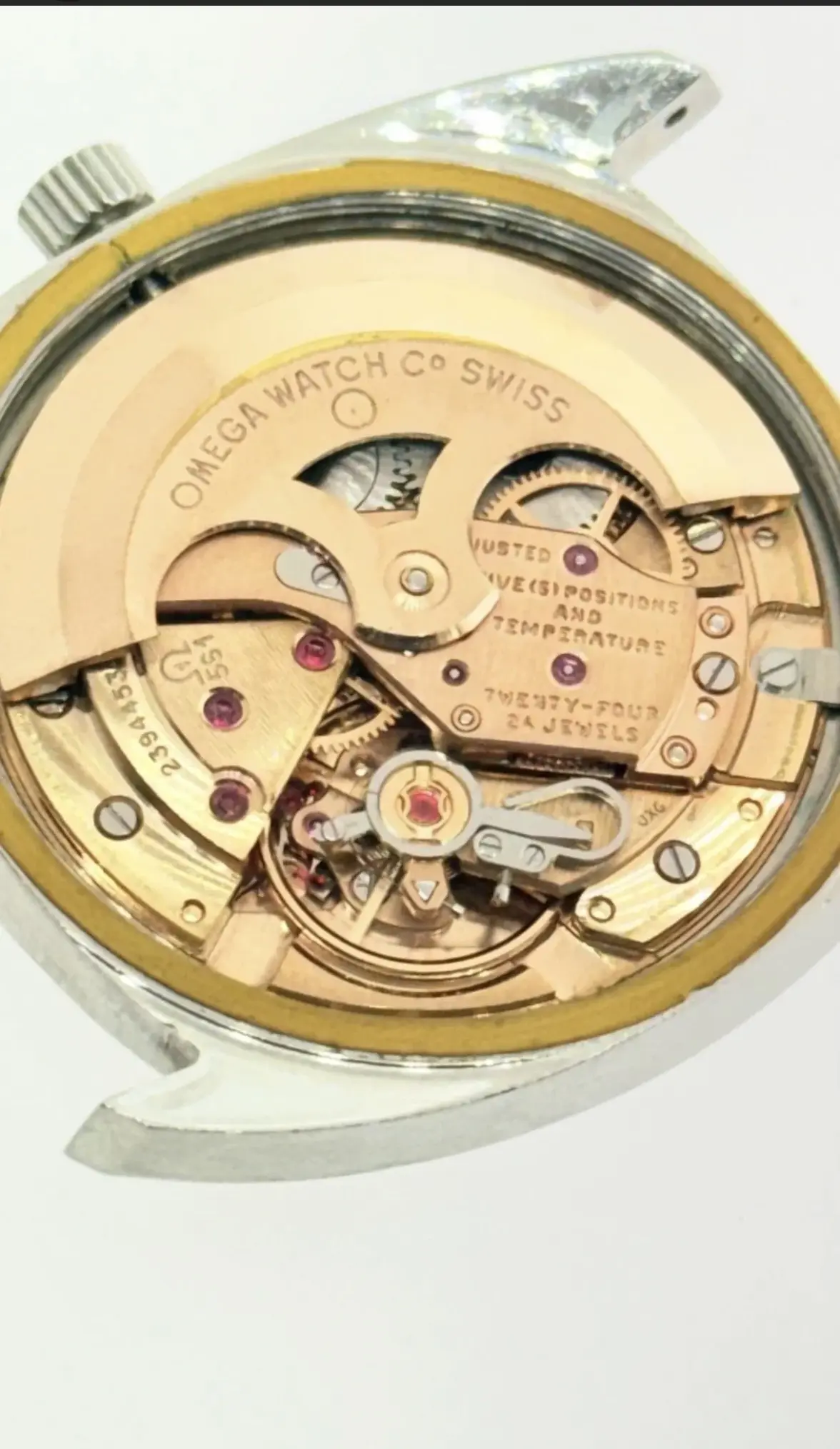
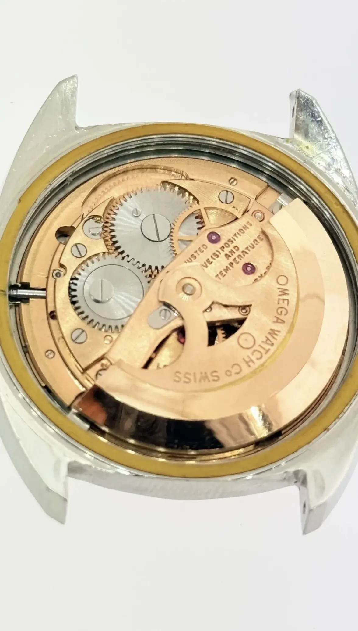
I’m looking to tap into the collective wisdom of the forum to get some insight and help identifying a highly unique vintage Hewlett-Packard (HP) Omega Constellation C-Shape (Ref. 168.017).
While the case geometry, hand length, and inner case back stamps (Schmitz Frères / S.F.) check out perfectly as standard late-1960s production, the dial features a very rare HP corporate presentation logo variant that I haven't been able to find documented anywhere else online.
Directly above the applied 5-pointed star at the 6 o'clock position, there is a vertically split oval emblem (dark left side, light right side). Inside this oval is a prominent, uppercase block letter "H" conjoined directly with a lowercase "p", where the right vertical leg of the capital H serves as the main spine for the wrap-around loop of the p.
I know that tech giants like Hewlett-Packard ordered tiny custom batches of executive presentation and retirement reward watches during this era, but their public branding typically utilized two lowercase letters (hp). This unique, blocky uppercase "H" structure looks like a highly specific internal variant or a custom design asset.
A few questions for the vintage experts here:
- Has anyone encountered this specific uppercase block "H" conjoined oval HP variant on a mid-century Omega corporate dial before?
- Are there any known archival records or old corporate catalogs showing when HP utilized this specific geometric emblem configuration for employee jewelry or internal milestone awards?
- Given the custom nature of the dial printing, would an Omega Extract from the Archives explicitly note the delivery straight to the corporate headquarters in the US for an order like this?
Thanks in advance!