Quiz for newbies - spot the problems
dennisthemenace
·It's not a speedmaster.😉
- Posts
- 25,980
- Likes
- 27,692
STANDY
··schizophrenic pizza orderer and watch collectorCan you post the link so i can create a thread and ask the forum to do it for me 

rogart
·I think i now 😀.Am i a newbie ? We can do it like a competion ? The one how writes the right answer will have to find a new Omega with some fault and so the thread goes on ?
Edited:
Spacefruit
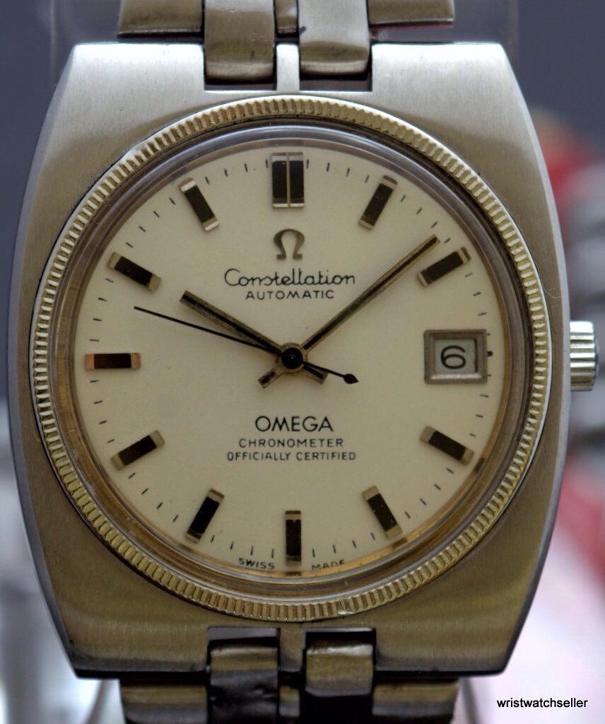
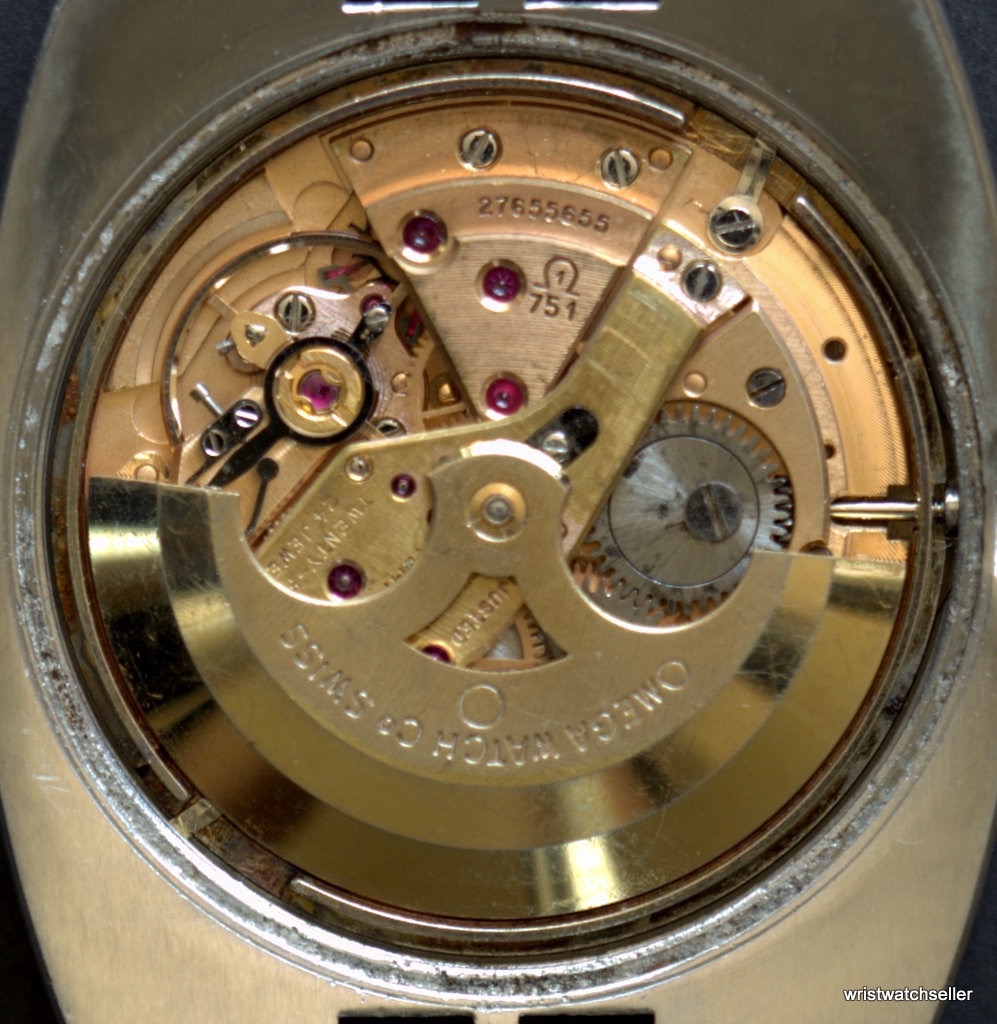
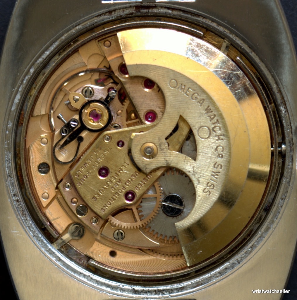
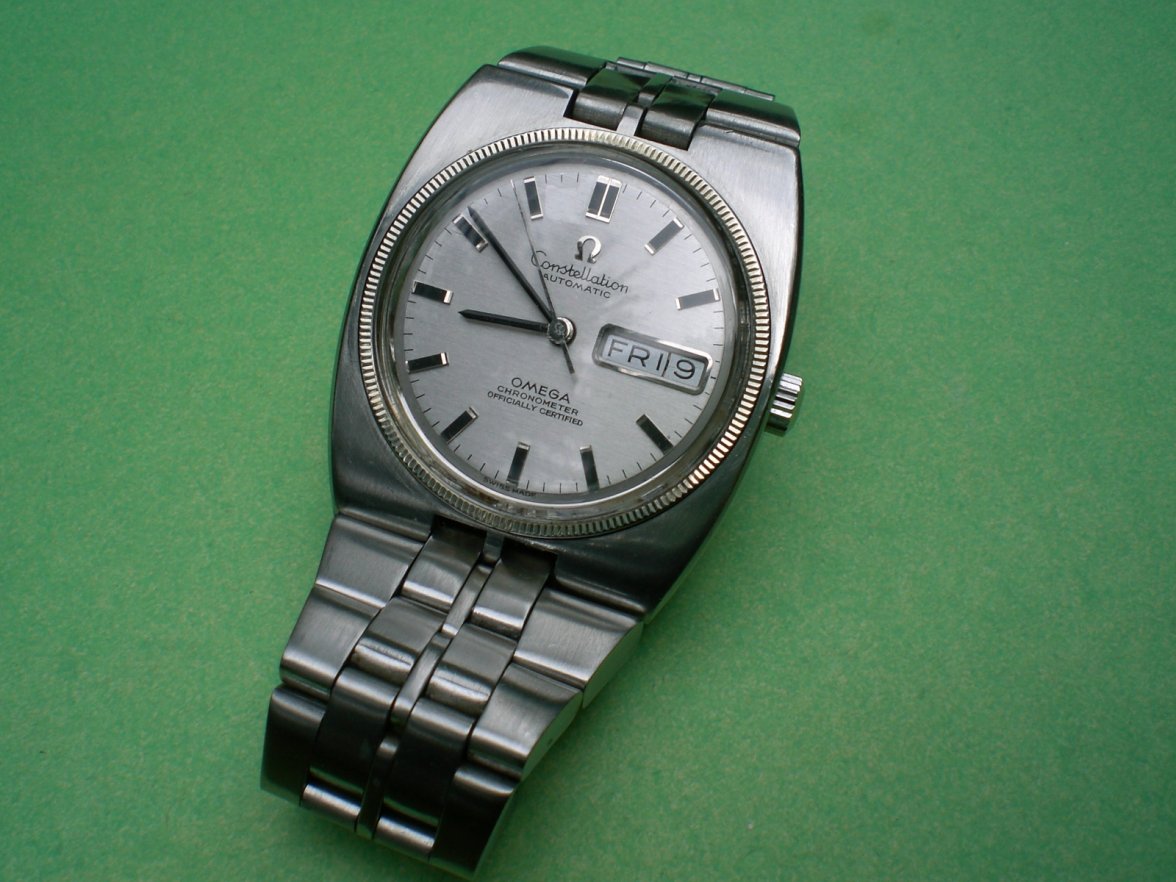
··Prolific Speedmaster HoarderWell I'm too lazy to cross reference the blog on my phone here, but I see a repainted dial (pure intuition) and an assembled movement judging by the miss matching colours on the plates and rotor.
What do I know. It isn't a speedy.
What do I know. It isn't a speedy.
Stewart H
·..... and for all of those noobs who can't be arsed to research what they are buying and expect others (this forum) to do their due diligence for them; this is probably a prototype - so a one-off, worth a fortune - and you should start a bidding war on it.
flyingout
·Dial aside:
Should be a day-date
Hands too short, wrong
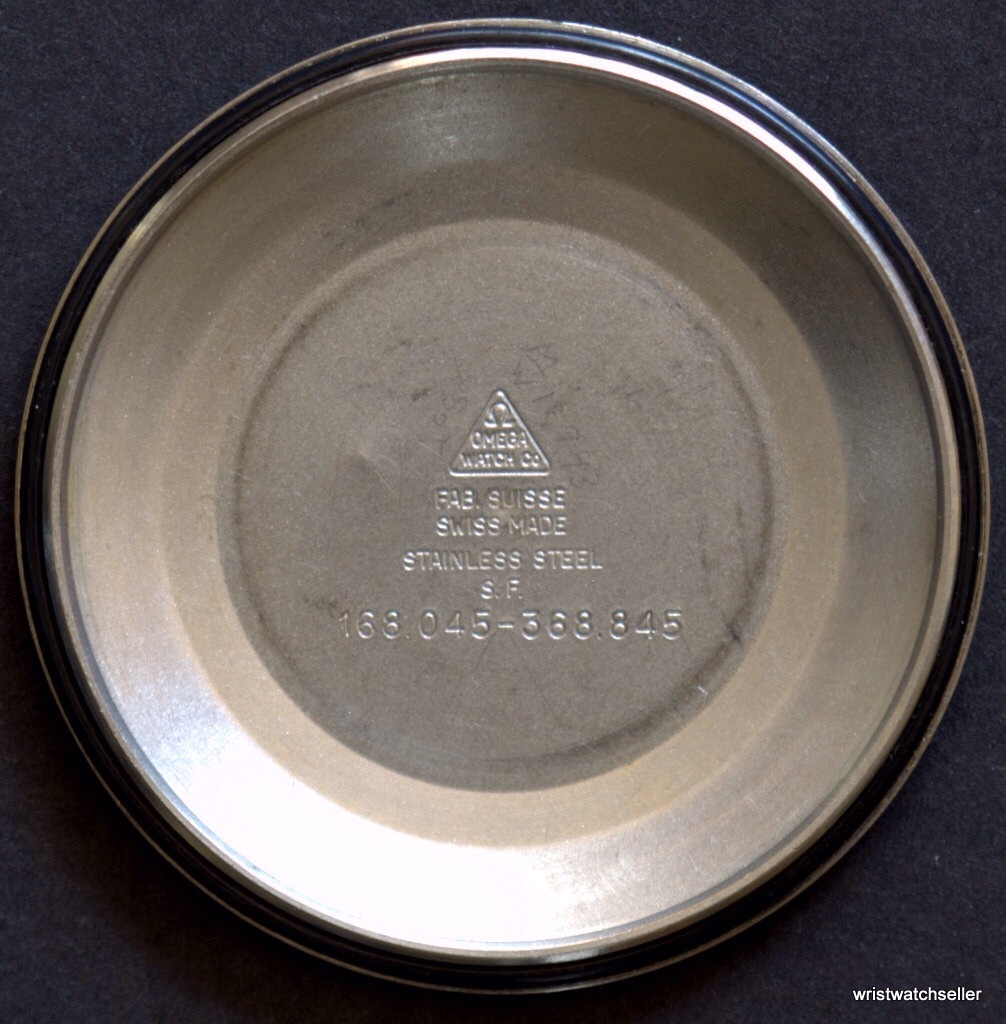
Bracelet doesn't fit
Should be a day-date
Hands too short, wrong
Bracelet doesn't fit
Stewart H
·I believe Daniel is trying to get noobs to look for the minutiae as well as the big items. Let's see one of them step up to the plate and list some (or all) of the faults with the re-dial.
flyingout
·Wide SWISS MADE
oddboy
·I'm definitely a constellation noob.. but I'll try.
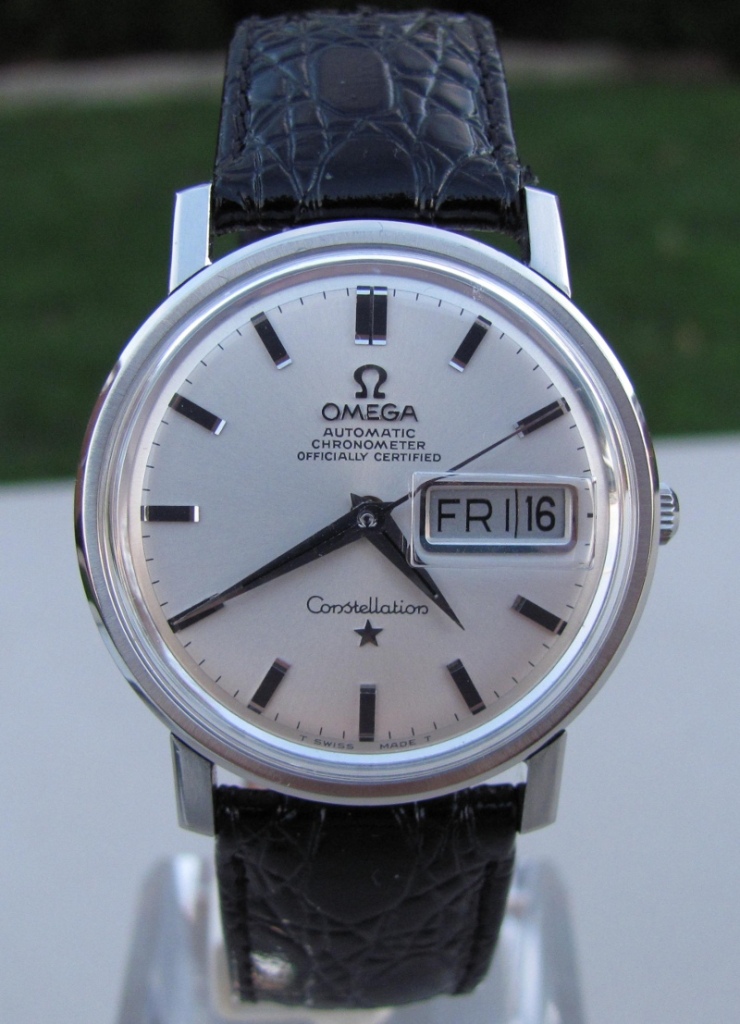
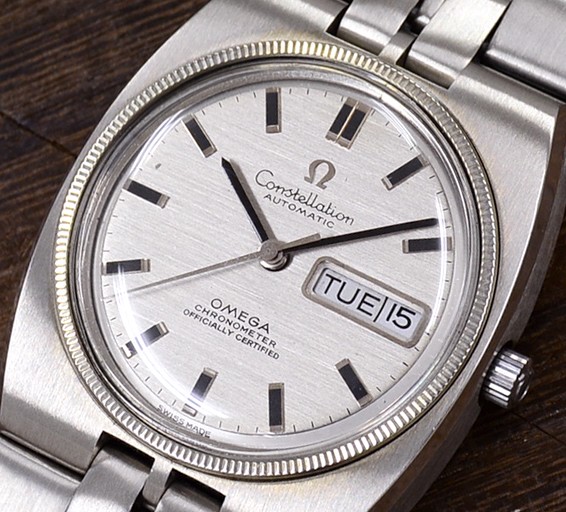
Constellation text should be below the center pin and omega should be above. The star is missing from the lower half of the dial as well. Definitely fails the MOY test. Round O and G in omega, should be a bit more oval.
751 is a day+date movement (as mentioned above)
I've never seen the flat end hands on a constellation, but I haven't really gone looking either. Same for those markers. They look too blocky, not elegant enough (slimmer, or the shark tooth or square rather than thick rectangle).
Edit, different case, but the dial and furniture should be more like this:
I'm sure I got some wrong and that there's plenty more.
Edit: AND I'm wrong on almost all counts for this reference. 🙁
Edited:
Giff2577
·What a Great idea for us noobs! I don't have much to add to what has been said, but what a fun exercise. The rotor and rotor bridge are definitely from a different movement and Swiss Made is printed wonky.
Stewart H
·Any views on fonts, serifs, spacing, minute markers etc?
lillatroll
·But I got this watch from my uncle and I would never sell it I think it is an unusual watch and wondered if I should get it serviced.
The 751 movement was a day date movement. The hands are wrong. The bracelet/case did not belong to the reference number on the back of the watch
The 751 movement was a day date movement. The hands are wrong. The bracelet/case did not belong to the reference number on the back of the watch
Stewart H
·But I got this watch from my uncle and I would never sell it I think it is an unusual watch and wondered if I should get it serviced.
By uncle, do you mean that bloke who was popping round to do your Mum a "favour" every now and then?
lillatroll
·From a good hard working Catholic family me. Only proper uncles with nice watches.😀
Edited:
- Posts
- 1,567
- Likes
- 859
PatrickJ
·Min hand a bit short
Seconds hand very short
Redial
Font lettering is not right, lines on M.
I need to do reading on this
Seconds hand very short
Redial
Font lettering is not right, lines on M.
I need to do reading on this
- Posts
- 25,980
- Likes
- 27,692
ulackfocus
·Edit: AND I'm wrong on almost all counts for this reference. 🙁
Well, you did get the part about the 751 being a day/date caliber correct. The movement is a franken, as spotted by Spacefruit (for:
Well I'm too lazy to cross reference the blog on my phone here, but I see a repainted dial (pure intuition) and an assembled movement judging by the miss matching colours on the plates and rotor.
You all are correct for suspecting the dial: it's a refinish.
There were flat stick hands, dauphine hands, and pencil hands used on various Constellations over the years so the flat top stick hands could be correct on the watch in question - but as just pointed out by Patrick, the second hand is too short.
flyingout
·Any views on fonts, serifs, spacing, minute markers etc?
Crispness aside, on the Constellation most letter shapes look almost right though spaced a bit too narrowly. C a tad short. n's and e about the right shape. s is the worst; missing the tick at top and a tad too open. Ticks on t's too short. Don't know what's going on with the l's though. Bad printing? Of course those who are familiar with these dials probably just see it wrong as a whole rather than needing to pick apart the bits.
Missing serif on AUTOMATIC and COC. COC font too narrow.
OMEGA font just off and too much vertical space below.
