Omega with double "Chronometre" inscription

Posts
9
Likes
5
Hello everyone,
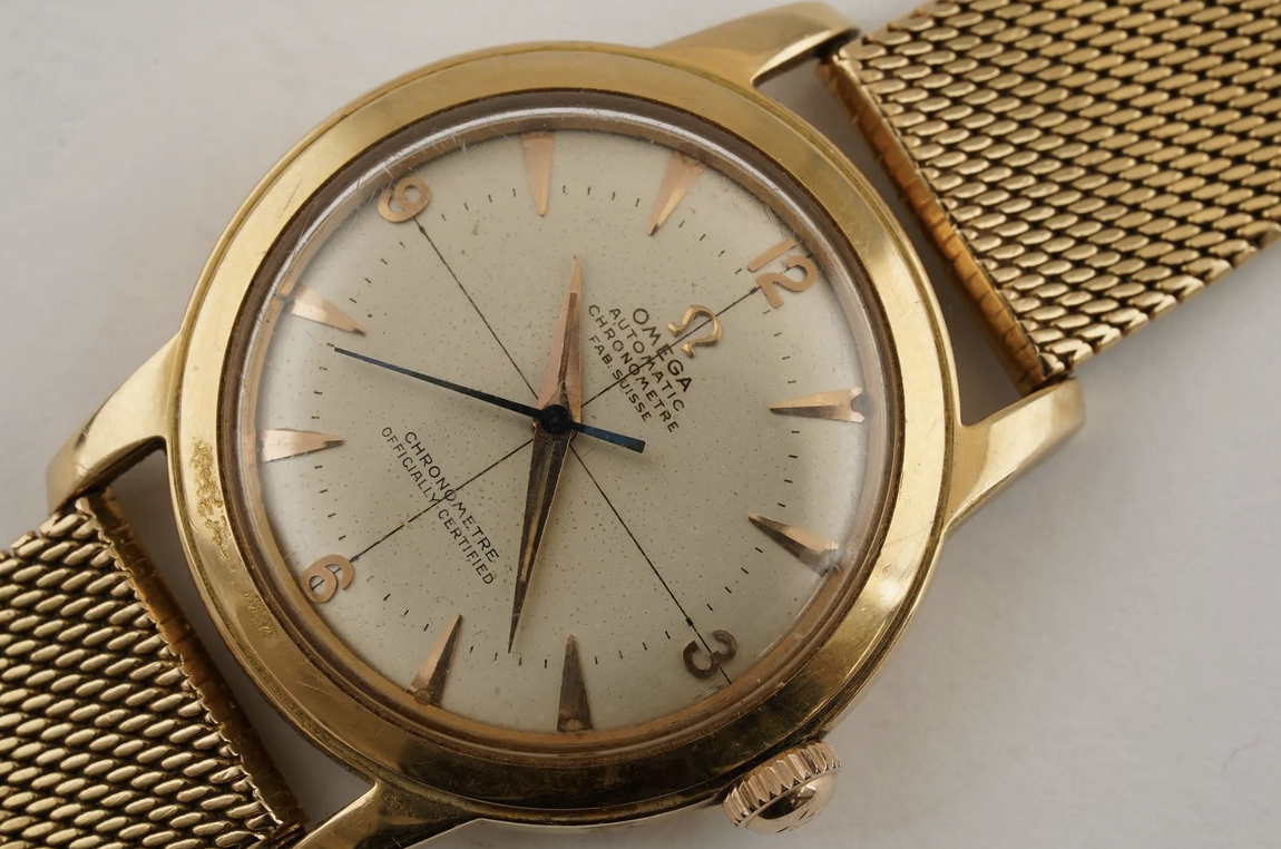
I am appealing to the knowledge of the forum for some information on this Omega with double "Chronometre" inscription.
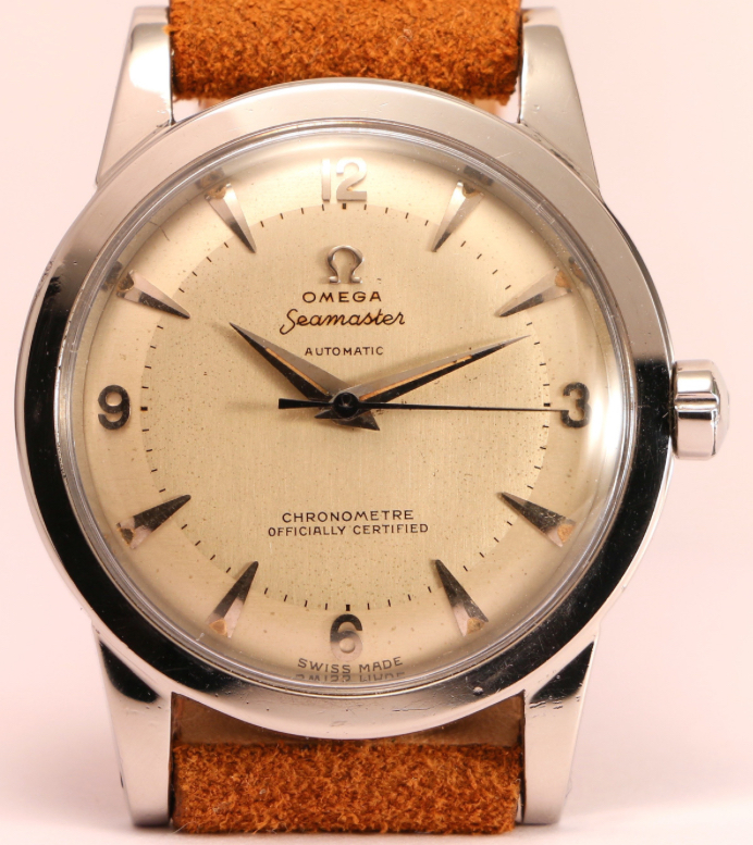
From the case hallmarks and the 'Fab. Suisse' instead of the usual 'Swiss Made' at 6 o'clock, it is clear that the watch was intended for the French market.
But how to explain this double inscription 'Chronometre'?
The watch comes with the original period warranty (sold in 1955) and the official chronometre bulletin (1952) and appears to be original in every part (including the dial).
This is the first time I have encountered such a double inscription. Usually Omegas of the same French era had the single inscription at the bottom , 'Chronometre Officially Certified'.
Here is a photo of the dial in question.
Thank you very much to those who can provide some information.

Cheers,

Ilio
 
Like 1
Posts
7,554
Likes
26,159
I'll hazard a guess: Omega wanted to emphasize the "officially certified" aspect, which may have been new marketing at the time, and that was the only way to do it. I suspect that the dial is original, and uncommon, to say the least.
 
Like 8
Posts
4,609
Likes
13,824
The minute track hits 12 and 6, but misses 3 and 9 ::confused2::
 
Posts
13,242
Likes
31,328
The minute track hits 12 and 6, but misses 3 and 9 ::confused2::

12 and 6 are taller than 3 and 9 are wide.
 
Like 3
Posts
7,247
Likes
33,539
Looks good to me.....and possibly twice as accurate? ;)

Here....the poor man's 'double chronometre'

2015-02-04 chronometre 2.jpg
 
Like 8
Posts
9
Likes
5
12 and 6 are taller than 3 and 9 are wide.
The minute track hits 12 and 6, but misses 3 and 9 ::confused2::

Thanks for your reply. Me too I noted this feature. This does not affect the originality of the dial. I really do not know. Quite confused :)

Looks good to me.....and possibly twice as accurate? ;)

Here....the poor man's 'double chronometre'

2015-02-04 chronometre 2.jpg

Thanks @cristos71 Looking at the French case 'Officially Certified' on the web I found these your pictures. Nice trio :)
 
Posts
1,453
Likes
3,451
The fonts in the two ‘Chronometre’ don’t match to my eye, particularly the “R”? Also the line running through the two “O” jars.
 
Posts
9
Likes
5
The fonts in the two ‘Chronometre’ don’t match to my eye, particularly the “R”? Also the line running through the two “O” jars.
Hi that’s normal. See at the @cristos71 ’s Omega. Chronometre fonts are different
 
Posts
744
Likes
3,035
Looks original to my eyes.

I am not sure why 'omega' needs to be printed with the word 'chronometer' for both times.

May I see the movement picture and the picture inside of the caseback
Edited:
 
Posts
7,247
Likes
33,539
I was actually considering bidding on this one, but totally forgot. It went over the weekend @krapula right?
 
Posts
9
Likes
5
I was actually considering bidding on this one, but totally forgot. It went over the weekend @krapula right?
Yes, it was yesterday afternoon :)
 
Posts
1,320
Likes
1,684
@krapula Do you recall the movement calibre?
As @Tony C. alluded to, it was likely a transitional dial to indicate the recently marketed designation of “officially certified”. Here’s a Seamaster example with “Chronometre Officially Certified” on the lower part of the dial probably prior to transitioning to the more common variant.
 
Like 1
Posts
4,609
Likes
13,824
12 and 6 are taller than 3 and 9 are wide.

How have I never noticed this before?