Forums Latest Members
  1. bbozic Sep 28, 2020

    Posts
    145
    Likes
    1,265
    Hi all,

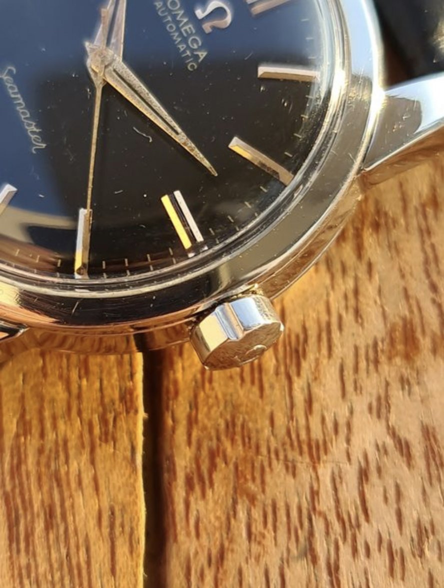
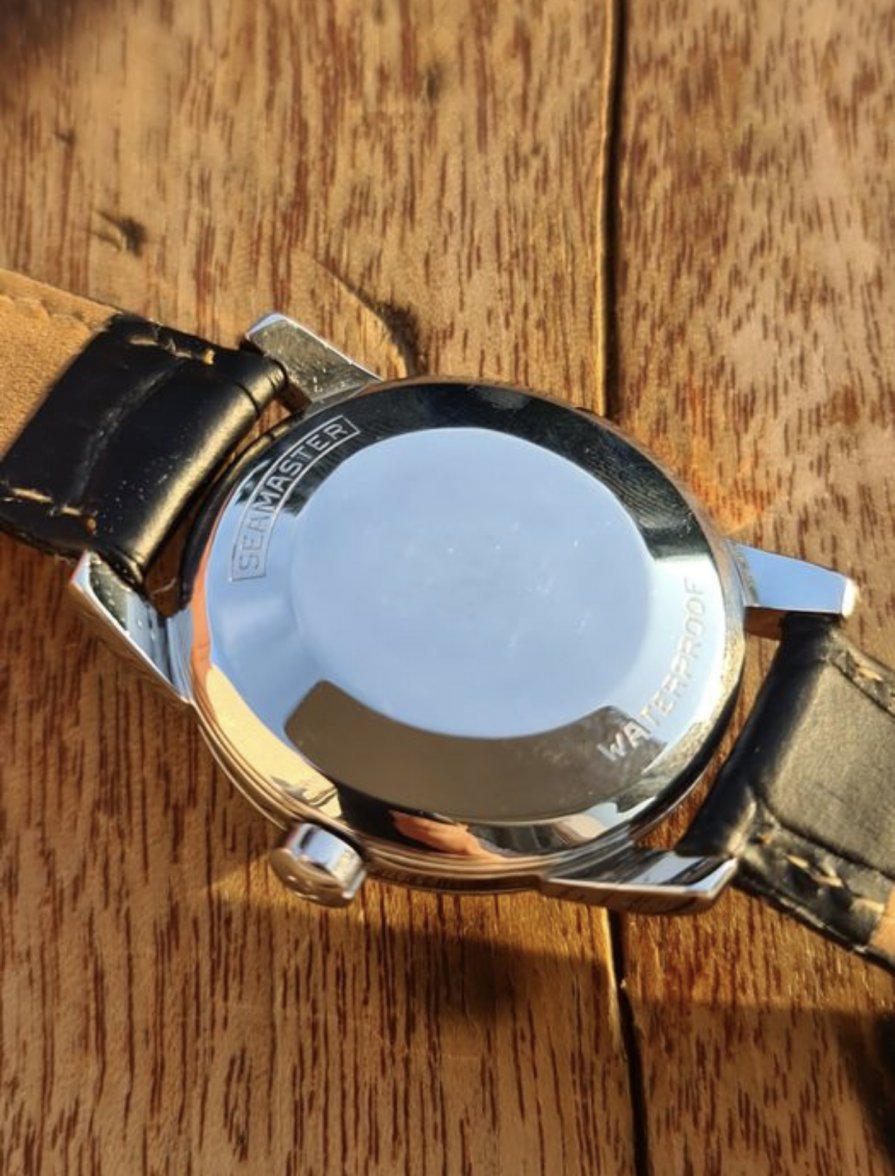
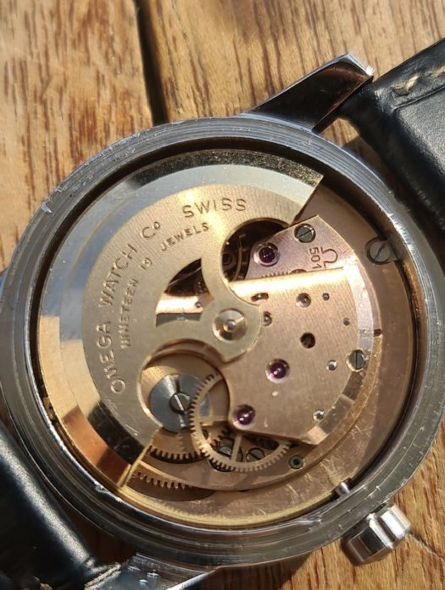
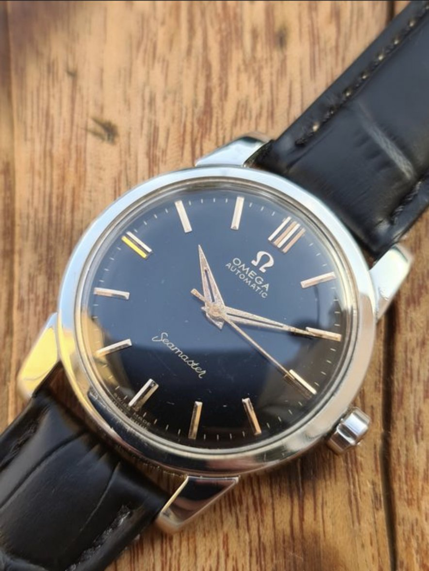
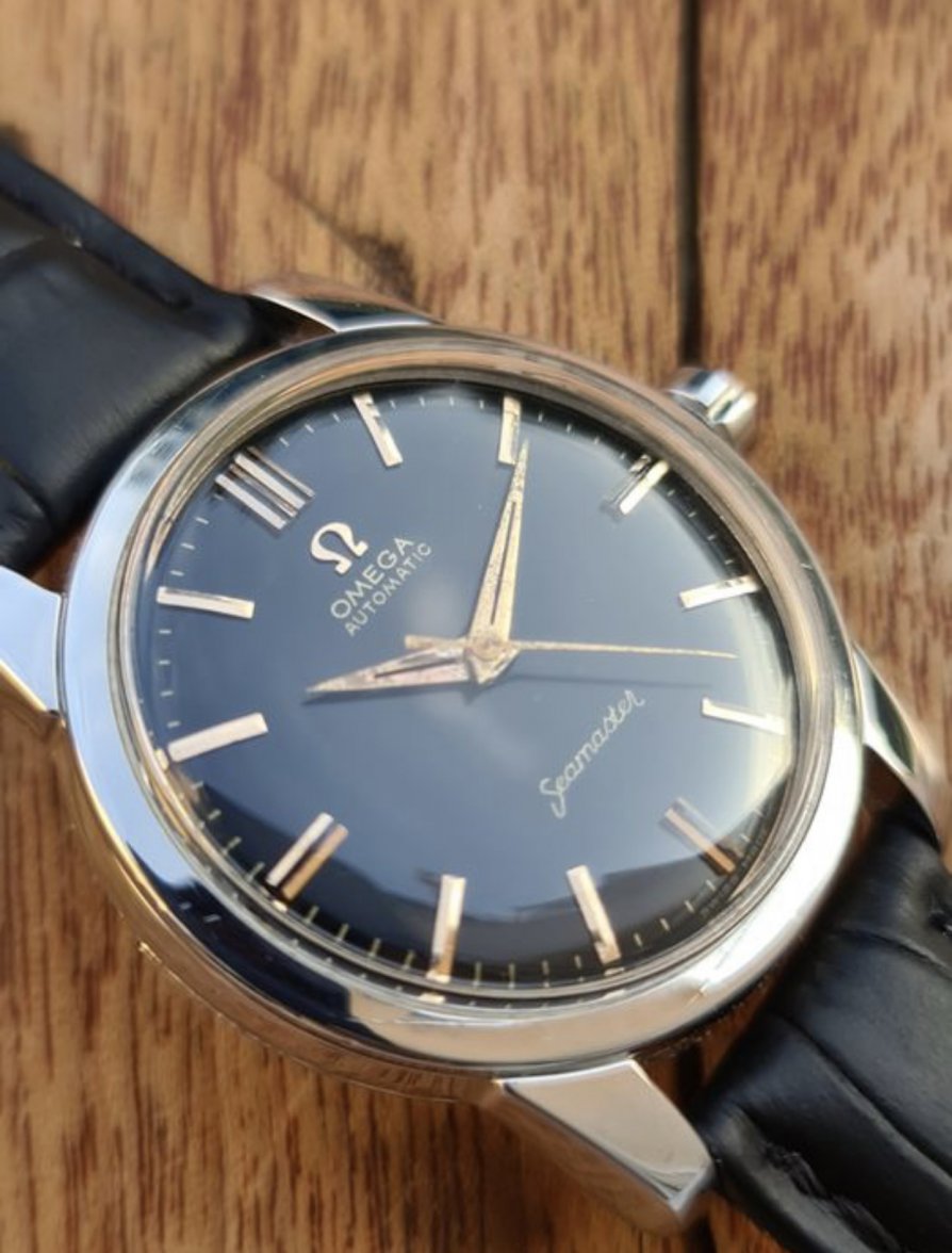
    I found this Omega with a dial i have not seen on this particular model before. The watch is described as fully original and unpolished by the seller but i have doubts. First the case, it looks very shiny, looks like it has gotten a polish treatment right? Second is the dial. Did Omega make this reference with this dial variation? Im thinking it could be a service dial or perhaps a dial for a specific market. Does anyone here have a similar or have seen another example?
    40AF5CA2-3993-4B20-B910-7764A92EE636.jpeg 460FB868-5219-438E-A04C-FC57C2492ED4.jpeg 07CF7611-E126-4BBC-B41D-57F613E07B36.jpeg A0E90529-A2E7-4867-95E8-234B091CB193.jpeg 3CAC9C6D-5C36-44B7-A9A1-BA859DABBCF7.jpeg
     
  2. Dan S Sep 28, 2020

    Posts
    18,754
    Likes
    43,098
    I'm a little suspicious of the dial. Also, I doubt that the hands and dial go together.
     
  3. PlainVanilla Sep 28, 2020

    Posts
    837
    Likes
    1,539
    The dial doesn't look original to me the "Seamaster" font seems odd.
     
  4. seekingseaquest Sep 28, 2020

    Posts
    2,327
    Likes
    6,147
    Yeah it’s a redial. The fonts are off and the text doesn’t appear to be gilt. Lume is missing from the markers and either the hands are replacements or the dial is a replacement per observation from @Dan S .

    Edit: it’s also been polished
     
    Dr No and Dan S like this.
  5. bbozic Sep 28, 2020

    Posts
    145
    Likes
    1,265
    I actually thought the same about the hands. They have lume but the dial has not.
    The redial was not as obvious to me. I was leaning more towards that the dial had been replaced
     
  6. Dan S Sep 28, 2020

    Posts
    18,754
    Likes
    43,098
    There are some details about the printing that someone with expertise like @seekingseaquest would notice unconsciously. One thing that jumped out at me is the was the way that the "s" and "t" in "Seamaster" are too close to each other. Then once I saw that, I started to notice some other subtleties with the fonts, alignment, etc.