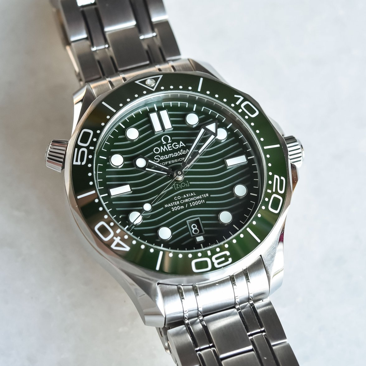
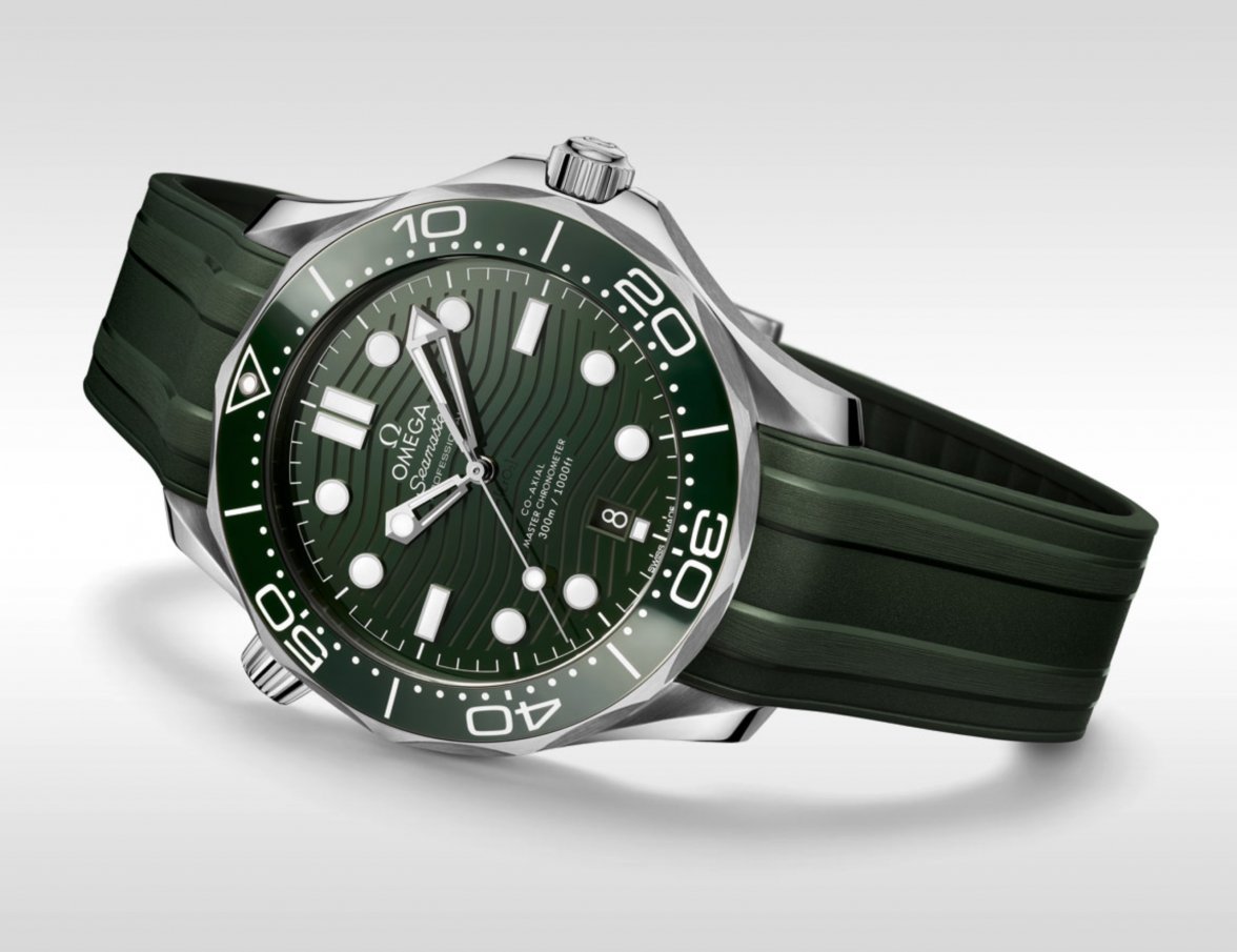
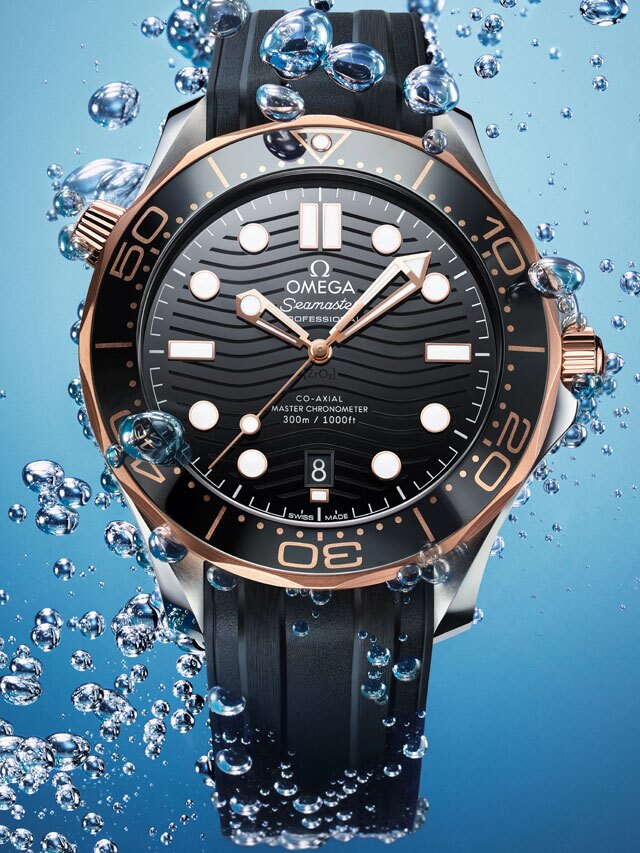
Next gen SMP

Posts
238
Likes
750
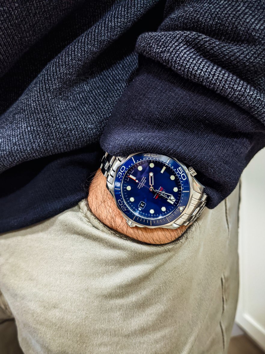
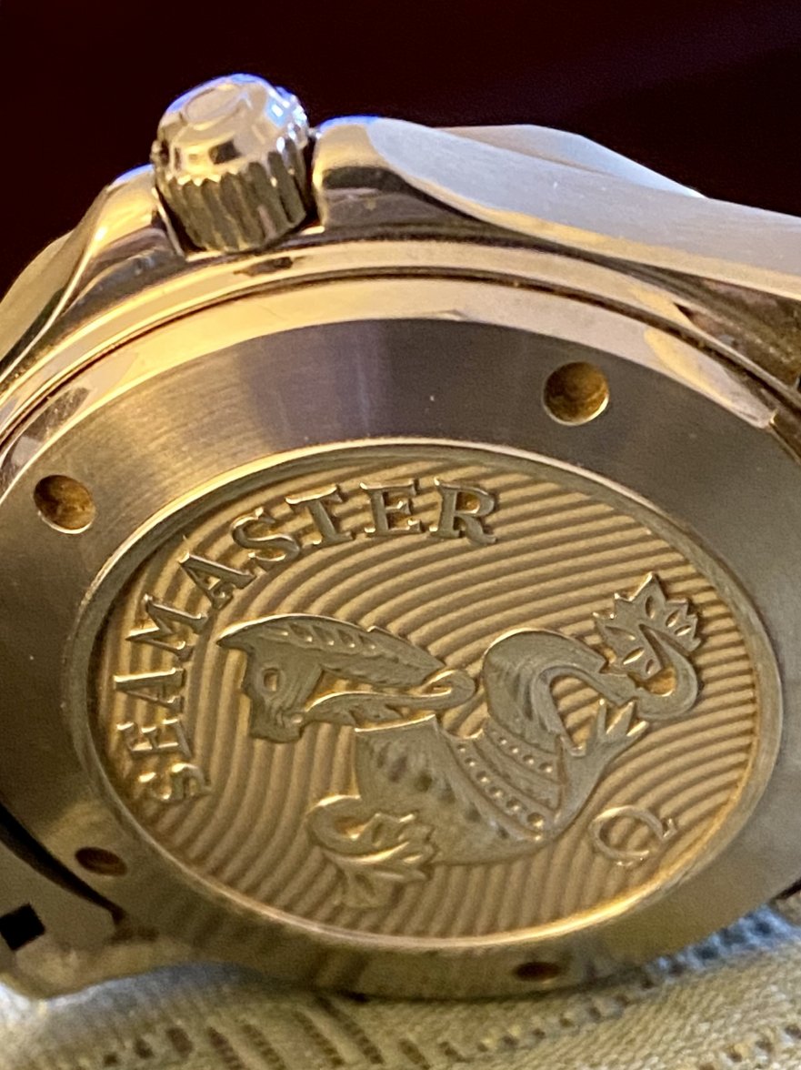
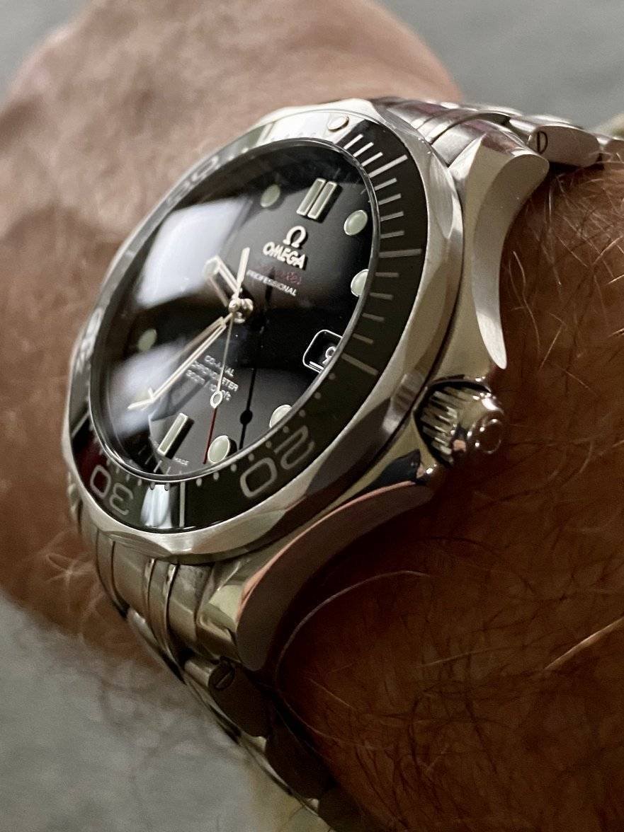
Agreed. Still the best version in my opinion. It’s thinner and smaller than the current version, dressier overall, and it has an applied logo and that gorgeous large hippocampus engraving on the case back. Pure class. I’ll never sell mine.

Makes the two of us...
 
Posts
13
Likes
22
There's a few things I'd be looking to. First, the waves. I find it hard to see them removing the waves at this point. I wonder if they're sticking with the HEV style. And I wonder if they'll stick with the seconds marker design. The way the seconds markers connect to each other might be the oddest change they made this gen, not that it's bad, it just seems arbitrary. The seconds design seems more sensible on the PO. I can see how the design originated from the shape of the hour markers. But on the SMP, it looks like they simply lifted the idea from the PO without making it make sense.

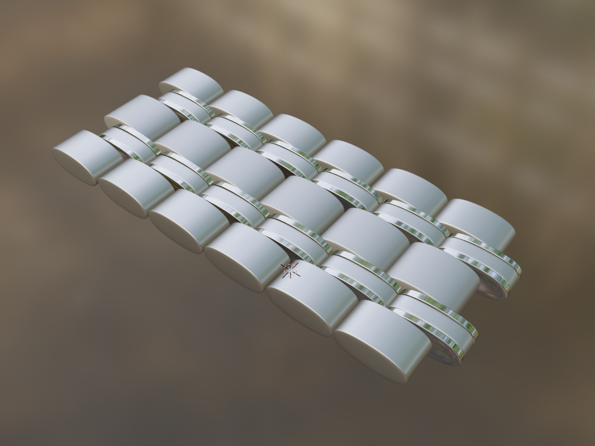
If I had to bank on anything, it would be changes to the bracelet. If you look at the new AT and Speedmaster links, they are shorter and rounder. They're not round like the old SMP. These new links are sharp horizontally, but round vertically. The links on the current SMP are very flat.
 
Posts
13
Likes
22
If what I was saying was confusing, I made a 3d model of what I mean. showing sharp horizontally but round vertically. It's a direction I can see them going.
 
Posts
164
Likes
36
Next year is the 30th anniversary of the model. If not a refresh I'm sure we'll see at least some special (limited?) edition.
I’m here for some limited editions
 
Posts
9,547
Likes
52,660
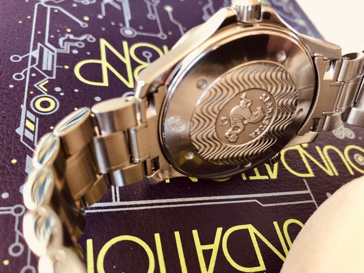
I prefer my waves on the case back. Regarding the current model, where’s the logic in putting a display case back on a dive watch? 👎
 
Posts
181
Likes
313
I prefer my waves on the case back. Regarding the current model, where’s the logic in putting a display case back on a dive watch? 👎

Yup, I agree. I want the beautiful, solid, hippocampus case backs on the SMP 300M line. They should save the eye candy, added thickness, and added expense for the POs. 🙄
 
Posts
11
Likes
15
started with a 2531.80 Bond back in 1996 and several decades (plus several SMP later) on to my current (2552.80)
0uwRkmf.JPG

I really like the evolution of the line over the last 25+ years... my only criticism is the HEV has gotten ugly (protrudes outward too far - should be much more subtle and refined).
 
Posts
249
Likes
471
I was never a big fan of the wave dial, but it doesn't bother me on the new green SMP. Gorgeous watch IMO.

Is it just me or do the hour and minute hands blend in to the green background to much?
 
Posts
138
Likes
231
Is it just me or do the hour and minute hands blend in to the green background to much?

I think it's the lighting and angle of the pic. Looks good in this pic.

 
Posts
39
Likes
90
Without the He, waves and sword hands, it's not an SMP 300.

absolutely 100% agree, remove any of those items and it’s not an SMP 300. If people don’t like those features then it’s not the watch they should buy.

Of current generation I really like the Sedena gold and stainless version, it really grabs my attention.

Edited:
 
Posts
97
Likes
144
absolutely 100% agree, remove any of those items and it’s not an SMP 300. If people don’t like those features then it’s not the watch they should buy.

That’s where I am. I have the NTTD and love it for the most part but struggle with the legibility of the skeletonized sword hands (older eyesight). Other models don’t have this same issue but I’m not a fan of the waves.

So as much as I love the colors, weight, bracelet, etc. I’ll be selling it. Waiting on a Submariner. I’d prefer an Omega but there really isn’t a model that provides great legibility to me without the inclusion of waves on the dial.
 
Posts
1,438
Likes
2,213
I really enjoyed mine for the most part, but eventually surrendered to the slippy bezel (mine may have been an outlier) and bracelet weight. Loved plenty about it but I like to dive with my divers and didn't manage to make that work well with the 2018 iteration.

That said, it's a terrific all-rounder, and easily good enough to be the only watch for many. I will definitely be keeping my eyes peeled for the next gen.
 
Posts
19
Likes
14
Man, I hope they don't do anything with it for years. The newest version is barely four years old. Despite wanting a couple changes on the Planet Ocean, I'm glad they left it as is for now. I have no problem with leaving any model as is for 8-10 years.
The PO is actually more likely to receive and update first. It has been 5-6 years between each generation, and now we're at 6½ years. Really hoping for a new one in the fall.
 
Posts
1,438
Likes
2,213
The PO is actually more likely to receive and update first. It has been 5-6 years between each generation, and now we're at 6½ years. Really hoping for a new one in the fall.

We need one of those Omega Buyer’s Giudes that are bread n’ butter for sites like MacRumors, with CAUTION and DO NOT BUY warnings and average days between refreshes, etc. then we’d know.
 
Posts
274
Likes
266
Regarding the current model, where’s the logic in putting a display case back on a dive watch? 👎
What’s the logic in putting tens of small windows on an aluminum tube with wings flying 40,000 feet in the sky?

The display case back is a welcomed feature my friend! Also a good way to see if water has gotten into your case.
 
Posts
230
Likes
195
absolutely 100% agree, remove any of those items and it’s not an SMP 300. If people don’t like those features then it’s not the watch they should buy.

Of current generation I really like the Sedena gold and stainless version, it really grabs my attention.


Those are NOT sword hands. They are skeleton hands. It just makes things confusing.
 
Posts
168
Likes
52
That’s where I am. I have the NTTD and love it for the most part but struggle with the legibility of the skeletonized sword hands (older eyesight). Other models don’t have this same issue but I’m not a fan of the waves.

So as much as I love the colors, weight, bracelet, etc. I’ll be selling it. Waiting on a Submariner. I’d prefer an Omega but there really isn’t a model that provides great legibility to me without the inclusion of waves on the dial.

I love my NTTD but the lack of contrast can make reading the time less instantaneous than with other watches. I hope Omega issues the same, still in titanium but with black dial and bezel with white markings, for the anniversary…
 
Posts
97
Likes
144
I love my NTTD but the lack of contrast can make reading the time less instantaneous than with other watches. I hope Omega issues the same, still in titanium but with black dial and bezel with white markings, for the anniversary…

that would be ideal to me.