Dov3
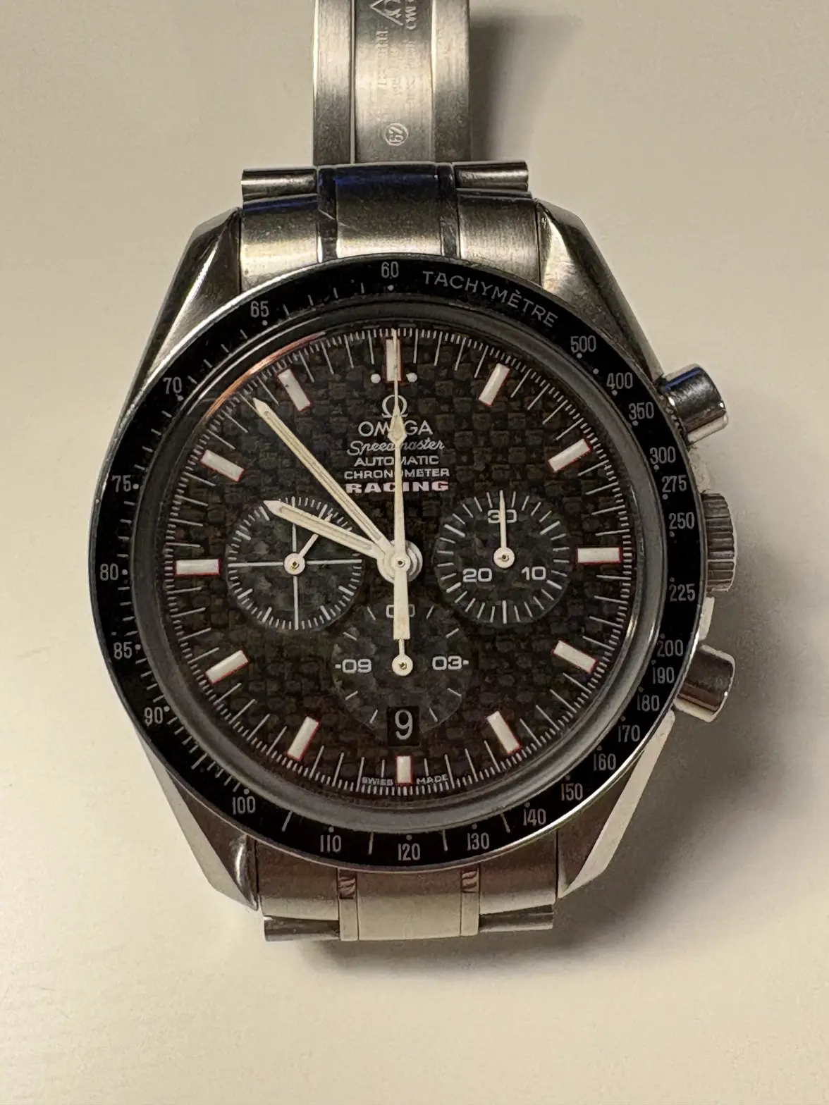
·So I bought the Omega 3552.59 Omega Speedmaster Racing Carbon dial version.
I ticked all the right boxes. Moonwatch size of 42/Automatic/Date/Three subdials.
But after a short while I realized that the carbon background was really hard to read the time and it distracted the otherwise perfect watch.
So I started researching other omegas with the same movement to see if there were any matching dials that would fit better with the look I was going for.
The best looking one I found was the dial from the 3551.50 broad arrow version. Got it off EBay for a reasonable amount..
Have now swapped the dials and I feel the watch now looks perfect. Much sleeker and calmer look.
What do you guys think?

