Longines sector dial for sale

Posts
2,820
Likes
4,924

https://chronocentric.com/forums/chronotrader/index.cgi?md=read;id=123252

Presently, there is a Longines ref. 2326 for sale on the forum (see photo above). The watch has a sector dial. Many dials are described as sector dials but this one actually resembles the one shown on Stern Freres' patent (number 180106) from 1935. See a copy of the patent here: http://watchexpertise.com/oldlonginespassion/Longines_Passion/Quadranti_a_settori.html

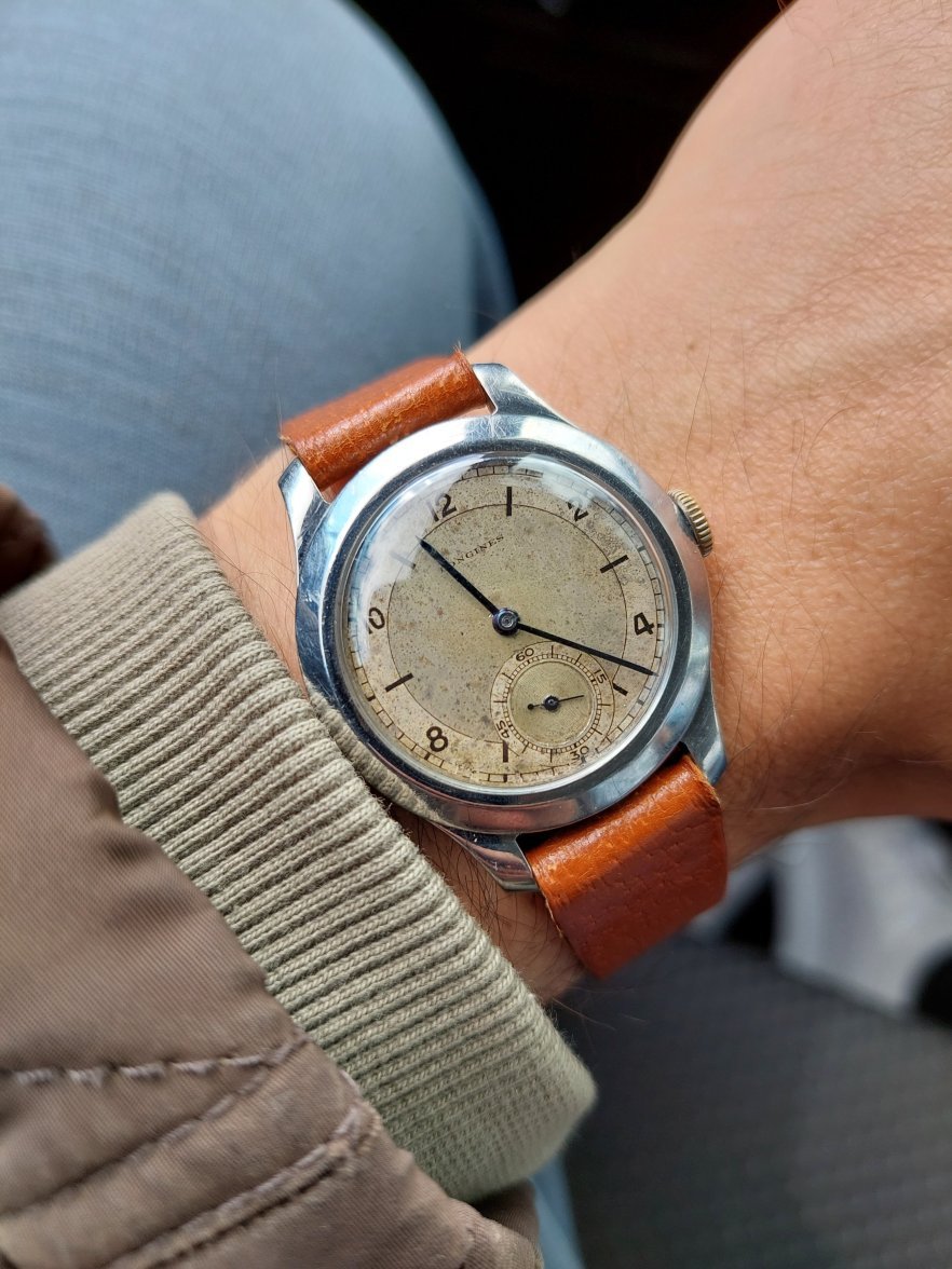
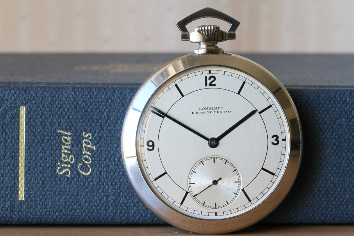
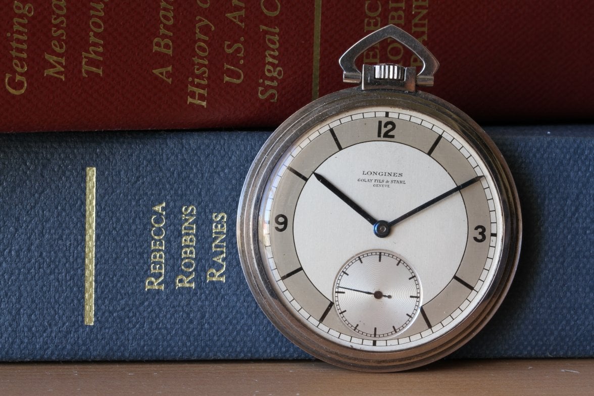
In the listing, the dial is described as "absolutely original". In my opinion, the dial does not appear to be original. The dial consists of both raised and printed elements. The hour markers consist of a raised 3, 9, and 12, and a raised circular element with attached, linear markers that radiate outward. The signature, sub-dial, and minute scale are all printed. The signature on the dial in question is in a sans-serif font that I think is incorrect. Additionally, the design of the minute scale, and possibly the sub-dial, seem to be atypical for this type of sector dial. Below are some sector dials that I believe to be original, for comparison.

Just to be clear, my objective with this thread is to begin a discussion. Prior to starting this thread, I contacted the seller and expressed my thoughts. Unfortunately, I have yet to receive a response since sending my message 8 days ago. Here is the listing: https://omegaforums.net/threads/vintage-longines-3d-sector-dial-reference-2326.145978/
https://www.watchnet.co.jp/en/
http://watchexpertise.com/oldlonginespassion/Longines_Passion/Quadranti_a_settori.html
https://www.instagram.com/p/CUdEXpMIQFN/
No link, but this watch was sold by Christie's years ago.


https://www.pinterest.ca/pin/265079128042756611/
No link, my apologies.

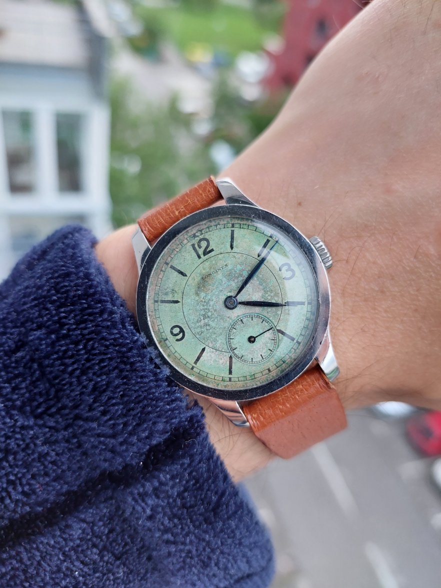
In my view, the following dial is a different type of sector dial. I have included it because its sub-dial printing and minute scale printing are of the same design as the dial in question. In my view, the execution of the printing on this dial is finer than on the dial in question.


https://grailium.com/product/watch/longines-sector-dial-cal-12-68z/
 
Posts
322
Likes
856
100% agreed. The last dial looks very fine and the font is as it should be peridoly. Here is mine with the combination of crossline and "typical"
sector subdial.
 
Posts
2,446
Likes
7,040
I'm no expert, but don't most the dial examples shown have both raised and printed features? So what does that prove?

Some of the dials are double-sunk, some single sunk.

Some specimens show sub-dial with painted background, others are bare metal "reflected".

The logo's font of the seller's watch does seem off.

My guess most of the dials shown have been reworked at some time. The raised features are permanent but the printed features were redone. I'm not sure if any is completely original.
Edited:
 
Posts
322
Likes
856
I'm no expert, but don't most the dial examples shown have both raised and printed features?
Yes, you find raised numerals and printed numerals as well as the sector circles. The subdial is always printed.
 
Posts
322
Likes
856
My guess most of the dials shown have been reworked at some time. The raised features are permanent but the printed features were redone. I'm not sure if any is completely original.
What makes you believe that? I can spot no inconsistance between the printings of the raised parts and the subdial prints. So I do not believe that somebody will reprint a subdial, even he would more concentrate on the raised parts to paint it over, maybe....?
 
Posts
8,097
Likes
28,528
I'm no expert, but don't most the dial examples shown have both raised and printed features?

No, there are plenty of examples with only printed dials.
 
Posts
2,959
Likes
6,317
I agree with your suspicions. The signature and subdial are the biggest offenders. The third example down also looks suspicious too, no (the lone dial)? Harder to say - but the subdial seems crude, with soft edges. And the texture is white and grainy. Though I would like a higher resolution.

Now for these:
 
Posts
2,820
Likes
4,924
I think this image is enough to say it's a reprint
Would you be willing to elaborate? The sub-dial bothers me too, but I am curious what you are seeing.
 
Posts
2,820
Likes
4,924
100% agreed. The last dial looks very fine and the font is as it should be peridoly. Here is mine with the combination of crossline and "typical"
sector subdial.
Thanks for your response. Your example is fantastic, thanks for the photo!
 
Posts
24,262
Likes
54,031
I'm curious about the hands. Are they meant to contain lume?
 
Posts
2,820
Likes
4,924
I'm curious about the hands. Are they meant to contain lume?
No. This style appears on 1930s examples with non-luminous dials. I forget their name. @Syrte probably remembers.
 
Posts
3,998
Likes
9,018
Would you be willing to elaborate? The sub-dial bothers me too, but I am curious what you are seeing.

at first glance one might think the sector marks are of inconsistent thickness, but looking closer the thick ones are consistently at the quarters of the dial

Doesn’t appear to be done by hand, to me - or I applaud that hand
 
Posts
2,820
Likes
4,924
at first glance one might think the sector marks are of inconsistent thickness, but looking closer the thick ones are consistently at the quarters of the dial

Doesn’t appear to be done by hand, to me - or I applaud that hand
Agreed, the thicker ones are at the quarters. Whether this is correct or not, I am not certain. The last example I posted has a similar sub-dial design (with only twelve lines) but all of the twelve lines are of the same thickness.
 
Posts
2,820
Likes
4,924
The third example down also looks suspicious too, no (the lone dial)? Harder to say - but the subdial seems crude, with soft edges. And the texture is white and grainy. Though I would like a higher resolution.
To me, the sub-dial and signature look good. I find the edges of the sub-dial difficult to assess based on the photo available. As for the white and grainy texture, this does appear on some dials from the period. Here is one of mine:

 
Posts
2,959
Likes
6,317
Agreed, the thicker ones are at the quarters. Whether this is correct or not, I am not certain. The last example I posted has a similar sub-dial design (with only twelve lines) but all of the twelve lines are of the same thickness.

Referring to the original watch: The design of the subdial just doesn't make sit well to me. The railroad track has a large, empty gap before the inner sunk subdial. I'd like to see another example of a double sunk dial, with that type and proportion of railroad track.
Edited:
 
Posts
2,820
Likes
4,924
Referring to the original watch in question: The design of the subdial just doesn't make sit well to me. The railroad track has a large, empty gap before the inner sunk subdial. I'd like to see another example of a double sunk dial, with that type and proportion of railroad track.
Good observation, the gap is quite large. It would, indeed, be useful to see other examples.
 
Posts
2,820
Likes
4,924
I'm curious about the hands. Are they meant to contain lume?
I responded above, but here is an image from a catalog, just for fun: