Longines blingy Tank legit?

Posts
494
Likes
980
Hi folks,

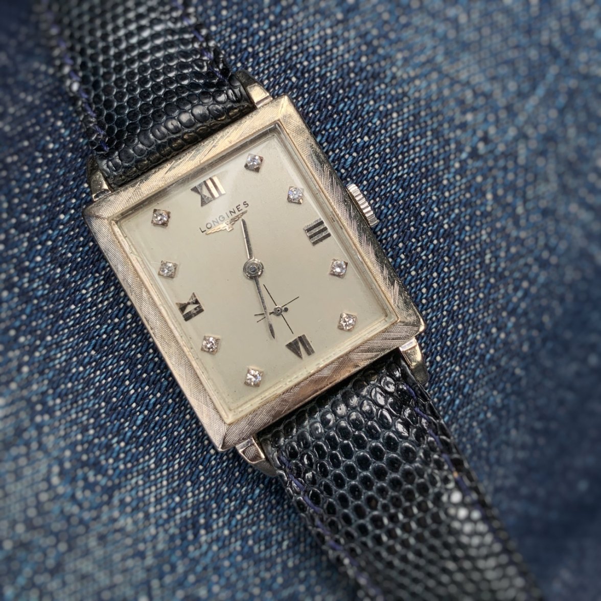
this one fell into my lap accidentally but I find it too pretty to neglect straight away. It’s a 14k white gold case with Morellis finish and a diamond set dial. The dial has very appealing 3,6,9 and 12 markers in addition to the the other diamond markers. What bothers me is the Longines script. It looks quite crude and unrefined compared to the rest of the watch. Is it a re-dial? What do you think?

thanks so much for your help and have a pleasant change of the years.
 
Posts
1,094
Likes
5,550
I`m leaning towards original non-serif logo based on the pictures, but I have never seen this model before😀
 
Posts
12,554
Likes
16,924
Looks like a redial to me. Seems to be missing “Swiss” under the 6 marker.

On a diamond dial like this it is less of an issue than with other watches.
gatorcpa
 
Posts
321
Likes
839
I'd vote redial too. The "Longines" looks unevenly if you look especially at the gap between the "e" and the "s".Apart from this, the dial looks quite expensive for a redial.
 
Posts
494
Likes
980
Thanks for your help. In my opinion the missing Swiss below 6 is not unusual as we see this randomly through almost all brands, however the script of Longines bugs me.

but indeed it must have been an expensive re dial at the time.
 
Posts
7,600
Likes
21,803
I’m leaning towards redial too, mainly because I find the logo not to be properly centered with respect to the dial signature, and also because I find some of those letters lack definition- but that maybe because the picture is blurry?

I think it’s fair to say the sans-serif signature is most often found without logo.
For an example with a logo, see the very good high res pictures @Kbjohn posted at the end of the thread below.

https://omegaforums.net/threads/longines-dial-fonts-and-us-market.33758/

I also think it’s the first time I see the sans-serif signature with an applied hour glass logo. It might exist but who knows.
 
Posts
2,753
Likes
4,793
In my opinion the missing Swiss below 6 is not unusual as we see this randomly through almost all brands, however the script of Longines bugs me.
I would contend that the presence of "Swiss" is not entirely random. The majority of American-market Longines dials from the 1930s to the 1960s (at least) have "Swiss" printed on them. Judging by its design, this is likely an American-market watch.

If everything about the dial looked correct but "Swiss" was missing, it might be reasonable to conclude that the dial was correct. However, given that "Swiss" appears to be absent, the signature leaves something to be desired, and the condition is essentially perfect, I am inclined towards a redial. I also notice that the sub-dial cross looks misaligned with respect to the second hand.

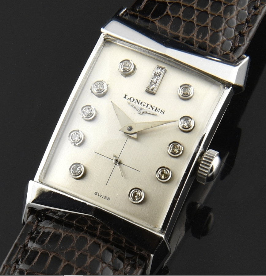
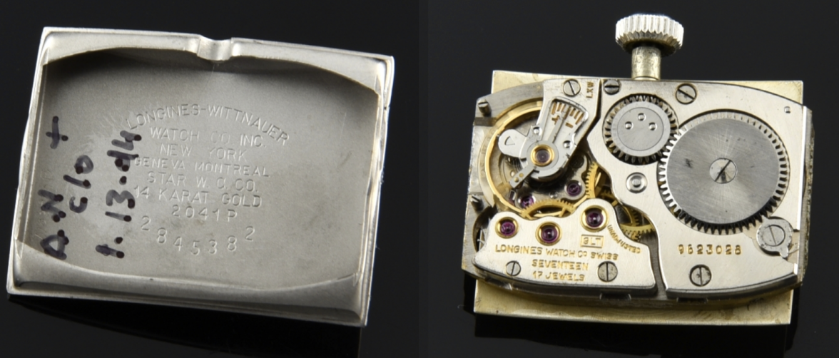
As mentioned above, Longines did use sans-serif signatures on American-market dials during the period so the font is not so dissimilar to those found on some original dials. Though not entirely comparable, below is another diamond dial that appears to be original. The watch is likely earlier than yours.


Source: https://watchestobuy.com/wp-content/uploads/2015/05/LonginesWhiteGoldb.jpg
Edited:
 
Posts
494
Likes
980
Great and detailed explanations from both of you. Please don’t get me wrong, I also think it’s a re-dial. However it would have been grate when it turned out it was legit, wouldn’t it 😁

I still find it very appealing as the beauty of this one comes mostly from the precious metal, stones and the markers.