- Posts
- 3
- Likes
- 2
RainDrop
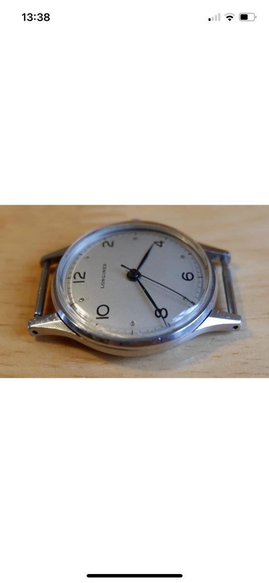
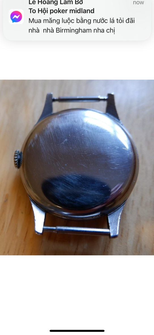
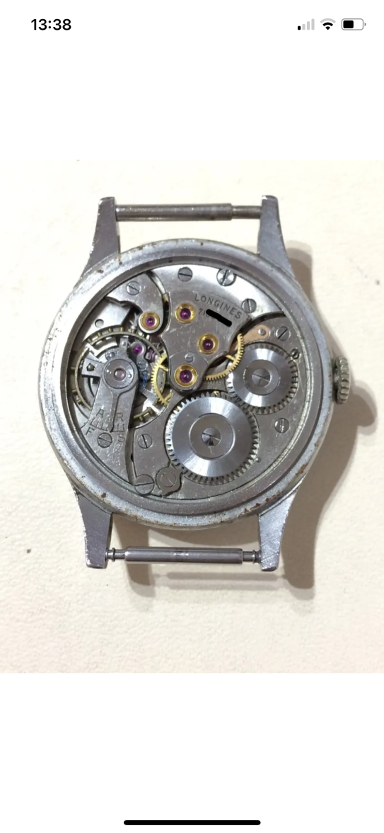
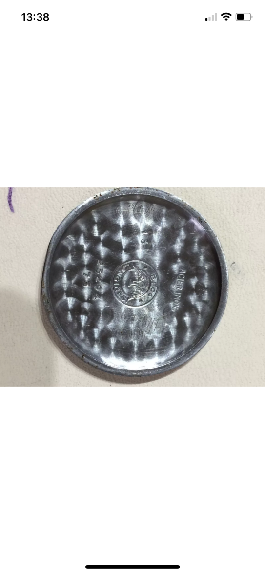
·hi all,
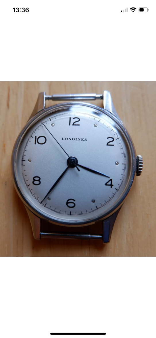
i am a lurker here and would like to made my first purchase of a vintage watch. I found the below listing and wonder if you could help check whether there are anything ‘off’ about it.
Ebay link:
https://www.ebay.co.uk/itm/32558249...hEGF41fRfW&var=&widget_ver=artemis&media=COPY
Thanks all
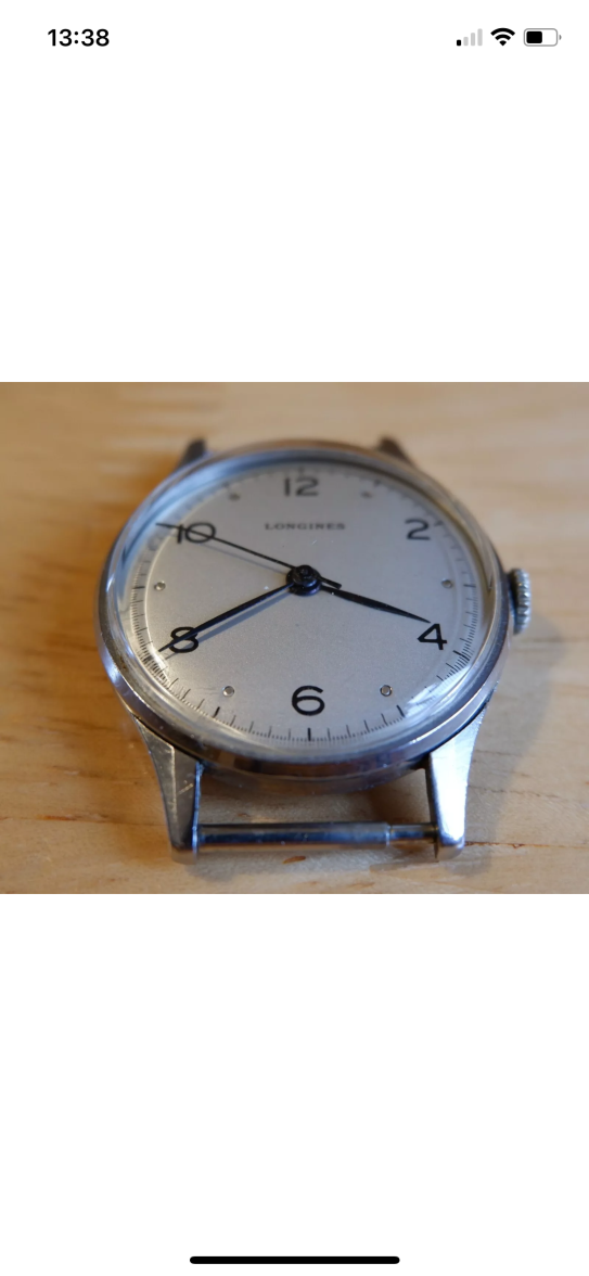
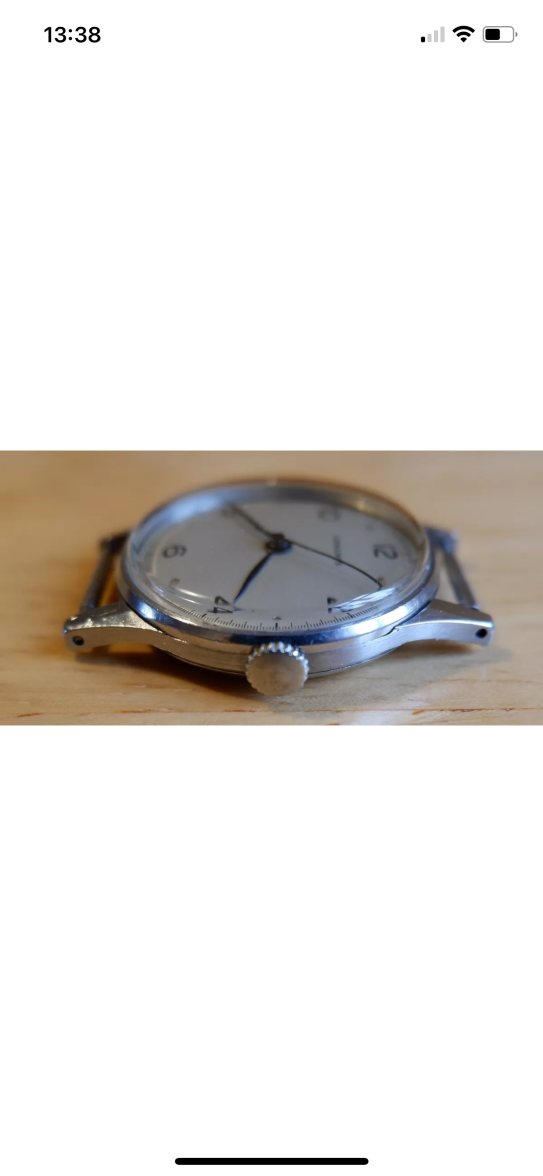
i am a lurker here and would like to made my first purchase of a vintage watch. I found the below listing and wonder if you could help check whether there are anything ‘off’ about it.
Ebay link:
https://www.ebay.co.uk/itm/32558249...hEGF41fRfW&var=&widget_ver=artemis&media=COPY
Thanks all

This website may earn commission from Ebay sales.