banders
·Hey everyone,
Just wanted to share the results of a little investigation I did and also get your feedback on it.
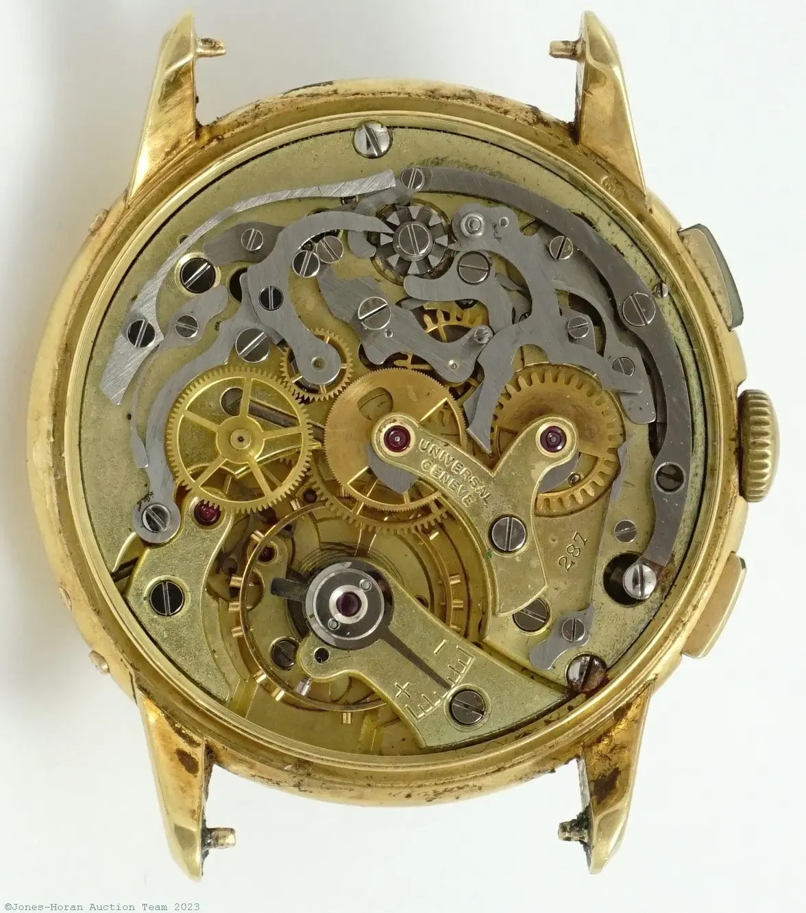
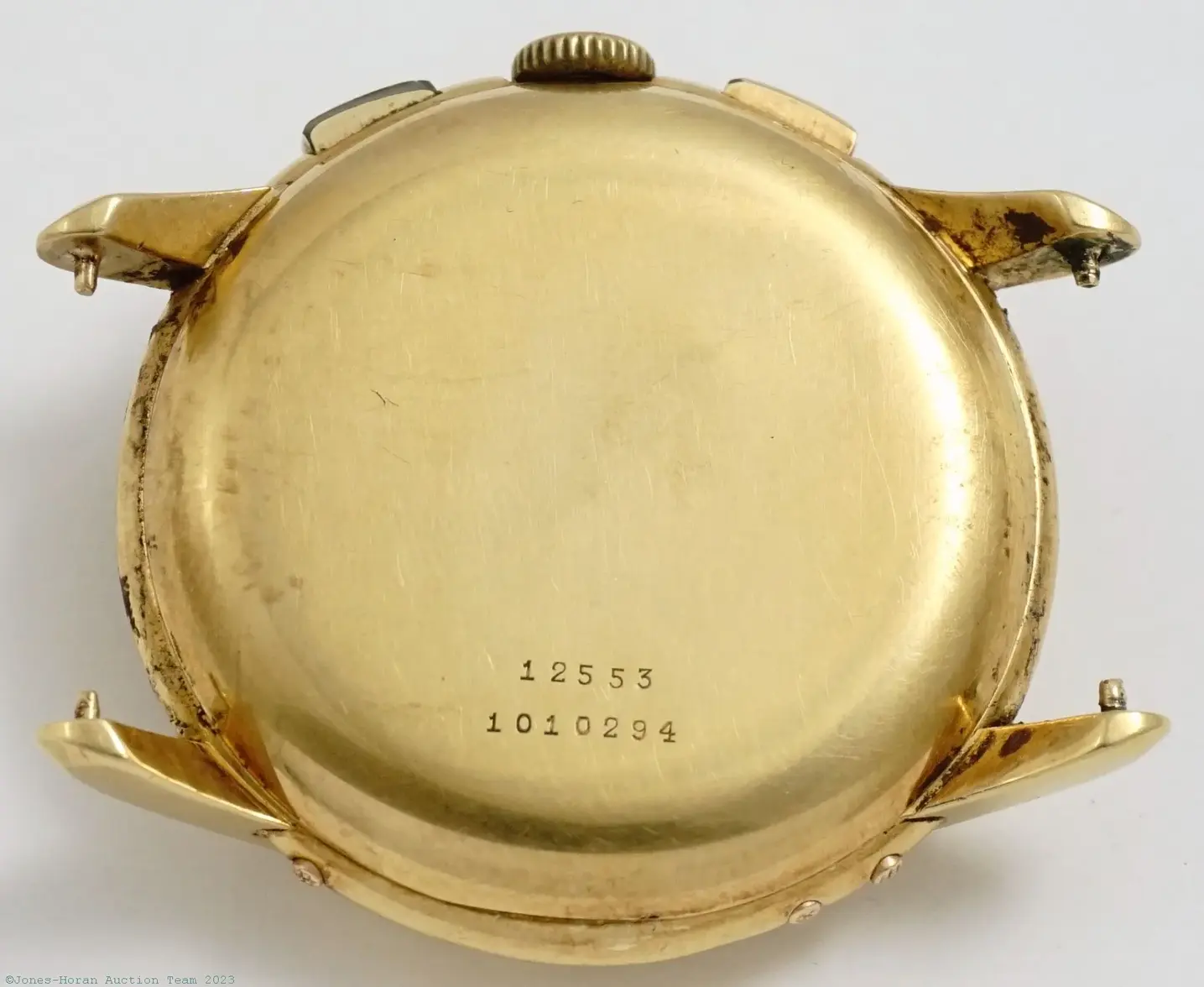
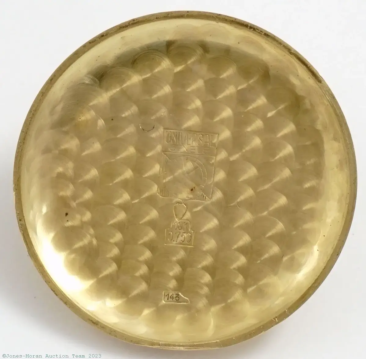
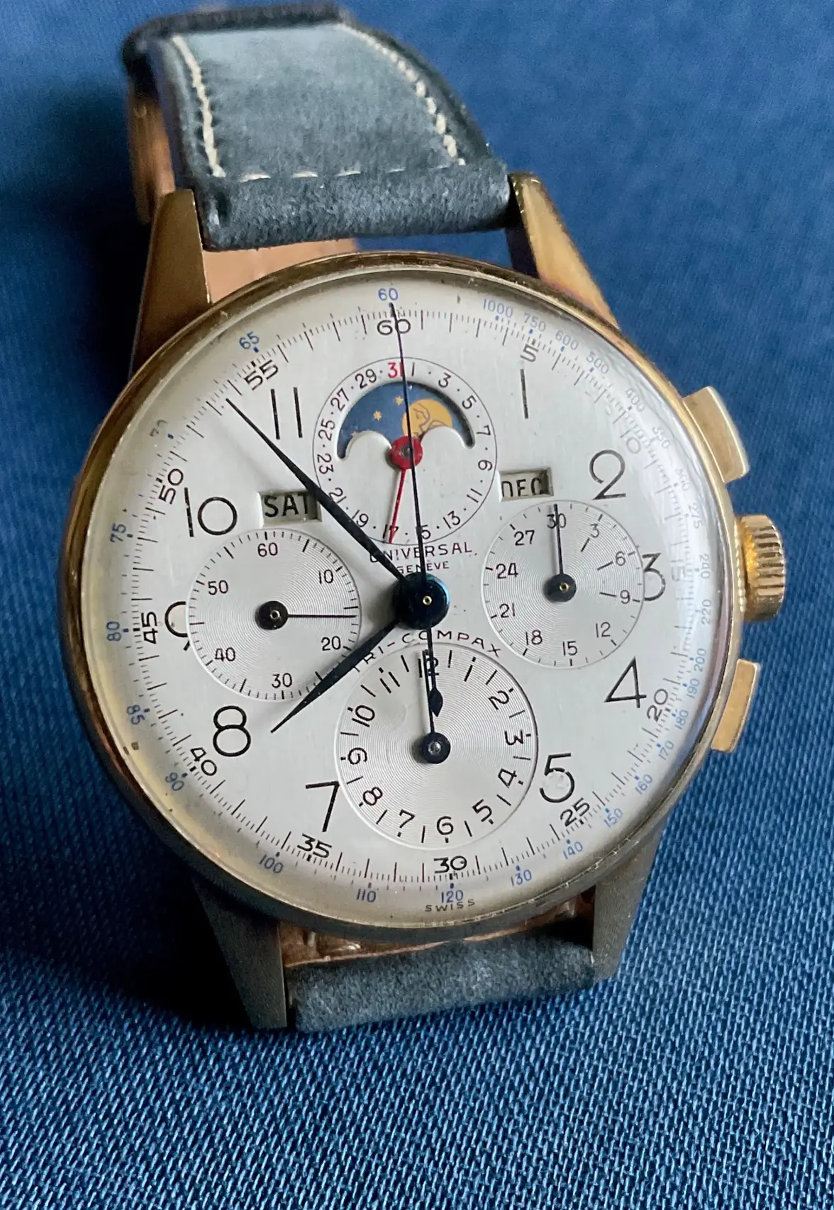
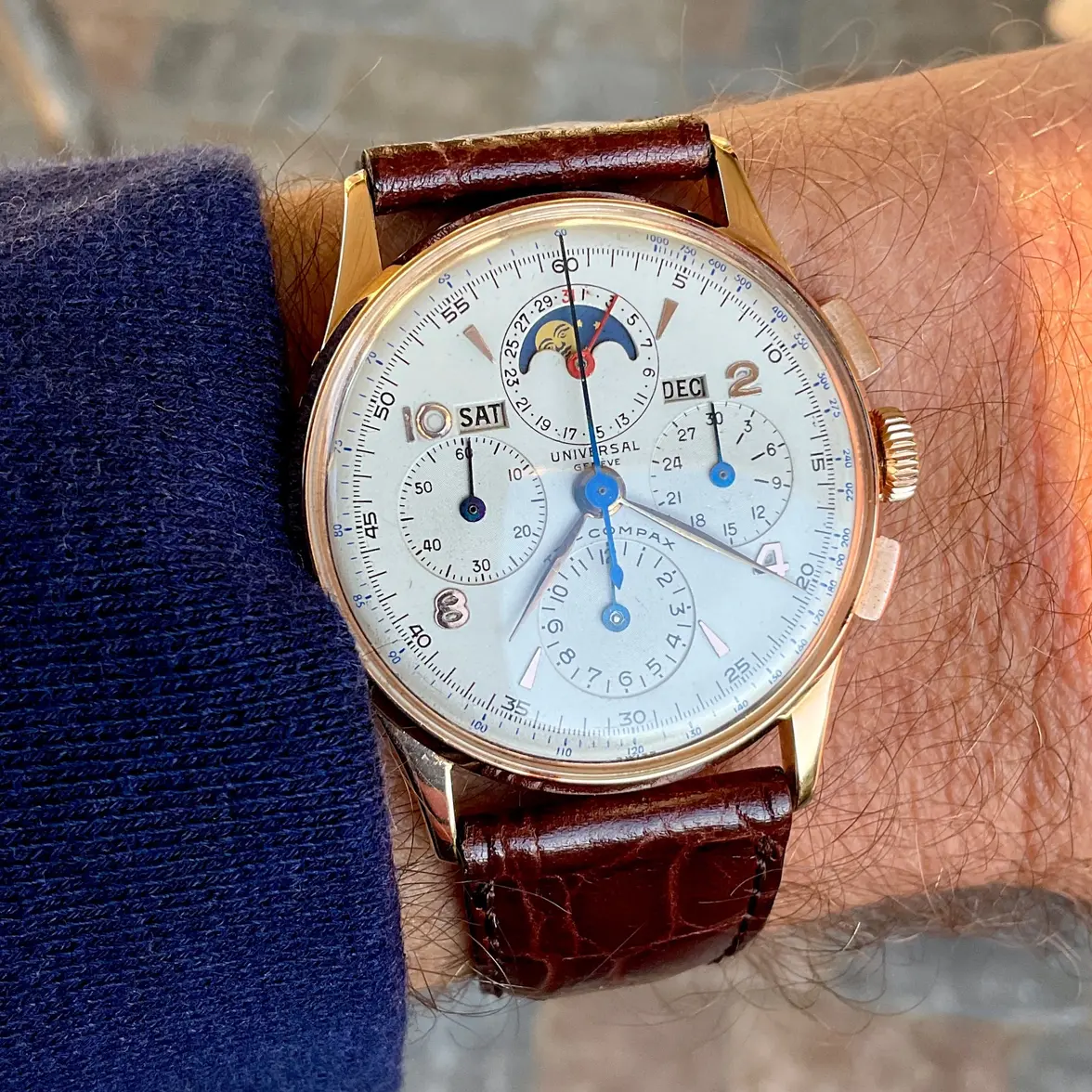
About a year ago, I bought this tri compax:
It's been away at the spa since I bought it and hopefully I'll get it back sometime in December.
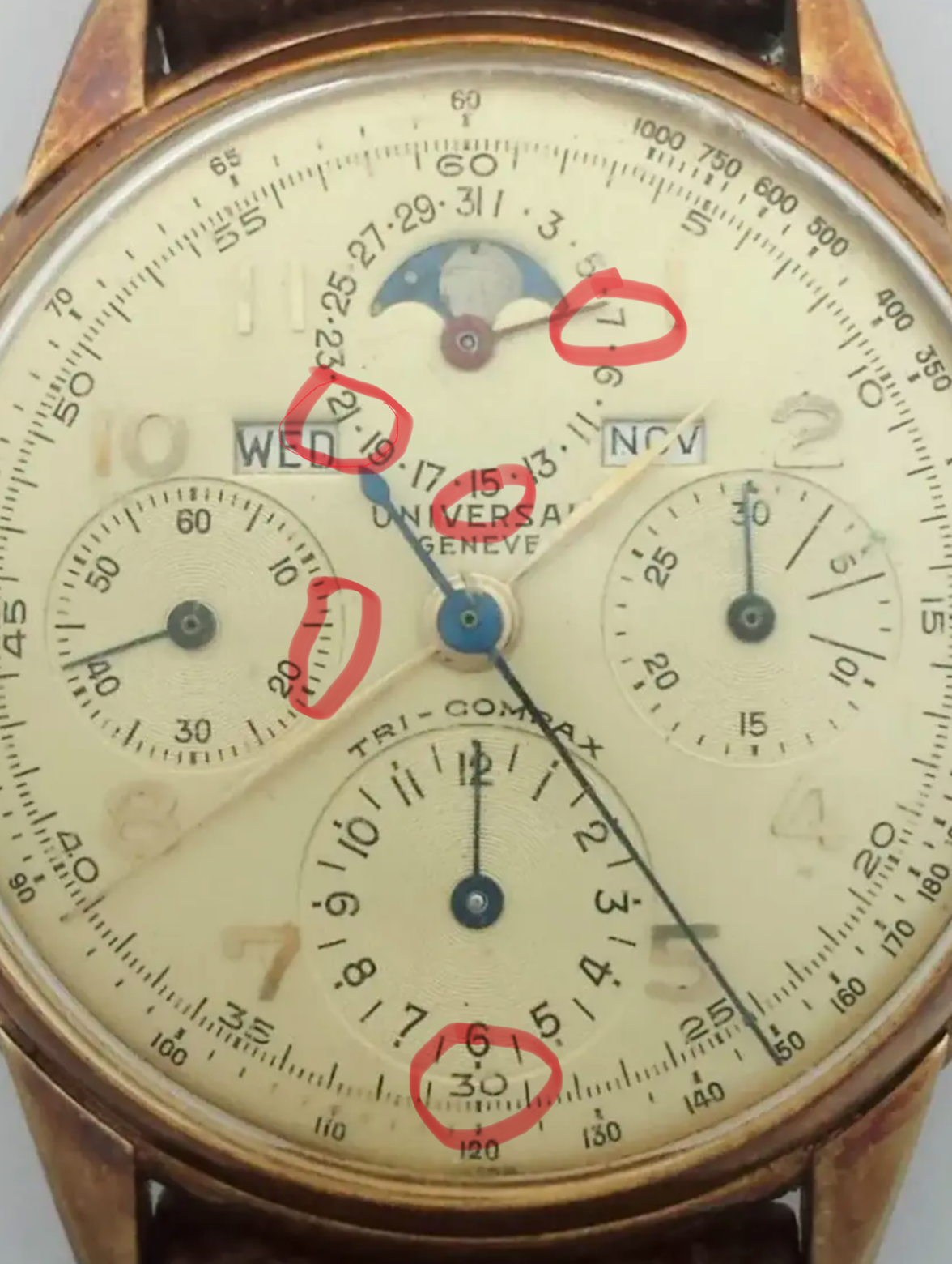
Recently I started worrying about the dial because it has some features I wouldn't expect to see in dials from the early 40s. I DM'd @Florent for help and here are the irregularities we came up with:
I know there is a lot of variation with UG dials, but since it is my watch, I wanted to be as certain as possible regarding its originality. Here is what I found:
First I looked into the missing ring around the dates. I believed this feature was legitimate on dials from the late 40s onwards, but I always had doubts when I saw it on supposedly early-mid 40s dials.
Here's a post establishing that it's a legitimate feature for late 40s onwards: link
Here's a post I wrote about my theory that a black ring can be an indication of a later dial: link
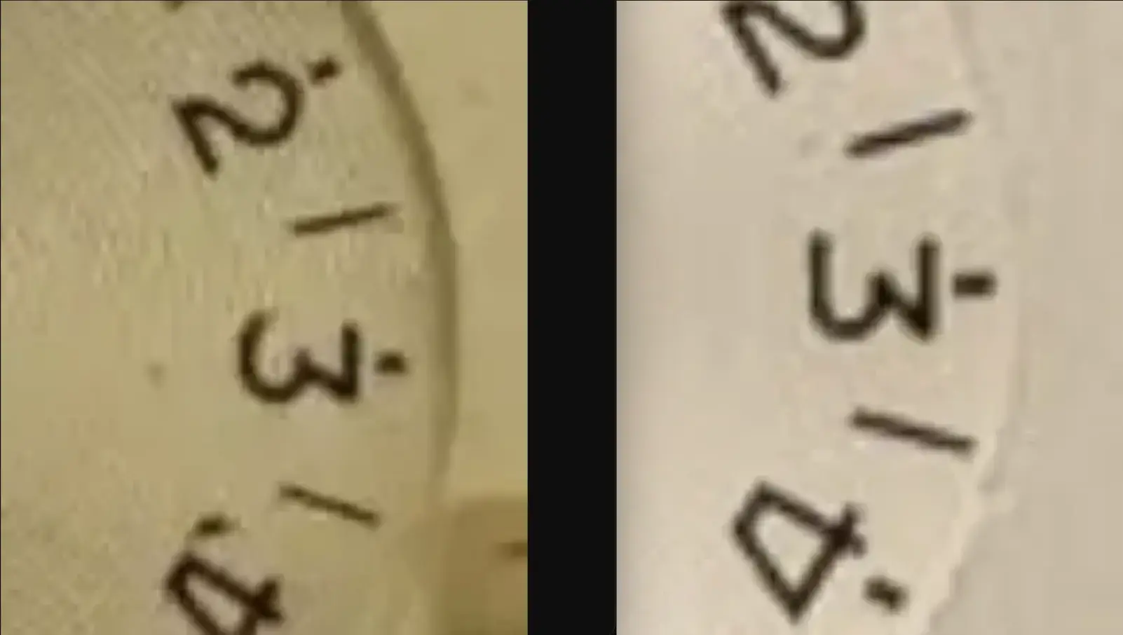
I didn't find anything new on this front so I continued on to the next irregularity: the numerals font. Again, I could only find examples of this on dials from the late 40s onwards. For instance:
link
Next up was the missing 'BASE' text. This was an easy concern to assuage, since it actually seems somewhat common:
link
At this point, I wasn't feeling great. The evidence I had pointed to my dial possibly being a replacement dial. Given the strange 'UNIVERSAL GENEVE' text, I was concerned it might even be refinished.
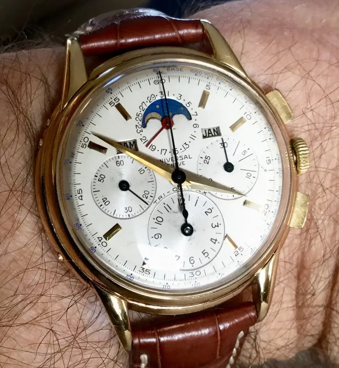
Things got interesting when I started looking for watches with the same 'UNIVERSAL GENEVE' text. I looked through hundreds of watches and only found a few with this feature. Here they are:
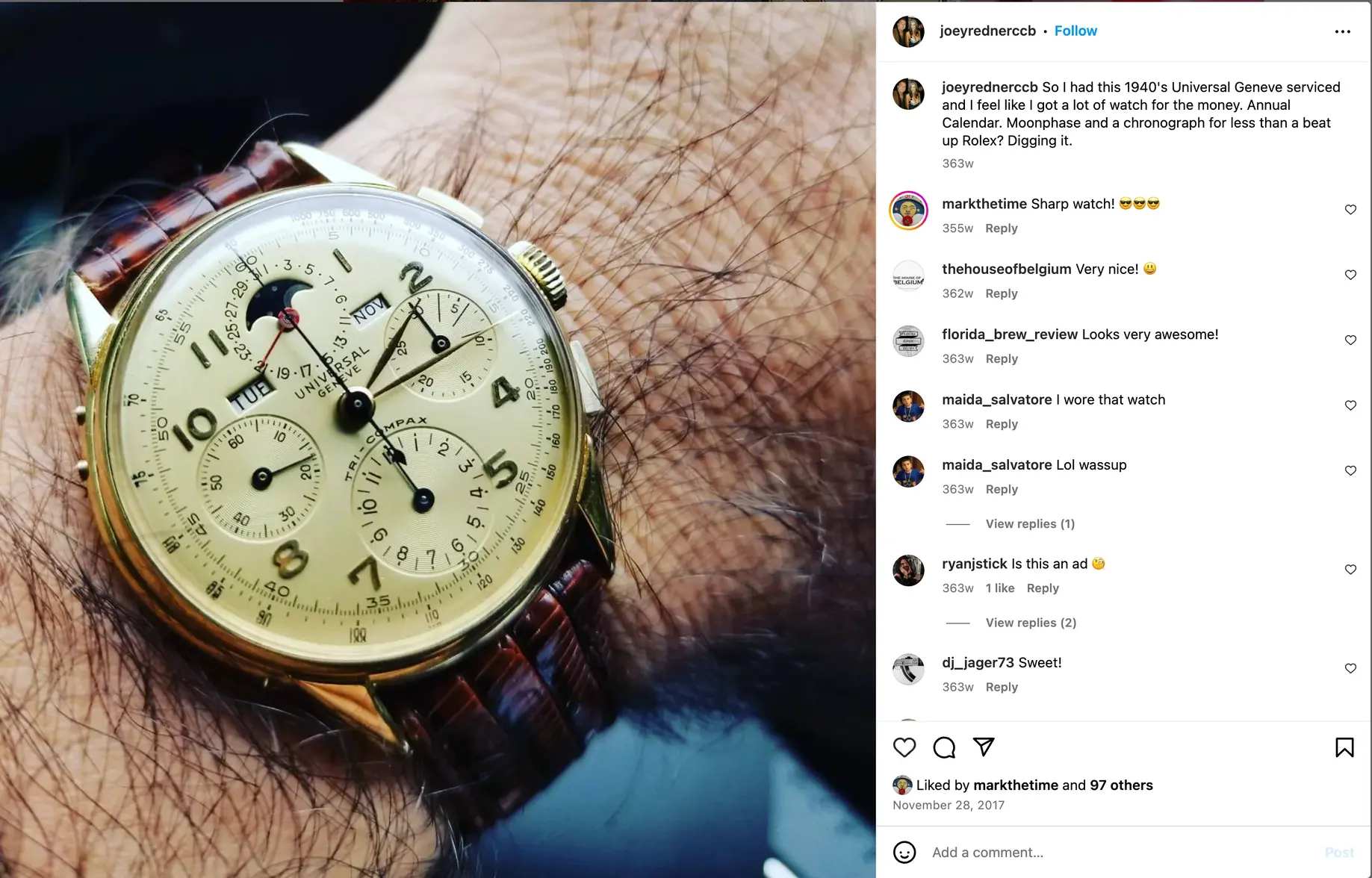
1) A slightly sus watch from Invaluable. The hands are definitely unoriginal, the date/month text raised my eyebrows as well. No case number. The lot passed, which suggests other people had questions as well.
https://www.invaluable.com/auction-...ined&queryID=dd5c12f68c8ef47dcc6e93dd736753a3
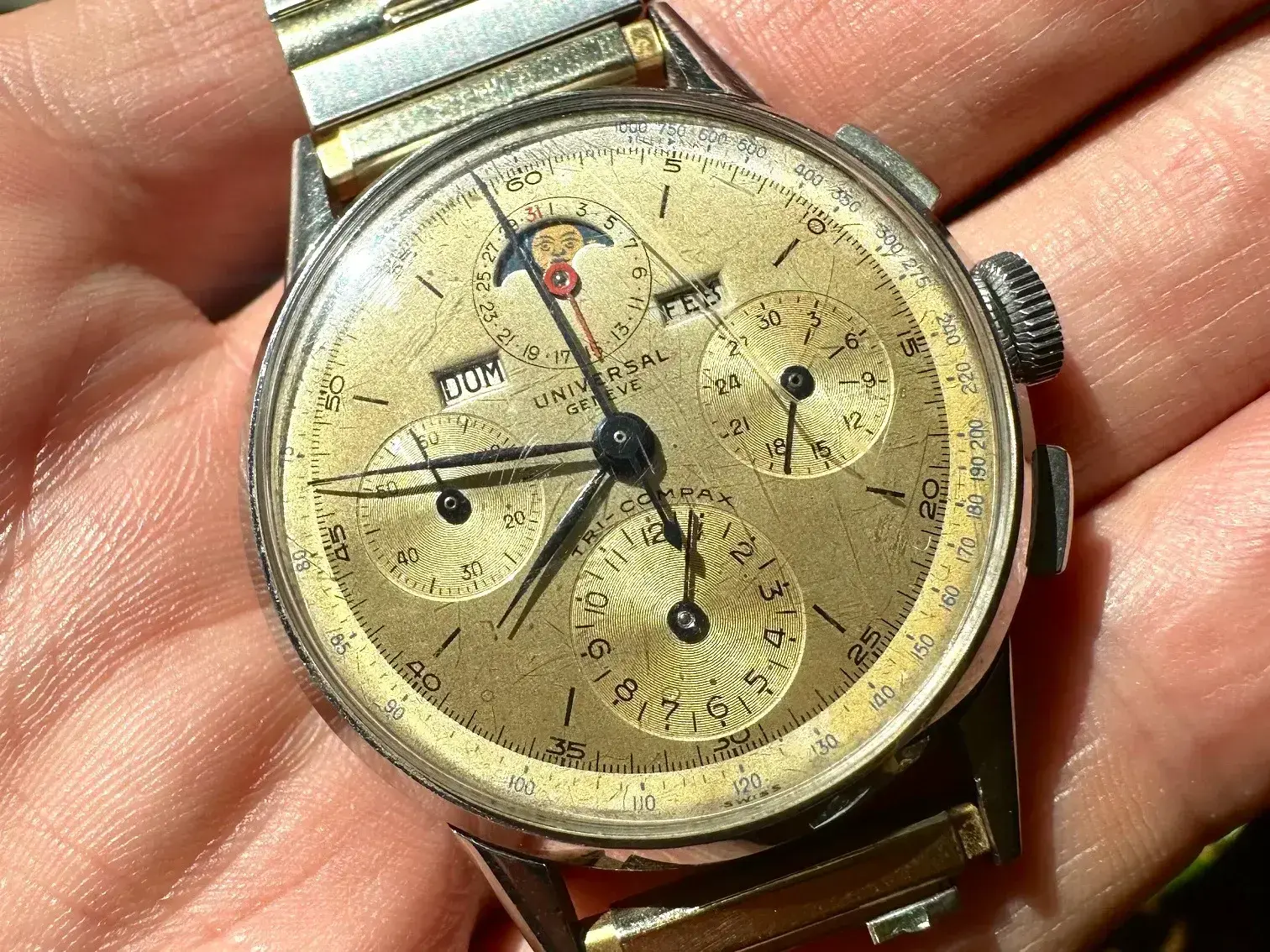
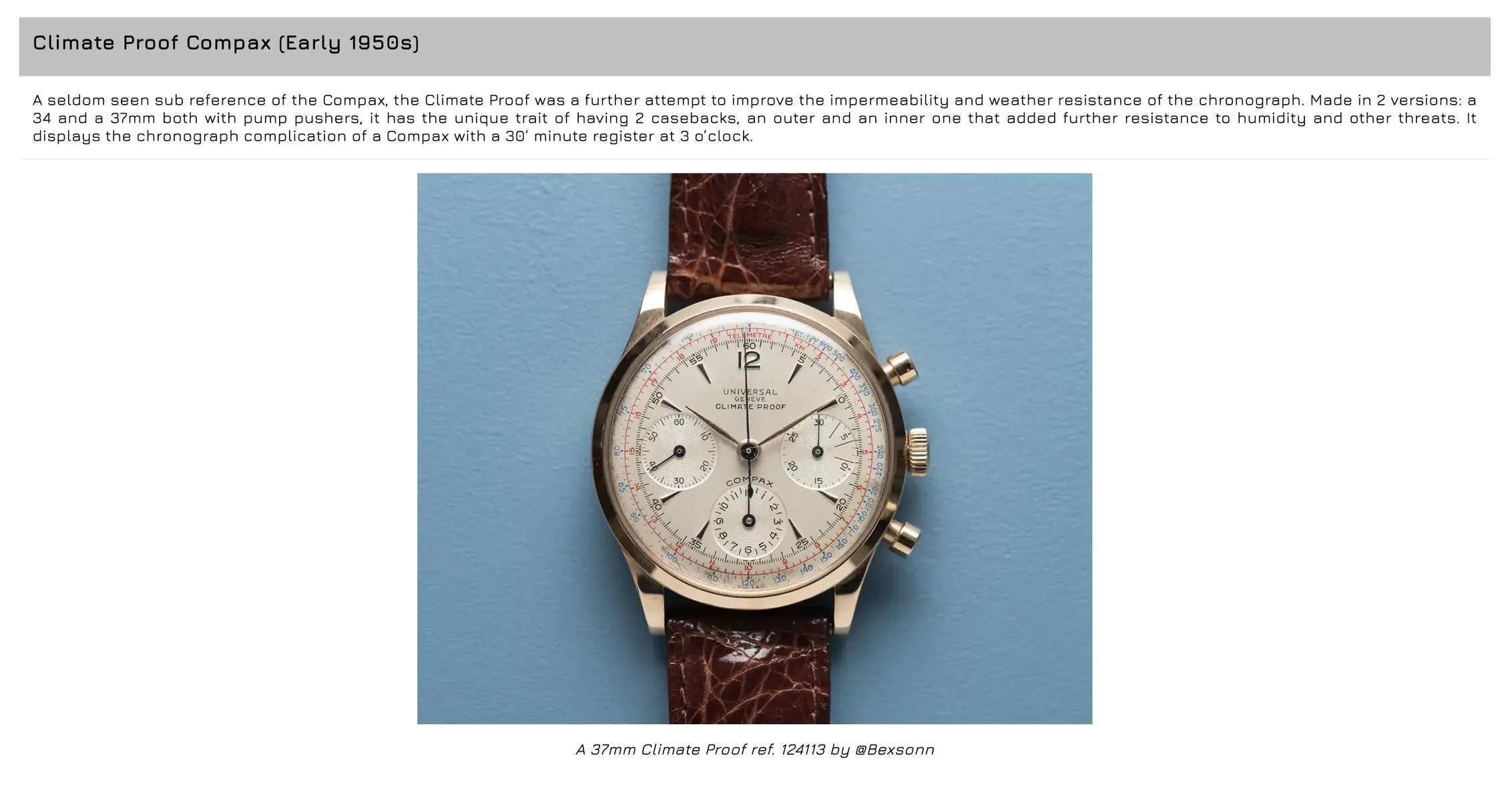
2) Early 50s climate-proof. This eased some of my concerns because this watch has the same UG font, and I'm very confident it's original. When I saw this I was no longer worried that the dial on my watch was refinished. However, because this watch is from the early 50s, I was still very concerned that my dial might not be original to my early 40s watch.
https://universalgeneve.info/content/14-models
3) Cal 262 from 1943 (SN: 923070, Ref: 212127). I'm very interested to hear from others if they think this dial is original to the watch. If so, it would mean that UG was definitely using this 'UNIVERSAL GENEVE' font when my watch was made. @Mark020
https://www.ebay.com/itm/114567589977
I also found a few watches with a similar 's' but not quite matching:
1. Tri compax from ~1956
https://universalgeneve.info/content/14-models
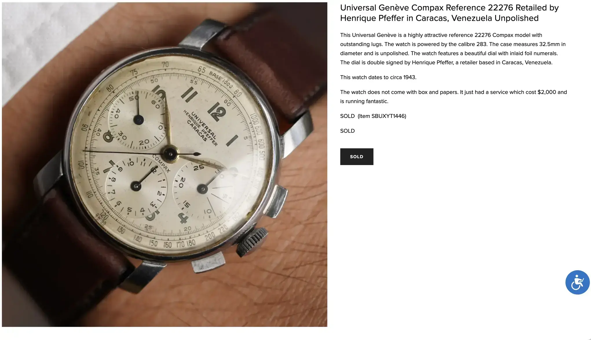
2. Compax from ~1943
https://www.windvintage.com/univers...22276-retailed-by-henrique-pfeffer-unpolished
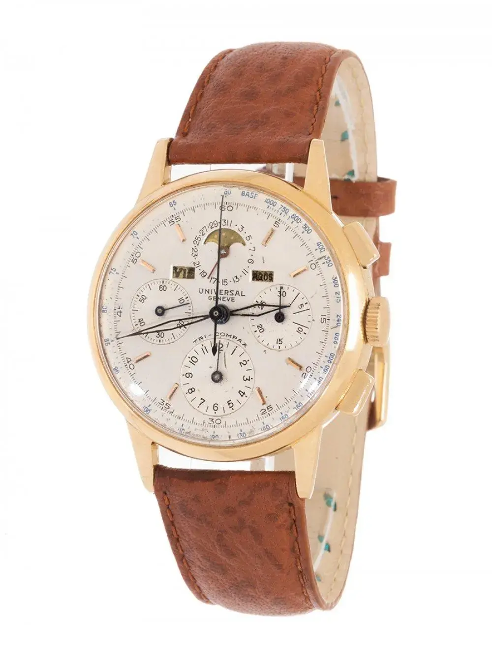
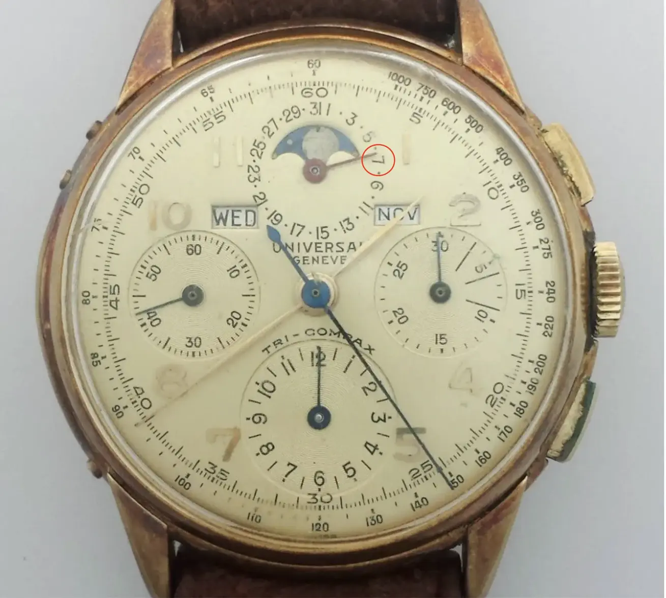
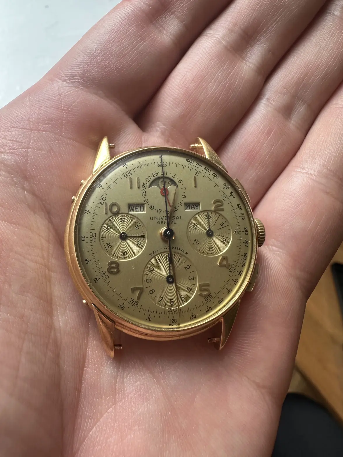
I stopped my search when I made my most important find--a 12553 tri compax with a dial almost identical to the dial in my watch. It even has the same slightly-too-long minute hand, which I thought may have been a replacement on my watch. Notably, it is missing the serifs on some 7s. Unfortunately, the case number and other pictures are not available. The original image is watermarked 'Hess Fine Auctions' so I will reach out to see if they have any more images/details.
https://vintagewatchlife.com/en-us/collections/ユニバーサル-ジュネーブ-universal-geneve
Finding this was a relief because IMO an almost identical watch suggests that the dials in both are original. Extrapolating further, I believe this means that dates without a ring and all these fonts can be perfectly legitimate in early 40s dials.
If you made it this far, thanks for hearing me out. Please let me know what you think, especially if you disagree on anything 🙏
And many thanks to @Florent for taking the time to help me with this!
Just wanted to share the results of a little investigation I did and also get your feedback on it.
About a year ago, I bought this tri compax:
It's been away at the spa since I bought it and hopefully I'll get it back sometime in December.
Recently I started worrying about the dial because it has some features I wouldn't expect to see in dials from the early 40s. I DM'd @Florent for help and here are the irregularities we came up with:
- no ring around the dates
- font for numerals
- missing 'BASE' text on the tachy scale
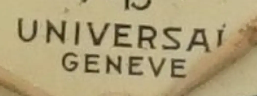
- 'UNIVERSAL GENEVE' font (notice the 's' in particular). This was the most worrying to me because I had never seen it before.
I know there is a lot of variation with UG dials, but since it is my watch, I wanted to be as certain as possible regarding its originality. Here is what I found:
First I looked into the missing ring around the dates. I believed this feature was legitimate on dials from the late 40s onwards, but I always had doubts when I saw it on supposedly early-mid 40s dials.
Here's a post establishing that it's a legitimate feature for late 40s onwards: link
Here's a post I wrote about my theory that a black ring can be an indication of a later dial: link
I didn't find anything new on this front so I continued on to the next irregularity: the numerals font. Again, I could only find examples of this on dials from the late 40s onwards. For instance:
link
Next up was the missing 'BASE' text. This was an easy concern to assuage, since it actually seems somewhat common:
link
At this point, I wasn't feeling great. The evidence I had pointed to my dial possibly being a replacement dial. Given the strange 'UNIVERSAL GENEVE' text, I was concerned it might even be refinished.
Things got interesting when I started looking for watches with the same 'UNIVERSAL GENEVE' text. I looked through hundreds of watches and only found a few with this feature. Here they are:
1) A slightly sus watch from Invaluable. The hands are definitely unoriginal, the date/month text raised my eyebrows as well. No case number. The lot passed, which suggests other people had questions as well.
https://www.invaluable.com/auction-...ined&queryID=dd5c12f68c8ef47dcc6e93dd736753a3
2) Early 50s climate-proof. This eased some of my concerns because this watch has the same UG font, and I'm very confident it's original. When I saw this I was no longer worried that the dial on my watch was refinished. However, because this watch is from the early 50s, I was still very concerned that my dial might not be original to my early 40s watch.
https://universalgeneve.info/content/14-models
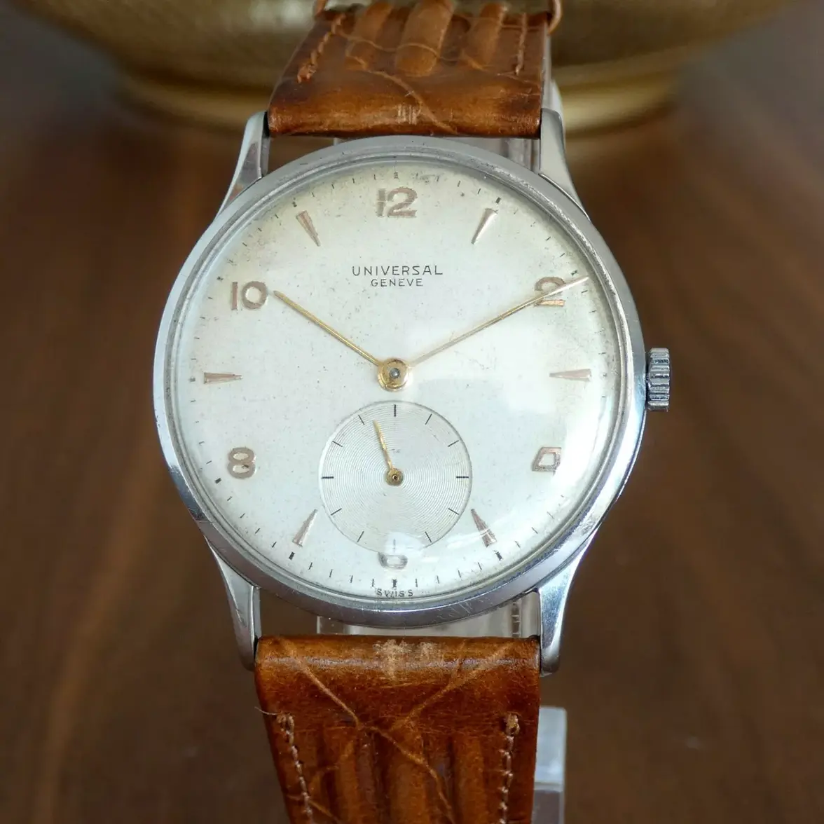
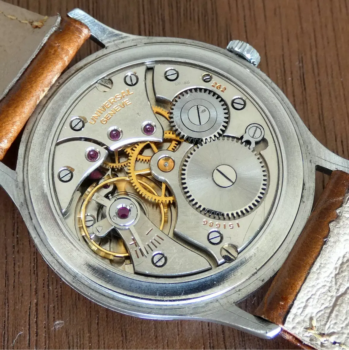
3) Cal 262 from 1943 (SN: 923070, Ref: 212127). I'm very interested to hear from others if they think this dial is original to the watch. If so, it would mean that UG was definitely using this 'UNIVERSAL GENEVE' font when my watch was made. @Mark020
https://www.ebay.com/itm/114567589977
I also found a few watches with a similar 's' but not quite matching:
1. Tri compax from ~1956
https://universalgeneve.info/content/14-models
2. Compax from ~1943
https://www.windvintage.com/univers...22276-retailed-by-henrique-pfeffer-unpolished
I stopped my search when I made my most important find--a 12553 tri compax with a dial almost identical to the dial in my watch. It even has the same slightly-too-long minute hand, which I thought may have been a replacement on my watch. Notably, it is missing the serifs on some 7s. Unfortunately, the case number and other pictures are not available. The original image is watermarked 'Hess Fine Auctions' so I will reach out to see if they have any more images/details.
https://vintagewatchlife.com/en-us/collections/ユニバーサル-ジュネーブ-universal-geneve
Finding this was a relief because IMO an almost identical watch suggests that the dials in both are original. Extrapolating further, I believe this means that dates without a ring and all these fonts can be perfectly legitimate in early 40s dials.
If you made it this far, thanks for hearing me out. Please let me know what you think, especially if you disagree on anything 🙏
And many thanks to @Florent for taking the time to help me with this!
Edited:
This website may earn commission from Ebay sales.

